Responsive Headings
Last Update: October 29, 2025
Avada includes several Responsive Typography options. These are global options that can be set in the Avada > Options > Responsive section. Responsive Typography options have also been built into the Avada Slider. Continue reading below to learn more about each option and how to set them up.
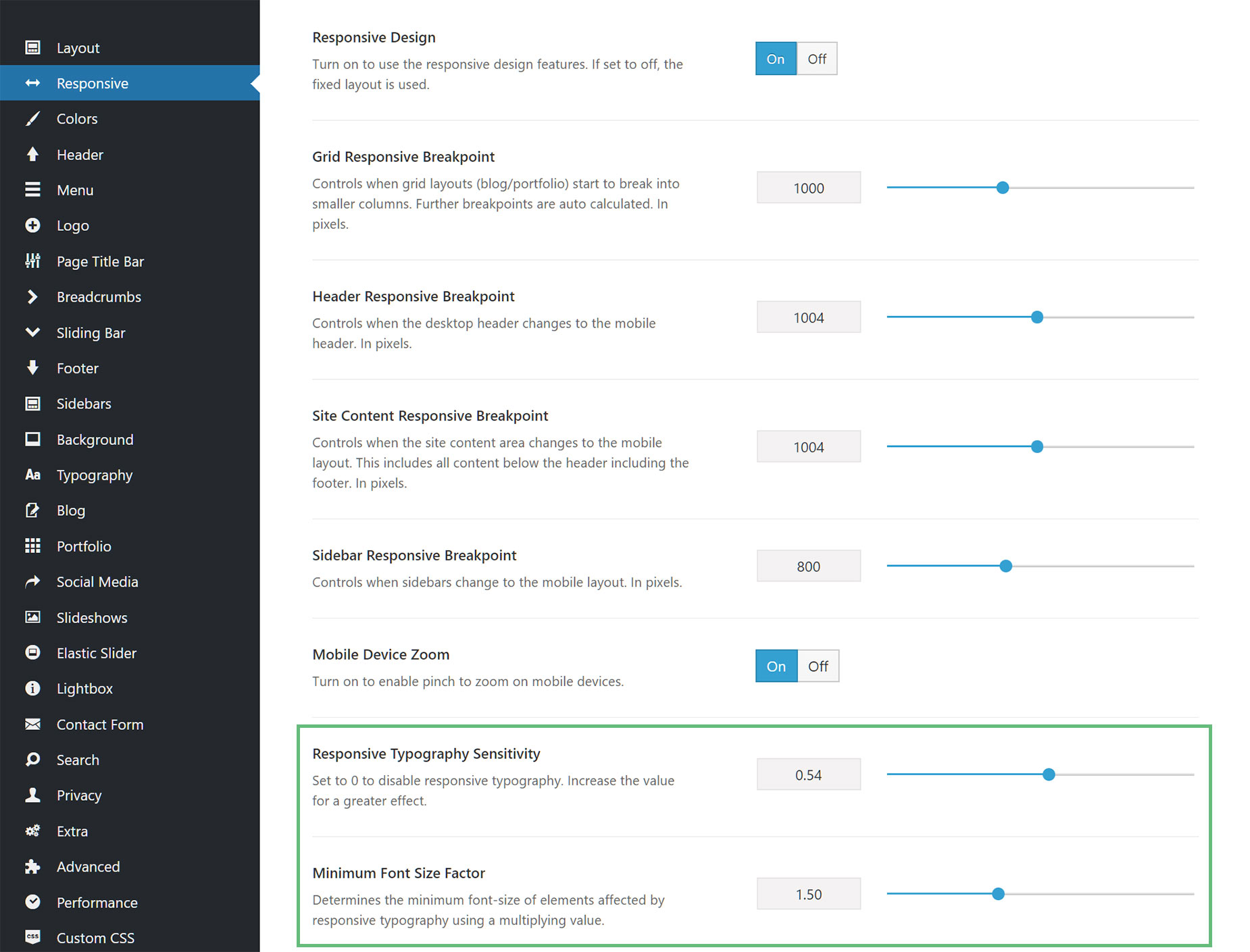
Manage Responsive Options In Global Options
Located here -> Options > Responsive
How Does This Work?
Let’s consider a common example where the Responsive Typography Sensitivity is set to to 1, the Minimum Font Size Factor to 1.5, and the Body font size is left at the default size of 16px.
The Minimum factor will use 1.5 times the body font, so will lead to 16 * 1.5 = 24px. Our minimum viewport width is set to 360px for the calculations.
The Maximum font size, so the size set by the user to the heading, will be reached at and above the grid breakpoint size (1000px is the default).
So what happens with the calculations is that between 360px and 1000px viewport width, the font size changes from font size set by usersto 1.5 * body font size. As an example: a 680px viewport width is exactly in the middle of the two values, which means the font size would also be in the middle of its range, so if minimum is 16px and maximum is 48px, it would be at approx 32px. Reducing the sensitivity will just slowdown the scaling.
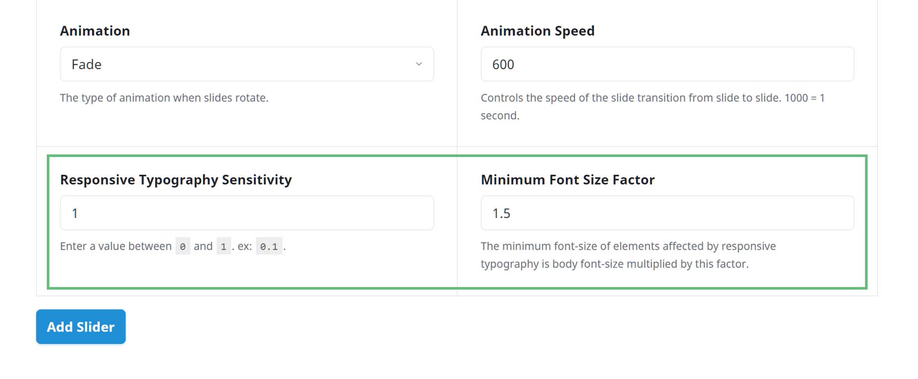
Manage Responsive Type For Avada Sliders
Aside from the Avada Global Options, you can also set the Responsive Type options in each Avada Slider.
The Avada Slider responsive typography settings are independent of the Global Option settings and only apply to the individual Avada Slider.
Located here -> Avada Slider > Add/Edit Sliders
Common Issues & Questions
1. My headings are too big for mobile and are being cut off
This means that your responsive settings are probably not set correctly. Please check the Responsive Typography Sensitivity and Minimum Font Size Factor settings in the global options and ensure the values are correct. Responsive Typography Sensitivity will increase the amount of resizing. 0 will disable responsive typography, while 1 is maximum responsiveness. Minimum Font Size Factor is used to determine the multiplying factor for the minimum font size.


