Mobile Menu Settings
Last Update: October 31, 2025
With Avada being responsive and mobile-friendly, this includes a mobile responsive menu as well. Having a Mobile Menu makes it easier for the users to navigate your website on devices with smaller screen size, especially if you have a lot of pages/menu items. Avada has specific section in the Global Options to help you customize your Mobile Menu with ease. Continue reading below to know more about customizing and setting up Mobile Menu.
Mobile Menu Options
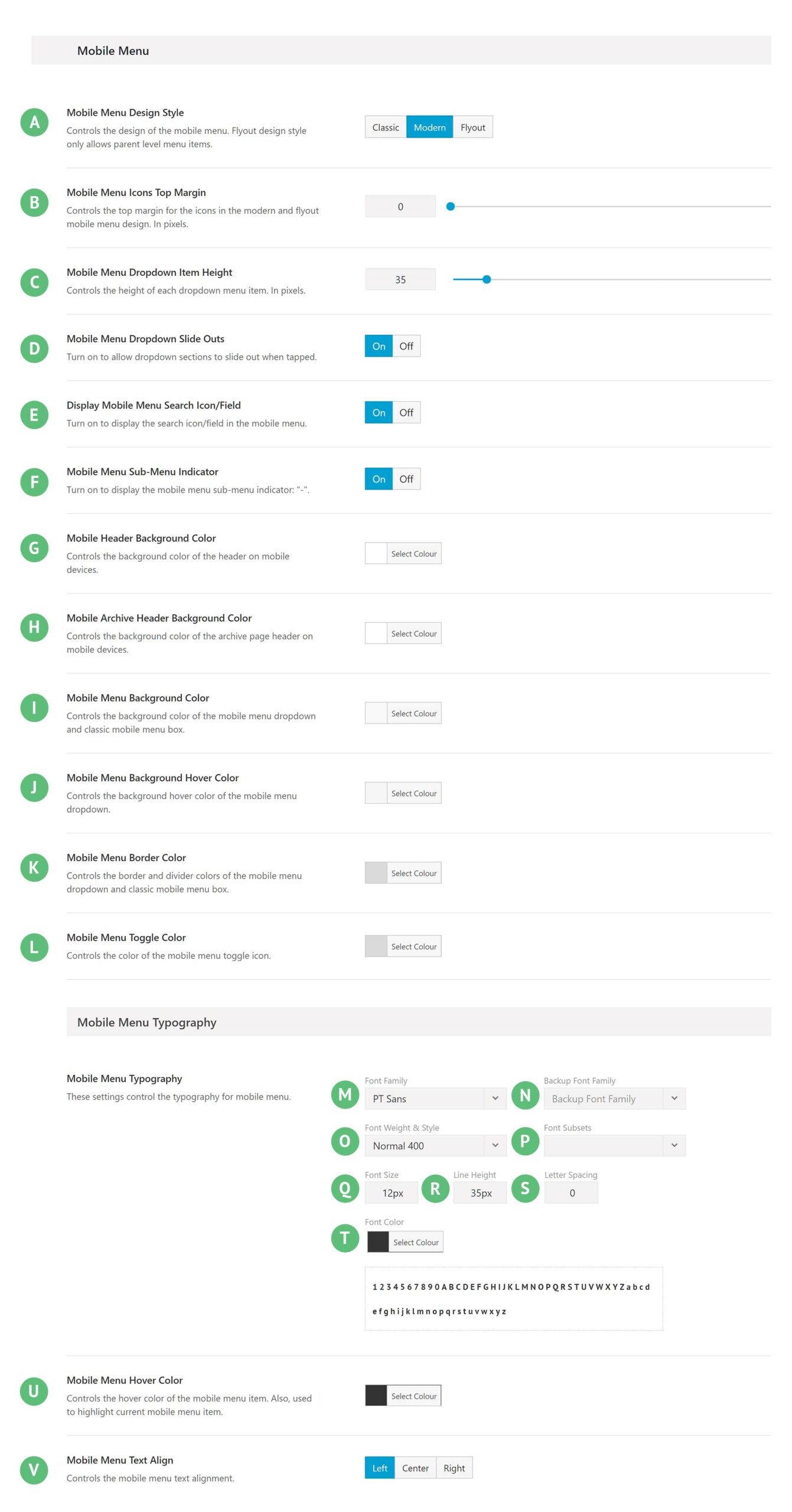
Navigate to Avada > Options > Menu > Mobile Menu section and you will see the available options for Mobile Menu.
Mobile Menu Design Style – Illustrated as A. Controls the design of the mobile menu. Choose between Classic, Modern, or Flyout. Flyout design style only allows parent level menu items. Note: When you select Flyout design, only a few options will be available. You can find other options for Flyout in the Flyout Menu section.
Mobile Menu Icons Top Margin – Illustrated as B. Controls the top margin for the icons in Modern and flyout menu design. Manually enter a value (0-200) or drag the slider left/right.
Mobile Menu Dropdown Item Height – Illustrated as C. Controls the height of each dropdown menu item. Manually enter a value (0-200) or drag the slider left/right.
Mobile Menu Dropdown Slide Outs – Illustrated as D. Turn on to allow dropdown sections to slide out when tapped.
Display Mobile Menu Search Icon/Field – Illustrated as E. Turn on to display the search icon/field in the mobile menu.
Mobile Menu Sub-Menu Indicator – Illustrated as F. Turn on to display the mobile menu sub-menu indicator: “-“.
Mobile Header Background Color – Illustrated as G. Controls the background color of the header on mobile devices.
Mobile Archive Header Background Color – Illustrated as H. Controls the background color of the archive page header on mobile devices.
Mobile Menu Background Color – Illustrated as I. Controls the background color of the mobile menu dropdown and classic mobile menu box.
Mobile Menu Background Hover Color – Illustrated as J. Controls the background hover color of the mobile menu dropdown.
Mobile Menu Border Color – Illustrated as K. Controls the border and divider colors of the mobile menu dropdown and classic mobile menu box.
Mobile Menu Toggle Color – Illustrated as L. Controls the color of the mobile menu toggle icon.
Font Family – Illustrated as M. Controls the font family to be used.
Backup Font Family – Illustrated as N. Controls the backup font family to be used in case the primary font doesn’t load correctly.
Font Weight & Style – Illustrated as O. Controls the font weight and style to be used.
Font Subsets – Illustrated as P. Controls the font subset to be used.
Font Size – Illustrated as Q. Controls the size of the text on display.
Line Height – Illustrated as R. Controls the spacing between lines.
Letter Spacing – Illustrated as S. Controls the spacing between letters.
Font Color – Illustrated as T. Controls the color of the text.
Mobile Menu Hover Color – Illustrated as U. Controls the hover color of the mobile menu item. Also, used to highlight current mobile menu item.
Mobile Menu Text Align – Illustrated as V. Controls the mobile menu text alignment. Choose between Left, Center, or Right.
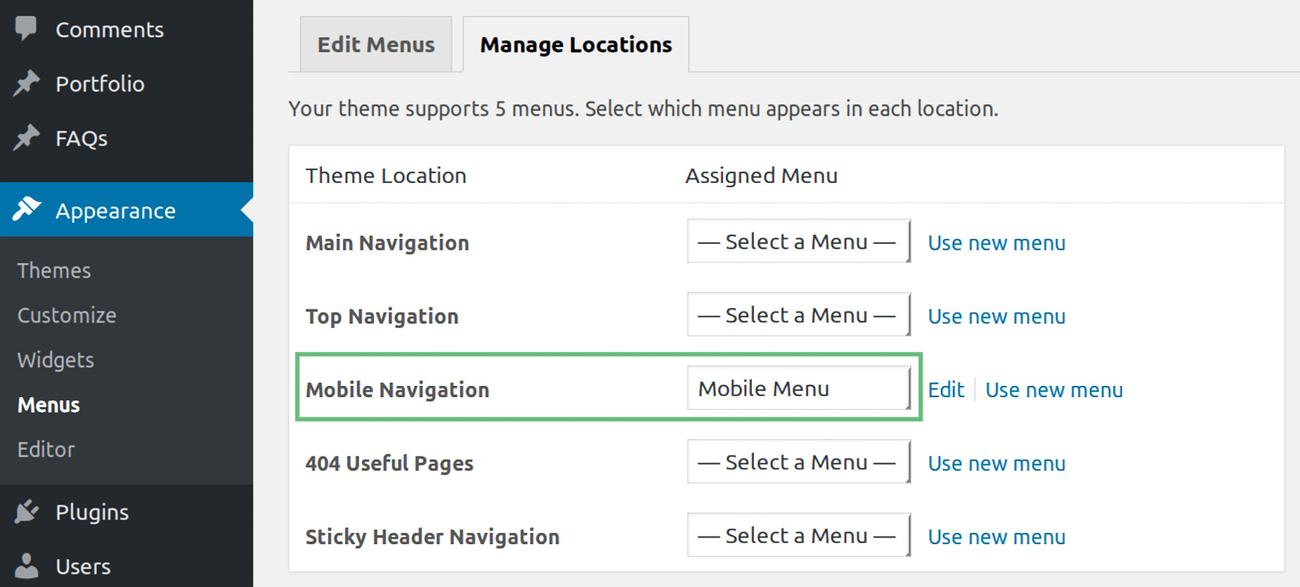
How to assign a Mobile Menu


