Image Format And Size Guide
Last Update: September 27, 2025
Images for websites is a deep and complex subject. There are many factors to understand and to take into account, and it’s not a topic where an easy, one size fits all answer will suffice. But if you want to know more about how images work with your website, and get a general overview of the factors at play, read on.
When we speak of image size, it is useful to keep in mind the two different sides of the issue. The first one is “What size images should I upload?”, while the other side is “What affects how large my images are displayed?” And these are not independent questions. You can’t answer the first one without also considering the second. Secondly, different usage requires different formats, and it’s good to know what formats suit what situations.
Below is a general guide on how to gauge how big or small your images should be to fit your website, as well as to ensure that they look crisp on your viewers’ screens. The size, and quality of the images on your website depends on a whole range of factors, such as the format, how big you upload them, your site width, whether they’re in columns or being used as a background image, whether you use sidebars, and even the resolution of the end user’s screen, to name just a few.
Continue reading below to learn more about these factors. Also, take a look at our extensive blog article, ‘A Comprehensive Guide To WordPress Image Optimization’, to explore the basics of image optimization, and watch the video below for a visual overview of the topic
Image Formats
Image size is also directly affected by your choice of image format. This is a huge topic, and way too big for a tutorial such as this, but basically, there are two major file fomats you are likely to be using on your website, as well as a few more upcoming and possible formats. There are both vector and raster image formats, and each format has their own strengths and weaknesses. For a more detailed look at image file formats, view this excellent article at HubSpot, or this one at Kinsta.
JPG / JPEG
JPG (.jpg or .jpeg) is the most common image raster format for the web, most suitable for photos. It compresses well (maintains quality relatively well for the file sizes you can achieve). It doesn’t support transparency, but it’s by far the most common image format.

PNG
PNG (.png) is also a very common image format, with specific strengths. It was invented to replace GIFs, and is a lossless format and also supports transparency. This means it is great for logos and other images that require transparency. It is also a good format for high quality photos, but the comparitive file size is much bigger than a jpg.
GIF
GIF (.gif) is a lossless format, meaning that a GIF retains all the data contained in the file, but they are smaller than JPGs, specifically because they only accommodate up to 256 indexed colors. GIF also supports transparency, but for logos, PNGs are a better format. This format is slowly being replaced by the .png format, but where GIFs still shine, is that they can be animated, and so are very useful in some situations.
SVG
SVG (.svg) is a vector format, which while having wide browser support, is not yet as easy a file format to implement as the others. It is however a great choice for logos, or other graphics you want to be tack sharp. Unlike raster formats seen in JPG, GIF, and PNG, an SVG image remains crisp and clear at any resolution or size, because they are mathematically declared shapes and curves, not pixels.

WEBP
WebP is the new kid on the block, this file format is developed by Google, and was developed specifically to provide better lossless and lossy compression of images. This format does not have 100% browser support at this time, but there are ways around this using image optimisation plugins like ShortPixel. For more info on how to implement WebP with WordPress, check out this post.
What Size Images Should I Upload?
Images that are too large are one of the main causes for slow loading websites. So if you want a really slow website, just upload images straight from your phone, camera or other capture device. These are often over 5,000px in width and up to six or seven megabytes in size. This will ensure your pages take forever to load. This approach is incredibly common, yet it doesn’t take into account the size (both in pixels, and in kilobytes, or even megabytes) of the image being uploaded.
But we all want fast loading websites, and so we need to consider these things. To do this, and to determine what size our images should be, we need to understand a few things about images, and about how big the space we are adding the images into actually is. The first thing to understand is how images for the web are sized.
Pixel Size and File Size
For a start, forget about what ppi (pixels per inch) your image is. It makes no difference in a web browser, and doesn’t affect file size either. It is a printing instruction, and can be completely ignored with images for the web. Despite this, it’s a standard to upload images that are at 72ppi.
The most important figure to understand about images for the web is the pixel dimensions. Capture devices, like cameras and phones, capture images at a fixed aspect ratio and size. The longest length of an image is usually in the range of 3,000 – 7,000 pixels, but this depends entirely on the device. But this is what you most need to consider when preparing your images for uploading to a website. We will cover more on what’s an appropriate size, but as a very rough guide, images around 2,000 – 2,500 pixels on the longest length are considered the largest size you’d ever need to upload. In many cases, images around 600 – 1200 pixels would be more appropriate. And images that are only a couple of hundred pixels in width (like logos) will be fine in small Columns, but would pixelate if added to larger Columns.
When it comes to file size, this is determined by three things – the complexity of the image (an image of the blue sky will be much smaller than the same-sized image of a forest), the pixel dimensions of the image, and the compression applied to the image. There’s not much you need to know about the first one, and the second one will be determined by other considerations, but the compression is also important. This setting, available in virtually all graphics software and via image optimization websites or WordPress plugins, reduces the kilobyte size of an image and optimizes it for the web. The more compression you apply, the smaller the file size. But quality is also reduced. So, a balance between the two needs to be found. Check this comprehensive guide on image optimization.
So, What Size Images Did You Say I Should Upload?
Images Within The Site Width
So, now you know a bit about resizing images, and what formats to potentially use, how do you actually decide how big your images should be? Well, it all starts with your Site Width. You’ll find this setting in Avada > Options > Layout > Site Width. This can be a percetage value, but web design is still largely pixel based, and the current default width is 1200px (this is to do with screen reslolutions, which we will get to…)
Let’s say your Site Width is 1200px. That means that all the content on your site will display across 1200 pixels of the monitor it’s being viewed on. As an example, the content on this documentation, including the sidebar, is 1300px. (You can break the content out of this Site Width by using the 100% Width setting on Containers, or a slider, but again, we will get to that…)
Therefore, if you had a full width Column with an Image Element, an appropriate size for your image would be around 1200px. To determine the image size, we just need to consider the width (in pixels) of the area it will be added to.
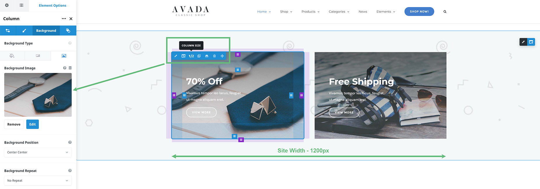
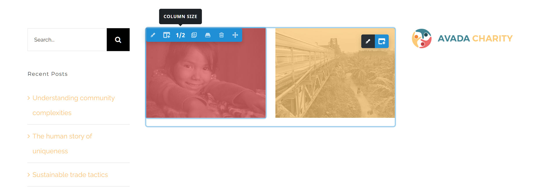
So now, let’s say you have two one-half columns, and you want an image to display in one of them. How big does that image need to be? Well, around half of the Site Width would be a good starting point. So, around 600px. If you optionally wanted the image to be able to be opened in a Lightbox, you might initally upload a larger version (perhaps 1000 – 1500px) and then insert a 600px version into the column, and the full size into the Lightbox option of the Image Element.
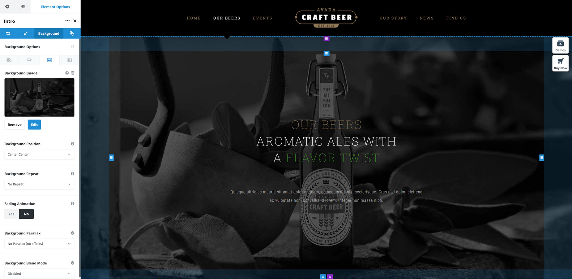
In the example below, instead of being added via the Image Element, the image has been added to the background of the Column (to enable the overlaid Text and Button Elements). But it’s still being displayed in a one-half Column, and so an image size of approximately 600px would be appropriate. You could still enable a Lightbox with this method as well, only you’d do that via the Link URL and Link Target options in the Column itself.
Images Using The Screen Width
Now, let’s say you want to use the image in the background of a Container that’s set to 100% width, or as an image in a full screen slider? Both methods break the image out of the Site Width, and now it’s a completely different consideration we have to take. Now, what’s most important is the screen resolution (or pixel width) your users are viewing it on. This can be tricky, as there are many different screen resolutions.
The most common is still standard laptop resolution (1366px). This is why the default Site Width is 1200px, so that the content fits on this screen resolution. But Full HD is resolution, and 4K monitors are gaining in popularity as well (3840px). Some iMacs even have 5K resolution (5120px). So, how do we take all these different screen resolutions into account? A common way to approach this is to use an image size of around 2,000-2,500px. This covers most screen resolutions, and it is not interpolated significantly except for 5K monitors.
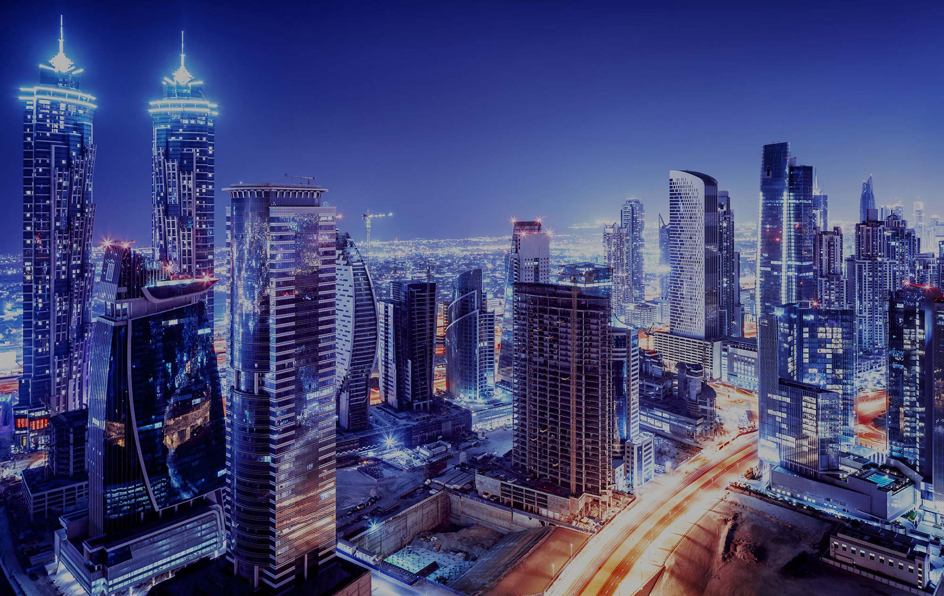
In the first example below, the page is using the 100% width template, which means that any container background images go full width. The container itself is also set to Full Height. And so the image size needs to be large enough to fill the screen. In this case, the image used is 1803px x 902px, which is almost the size of an HD monitor resolution. This could be bigger, but here it’s being used as a background image, and so the quality is not as important.
Note: Just to be clear, if viewed on a 5K iMac, this 1803px image would be distributed across the full 5120px of the iMac’s screen (less scrolling bars), effectively reducing the quality of the image. But on a laptop, with a resolution of only 1366px, the image would be more than big enough and would be crisp. It’s all about finding a sweet spot between screen resolution and file size (which comes directly from your choice of pixel dimensions). If you were sure most of your users were using iMacs, you’d probably make this image closer to 4000-5000px, but it would then be a much larger file.
In the second example, the image is being used in a full screen slider. In this case, the image is sized at 2500px width, which on more than 95% of screen resolutions, would be larger than the monitor’s resolution and therefore be nice and sharp. With larger images such as these, optimisation of images using compression becomes even more important to keep file size, and therefore page load speed, down.

Image Compression
Once you know what the largest size is of an image you want to upload, then you need to prepare it. This simply involves resizing it to the desired pixel width, and then applying compression before uploading it to your server. To learn more about image compression, read this detailed blog post, or our own blog post on Image Optimization.
In short, you can use graphics software like Adobe Photoshop to compress your images for web as you save them. Alternatively, there are many good websites, such as Compressor. Additionally, you can also use image compression plugins, such as Short Pixel, to further compress image. A bonus is that you can also use such plugins to generate .WebP images on your site.
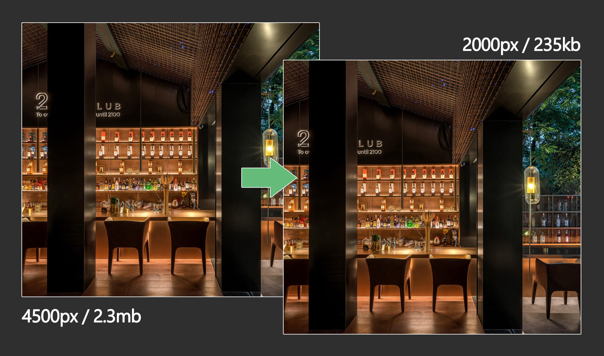
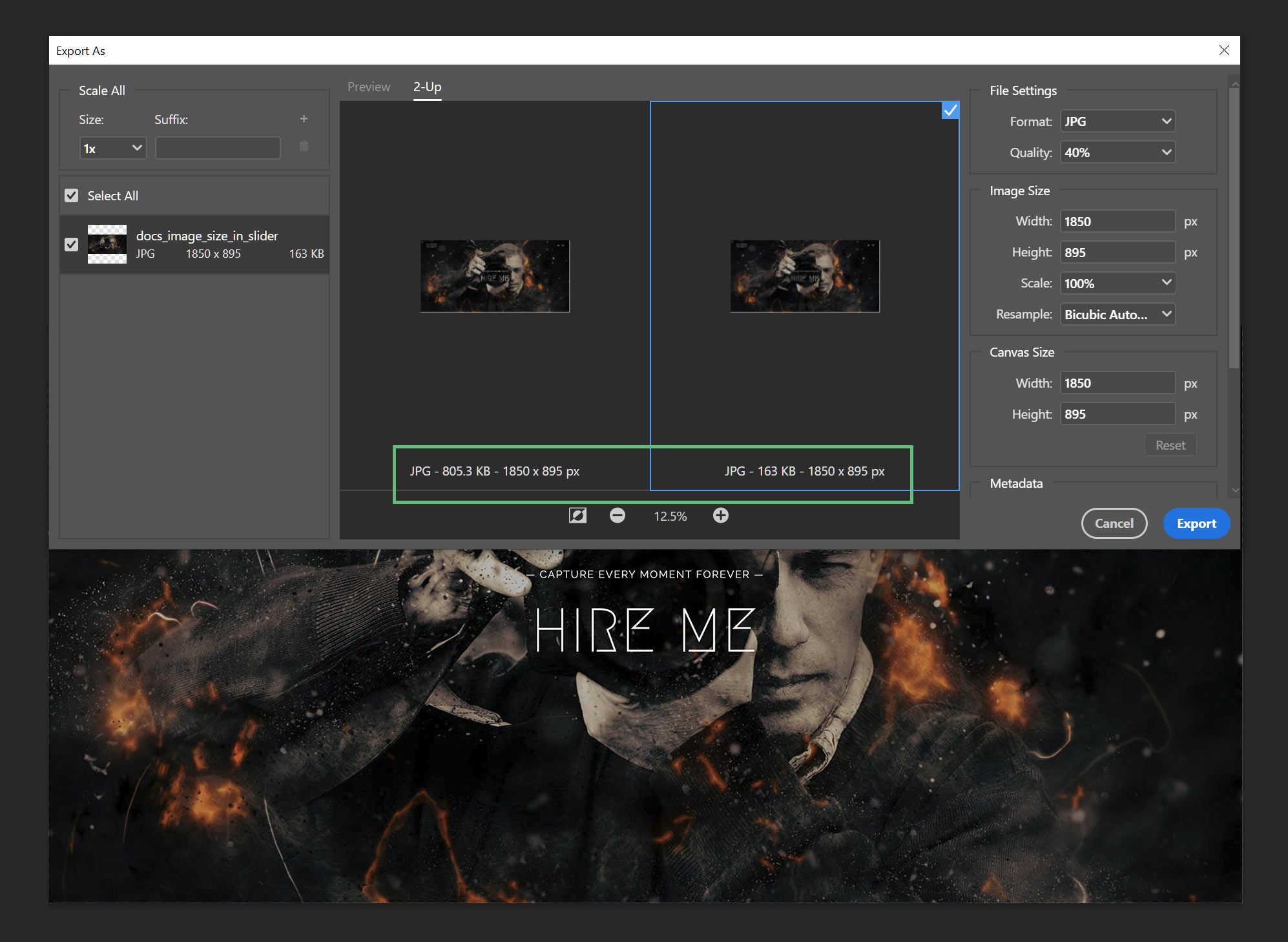
A well compressed image that has first been resized to the correct pixel values can be many times smaller than the original file. in the example below, you can see that the original jpg was 805kb, but that with 40% compression, the final size of the image came down to only 163kb, almost 5 times smaller.
Options That Influence Image Size
As mentioned above, the size of the area the image will be displayed in is the major factor that determines how big it should be. Here are the main theme related areas that will affect this.
Example: As can be seen in the example below, if we start with a Site Width of 1170px (this is what the Charity Website has), but then use a dual sidebar layout, using the global option defaults, the sidebars combined take up 42% of the site width. This leaves approximately 679 pixels for the content area. And then there are the Column margins. So if adding an image in a one-half Column in this situation, it would only need to be around 330px width.
Slider Image Sizes

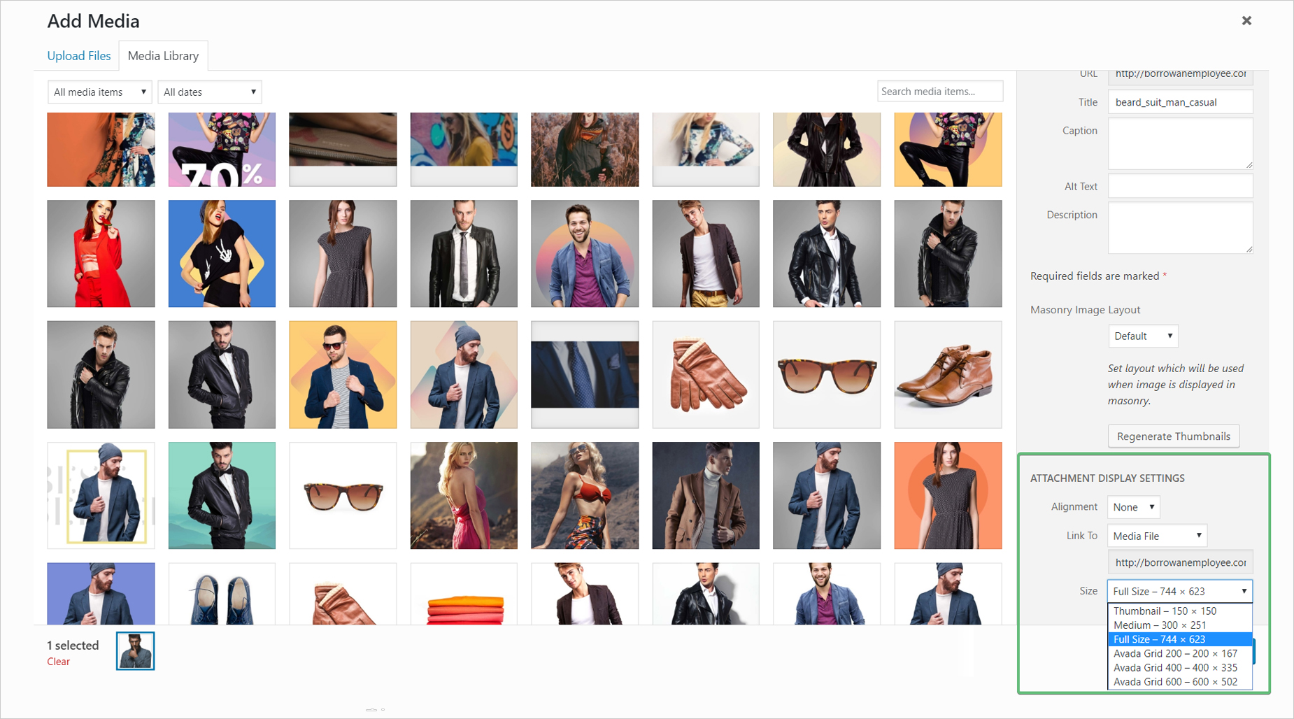
Attachment Display Settings
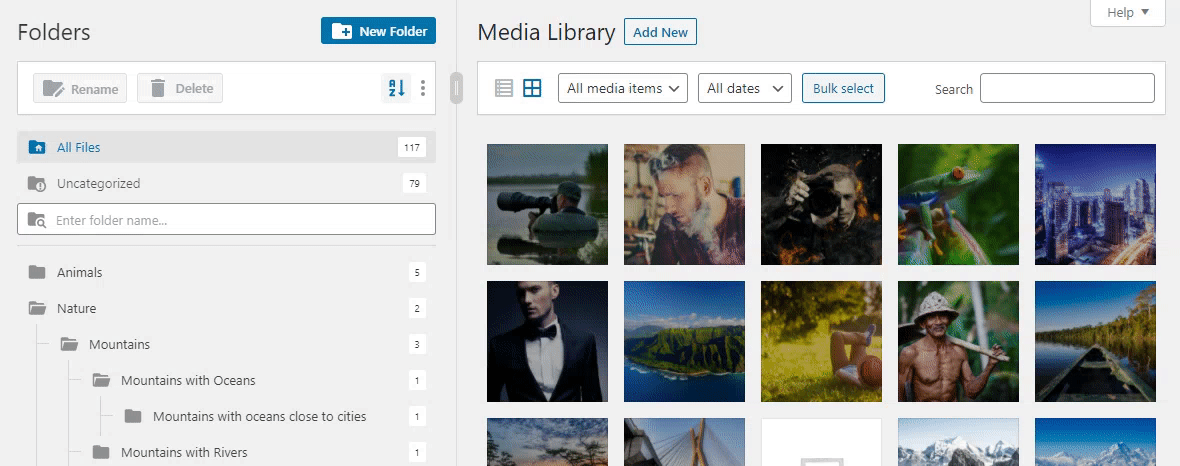
One crucial thing to understand – when uploading an image to your Media Library, a range of images of different sizes are automaically created at the same time. WordPress creates some of these (the Small, Medium, and Large Thumbnail sizes specified in WordPress > Settings > Media, and one unlisted intermediate size) and Avada itself creates a number of sizes to best suit certain situations. These image sizes are then automatically applied to different sections of the site. See the How Avada Controls Responsive Images document for more details on this.
When adding an image to the page content, such as through Elements, you’ll find the ‘Attachment Display Settings’ section at the bottom right of the Media Library. Your choices in this section also directly affect how your images display on the page, as here you are choosing which version of the image to use.
Container Background Image Sizes On Mobile Devices
When uploading a background image to an Avada Builder Container, you may notice that only a portion of your image is displayed when viewed on mobile or tablets. This is how the theme naturally handles background images, and is not a responsive issue. The background image is first centered, then it will resize proportionally until the image’s width or height is equal to the container’s width or height (whichever is greater). For example, if you have a 500px x 500px image and a 100px x 350px container, then your background image will be resized to 350px x 350px.
Conclusion
Getting images right is a crucial part of a visually interesting and fast loading website. And there’s a learning curve to be sure. But the benefits to be had are numerous, and it’s all part of the fun of building and maintaining an Avada website!


