How Background Images Work in Avada
Last Update: November 4, 2025
We regularly get support tickets asking why a background image is cropped or zoomed in. So here’s some information on how background images work to help explain those situations when a background image doesn’t look like you expect it to.
It all starts with the concept of image aspect ratios. This is the relationship between the width and height of an image. So if an image is 1200px by 800px, it has a 3:2 aspect ratio, in that if its length were 3, its height would be 2.
In this document we will look at adding background images to container and then columns.
Container Background Images
When you add a background image to a container, this is what happens: Images set as backgrounds on containers span to the height or width of the container while maintaining their aspect ratio; effectively, always filling the container. But containers by themselves have no height at all, so it’s the content (or padding) that determines their height, and the Site Width setting that determines the width (or the screen it’s being viewed on with the 100% width template).
Example
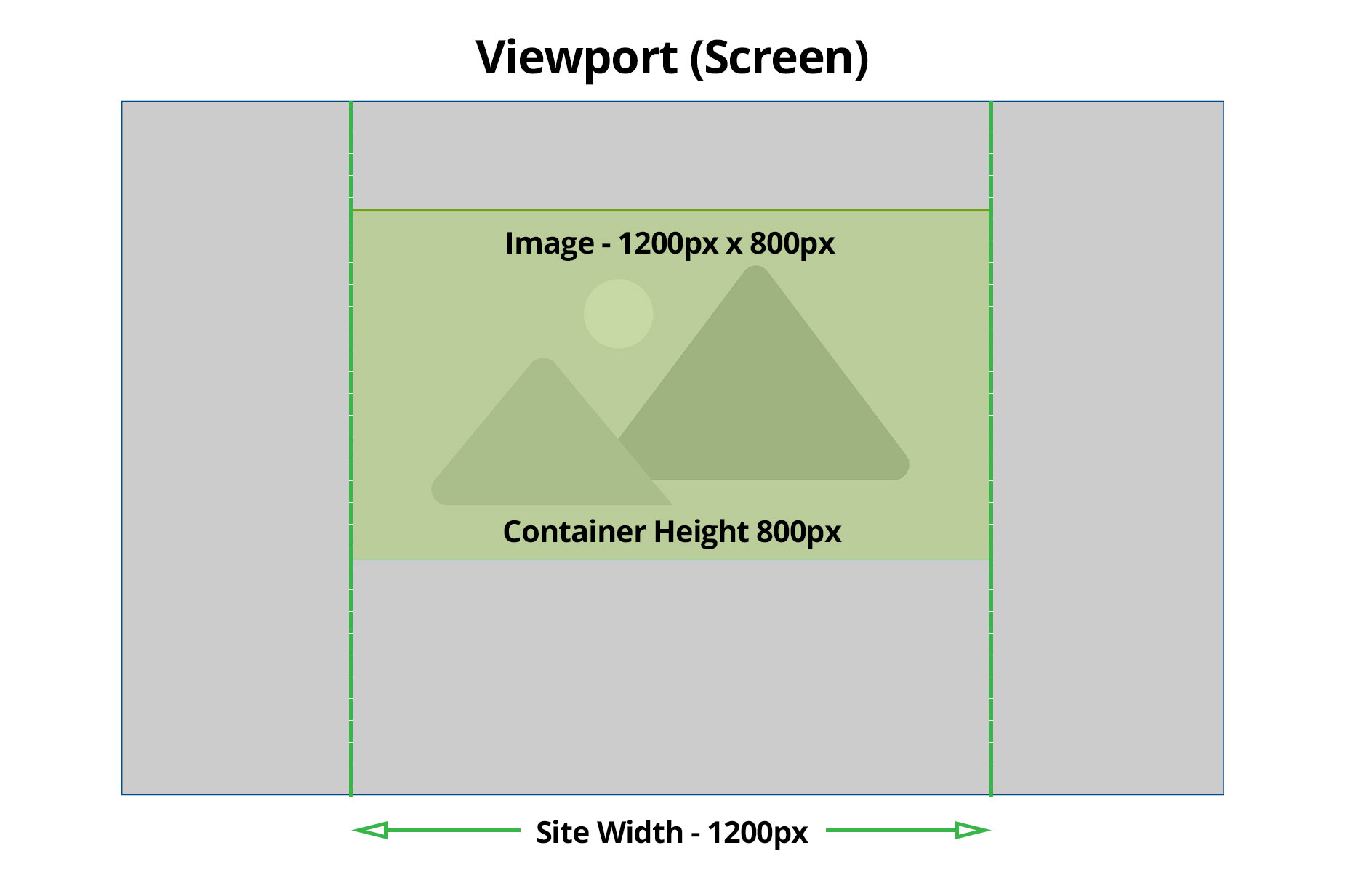
Let’s take a simple example to illustrate. In the diagram below, the image is 1200px wide and 800px high. Let’s also say that the site width has been set to 1200px in the Layout > Site Width option, the page is using the Site Width template, and that the container height is exactly 800px, either through content, or padding. In this case the image would display fully, at its native aspect ratio.
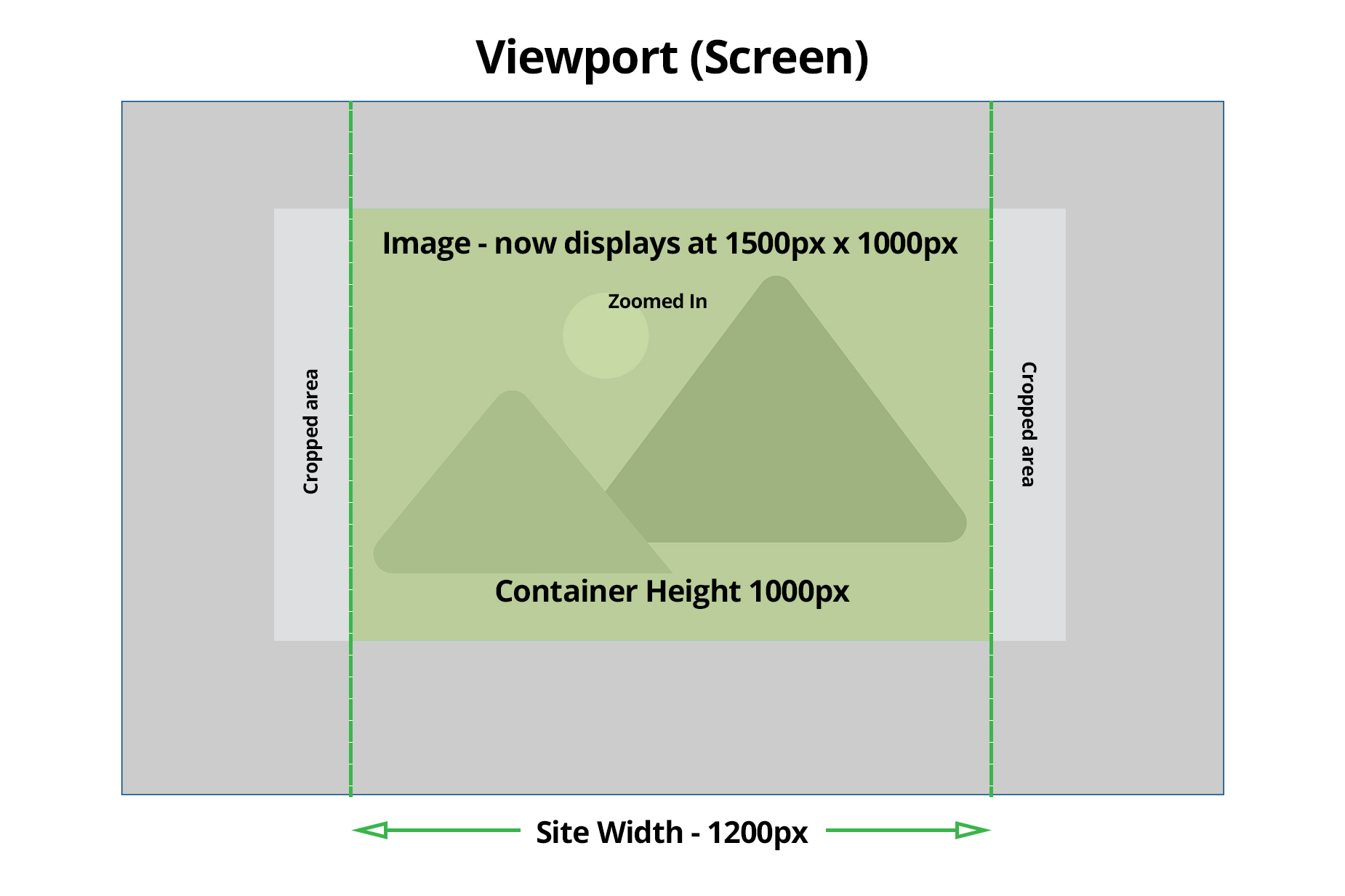
Now if the container height was increased to 1000px, either through content or padding, then the image will now display at 1000px height, and keeping its aspect ratio, 1500px in width. So here the image will be slightly zoomed in, and slightly cropped on both sides.
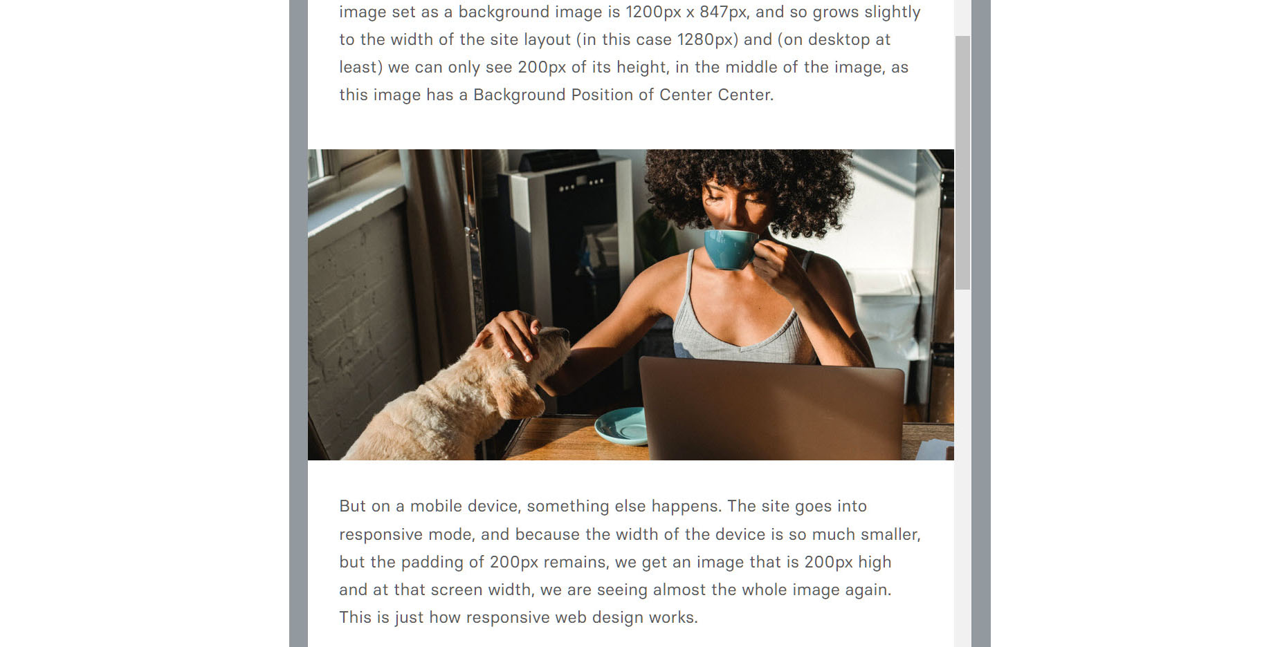
And here’s a real world example. The container below is completely empty (no column or elements) and has padding set to 200px in height. The image set as a background image is 1200px x 847px, and so grows slightly to the width of the site layout (in this case 1280px) and (on desktop at least) we can only see 200px of its height, in the middle of the image, as this image has a Background Position of Center Center.
But on a mobile device, something else happens. The site goes into responsive mode, and because the width of the device is so much smaller, but the padding of 200px remains, we get an image that is 200px high and at that screen width, we are seeing almost the whole image again. This is just how responsive web design works.
100% Width Template
Things are also a little different when you add a background image to a page with the 100% width template. Then, it’s the user’s screen size that comes into play. With a large resolution monitor, for example a 4K monitor, which has a resolution of 3840px x 2160px, then images might have to upscale considerably. It’s always a balance between image file size and pixel size, and so a typical approach is when uploading a container background image on a 100% width template, is to ensure the image is at least 2000px in width, so the upscaling is kept to a minimum.
Example
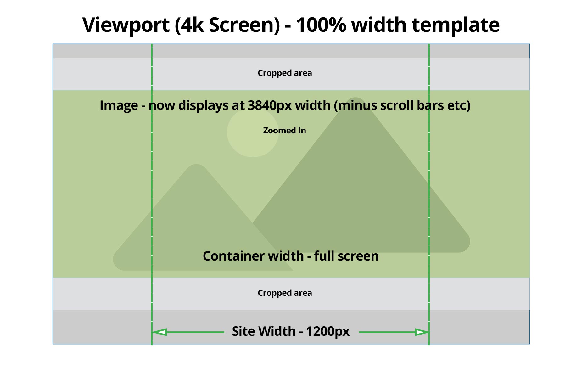
Here’s a final illustration, showing an example of a container on a page using the 100% width template, on a large monitor. The image displays at the width of the screen resolution (minus any scroll bars etc) and the image will be cropped in height unless the container height equals the images’ native aspect ratio. So for an image with a 3:2 aspect ratio and sized at 2000px, the container height would need to be around 1333px for no cropping to occur. So in most situations, some cropping will occur, and the image will be zoomed in. If your image is very pixellated in a situation like this, it’s because the uploaded background image isn’t large enough to upscale on a large monitor without pixellation.
Column Background Images
Columns are a bit different than containers. They grow to the size of the background image inserted. Below is the same image inserted as a column background, into an empty 1/1 column. The column adjusts its height to show the image in full. In this case, as the image is only 1200px wide and the site width is 1280px, the image is also slightly zoomed in.

If we resize the columns, then the image displays smaller, always showing the full image. However, if our column content increase past the aspect ratio of the image, then the height of the image will always fill the column, and the image will be cropped on the width to keep the image aspect ratio intact. See two examples of that below.
Examples
On the left hand side, the column has simply been resized to 1/2. The full image displays, and is just scaled down to fit the 1/2 dimension. On the right hand side, however, content has been added that pushes the height of the column past where the apsect ratio of the image would make it. And so the height of the image is maintained, while the image is zoomed in on the sides, cropping the image, but keeping the aspect ratio intact.
Lorem ipsum dolor sit amet, consectetur adipiscing elit, sed do eiusmod tempor incididunt ut labore et dolore magna aliqua. Vitae et leo duis ut diam quam. Cras semper auctor neque vitae. Porta non pulvinar neque laoreet suspendisse. Elementum curabitur vitae nunc sed velit. Mauris in aliquam sem fringilla ut morbi tincidunt augue interdum. Bibendum arcu vitae elementum curabitur vitae nunc. Eget nunc lobortis mattis aliquam faucibus. Volutpat commodo sed egestas egestas. Ut sem nulla pharetra diam sit amet nisl. Semper eget duis at tellus at urna. Dictumst vestibulum rhoncus est pellentesque elit ullamcorper. Velit egestas dui id ornare arcu odio ut. Ut consequat semper viverra nam libero justo laoreet.
Hopefully, this article goes some way towards explaining how images work as Container and Column backgrounds. There are a lot of scenarios we haven’t covered here, but the principles are the same. Web design can be complex, but with an understanding of the principles at play around the theme and how it interacts with images, then you can achieve a satisfying result every time.


