How To Use Captions On Image Based Elements
Last Update: December 26, 2025
Captions are now easy to add to image based elements such as the Image Element, Image Carousel and the Gallery Element. You can find Captions on their own tab, and fully control the look and feel of how they display with a variety of design styles.
Read on to find out more about this awesome feature for images, and watch the video below for a visual overview.
Where Do Captions Come From?
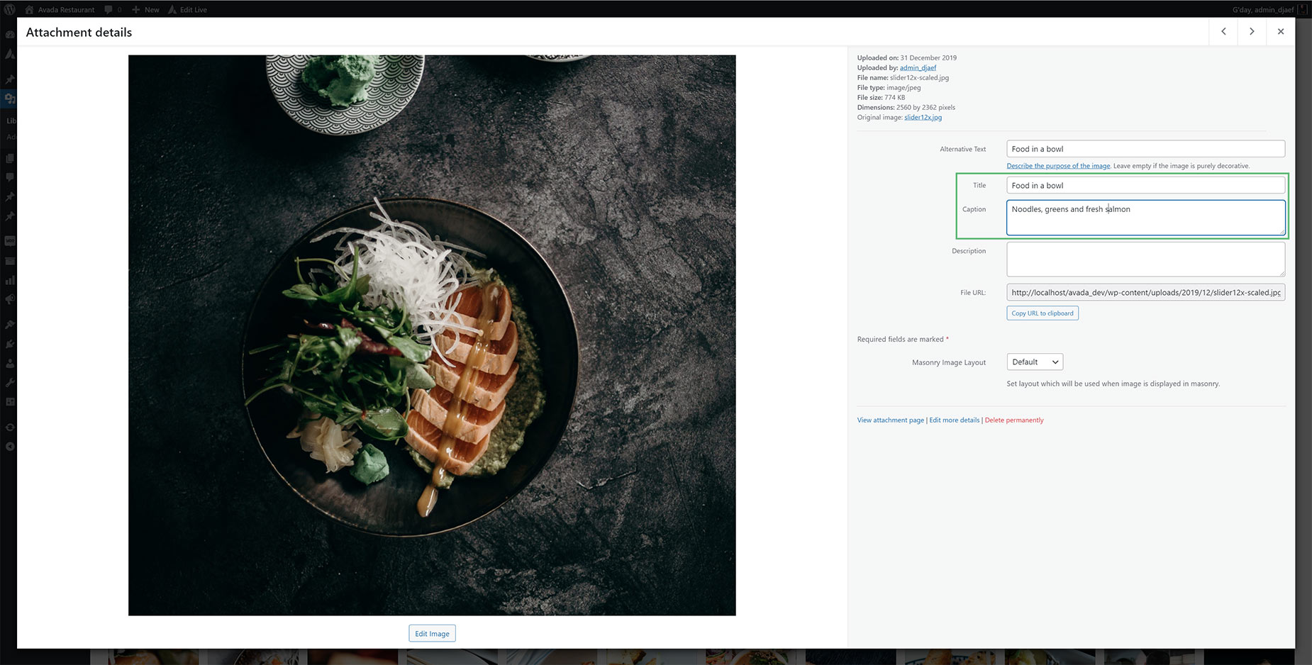
Captions and Titles are fields that are already available in images in the Media Library, as you can see in the image below. When you upload an image you can add, amongst other things, a Caption and / or a Title. The media based Elements with captions then pull that information directly from the images to display using the new Captions styles.
For images that don’t have captions and titles embedded in the file, you can add them (or override them) in the Element itself. There is one main difference however, between the Image Element, and the Image Carousel and Gallery Elements. With the Image Element, you can add the individual caption and title text on the Captions tab of the Element as it is a single image Element, but with the Gallery Element and the Image Carousel Element, these Image Title and Image Caption options are found by editing the individual Element items, found under the Children tab.
Caption Options
The range of options on the Caption tabs of the three image-based Elements are almost identical, bar for the Title And Caption options mentioned above. But for a full list and screenshots of the options available on the Captions tab, please see the individual Element docs: Image Element, Image Carousel Element, & the Gallery Element
Caption Styles
There are a range of Caption styles to choose from. By default, captions are Off. There are two simple caption styles – Above and Below, and then a range of five styled caption designs. These are code named Navin, Dario, Resa, Schantel & Dany. Let’s look at these caption styles individually to see what you can achieve.
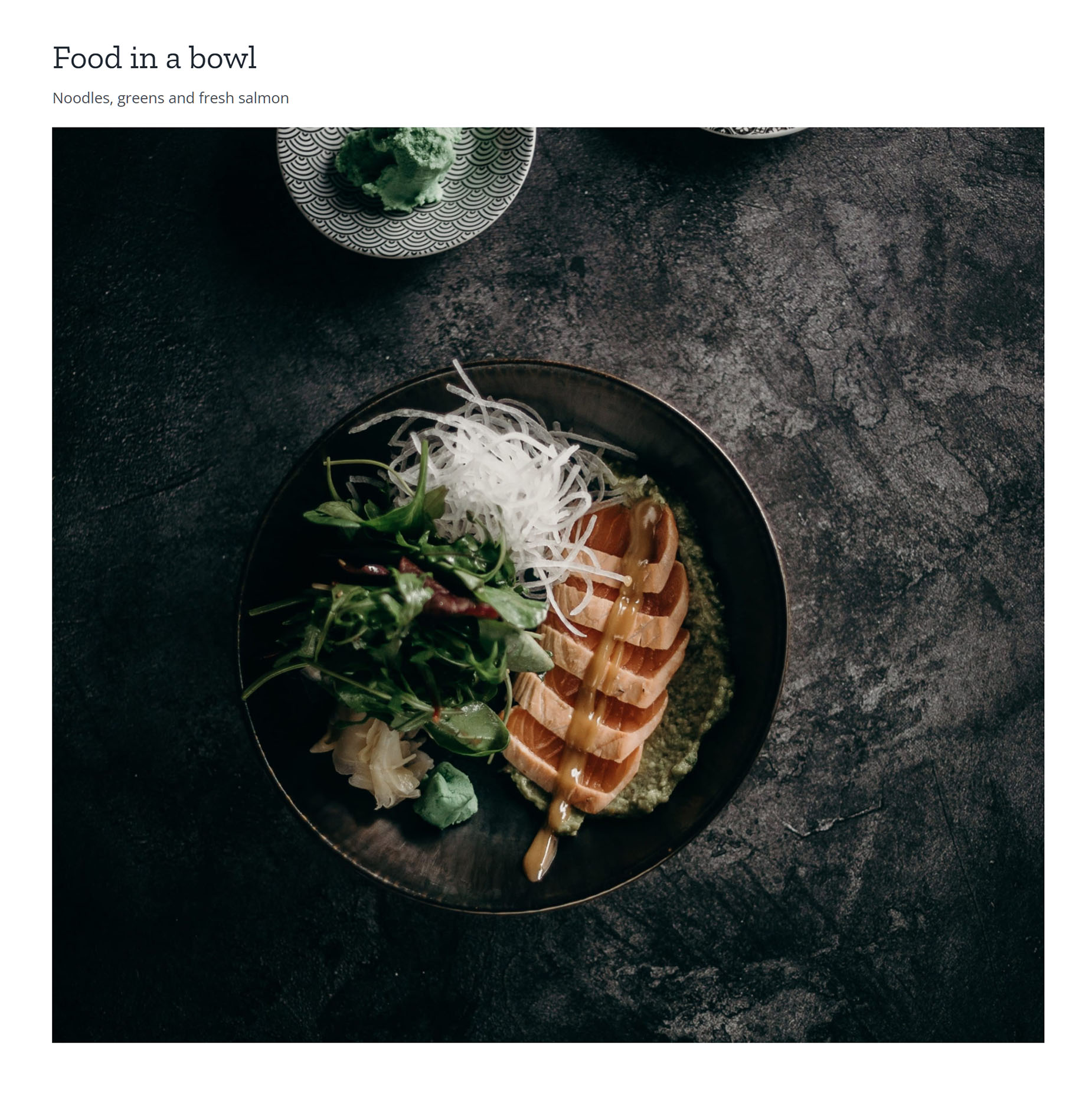
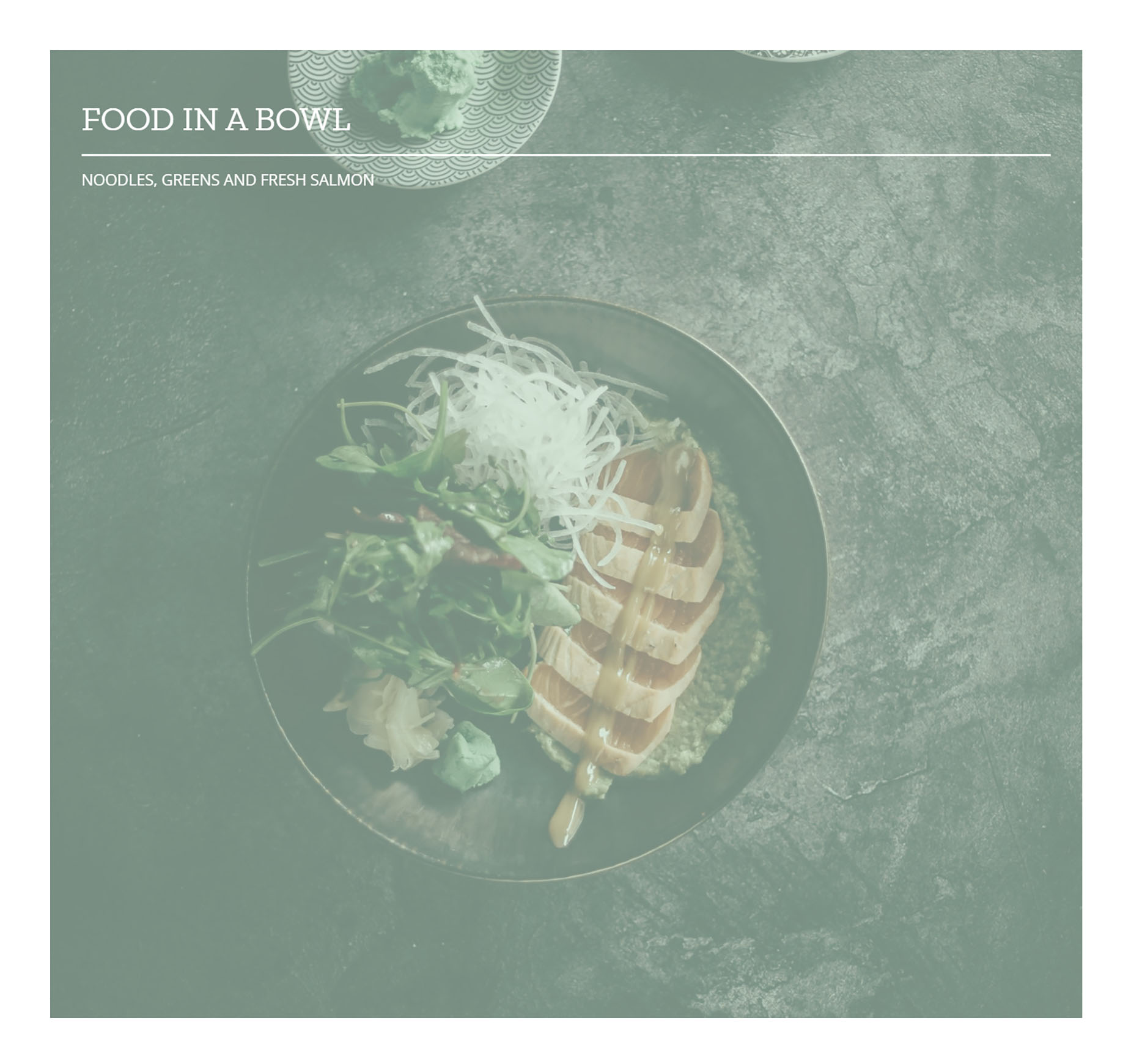
Above
As the name says, the Title and Caption are placed above the image with this selection. You can control the color and size of the fonts etc used with the Element Options.
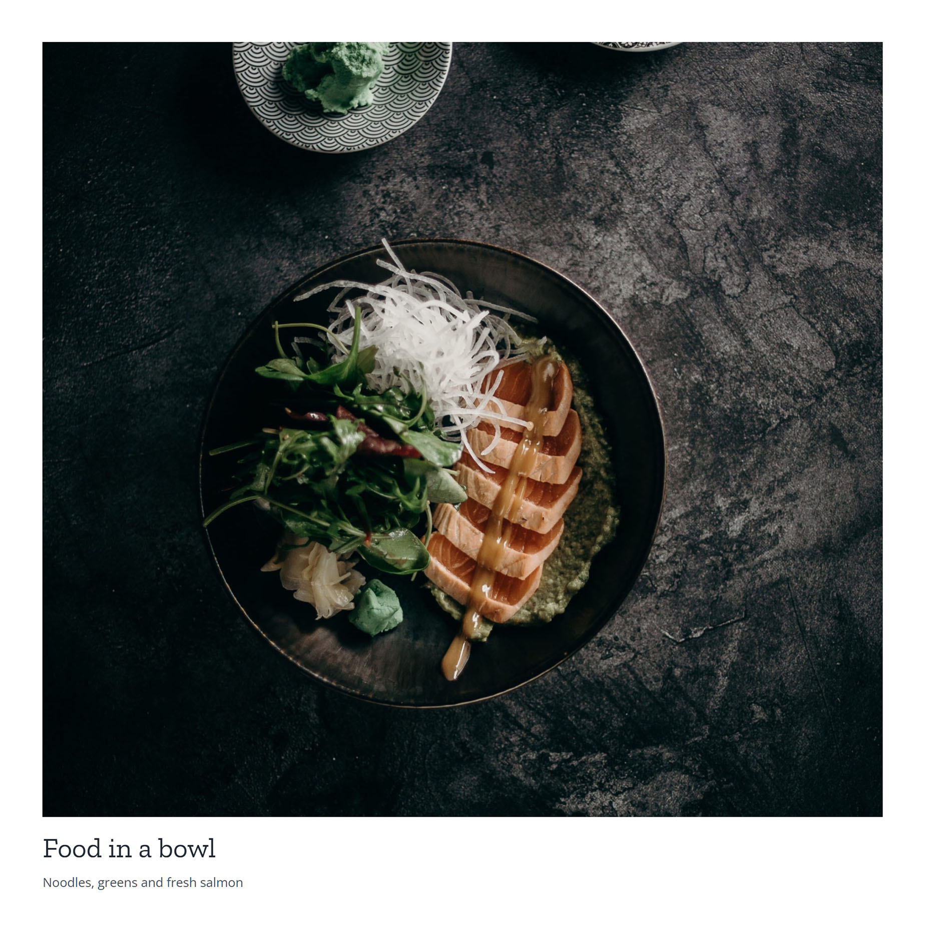
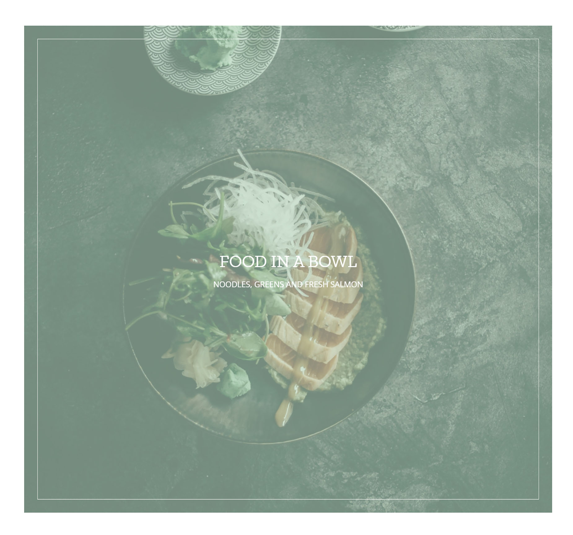
Below
This is exactly the same as Athe previous style, only this time, the title and Caption sit below the image.
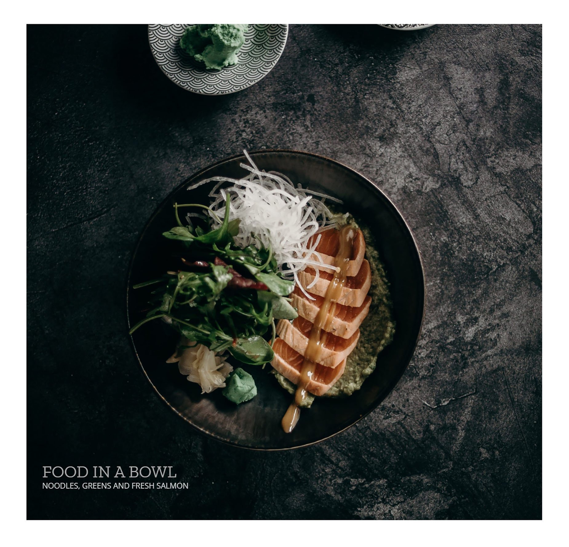
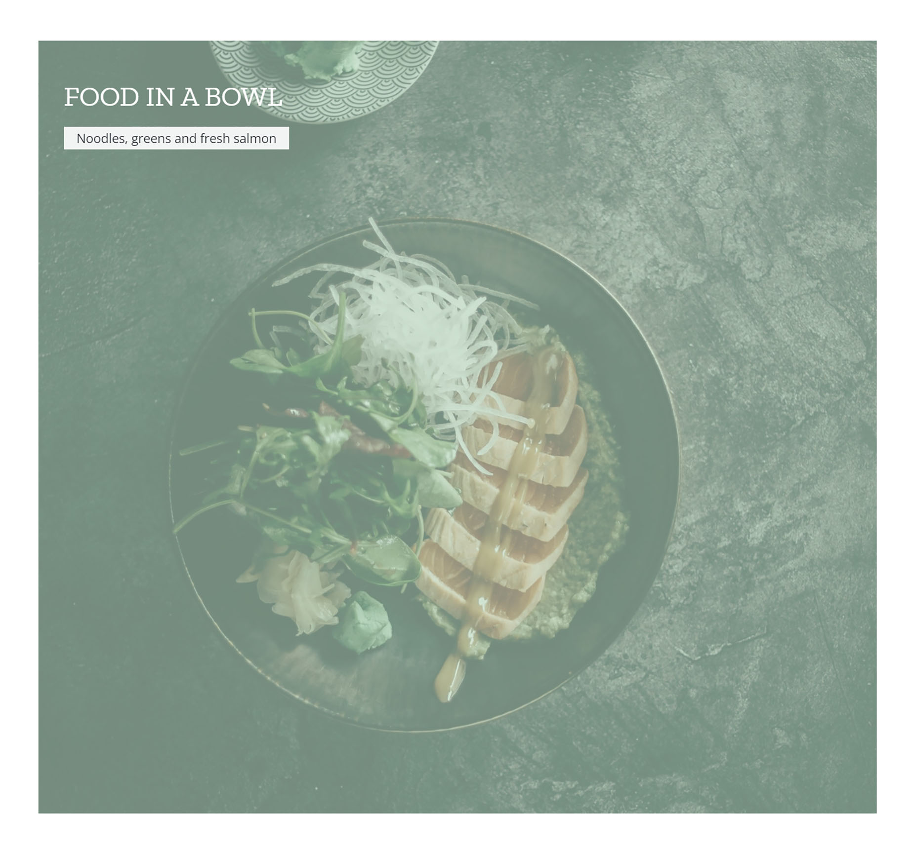
Navin
This places a color overlay over the image. And we can see the title on the image itself. So here, when we mouse over the image, the overlay disappears, and the title lifts up so there’s room for the caption to slide in beneath it.
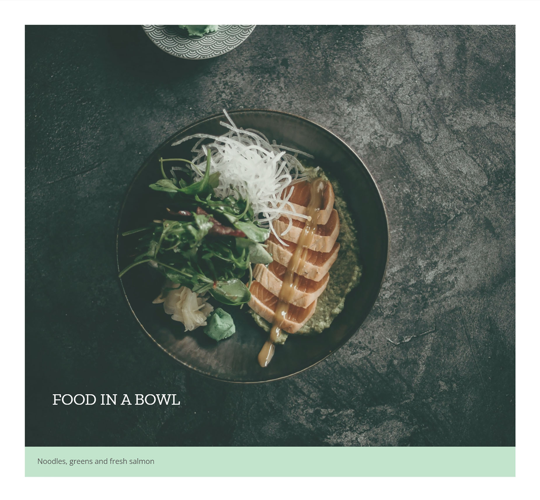
Dario
OK, Dario is the next style, and this one places the Title near the top, and upon mouseover a border slides in under the title, and the caption slides in from the other side
Resa
Resa is a very stylish design. It only shows the title initially, but on mouseover the title and caption are aligned in the center of the image, and a border appears around the inside of the image.
Schantel
Schantel has the title at the top left, and the caption slides in below this on mouseover, with a background color. There’s also a new option with this style called Image Caption Background Color to control that color of course. There’s also a zoom in effect applied to the image with this style.
Dany
Finally, there is Dany. This puts the title at the bottom of the image, and on rollover, the image and title lift up, and the caption is presented with a background color. This option also has the Image Caption Background color option.


