Working With Sticky Containers
Last Update: November 17, 2025
There’s an enormous amount you can do with Sticky Containers. You can make a Container sticky in normal page content, but more often than not, this feature will be used as part of a Custom Header Layout, in conjunction with other complementary Sticky options, now found in Columns and certain other Elements. Read on to go through the various Sticky Options to see what they can do, or watch the video for a visual overview.
Sticky Position Option
You will find the main Sticky option for Containers on the Extras tab in the Container Element. It’s called the Sticky Position option. If this is set to On, then a range of other Sticky related options appear beneath it.
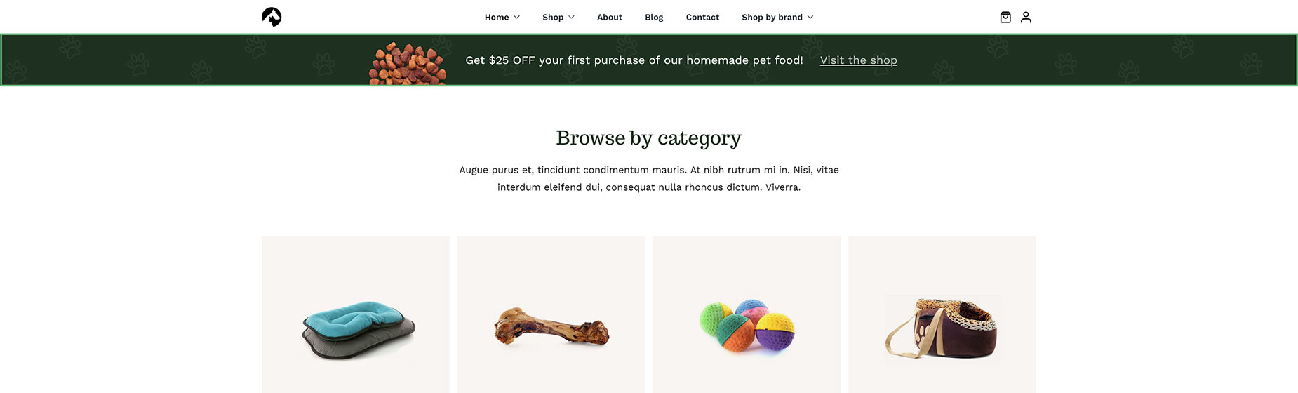
The first of these is the Responsive Position Sticky, which again, allows you to choose at which screen sizes the container should be sticky. So for example, you might have the Container sticky on large screens, but not on medium or small ones.
You can see an example of this on the Pet Supplies website, where the “Get $25 OFF” banner on the Home page (which is in the Custom Page Title Bar Layout section, not in the Header itself) is sticky on large screens, but isn’t on other sizes.
Sticky Container Background Color & Minimum Height
Under this, there is an option called Sticky Container Background Color, which allows you set a background color for the Container when it is Sticky.
There is also an option called Sticky Container Minimum Height, which controls the minimum height of the container when sticky. This option, however, will only show if the Height of the Container is set to Minimum Height in the General tab.
Sticky Container Offset
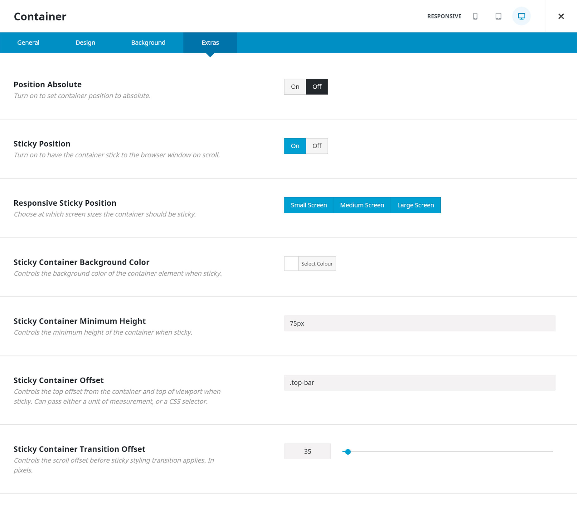
Then comes the Sticky Container Offset option. This controls the top offset from the container and top of the viewport when sticky. It can pass either a unit of measurement or a CSS selector.
As an example, let’s look at New Header Layout 6, one of the Prebuilt Headers For Layouts. In this Layout, both Containers are sticky. Without the Sticky Container Offset on the second Container, both Containers would be aligned to the top of the viewport when they became sticky and would overlap.
So what this option allows you to do is to set a CSS Class in the top Container (for example top-bar) and then use that selector in the Sticky Container Offset field (.top-bar) in the second Container. This way, the second container is also sticky, but its position is offset by the height of the Container above it, so they don’t overlap. Alternatively, you can just use a pixel value in the Sticky Container Offset field.
As you can see in the image below of the second Container, the Sticky Container Minimum Height has been set to 75px (from it’s normal Minimum Height of 110px), and the .top-bar class has been assigned to the Sticky Container Offset field.
Sticky Container Transition Offset
You can also see at the very bottom of the screenshot above, that there have been 35 pixels of Sticky Container Transition Offset set. This controls the scroll offset before the sticky styling transition applies. This will give the user a much smoother experience.
As can be seen in our above example, we are transitioning from a 110px Container height to an 75px Container height, and if we had no transition offset, the Sticky Container would decrease by 35px as the top of it touched the viewport. This would mean the content under the container would suddenly jump up 35px or there would be 35px of empty space.
So, in this case, we want the actual height transition to kick in only after we have scrolled enough past the header for that jump not to occur.
Sticky Container Hide On Scroll
The final Sticky option in the Container Element is Sticky Container Hide on Scroll. This controls the scroll distance before the container stops being sticky, and is hidden while scrolling downwards.
In this way, you could have multiple Sticky Containers as you scrolled down a page, with some staying, and some disappearing again as you scrolled further down. The creative options here are almost endless. Set to 0 to keep the Container always visible as you scroll down. This can be set up to 1000 pixels.
Image Sticky Max Width
There is also another Sticky option in the Image Element, as you can see at the bottom of the screenshot above, to enable an Image Sticky Max Width. This of course, is the maximum width the image should take up when the Container is sticky. You could leave this empty to use the full width of the image.
Menu Element – Sticky Minimum Height
Another Sticky option can be found in the Menu Element. This is the Sticky Minimum Height, found on the Main tab, and it sets the minimum height for main menu links when the Container is sticky. This could also be used in conjunction with the previous Sticky Max Width option in the Image Element to control the height of both logo and Menu in a Sticky Container.
Element Sticky Visibility Option
In certain Elements, you can also find another important new Sticky option. This is the Element Sticky Visibility option. This is a dependent option which only appears if the parent Container is set to Sticky. It allows you to determine when the Element will be visible, based on whether the Container it is in, is in Sticky mode or not. You can choose from Normal and Sticky visibility, and by default, they are both selected, meaning the Element is always visible. But if you deselect the Normal option, the Element will ONLY be visible when the parent Container is in Sticky mode.
This can be used in a number of creative ways, particularly with Header Layouts, but generally as well. The Column Element has this option as well, and in the above example with an individual Sticky Container, you would set the Column Element Visibility to only sticky, so the entire Column would only display when the parent Container went into Sticky mode.
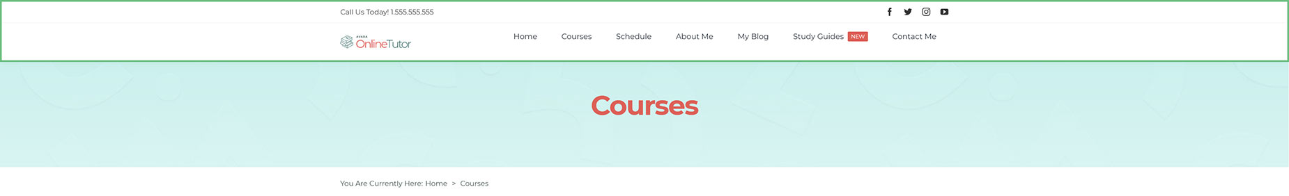
An example of this technique can be seen in New Header 5, one of the Prebuilt Headers for Layouts. In this Layout, as you can see below, there are two Containers, with the second one being set to Sticky. The two outside Columns on the second Container have their Element Visibility set to Sticky only, and so in the normal state of the Container, these two Columns, and the Elements inside them, are not visible, but when the Sticky Container activates, the logo and the Woo Menu suddenly appear in the Container.
Currently, this option is only available for the Columns, Nested Columns, Alert, Breadcrumbs, Button, Icon, Image, Menu, Search, Separator, Sharing Box, Social Links, Title, and Text Block Elements.

Normal Container

Container in Sticky Mode
Sticky Header
One of the most common scenarios for Sticky Containers is to create a Sticky Header. Watch the video below for a quick rundown on the main aspects of using Sticky Containers to create a Sticky Header.
Conclusion
The sticky options in the Container, and other Elements, can be used in many creative ways, both in a Header Layout Section, other Layout Sections, and in the page content itself. Play around with these options to see just how flexible Avada has become.


