How To Use Flex Grow On Separators
Last Update: March 10, 2026
A feature enabled by the addition of Flexbox to Avada, is the use of Flex Grow on Separator Elements. Let’s have a look at what this new option does.
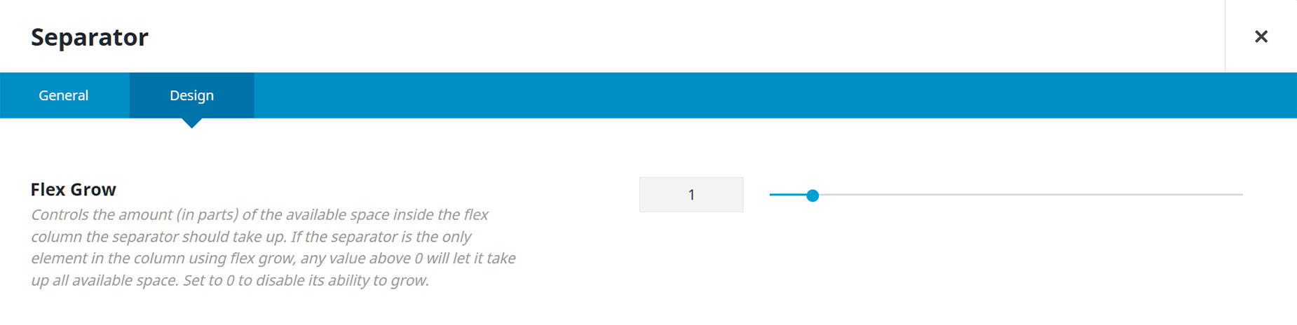
The option is found in the Separator Element, at the top of the design tab. It’s a Flex option that allows the separator to grow to fill the available space. It’s best explained with an example.
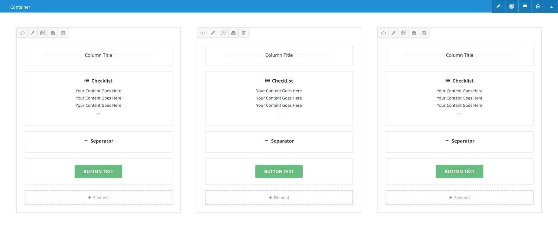
Let’s say we have three Columns in a row, with the parent Container’s Column Alignment option set to Stretch. This allows the Columns to Stretch to the full Height of the Container. Now let’s imagine that each Column has a Title, a Checklist Element, a 20px Separator, and a Button at the bottom. The columns would be the same heights, but depending on the number of Checklist items though, the buttons would not be aligned at the bottom. It would look something like this.

In the back end builder, the columns would look like this.
You could go to the Column > Content Alignment Option, and see if you could get a better alignment using one of the Space options there, such as Space Around, Space Between, or Space Evenly. But a simpler solution exists, right inside the Separator Element. And that, of course, is Flex Grow.
The option is very simple. By default, it’s set to 0, and so is disabled. But in our situation here, we only need to go into the Separator Element in each Column and change the Flex Grow option to 1. This essentially tells the Separator to grow into the available space. As Flex Grow is implemented in other Elements, other possibilities will arise, using numbers higher than 1. But currently, you don’t need to set it higher than 1, and the Separator will expand into the available space.
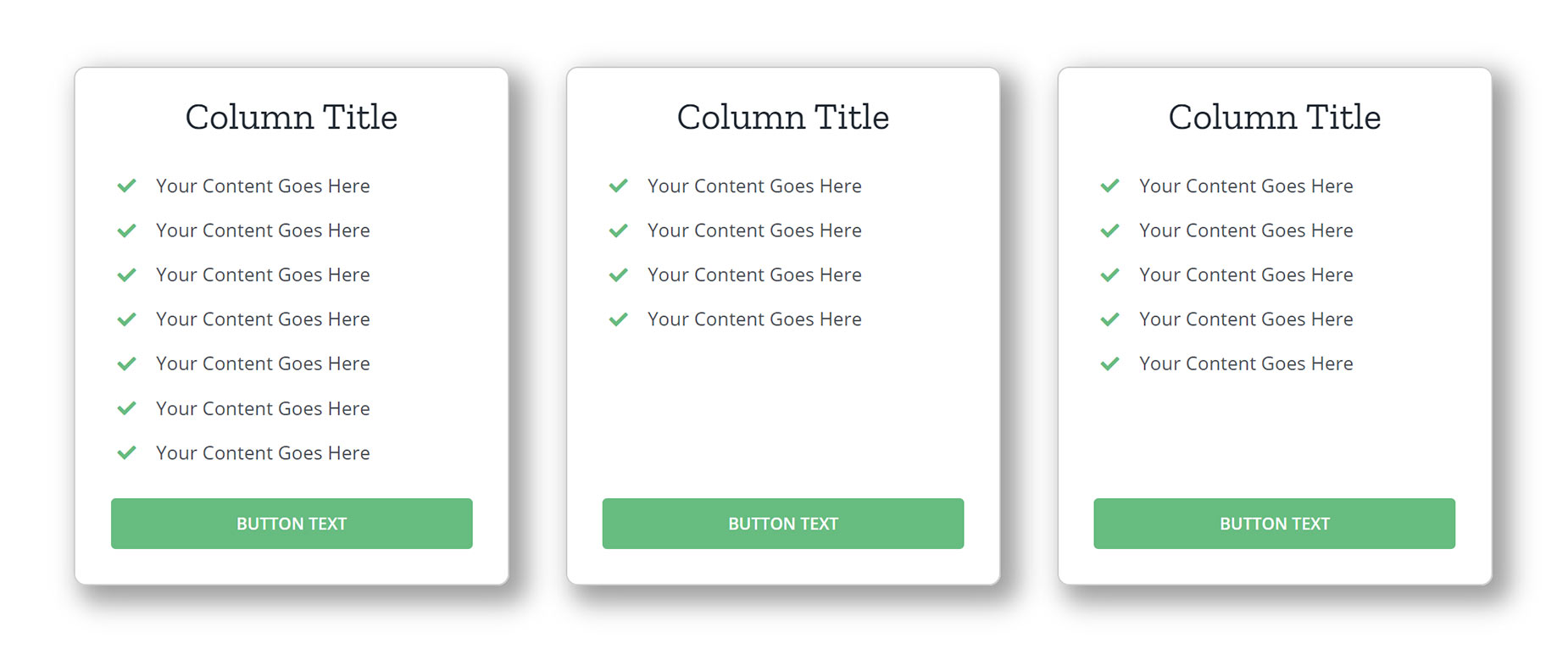
This would make our Columns look like this, now with the Buttons aligned along the bottom. That’s Flex Grow!


