How To Use The Lightbox
Last Update: October 29, 2025
Lightbox is an Avada option that allows you to open beautiful, responsive overlay windows, containing images or videos. Below you’ll find a description on each Avada Global Option available for the Lightbox, as well as the Lightbox Skins, the Lightbox Element, and the other elements that utilize the Lightbox.
Lightbox Global Options
The Global Lightbox Options are found in the Global Options at Avada > Options > Lightbox. These options affect the way Lightbox works across the site.
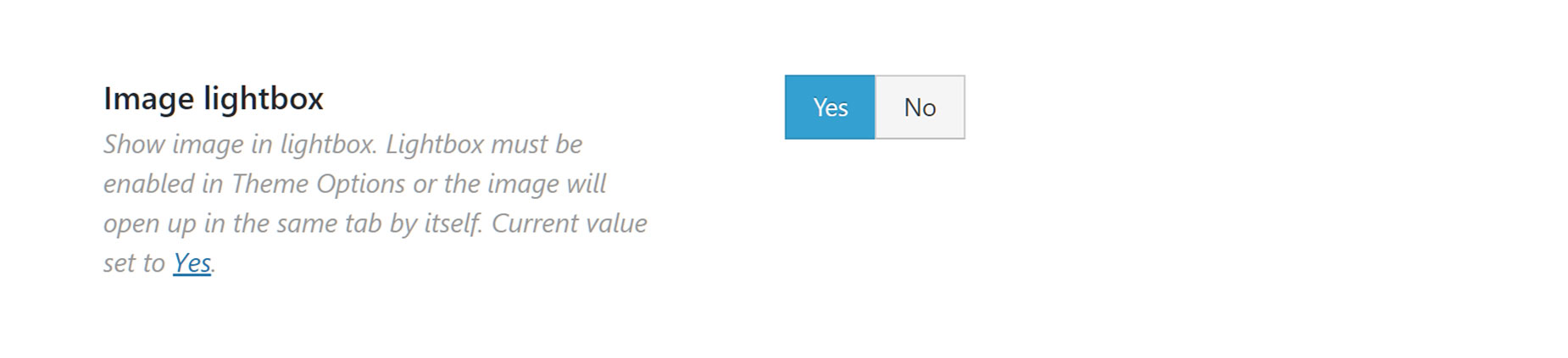
Lightbox – Allows you to enable or disable the Lightbox across your site. Choose between Yes or No.
Lightbox For Featured Images On Single Post Pages – Turn on to enable the lightbox on single blog and portfolio posts for the main featured images.
Lightbox Behavior – Allows you to set what the Lightbox will display for portfolio and blog posts. Choose between First Featured Image of Every Post, or Only Featured Image of Individual Post.
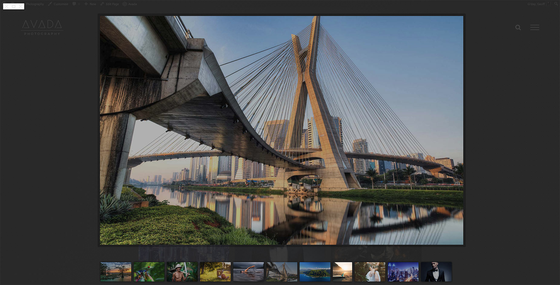
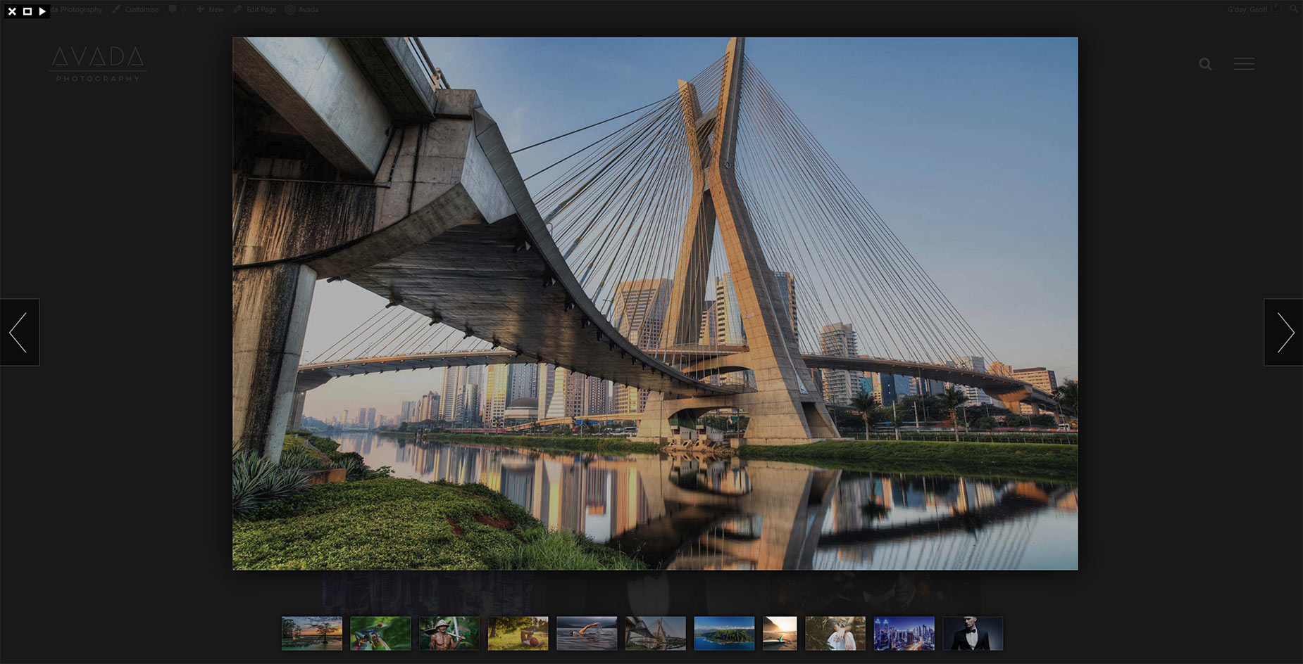
Lightbox Skin – Allows you to set a Lightbox skin. Choose between Light, Dark, Mac, Metro Black, Metro White, Parade or Smooth. See below for examples of the various skins.
Thumbnails Position – Allows you to set the position of the thumbnails in the Lightbox. Choose between Right or Bottom.
Animation Speed – Allows you to set the animation speed. Choose between Fast, Slow or Normal.
Arrows – Allows you to enable or disable navigation arrows. Choose from Yes or No.
Gallery Start/Stop Button – Allows you to enable or disable the gallery start/stop button. Choose from Yes or No.
Autoplay The Lightbox Gallery – Allows you to enable or disable the Lightbox gallery’s autoplay feature. Choose from Yes or No.
Slideshow Speed – Allows you to enter a numerical value that sets the slideshow speed if the ‘Autoplay The Lightbox Gallery’ option is enabled. For example, 1000 = 1 second.
Background Opacity – Allows you to enter a numerical value that sets the background opacity. For example, 0.00 (transparent) or 1.00 (opaque).
Title – Allows you to enable or disable image titles in the Lightbox. Choose from Yes or No.
Caption – Allows you to enable or disable the image captions in the Lightbox. Choose from Yes or No.
Social Sharing – Allows you to show or hide the social sharing button on the images in the Lightbox. Choose from Yes or No.
Deeplinking – Allows you to enable or disable deep linking image in the Lightbox. Choose from Yes or No.
Show Post Images In Lightbox – Turn on to display post images in the Lightbox that are inside the post content area. Choose from Yes or No.
Slideshow Video Dimensions – Accepts a pixel value that lets you control the width and height of videos inside the Lightbox. For example, 1280px x 720px.
Lightbox Skins
The Lightbox comes with a choice of seven skins – Light, Dark, Mac, Metro Black, Metro White, Parade, & Smooth. These are set in the Global Options at Avada > Options > Lightbox > Lightbox Skin. You can see an example of each style below.
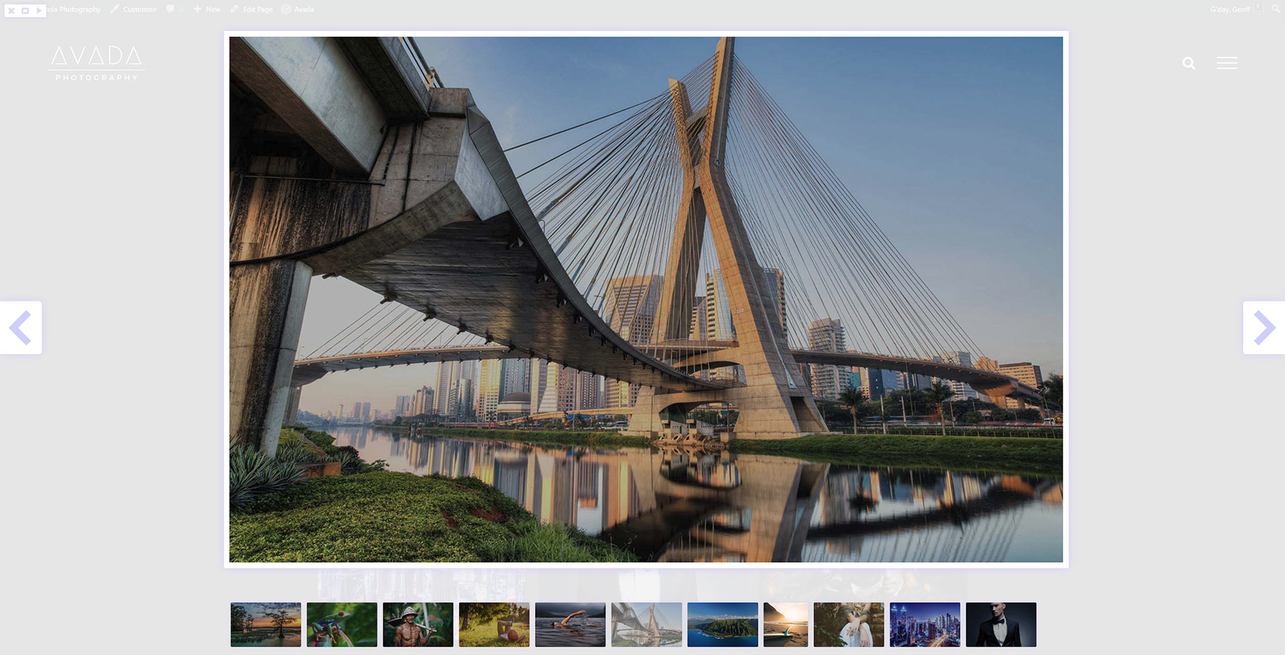
Light
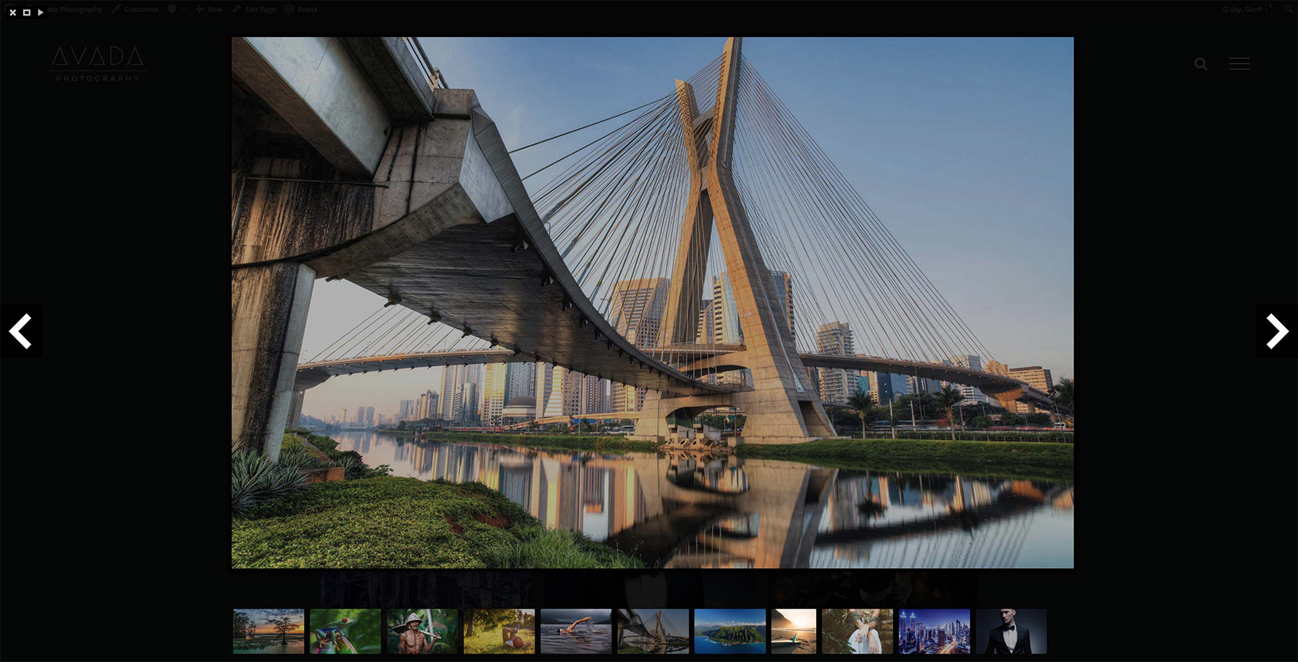
Dark
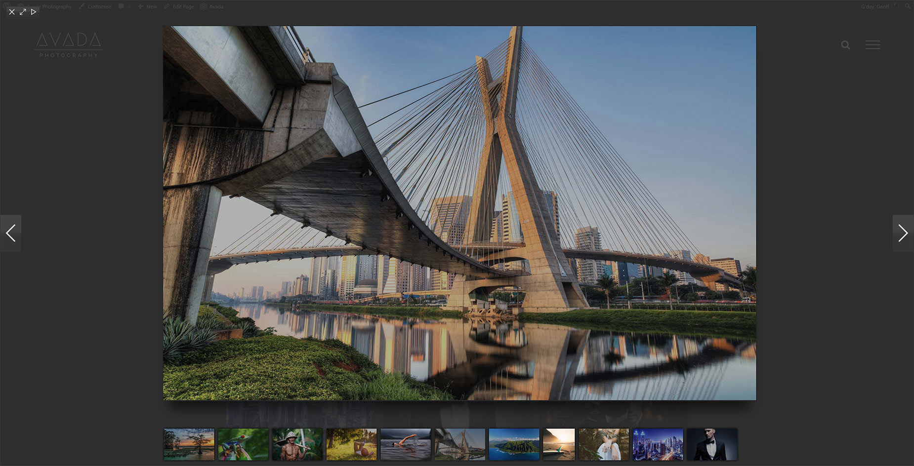
Mac
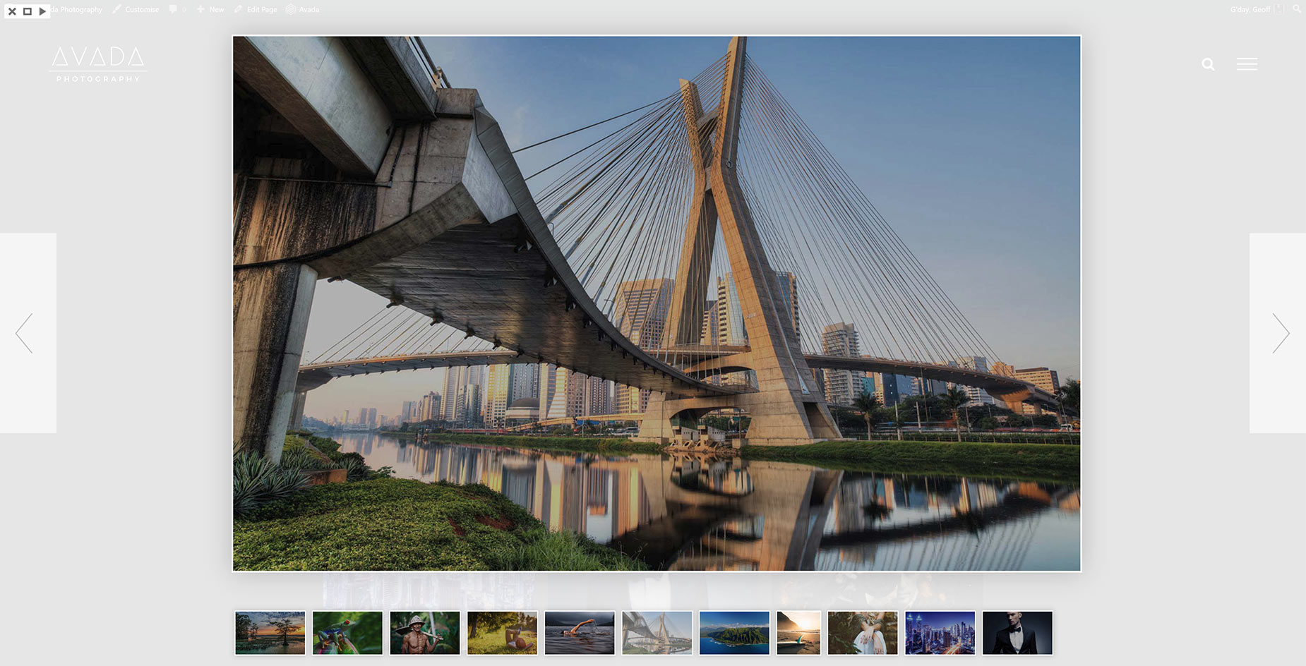
Metro Black

Metro White
Parade
Smooth
Lightbox Element
The Lightbox Element is added through the Avada Builder. You can also add a Lightbox Element to a content area (eg. a Text Block Element), via the Element Generator found in the WordPress Content Editor toolbar. Learn more about Inline Elements here. For full details on the Lightbox Element, please follow the link below.
Other Elements With Lightbox Options
Image Element
In the Image Element, you can choose to upload and display an image in a lightbox, different from the image you choose to display inside the Image Frame. To enable that, simply select Yes on the Image Lightbox option. To upload a different display image to display on the lightbox, click the Upload button in the Lightbox Image field and select an image from your Media Library or upload a new one. You can also add images added via the Image Element to a Lightbox Gallery by linking them with the same Gallery ID.
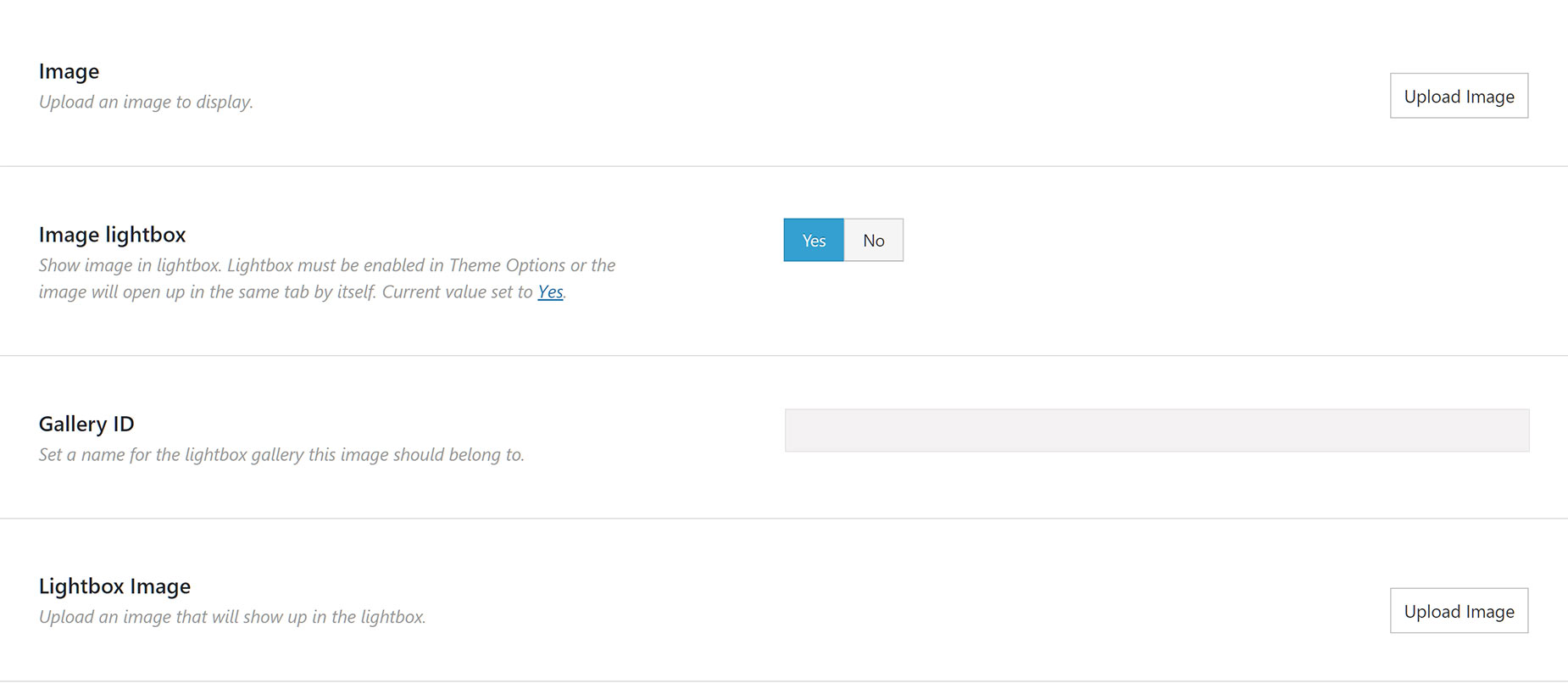
Image Carousel Element
In the Image Carousel Element, you can choose to display your images in a lightbox. To display images in a lightbox, simply select Yes on the Image Lightbox option.The Image Carousel Element will display your images in the Lightbox at the size they are uploaded. Avada uses an appropriate sized image for the carousel thumbnails. For more information on this, please see the How Avada Controls Responsive Images doc.
Gallery Element
The Gallery Element uses the lightbox by default. The Gallery will display your images in the Lightbox at the size they are uploaded. Avada uses an appropriate sized image for the gallery thumbnails. For more information on this, please see the How Avada Controls Responsive Images doc.


