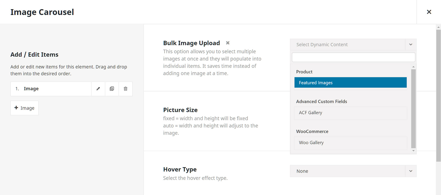
| Heading | | Description | | Bulk Image Upload | | This option allows you to select multiple images at once and they will populate into individual items. It saves time instead of adding one image at a time. |
| Layout | | Choose a carousel layout. |
| Slide Transition Style | | Choose the transition style for the slider layout. |
| Order By | | Defines how items should be ordered. NOTE: This option will not work in the Live Editor. |
| Picture Size | | fixed = width and height will be fixed auto = width and height will adjust to the image. |
| Hover Type | | Select the hover effect type. Hover Type will be disabled when caption styles other than Above or Below are chosen. |
| Marquee Direction | | Select the marquee direction. |
| Slide Rotation Angle | | Set the rotation angle for the slides in coverflow layout. |
| Slide Depth | | Set the z-axis translation offset of the slides in coverflow layout. |
| Transition Speed | | Set the duration of the transition between slides. In milliseconds. |
| Autoplay | | Choose to autoplay the carousel. |
| Autoplay Speed | | Set the autoplay speed, the duration between transitions. In milliseconds. |
| Autoplay Pause On Hover | | Choose to pause autoplay on hover. |
| Column Alignment | | Select the column alignment within rows. |
| Maximum Columns | | Select the number of max columns to display. When using the coverflow layout, the total number of columns will also depend on other settings and available space. |
| Column Spacing | | Insert the spacing between slides without "px". ex: 13. |
| Scroll Slides | | Insert the number of slides to scroll. Leave at 0 to scroll number of visible slides. NOTE: Please make sure that the number of total slides is an even multiple of the number of scrolled slides (2x, 3x, etc.). For larger numbers of scrolled slides, or when using centered slides it is best to have an even larger multiple to ensure smooth looping. |
| Center Active Slide | | Choose to always have the active slide centered. Otherwise it will be left on LTR and right on RTL sites. NOTE: To ensure smooth looping, please make sure that the number of total slides is an even multiple of the number of maximum columns + 1 (e.g. 2n + 1). |
| Mask Edges | | Choose if the edges should be masked with a fade out effect. Navigation arrows will not be displayed, if masked edges are active. |
| Display Shadow | | Choose to show a shadow on the individual slides on coverflow layout or during transitions. |
| Show Navigation | | Choose to show navigation buttons on the carousel. Note: You can also set the CSS ID (e.g. my-id) for this Carousel and use #my-id-next, #my-id-prev as links on a Button element to navigate through the slides. |
| Arrow Box Dimensions | | Controls the width and height of the arrow box. Enter values including any valid CSS unit. |
| Arrow Icon Size | | Set the arrow icon size. Enter value including any valid CSS unit, ex: 14px. |
| Previous Icon | | Click an icon to select, click again to deselect. |
| Next Icon | | Click an icon to select, click again to deselect. |
| Arrow Position | | Controls the position of the arrow. Enter value including any valid CSS unit, ex: 14px. |
| Arrow Border Radius | | Enter values including any valid CSS unit, ex: 10px. |
| Arrows Styling | | |
| Arrow Background Color | | Controls the background color of arrow. |
| Arrow Color | | Controls the color of arrow. |
| Dots / Progress Bar Position | | Controls the position of the dots / progress bar. Enter value including any valid CSS unit, ex: 14px. |
| Progress Bar Size | | Set the overall size of the progress bar. In pixels. |
| Dots Spacing | | In pixels. |
| Dots / Progress Bar Margin | | In pixels or percentage, ex: 10px or 10%. |
| Dots Alignment | | Controls the border style of the arrow. |
| Dots / Progress Bar Styling | | |
| Dots Size | | In pixels. |
| Dots / Progress Bar Color | | Controls the color of the dots / progress bar background. |
| Mouse Scroll | | Choose to enable mouse drag and/or wheel control control on the carousel. IMPORTANT: For easy draggability, when mouse scroll is activated, links will be disabled. |
| Free Mode | | Choose to enable free mode for dragging and scrolling the images arbitrary amounts. |
| Border Width | | Set the border width of the images. In pixels. |
| Border Style | | Controls the border style of the images. |
| Border Color | | Controls the border color of the images. |
| Border Radius | | Enter values including any valid CSS unit, ex: 10px. |
| Image Lightbox | | Show image in lightbox. Lightbox must be enabled in Global Options or the image will open up in the same tab by itself. |
| Margin | | Enter values including any valid CSS unit, ex: 4%. |
| Element Visibility | | Choose to show or hide the element on small, medium or large screens. You can choose more than one at a time. |
| CSS Class | | Add a class to the wrapping HTML element. |
| CSS ID | | Add an ID to the wrapping HTML element. |


