How To Set Up A Global Options Footer
Last Update: August 31, 2025
Footers in Avada can be constructed in two ways – the recommended method of using Avada Layouts to create a completely custom footer with no limitations, or the traditional method, configuring the footer via the Global Options and adding widgets to populate it. For more details, please see How To Create A Footer In Avada. If you do wish to build a footer using the traditional method, it will be helpful for you to familiarize yourself with the Global Footer options, as shown in this document.
Various options are available for customizing the Footer in the Avada Global Options, accessed from the WordPress Dashboard at Avada > Options > Footer. To access these theme options from Avada Live, you can simply mouse over the footer and choose Edit Footer. This will open the Sidebar to the Footer Options section of the Avada Options.
There are three sub-panels in the Footer tab: Footer Content, Footer Background Image, and Footer Styling, as well as a Footer Social Icon Styling sub-panel under Social Media. Please continue reading below to know more about the options in each section.
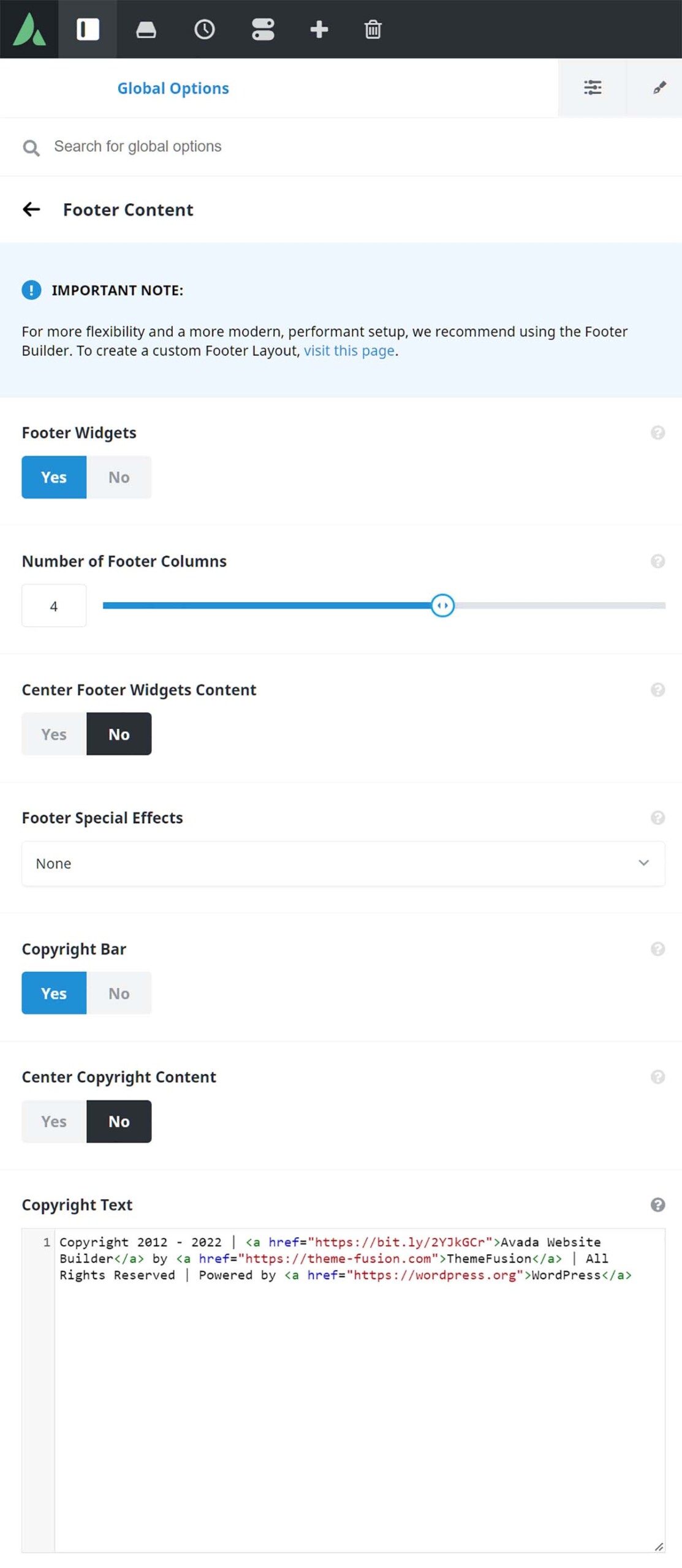
Footer Widgets – Allows you to show or hide the footer widgets. Setting this to ‘Off’ removes the entire footer section from the page,
Number of Footer Columns – Controls the number of columns to be displayed in the footer. Choose from 1 to 6.
Center Footer Widgets Content – Allows you to center the footer widget content.
Footer Special Effects – Allows you to select a special effect for the footer area. Choose between None, Footer Parallax Effect, Parallax Background Image, Sticky Footer, or Sticky Footer and Parallax Background Image.
None – Allows you to disable footer effects.
Footer Parallax Effect – Allows you to enable a fixed footer with parallax scrolling effect.
Parallax Background Image – Allows you to enable a parallax effect on the background image selected in “Background Image For Footer Widget Area” field.
Sticky Footer – Allows you to enable a sticky footer. The entire footer area will always be “below the fold”. On very short pages, it makes sure that the footer sticks at the bottom, just above the fold. IMPORTANT: This will not work properly when using a Left or Right Side Header layout and the side header is larger than the viewport.
Sticky Footer and Parallax Background Image – Allows you to enable a sticky footer with a parallax effect on the background image. The entire footer area will always be “below the fold”.
Copyright Bar – Allows you to show or hide the copyright bar.
Center Copyright Content – Allows you to center the copyright bar content.
Copyright Text – Allows you to enter the text that will be displayed in the copyright bar. Avada Builder Shortcodes and HTML markup can be used.
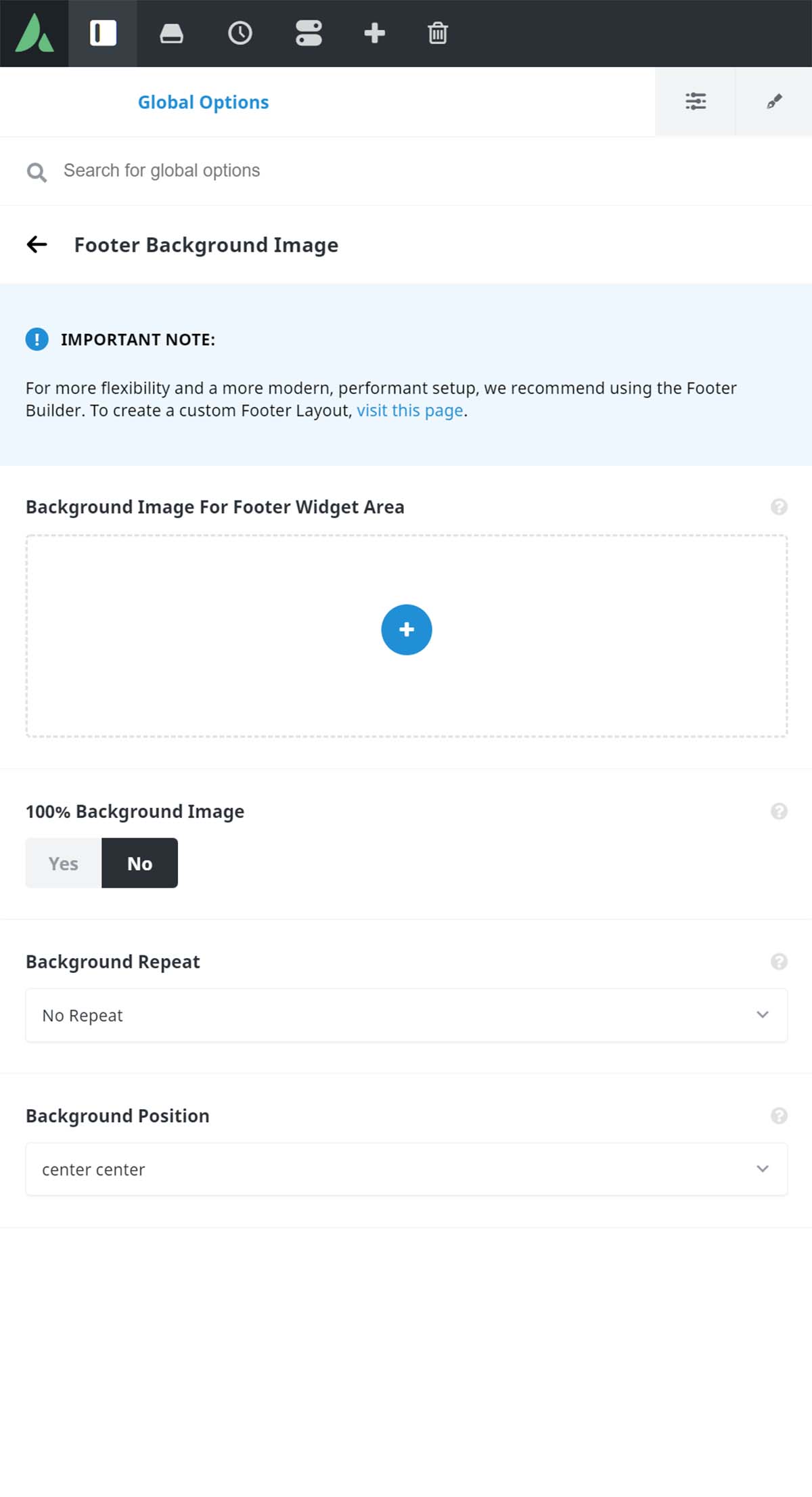
Background Image For Footer Widget Area – Allows you to set an image for the footer widget background. If left empty, the footer background color will be used.
100% Background Image – Allows you to have the footer background image displays at 100% in width and height according to the windows size.
Background Repeat – Controls how the background image repeats. Choose between Repeat All, Repeat Horizontally, Repeat Vertically, or No Repeat.
Background Position – Controls how the background image is positioned.
100% Footer Width – Allows you to have footer area display at 100% width according to the window size. If this is set to Off, it will follow the site width.
Footer Padding – Controls the top/right/bottom/left padding for the footer.
Footer Background Color – Controls the background color of the footer. The Background Color will not show/apply when a Footer Background Image is specified in the Footer Background Image section.
Footer Border Size – Controls the size of the top footer border.
Footer Border Color – Controls the border colors of the footer.
Footer Widgets Area Vertical Divider Line – Allows you to have the footer widget area display vertical divider line between columns.
Footer Widgets Area Vertical Divider Line Size – Controls the size of the vertical divider line between footer widget area columns.
Footer Widgets Area Vertical Divider Line Style – Controls the style of the vertical divider line between footer widget area columns.
Footer Widget Divider Color – Controls the divider color in the footer widgets and also the vertical divider lines between widget areas.
Footer Widgets Area Padding – Controls the right/left padding for the footer widget areas.
Copyright Padding – Controls the top/bottom padding for the copyright area.
Copyright Background Color – Controls the background color of the footer copyright area.
Copyright Border Size – Controls the size of the top copyright border.
Copyright Border Color – Controls the border colors for the footer copyright area.
Footer Headings Typography – Controls the primary and backup font family, font weight and style, font subsets, font size, line height, letter spacing, and font color of the footer headings.
Footer Font Color – Controls the text color of the footer font.
Footer Link Color – Controls the text color of the footer link font.
Footer Link Hover Color – Controls the text hover color of the footer link font.
Copyright Text Color – Controls the text color of the footer copyright area.
Copyright Link Color – Controls the link color of the footer copyright area.
Copyright Link Hover Color – Controls the link hover color of the footer copyright area.
Copyright Font Size – Controls the font size for the copyright text.
Footer Social Icons Styling
Display Social Icons In The Footer – Turn on to display social icons in the footer copyright bar.
Footer Social Icon Font Size – Controls the font size of the footer social icons. Enter value including CSS unit (px, em, rem), ex: 16px.
Footer Social Icon Tooltip Position – Controls the tooltip position of the footer social icons.
Footer Social Icon Color Type – Custom colors allow you to choose a color for icons and boxes. Brand colors will use the exact brand color of each network for the icons or boxes.
Footer Social Icon Color – Controls the color of the footer social icons. This color will be used for all social icons in the footer.
Footer Social Icons Boxed – Controls if each icon is displayed in a small box.
Footer Social Icons Box Color – Controls the color of the social icon box.
Footer Social Icon Boxed Radius – Controls the box radius. Enter value including any valid CSS unit, ex: 4px.
Footer Social Icon Boxed Padding – Controls the interior padding of the box. Enter value including any valid CSS unit, ex: 8px.


