Grid Column Resizing
Last Update: February 27, 2024
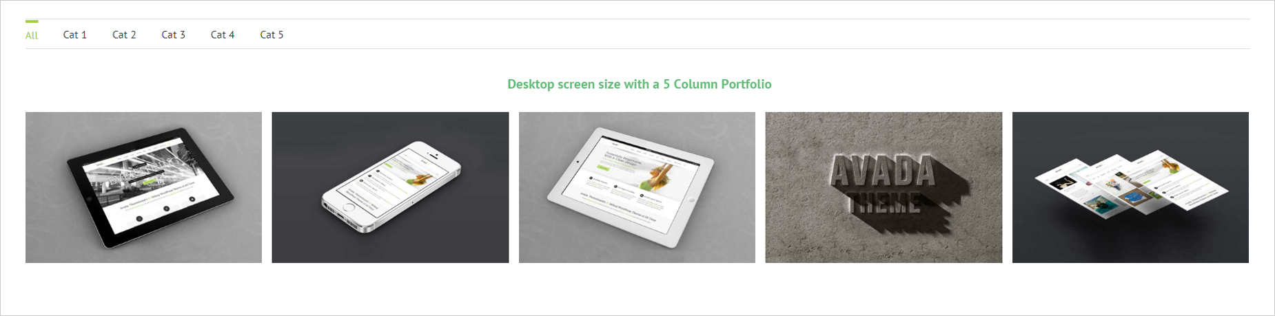
For Portfolio and Blog Grid Columns, the amount of columns can be freely selected and range from 1-6 columns. However, the amount of columns that will display depends entirely on the available width of the page. This is general responsive behavior and is completely normal. For example, if you select Portfolio 5 Column and have a site width of 1100px, then you will see 5 columns of images when viewing it on normal size desktop screens, but will see less when viewing it on smaller screen sizes.
Grid Framework Responsive Breakpoint
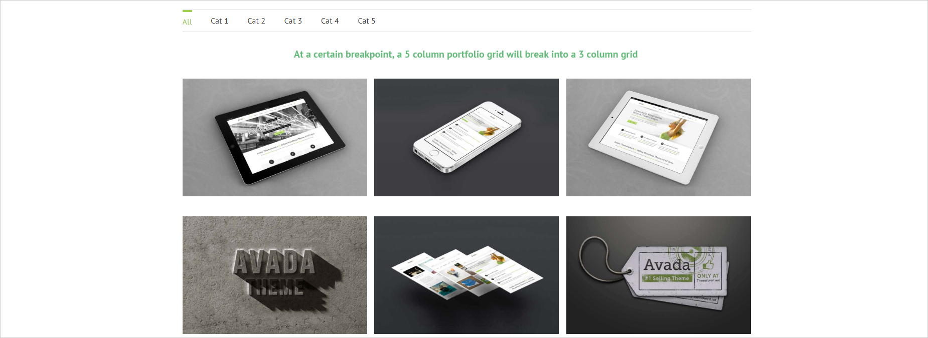
As explained above, the theme will continuously recalculate the size of the columns when you resize the window until it reaches a breakpoint. You can manually set a responsive breakpoint for the grid to control when it will start to break into smaller amount of columns. Please take note, however, that further breakpoints are calculated automatically. To learn more about this option, please view our Responsive Breakpoints article.


