Share
Choosing the right website colors goes beyond aesthetics—it shapes brand consistency, improves accessibility, and enhances the user experience. With Avada’s Global Color Palette and integrated tools, you can control and update your WordPress website’s colors efficiently, without editing each element. Whether building a new website, customizing an existing design, or rebranding, Avada provides a flexible, time-saving global system to maintain your site’s style and accessibility.
Overview
Why Color Management Matters
According to research from the Nielsen Norman Group (NNG), color is most effective in design when it goes beyond web aesthetics to enhance usability and communication. Strategic color use helps draw attention to key elements, communicates visual hierarchy, improves navigation, and ensures accessibility for all users.
By centralizing color control, Avada makes it easy to apply these best practices consistently across your website:
Whether you’re starting from scratch or customizing a pre-built Avada website, mastering these tools will save time and elevate your site’s design.
Step 1: Start with the Avada Global Color Palette
The Global Color Palette is the foundation of Avada’s color management system. You can access it under: WordPress Dashboard> Avada > Global Options > Colors
Avada starts with eight default colors. The Avada Setup Wizard helps you select or customize your palette, allowing you to choose from preset colors or your own custom colors.
How to Structure Your Color Palette

To build a balanced, accessible color scheme:
Avada’s palette follows a simple pairing logic to ensure contrast:
The Avada Setup Wizard checks your palette for contrast and luminance to ensure accessibility standards are met.
Step 2: Use Global Colors for Easy Site-Wide Updates
Avada uses color positions in the theme. Changing a color in the Global Palette instantly updates all occurrences across the site. For example, if you replace the color in Position 4 with a new hex code, every element referencing that position—such as buttons, headings, and icons—will instantly update.
Adding and Renaming Colors
This system maintains consistency and allows quick site-wide updates or rebranding.
Step 3: Master the Avada Color Picker & Advanced Options
Avada includes two color pickers:
When a color option is tied to the global palette, you’ll see a grey background, a blue globe icon representing a global link, and the global color name is displayed.
Using Advanced Global Adjustments
Click the “Advanced Options” icon to fine-tune a global color without adding new palette colors. You can adjust:
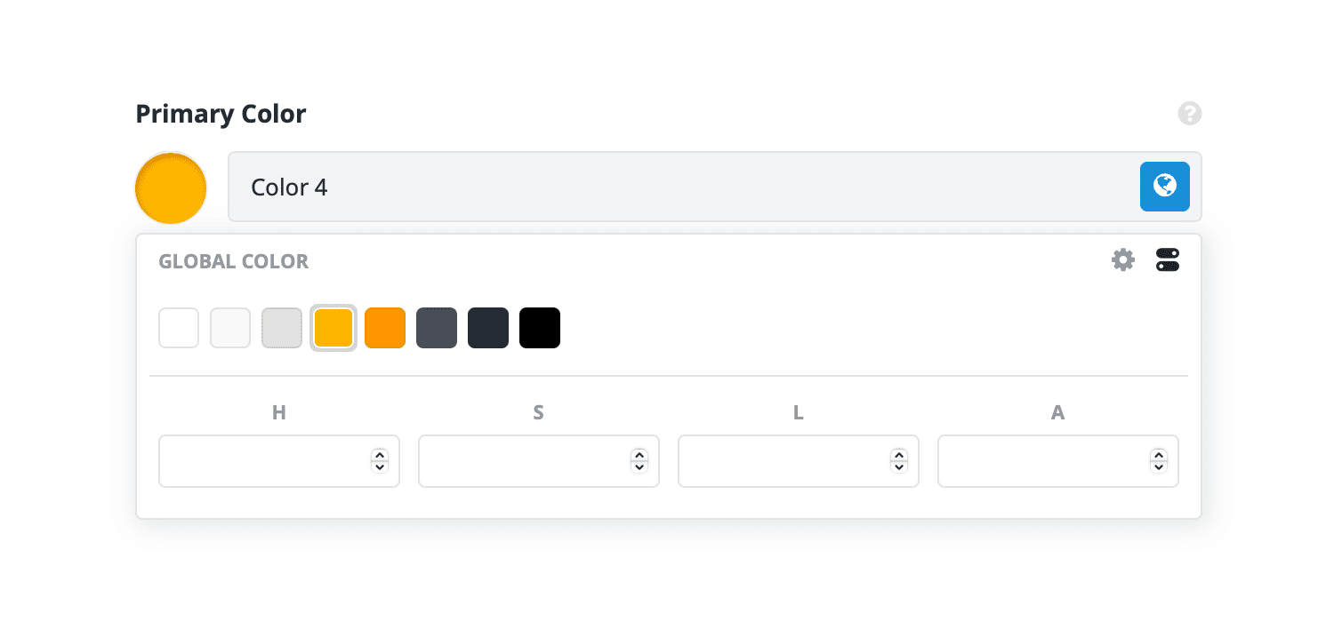
These adjustments create variations for effects and states (like hovers) while everything remains globally linked.
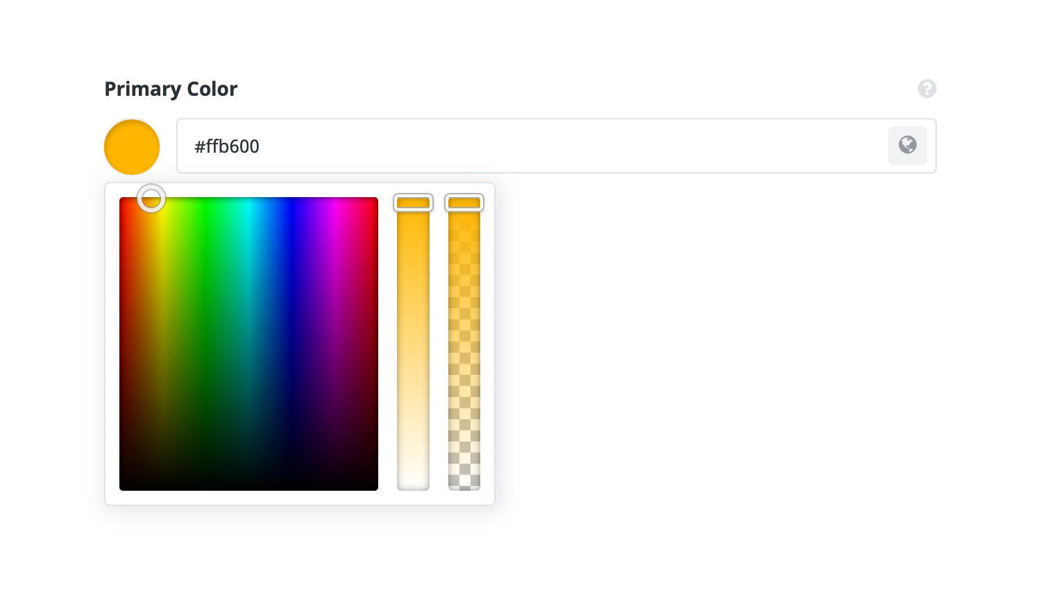
Switching to the Standard Color Picker
If you click the color indicator (not the globe), the link to the global color is removed, allowing you to:
Step 4: The Four Color States in Avada
Every color field in Avada falls into one of four states:
Recognizing these states helps you determine whether a color is set globally or overridden locally.
Step 5: Follow a Top-Down Workflow for Best Results
To keep your site consistent and easy to maintain, follow this order when setting colors:
This approach ensures you can rebrand, tweak, or experiment with colors in just a few clicks—without the need for endless manual edits.
Summary
Avada’s Global Color Palette and top-down approach make color management seamless, ensuring your site is unified, accessible, and simple to update.
For beginners, the Avada Setup Wizard is the perfect starting point, guiding you through palette selection and accessibility checks so you can build a strong foundation for your website’s color scheme.





Excellent guide on working with color options in Avada—super helpful for keeping branding consistent across a site. I recently redesigned a WordPress site for a local business using Avada, and the flexibility in global colors really saved time.
Thanks again for the great content!