Share
Businesses and content creators compete fiercely for user attention in today’s digital world. Websites are no longer static brochures but dynamic platforms that must constantly engage, inform, and persuade potential customers. As brands strive to capture attention and foster deeper relationships with their audiences, analytics have become indispensable tools for decision-making and optimization.
While many types of web analytics are available—from basic traffic metrics (like pageviews and session duration) to complex funnel tracking—one particular method has become prominent: hotspot analytics. Hotspot analytics (also known as heatmap analytics) enables website owners, marketers, and user experience (UX) designers to see visually intuitively how users interact with a website. Using heatmaps, scroll maps, and click tracking, hotspot analytics reveals precisely where users focus their attention, scrolling and clicking on any webpage.

If you’ve ever wondered why visitors aren’t scrolling far enough down a page to see your call-to-action button or why users click on non-clickable elements out of confusion, hotspot analytics can help answer those questions. Armed with these insights, you can rearrange design elements, optimize layout, and tweak content placement to improve engagement and guide users toward the actions you want them to take—signing up for a newsletter, purchasing, or simply spending more time exploring your site.
This blog post offers a comprehensive guide on using hotspot analytics to boost online engagement for your Avada website. We’ll review definitions, tools, implementation strategies, and real-world examples. By the end, you’ll have a roadmap for harnessing hotspot analytics to create more dynamic, user-friendly experiences that captivate and convert.
Overview
1. Defining Hotspot Analytics
Hotspot analytics is collecting and analyzing user interaction data on a webpage (or digital interface) to understand how visitors engage with elements like images, text, buttons, forms, and more. The term “hotspot” typically refers to areas of a webpage or interface that receive a high concentration of user activity—whether that be mouse movements, clicks, or scroll depth. There are multiple forms of hotspot analytics, including:
The goal of hotspot analytics is not just to generate pretty graphs or “heatmap” overlays; instead, it’s to uncover user behavior patterns. If you find, for instance, that 80% of users never scroll past the halfway mark of your homepage, you’ll know that any calls-to-action placed below that threshold might go unnoticed. This insight is invaluable for marketers, designers, and business owners alike.
2. Why Online Engagement Matters
Before diving deeper into hotspot analytics, it’s crucial to understand why improving online engagement matters in the first place. Online engagement metrics—from bounce rates to time on site to social shares—are direct indicators of how captivating and user-friendly your online presence is. High engagement often correlates with a variety of beneficial outcomes, including:
Higher Conversion Rates
Engaged visitors are more likely to sign up for newsletters, purchase products, or fill out forms. Conversions typically arise when your site elements are laid out in a way that aligns with user expectations.
Better User Experience (UX)
A website that considers visitors’ needs, habits, and preferences generally provides a smoother user experience. When users can easily find what they’re looking for, they stay longer and return more often.
Brand Loyalty and Trust
People are more likely to trust and connect with brands offering intuitive, frictionless online experiences. Consistent positive experiences build loyalty over time.
Improved SEO
Although not an official ranking factor, user engagement metrics like low bounce rates and high time on the page often correlate with better search engine rankings. When users find value in a page, they are more likely to stay, reducing the bounce rate—a signal that search engines often interpret as page quality.
Data-Driven Improvements
Engaged users produce more meaningful data. The longer someone stays on your site and interacts with various elements, the richer your data becomes, thus enabling you to make more informed decisions about what works and what doesn’t.
In short, engagement isn’t just a vanity metric—it signals how effectively your website resonates with your audience. By leveraging hotspot analytics, you’ll gain the insights needed to tweak your site for optimal engagement and, ultimately, better business outcomes.
3. The Components of Hotspot Analytics
Hotspot analytics can be broken down into several key components, each focusing on a particular aspect of user interaction.

Heatmaps
A heatmap is a graphical representation of data where colors depict individual values. In the context of website analytics, heatmaps are primarily used to visualize:
Heatmaps can pinpoint areas of high activity (represented in “hot” colors like red or yellow) and low activity (cooler colors like green or blue). They can visually highlight whether users are drawn to clickable elements like buttons and links or if they mistakenly click on non-clickable elements (indicative of confusion or unmet expectations).
Scroll Maps
Scroll maps show how far down a page people typically scroll. They help answer questions such as:
Scroll maps typically use color gradients or percentage indicators to mark how many users remain at different depths of a page. Suppose you notice a sharp drop-off at a certain point. In that case, that might indicate that your content isn’t engaging enough—or that it’s poorly structured, making visitors lose interest.
Click Tracking and Interaction Maps
This type of hotspot data dives deeper into specific click behaviors. Rather than just seeing where hot and cold areas exist, click tracking maps show:
Click tracking benefits forms and e-commerce pages, where each click (or lack of click) can indicate a user’s progress through a funnel.
4. Tools & Platforms for Hotspot Analytics
Various tools offer hotspot analytics features, ranging from free solutions to enterprise-grade platforms. Consider data privacy, pricing, and feature sets when choosing a tool. Combining session recordings and basic heatmaps is often enough for smaller websites.
Larger operations require more robust features, like advanced segmentation and integration with other analytics systems. Here are some popular options:
Hotjar https://www.hotjar.com
Hotjar is a widely used tool that provides heatmaps, scroll maps, click tracking, and even feedback polls and surveys. Its generous free tier makes it a great starting point.
Crazy Egg https://www.crazyegg.com/heatmap
Known for detailed heatmaps and scroll reports, Crazy Egg also offers split testing features to optimize design changes based on insights.
Mouseflow https://mouseflow.com
Mouseflow focuses on session recordings and heatmaps, letting you watch real visitor journeys. It also offers funnel analysis and form analytics.
Lucky Orange https://www.luckyorange.com/dynamic-heatmaps
It provides real-time analytics, heatmaps, and session recordings. Lucky Orange also includes a live chat function to help you engage with visitors in real time.
Fullstory https://www.fullstory.com/platform/heatmaps
Designed for more enterprise-level data capture, FullStory records every user interaction and can generate insights about user journeys.
5. Implementing Hotspot Analytics
Implementing hotspot analytics is more than just inserting a snippet of code into your website’s header. For best results, you should approach implementation systematically.
Setting Goals and KPIs
Before looking at a heatmap, you need a clear understanding of what you hope to achieve. Consider the following questions:
Defining clear goals allows you to focus your analysis. For instance, if your main goal is to increase newsletter signups, you’ll pay close attention to the areas around your signup form and how users interact with it (or ignore it). Typical Key Performance Indicators (KPIs) might include:
Choosing the Right Pages and Elements to Analyze
Hotspot analytics can be resource-intensive, especially if you have a large site with many pages. As a best practice, you should begin by analyzing your most critical or most trafficked pages—like the homepage, product pages, or lead-generation landing pages. From there, you can narrow your focus to specific elements, such as:
Starting with your “money pages”—the ones most tied to revenue or lead generation—ensures that any insights you gain have the most significant potential ROI (Return on Investment).
Adding The Tracking Code
Most heatmap and hotspot analytics tools require manually installing a snippet of JavaScript code into the head of every website page you want to track. This code runs on your web pages to capture user interactions (mouse movements, clicks, scroll depth) and send them to the tool’s servers. The process typically looks like this:
If you’re using a Content Management System (CMS) like WordPress, you can often install the code via a plugin or through the theme’s settings. This simplifies the process and ensures that the tracking code is placed correctly.
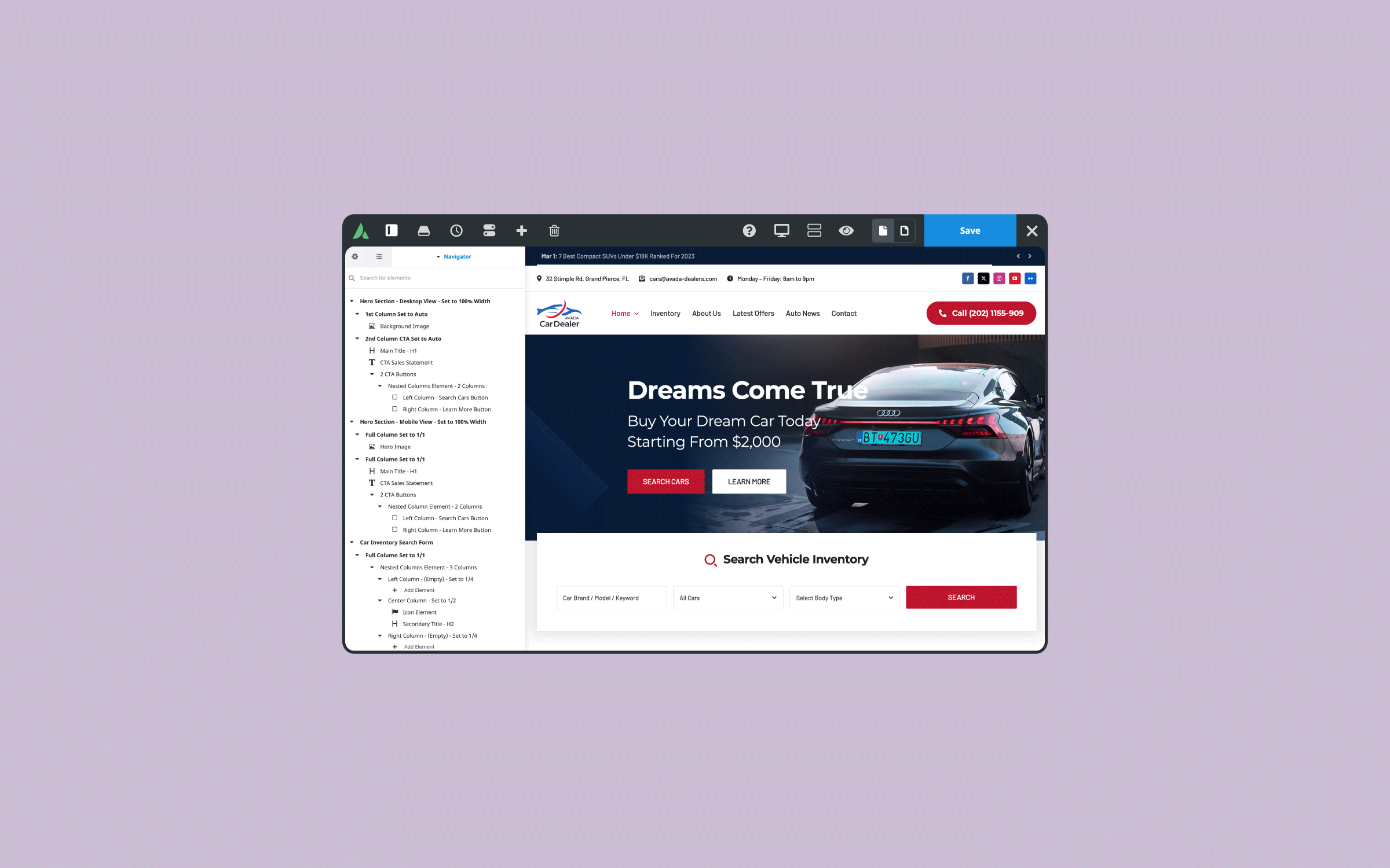
For Avada users, you can add the tracking code without editing the theme’s files directly by logging into the WordPress Dashboard and navigating to “Avada -> Options -> Advanced -> Code field -> Tracking code” – to add the JavaScript snippet.
Ensuring Privacy and Data Compliance
Whenever you track user behavior, be mindful of data privacy laws such as the General Data Protection Regulation (GDPR) in the European Union or the California Consumer Privacy Act (CCPA) in the United States. Key considerations include:
Transparency is crucial. To maintain trust and abide by legal requirements, ensure that your use of hotspot analytics is consistent with your stated privacy practices.
6. Interpreting Hotspot Data
Collecting user interaction data is just the first step. The true power of hotspot analytics is revealed when you learn how to interpret and act on the data.
Identifying High-Interest Areas
Heatmaps will often show large “hot” areas where users’ cursors spend the most time or where the most clicks occur. These spots represent high user interest. By paying attention to these hot areas, you can figure out what’s resonating with your audience:
Use these insights to reinforce positive user behavior. For example, an image draws much interest but isn’t clickable. Consider making it clickable and linking it to relevant content or a product page.
Understanding User Frustration Points
Conversely, hotspot analytics can reveal areas where users are frustrated or confused, such as:
Identifying these “pain points” or confusion areas is crucial for user experience improvements.
Analyzing Movement Patterns
Some tools let you visualize where clicks happen and how the mouse moves. These movement patterns can mimic (to some extent) eye tracking. If users consistently move their cursor in a particular pattern (for example, skipping over a chunk of text), they might be ignoring certain content.
You can identify cause-and-effect relationships when you correlate movement patterns with clicks or scroll data. For example, you might notice:
These insights can help you optimize page layout for better engagement.
Segmenting Users for Deeper Insights
If your hotspot analytics tool allows for segmentation, you can gain deeper insights by filtering user behavior based on:
For example, mobile users interact differently with your site than desktop users due to different screen sizes and usage patterns. Segmenting can help you design more tailored, device-specific experiences that drive higher engagement.
7. Strategies to Boost Online Engagement
Once you’ve collected and interpreted your data, the next step is to use those insights to boost engagement actively. Below are several proven strategies.
Optimizing Website Layout
One of the most impactful changes you can make based on hotspot analytics is reorganizing your website layout to align with user expectations and preferences. This might include:
Improving Calls to Action (CTA)
CTAs are crucial for guiding visitors toward desired actions. If your hotspot analytics reveal that your CTA buttons are not receiving enough clicks—or are overshadowed by other elements—you can:
Enhancing Content Placement
Content is key in user engagement, whether blog posts, product descriptions, or promotional banners. Hotspot analytics can show you exactly which content blocks command the most attention. You can optimize content placement by:
A/B Testing and Iteration
Hotspot analytics is an iterative process. You see what works, make a change, test, and refine. A/B testing (or split testing) involves running two versions of a page or element to see which performs better. For instance:
Personalization and User Experience (UX) Improvements
Lastly, hotspot analytics can serve as a foundation for personalization. If you notice that certain segments of users (e.g., returning visitors) show more interest in a particular product category, you could first personalize your homepage or menu to surface those categories. Personalization improves user experience and increases the likelihood of engagement and conversions.
8. Real-World Use Cases and Examples
To illustrate the power of hotspot analytics, let’s look at a few hypothetical but representative examples:
9. Common Pitfalls and How to Avoid Them
While hotspot analytics can be instrumental, it’s not without its challenges. Here are some pitfalls to avoid:
– Relying Solely on Heatmaps
Heatmaps are an effective visual aid but shouldn’t be your only data source. Combine them with session recordings, surveys, and traditional metrics for a comprehensive view.
– Misreading Data
A hot area may not always mean success. Sometimes, users are stuck trying to figure out a confusing element. Always correlate heatmap findings with other data points like bounce rates, time on page, or funnel completion rates.
– Ignoring Mobile
Desktop heatmaps don’t necessarily transfer to mobile layouts. Always analyze mobile and desktop interactions separately if you have a responsive or dedicated mobile site.
– Over-Focusing on Above-the-Fold
While ensuring key elements are visible without scrolling can be beneficial, some content naturally belongs deeper on a page. Don’t assume that all valuable content must be crammed at the top; test to see your audience’s preference.
– Failing to Iterate
Hotspot analytics is not a one-and-done solution. User behaviors and preferences evolve, especially if your site’s content and features change regularly. Continual monitoring and testing are essential.
10. Integrating with Other Data Sources
For the most concentrated insights, integrate hotspot analytics with other data sources. This multi-layered approach ensures that each insight you gain is cross-verified and contextualized, leading to more effective decision-making.
11. Measuring the Impact and Return on ROI
One of the biggest challenges for any analytics initiative is proving its value. Here’s how you can measure the impact of your hotspot analytics efforts:
12. Future Trends in Hotspot Analytics
The field of hotspot analytics continues to evolve. Several emerging trends are worth noting:
Summary
Hotspot analytics represents a powerful fusion of visual data representation and user behavior analysis. By highlighting areas of high user interest and pinpointing sources of frustration, it provides actionable insights that traditional web analytics alone can’t deliver. For businesses, marketers, and UX designers, these insights can distinguish between a website that merely “exists” and one that actively converts and engages.
From heatmaps that show which parts of your pages draw the most attention to scroll maps that reveal where users lose interest, hotspot analytics lets you see through the eyes of your visitors—even when you’re miles apart. Equipped with this data, you can take immediate, data-driven steps to optimize your site layout, refine calls to action, and create a more personalized user experience. Over time, these incremental improvements compound, leading to higher engagement, better conversion rates, and a more satisfied user base.
Of course, success with hotspot analytics doesn’t happen overnight. It requires thoughtful planning (identifying goals, key pages, and the right tools), careful implementation (tracking code installation, privacy compliance), and ongoing iteration (A/B testing, segment analysis, feedback incorporation). But the payoff is worth it. As you enhance your website in response to user interactions, you’ll likely witness higher user satisfaction, improved brand loyalty, and a tangible boost to your business objectives—be they sales, leads, or simply a thriving community of returning visitors.
If you’re ready to start, pick a reliable hotspot analytics tool and gather data on your most essential pages. Compare heatmaps to your existing metrics, formulate hypotheses, and launch targeted experiments. Track your changes, measure the results, and refine. Over time, you’ll develop a deeper understanding of your audience—what they love, what they ignore, and how they navigate your site. That understanding is the cornerstone of any successful digital strategy, ensuring you attract and engage visitors. By taking advantage of hotspot analytics, you’ll learn how many people visit your site and how they behave once they arrive—and that knowledge is a game-changer in boosting online engagement.