Share
Responsive web design is crucial in modern web development, ensuring websites function seamlessly across different screen sizes (mobile, tablet, desktop). One of the primary tools in Avada for achieving responsive design is the Responsive Option Sets feature. This functionality allows users to set multiple options for different screen sizes within the same Element, providing a high level of customization for Column size and visual order for your website layouts. Let’s take a closer look!
Overview
The Benefits Of Responsive Web Design
In today’s world, where internet access is only a mobile device away, responsive web design offers a range of benefits, including:
Avada Column Size and Order
Using Avada for your WordPress website, you can adjust the display order and size of Columns for both medium and small screen layouts. You can also create layouts that adapt fluidly to different devices by leveraging the Avada Responsive Option Sets functionality. To demonstrate this feature, let’s examine a Column from the Avada Pet Supplies prebuilt website.

Navigating to the “Design Tab” of a selected Column reveals several options marked with a screen icon. This icon is tied to the “Responsive Icon” in the toolbar. Selecting a specific screen size—such as small—causes all related options with a responsive icon to reflect the chosen screen size. Alternatively, users can click the screen icon within the options to change the view.
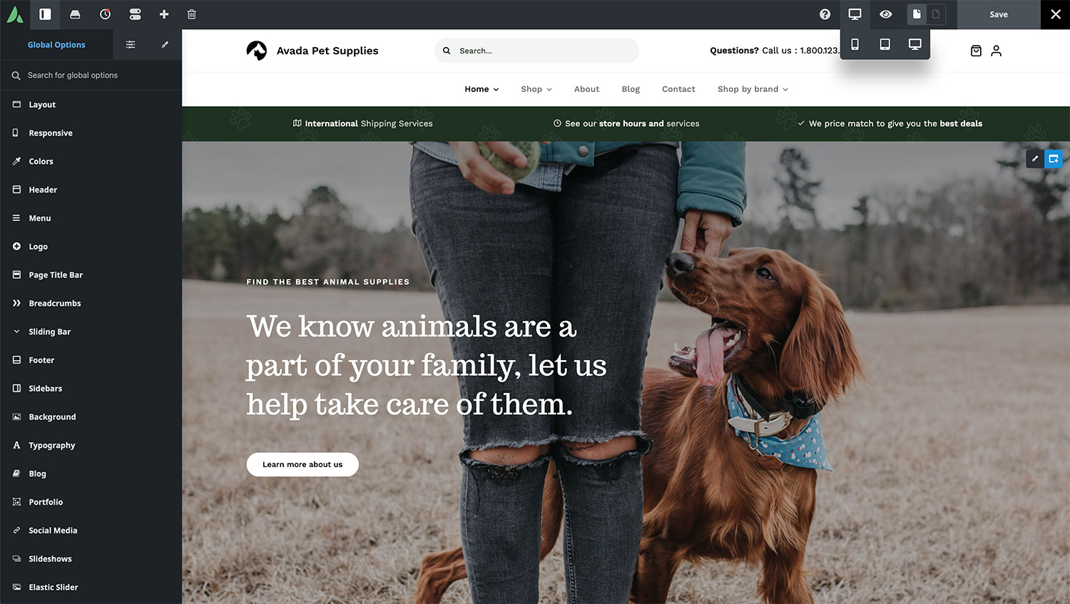
Each icon signifies that the assigned values only apply to the selected screen size. Suppose no values are set for medium or small screens. In that case, the Column settings will inherit from the large screen layout or the Avada Global Options settings.
Avada Column Behavior and Adjustments
Avada’s Global Column Options (located under Avada Builder > Elements > Column) control the default behavior of Column widths across different screen sizes:
However, these settings can be customized, allowing users to adjust margins, padding, column spacing, width, and order for specific screen sizes, offering exceptional flexibility in responsive design.
Practical Examples of Responsive Column Adjustments
Example 1: Three Equal Columns

Three one-third-width Columns exist in one section of the Avada Pet Supplies homepage. On medium screens, the layout remains unchanged. However, the default behavior on small screens typically stacks these Columns as full-width elements. In this example, though, only the third Column follows the default behavior. At the same time, the first two are adjusted to half-width. This demonstrates how Column widths can be independently customized for smaller screens.
Additionally, users can rearrange Columns for specific screen sizes. In this case, the order of the Columns on small screens was modified simply by dragging a column to a new position in the Avada Builder. This ensures that while the layout remains the same on medium and large screens, the order adapts on small screens for better usability.
Example 2: Half and Quarter Columns

Another section showcases two half-width Columns featuring background images of a dog and a cat. Below this, there’s a Container with four one-quarter-width Columns. By default, switching to a small screen would make all these columns full-width. However, the half-width Columns remain unchanged in this instance, while the quarter Columns adjust to half-width. This configuration ensures a visually balanced layout, even on smaller screens.
Example 3: Footer Adjustments

The footer in this design is a global custom footer layout. On large and medium screens, it consists of four one-quarter-width Columns. However, the two menu columns are adjusted to half-width on small screens, while the others revert to full-width. This ensures an optimized layout for mobile users while maintaining the design integrity of larger screens.
We also have a detailed post exploring different approaches to Responsive Header Design With Avada for you to check out.
Summary
Avada’s Responsive Option Sets feature provides an intuitive way to adjust column widths and order for different screen sizes. Whether designed for mobile devices, tablets, or desktops, this feature ensures that layouts remain visually appealing and functional across all devices.
By experimenting with these options, designers can create fluid, adaptable designs that enhance user experience. Try out these features in Avada and take complete control over responsive design!


