Woo Archives Element

Last Update: September 4, 2025

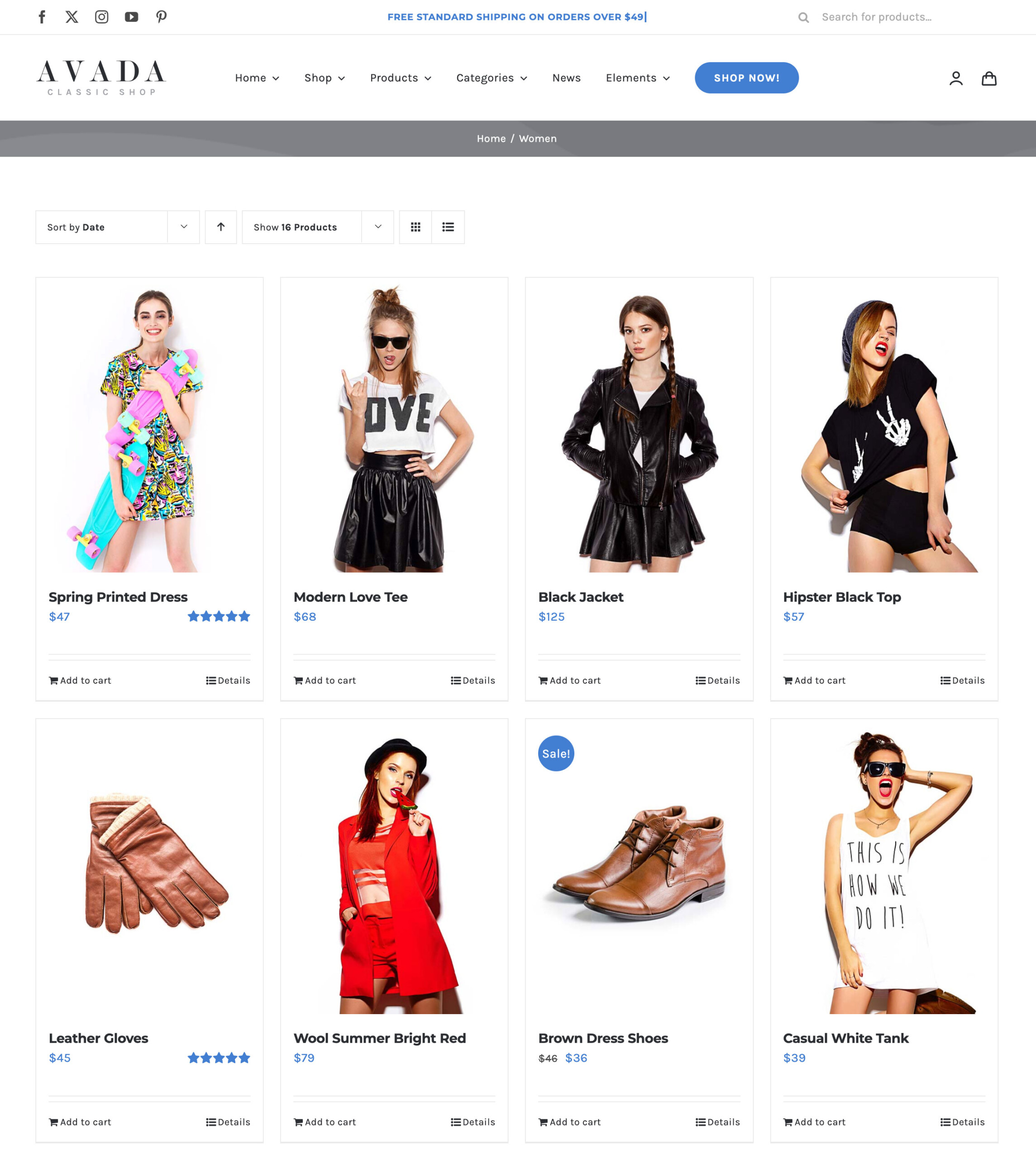
The Avada Woo Archives Element displays WooCommerce product archives, such as shop, category, or tag pages, in a flexible layout. The Element allows you to control how products are presented, including grid or list styles, columns, spacing, and product details such as images, prices, and add-to-cart buttons.

Watch the video below for a visual overview of Avada Layout Elements, and view the Avada Woo Archives Element page. Read on to see the complete list of options.

For privacy reasons YouTube needs your permission to be loaded.
Avada Woo Archives Element

How To Use The Avada Woo Archives Element

The Avada Woo Archives Element provides the option for adding WooCommerce Product Archives to your WordPress website. Using Avada Layout Conditions, this layout can then be applied to any or all WooCommerce archives, such as Categories or Tags. You can customize the number of products to display, the number of columns, and styling, among other options.

Element Options

Note: Please note that the displayed options screens below show ALL the available options for the element. If you have Avada’s Option Network Dependencies turned on, you will only see options relevant to your selections, and so the options screen may look somewhat different.
General

HeadingDescription
Number of ProductsSelect number of products per page. Set to -1 to display all. Set to 0 to use number of products from Avada > Options > WooCommerce > General WooCommerce.
Number of ColumnsSet the number of columns per row.
Column SpacingInsert the amount of spacing between items without 'px'. ex: 40.
Pagination TypeChoose the type of pagination.
Nothing Found MessageReplacement text when no results are found.
Element VisibilityChoose to show or hide the element on small, medium or large screens. You can choose more than one at a time.
CSS ClassAdd a class to the wrapping HTML element.
CSS IDAdd an ID to the wrapping HTML element.

Design

HeadingDescription
Show ThumbnailDisplay the product featured image.
Show TitleDisplay the product title below the featured image.
Show PriceChoose to show or hide the price.
Show RatingChoose to show or hide the rating.
Show ButtonsChoose to show or hide Add to Cart / Details buttons.
Grid Box ColorControls the background color for the grid boxes.
Grid Border ColorControls the color of borders for the grid boxes.
Grid Separator StyleControls the line style of grid separators. NOTE: Separators will display, when buttons below the separators is displayed and Box Design mode set to Classic.
Grid Separator ColorControls the line style color of grid separators. NOTE: Only work when Box Design mode set to Classic.
MarginIn pixels or percentage, ex: 10px or 10%.

In this article