Woo Notices Element

Last Update: July 14, 2024

The Woo Notices Element is a very versatile Element that displays relevant notices on WooCommerce pages. You can add it to Layouts when building single product layouts, as well as on relevant pages, such as the Cart and Checkout pages.

For privacy reasons YouTube needs your permission to be loaded.

How To Use The Woo Notices Element

The Woo Notices Element allows you to place and style your WooCommerce notices into your Woo Product Layout. The notices themselves are automatically generated from WooCommerce, and this Element does not offer any way to customize these.

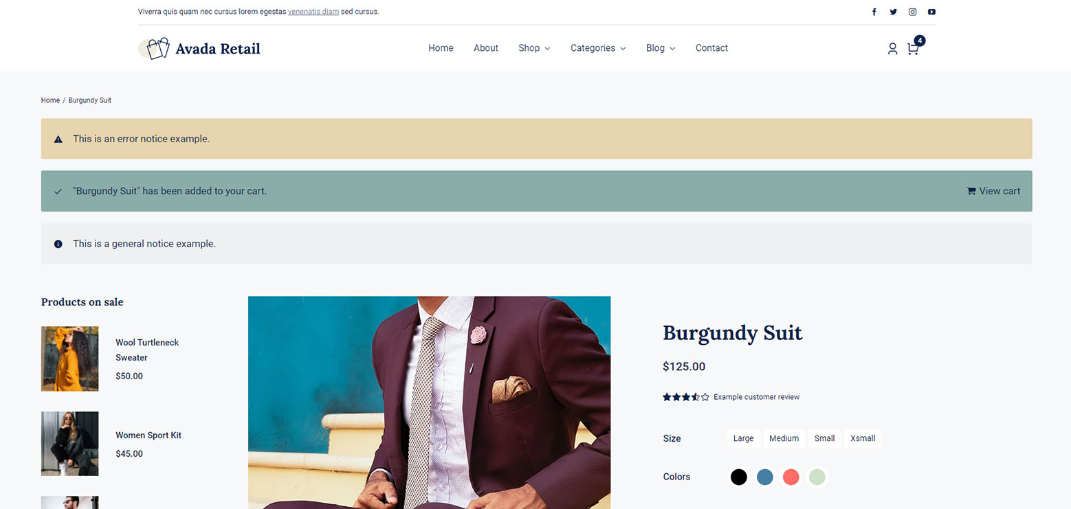
Simply place the Woo Notices Element in the area of your Layout or page you want the notices to appear. When you add the Element in Avada Live, you will see examples of the three notice types; General, Success, and Error. These allow you see what the notices will look like, so you can style them as you wish. Using the options in the Element, you can style the Notices’ appearance and color to your personal preferences.

Woo Notices Element > Example

Element Options

Please note that the displayed options screens below show ALL the available options for the element. If you have Avada’s Option Network Dependencies turned on, you will only see options relevant to your selections, and so the options screen may look somewhat different.

General

HeadingDescription
AlignmentChoose to align the content left, right or center.
Show ButtonMake a selection to show or hide button.
Element VisibilityChoose to show or hide the element on small, medium or large screens. You can choose more than one at a time.
CSS ClassAdd a class to the wrapping HTML element.
CSS IDAdd an ID to the wrapping HTML element.

Design

HeadingDescription
PaddingIn pixels or percentage, ex: 10px or 10%.
MarginIn pixels or percentage, ex: 10px or 10%.
Border SizeControls the border size of the notice.
Border StyleControls the border style of the notice.
Border RadiusEnter values including any valid CSS unit, ex: 10px.
Text SizeControls the size of the notice text. Enter value including any valid CSS unit, ex: 20px.
Icon SizeControls the size of the notice icon. In pixels.
Cart Icon StyleControls the cart icon style of the notice.
Cart IconSelect icon for cart message.
Notice Types Styling
General
Background ColorControls the background-color for the notice message.
Border ColorControls the border-color for the notice message.
IconSelect icon for notice message.
Icon ColorControls the icon color for the notice message.
Text ColorControls the text color for the notice message.
Link ColorControls the link color for the notice message.
Success State
Background ColorControls the background-color for the success message.
Border ColorControls the border-color for the success message.
IconSelect icon for success message.
Icon ColorControls the icon color for the success message.
Text ColorControls the text color for the success message.
Link ColorControls the link color for the success message.
Error State
Background ColorControls the background-color for the error message.
Border ColorControls the border-color for the error message.
IconSelect icon for error message.
Icon ColorControls the icon color for the error message.
Text ColorControls the text color for the error message.
Link ColorControls the link color for the error message.

Extras

HeadingDescription
Animation TypeSelect the type of animation to use on the element.
Direction of AnimationSelect the incoming direction for the animation.
Animation ColorSelect the color of the animation
Speed of AnimationType in speed of animation in seconds (0.1 - 5).
Animation DelaySelect the delay time after the animation starts(0 - 5).
Offset of AnimationControls when the animation should start.

In this article