Project Details Element
Last Update: September 4, 2025
The Avada Project Details Element presents information about portfolio projects, including client names, project dates, skills used, links, and any custom details added in the project settings. The Element pulls this data from the portfolio post type and displays it in a structured, styled format that can be styled.
Watch the video below for a visual overview of Avada Layout Elements, and view the Avada Project Details Element page. Read on to see the complete list of options.
How To Use The Project Details Element
The Avada Project Details Element is a dedicated Portfolio Element, designed to add the project details from a Portfolio (CPT) anywhere in a Content Layout Section, in any Single Portfolio Layout. Of course, you can also use the full range of Avada Design Elements when building your Layout, and combine them with the Layout Section Elements.
When you go to add an Element in a Content Layout Section, the Element dialog opens in a new tab called “Layout Elements”. This is where you will find the Project Details Element. The Project Details Element can be placed anywhere in your Layout Section and duplicates the Project Details that you usually see in a Portfolio item, positioned on the right side of the page, as shown below.
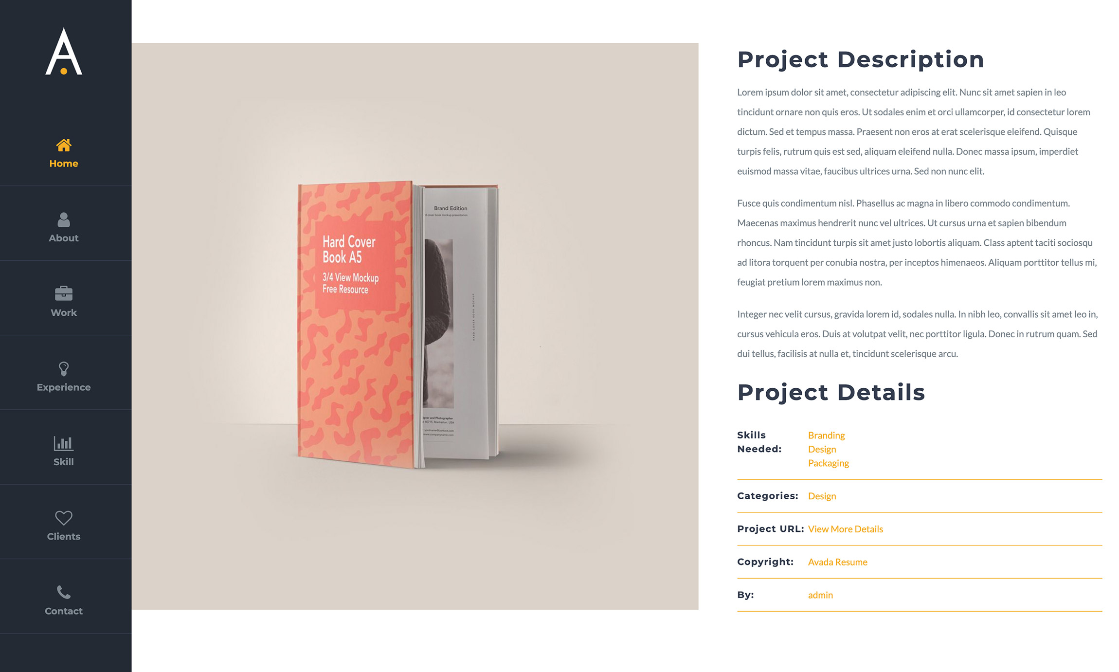
There are several options for the Element’s display, including headings and heading sizes. See below for an example of the Project Details Element as added to the Avada Resume website.
Element Options
Note: Please note that the displayed options screens below show ALL the available options for the element. If you have Avada’s Option Network Dependencies turned on, you will only see options relevant to your selections, and so the options screen may look somewhat different.


