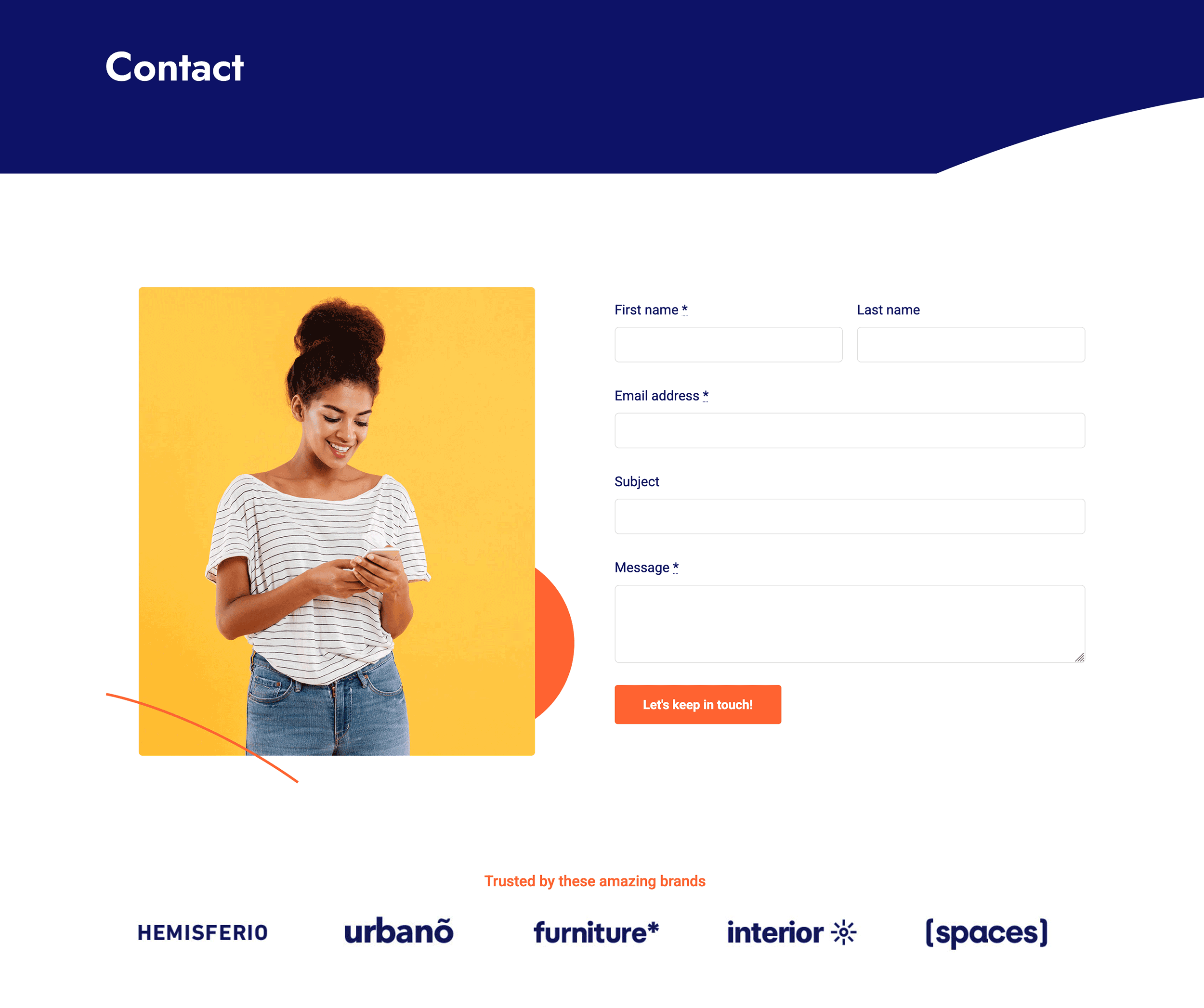
Avada Textarea Field Element Examples
The Avada Textarea Field Element provides a multi-line input area for longer user responses, such as comments, messages, or descriptions. You can control the number of rows, min/max character count, placeholder hints, and style text, including padding, borders, and responsive behavior, to ensure a consistent input experience.
Examples can include the individual option values set for that particular instance; however, in some cases, not all Element variations can be shown as they may be too numerous. Where a live example cannot be shown, an image representation will be used as a substitute. For more detailed information, please refer to the related Element documentation and videos.


