Avada Button Element Examples

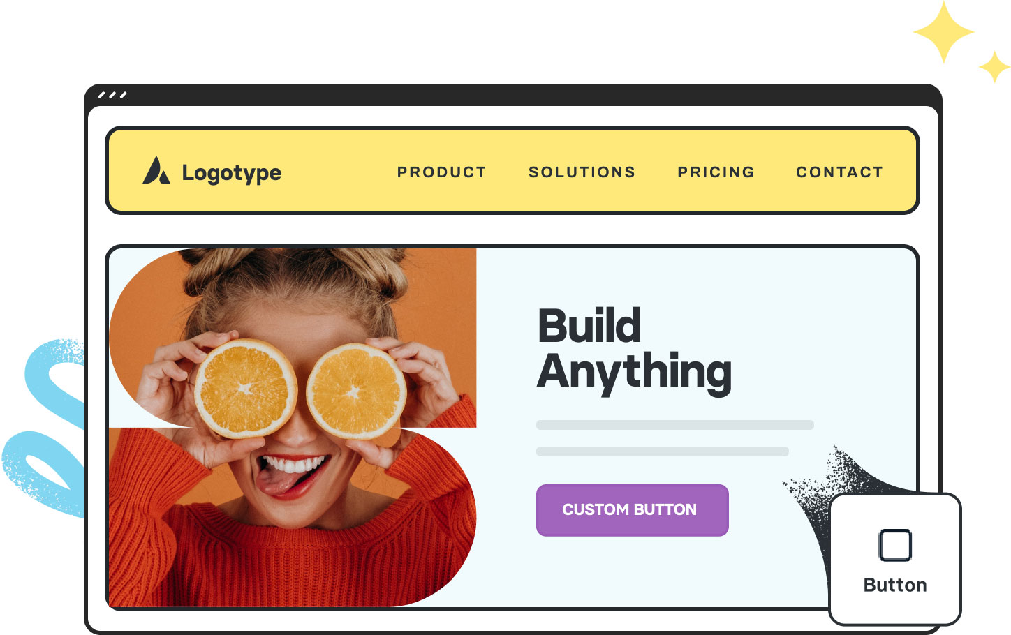
The Avada Button Element gives you the ability to create clickable call-to-action buttons anywhere in your content, styled to fit your branding—choosing from shapes, sizes, hover effects, icons, alignments, and more—so you can compel action in the exact look you want, without the need for external tools.

This Avada Button Element is set up as follows: Enable Button Hover Text/Icon (Off), Alignment (Center), Button Style (Custom), Gradient Color, Gradient Style (Linear), Button Type (Flat), Button Border Radius (0px), Button Size (Custom), Typography (Custom), and Button Span (No).

This Avada Button Element is set up as follows: Enable Button Hover Text/Icon (Off), Alignment (Center), Button Style (Custom), Gradient Color, Gradient Style (Linear), Button Type (Flat), Button Border Radius (0px), Button Size (Custom), Typography (Custom), and Button Span (No).

This Avada Button Element is set up as follows: Enable Button Hover Text/Icon (On), Button Hover Text, Alignment (Center), Button Style (Custom), Gradient Color, Gradient Style (Linear), Button Type (Flat), Button Border Radius (10px), Button Size (Custom), Typography (Custom), Button Span (No), and Hover Transition (Text Slide Up).

This Avada Button Element is set up as follows: Enable Button Hover Text/Icon (Off), Alignment (Center), Button Style (Custom), Gradient Color, Gradient Style (Linear), Button Type (3D), Button Bevel Color For 3D Mode, Button Border Size (1px), Button Border Radius (24px/8px), Button Size (Custom), Typography (Custom), and Button Span (No).

This Avada Button Element is set up as follows: Enable Button Hover Text/Icon (Off), Alignment (Center), Button Style (Custom), Gradient Color, Gradient Style (Linear), Button Type (Flat), Button Border Size (2px/4px), Button Border Radius (12px), Button Border Color, Button Size (Custom), Typography (Custom), and Button Span (No).

This Avada Button Element is set up as follows: Enable Button Hover Text/Icon (Off), Alignment (Center), Button Style (Default), Button Type (Flat), Button Border Radius (4px), Button Size (Custom), Typography (Custom), Button Span (Yes), Icon, Hover Transition (Text Slide Down), Animation Type (Zoom), and Direction Of Animation (Static).

This Avada Button Element is set up as follows: Enable Button Hover Text/Icon (Off), Alignment (Center), Button Style (Custom), Gradient Color, Gradient Style (Default), Button Type (Flat), Button Border Size (3px), Button Border Radius (10px), Button Border Color, Button Size (Custom), Typography (Custom), Button Span (Yes), Icon, Icon Position (Right), Icon Divider (No), and Hover Transition (Icon Slide).

This Avada Button Element is set up as follows: Enable Button Hover Text/Icon (Off), Alignment (Right), Button Style (Custom), Gradient Color, Gradient Style (Linear), Button Type (Flat), Button Border Size (2px/4px), Button Border Radius (7px), Button Border Color, Button Size (Custom), Typography (Custom), Button Span (No), Icon, Icon Position (Right), Icon Divider (No), Hover Transition (Icon Switch Position), Animation Type (Slide), and Direction of Animation (Right).

This Avada Button Element is set up as follows: Enable Button Hover Text/Icon (Off), Alignment (Right), Modal Window Anchor (Open Modal Element), Button Style (Custom), Gradient Color, Gradient Style (Linear), Button Type (Flat), Button Border Radius (0px/10px), Button Size (Custom), Typography (Custom), Button Span (No), Icon, Icon Position (Left), Icon Divider (No), and Hover Transition (Icon Switch Position).

Examples can include the individual option values set for that particular instance; however, in some cases, not all Element variations can be shown as they may be too numerous. Where a live example cannot be shown, an image representation will be used as a substitute. For more detailed information, please refer to the related Element documentation and videos.
Avada Slider Element Featured ImageAvada Slider