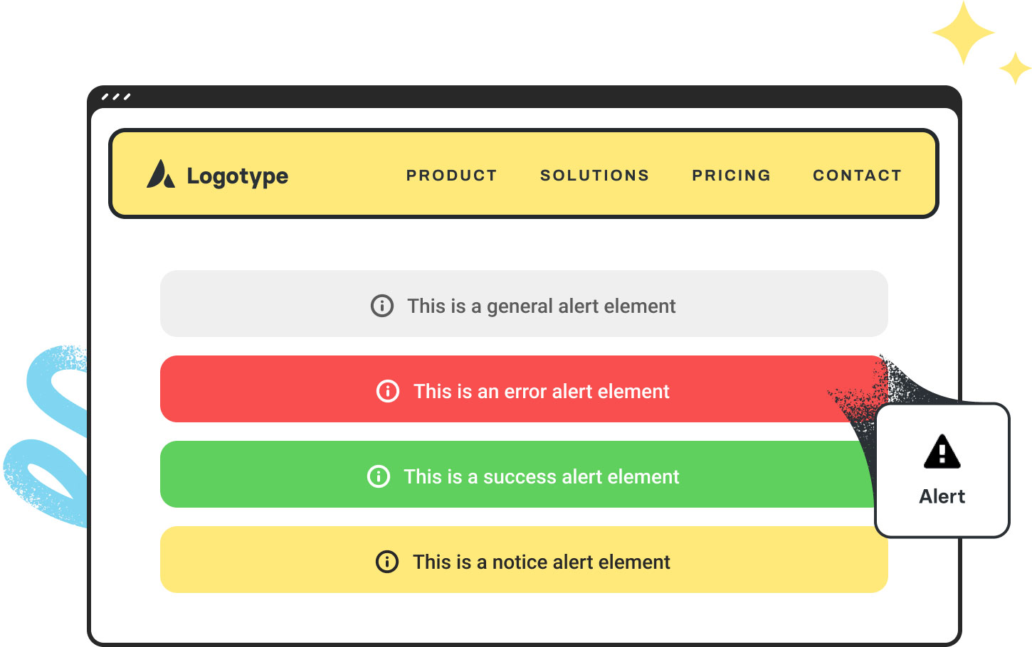
Avada Alert Element Examples
The Avada Alert Element makes it easy to capture attention and communicate essential information with impact, whether you’re sharing urgent notices, drawing attention to crucial details, or even notifications in Avada Forms. With customizable styles, dismissible options, and complete design flexibility, you can create alerts that stand out, align with your brand, and keep your visitors informed in precisely the way you choose.
Examples can include the individual option values set for that particular instance; however, in some cases, not all Element variations can be shown as they may be too numerous. Where a live example cannot be shown, an image representation will be used as a substitute. For more detailed information, please refer to the related Element documentation and videos.


