Woo Up/Cross-sells Element
Last Update: February 11, 2026
The Avada Woo Up/Cross-Sells Element displays related products on WooCommerce product and cart pages, encouraging customers to consider additional or higher-value items. Upsells appear as alternative or premium product suggestions on product pages, while cross-sells are shown in the cart as complementary recommendations.
Watch the video below for a visual overview of the Element, view the Avada Woo Up/Cross-Sells Element page for live examples, and read on to see the complete list of options.
How To Use The Woo Up/Cross-sells Element
The Avada Woo Up/Cross-Sells Element allows you to create columns or a carousel to promote other products on a product page or checkout page. The Element options are identical to those of the Related Products Element, except that the Related Products Element displays Products that share a category or tag.
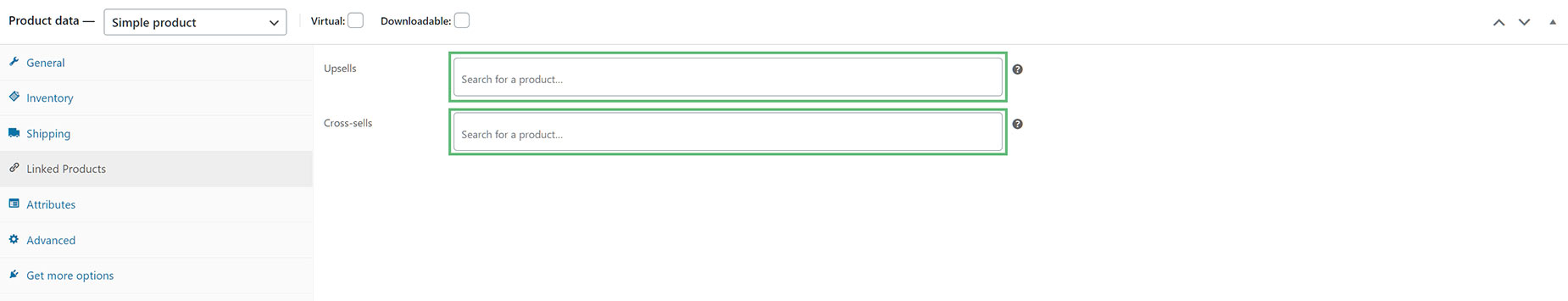
In contrast, the Woo Up/Cross-Sells Element displays products that have been manually added to specific WooCommerce products. This is done in the Linked Products section, as shown in the screenshot below. The Woo Up/Cross-Sells Element will then display any Cross-sells or Upsells when that specific product is viewed.
To use the Avada Woo Up/Cross-sells Element, add it to the desired display area. If the Woo Up/Cross-sells Element is added to a single product template, and the product viewed has Upsells specified, then the Upsells will appear where the Element is placed in the Layout. Cross-sells will not display here.
If the Element is also added to the Cart Layout, and there is a product in the cart that has Cross-Sells specified, then the Cross-Sells (and not the Upsells) will display in the Cart. Upsells display in the single product pages, and Cross-sells display in the Cart.

Element Options
Note: Please note that the displayed options screens below show ALL the available options for the element. If you have Avada’s Option Network Dependencies turned on, you will only see options relevant to your selections, and so the options screen may look somewhat different.


