Woo Product Grid Element

Last Update: August 29, 2025

The Avada Woo Product Grid Element allows you to display in a grid format on your website, either as the main shop page, or just wherever you want a grid of WooCommerce Products to be shown. You have control over which products display and how they are presented.

Watch the video below for a visual overview of the Element, view the Avada Woo Product Grid Element page for live examples, and read on to see the complete list of options.

For privacy reasons YouTube needs your permission to be loaded.

How To Use The Woo Product Grid Element

The Avada Woo Product Grid Element can be the basis for your main shop page, but you can also use it on any page where you want to display a grid of products. To add it to your main shop page, edit the assigned WooCommerce Shop page, design your layout, and add the Element into a Column.

Category or Tag can pull the Products displayed, and you can select or exclude specific categories or tags for complete flexibility. You can also specify how many products you want to display in total, how many columns to use, how they are ordered, and what type of pagination to use. There is also a range of design options for styling.
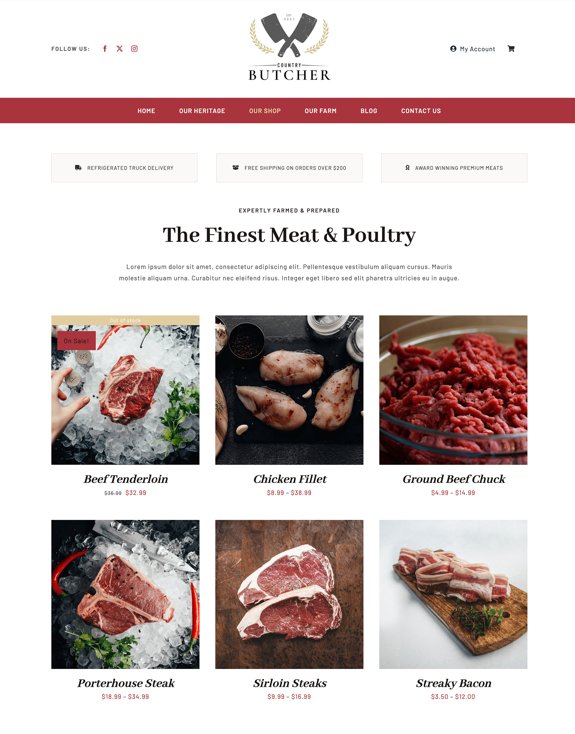
Avada Country Butcher Woo Product Grid

Element Options

Note: The displayed option screens below show ALL the available options for the element. If you have Avada’s Option Network Dependencies turned on, you will only see options relevant to your selections, and so the options screen may look somewhat different.

General

HeadingDescription
Pull Products ByChoose to show products by category or tag.
CategoriesSelect a category or leave blank for all.
Exclude CategoriesSelect categories to exclude.
TagsSelect a tag or leave blank for all.
Exclude TagsSelect a tag to exclude.
Number of ProductsSelect the number of products to display.
Product OffsetThe number of products to skip. ex: 1.
Number of ColumnsSet the number of columns per row.
Column SpacingInsert the amount of spacing between items without 'px'. ex: 40.
Order ByDefines how products should be ordered. NOTE: If Order by Price is not working, please regenerate the Product Lookup Tables here.
OrderDefines the sorting order of products.
Pagination TypeChoose the type of pagination.
Element VisibilityChoose to show or hide the element on small, medium or large screens. You can choose more than one at a time.
CSS ClassAdd a class to the wrapping HTML element.
CSS IDAdd an ID to the wrapping HTML element.

Design

HeadingDescription
Show ThumbnailDisplay the product featured image.
Show TitleDisplay the product title below the featured image.
Show PriceChoose to show or hide the price.
Show RatingChoose to show or hide the rating.
Show ButtonsChoose to show or hide Add to Cart / Details buttons.
Grid Box ColorControls the background color for the grid boxes.
Grid Border ColorControls the color of borders for the grid boxes.
Grid Separator StyleControls the line style of grid separators. NOTE: Separators will display, when buttons below the separators is displayed and Box Design mode set to Classic.
Grid Separator ColorControls the line style color of grid separators. NOTE: Only work when Box Design mode set to Classic.
MarginIn pixels or percentage, ex: 10px or 10%.

Extras

HeadingDescription
Animation TypeSelect the type of animation to use on the element.
Direction of AnimationSelect the incoming direction for the animation.
Animation ColorSelect the color of the animation
Speed of AnimationType in speed of animation in seconds (0.1 - 5).
Animation DelaySelect the delay time after the animation starts(0 - 5).
Offset of AnimationControls when the animation should start.

In this article