toTop Button

Last Update: April 10, 2024

The ToTop Button has been around for quite a while in Avada, unobtrusively assisting you back to the top of the page when required. At several times during the release cycle we have added enhancements to the script, to make this feature even more useful to you. Check out the full options of this useful feature below.

toTop Global Options

The toTop Button can be configured at Avada > Options > Extras > ToTop. It can be enabled/disabled separately for desktop and mobile, or for both, and there are a range of other settings to customize it.
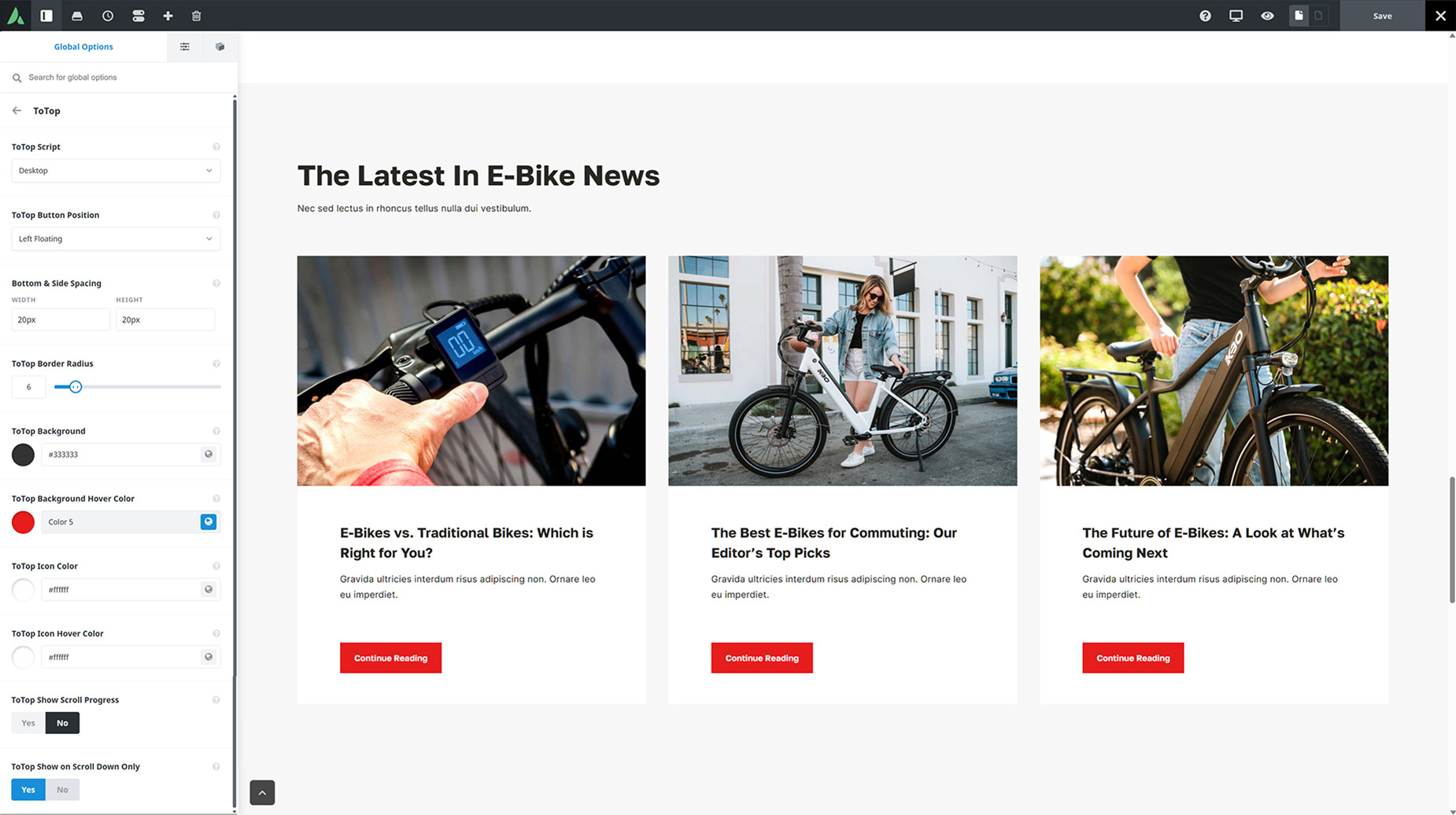
toTop Settings

  • Enable/Disable ToTop – The toTop Button can be enabled/disabled separately for desktop and mobile, or for both.
  • ToTop Button Position – You can now choose the position of the toTop button. Choose from Left, Left Floating, Right, or Right Floating. The Floating options lift the button off the base of the viewport to leave the button floating on the page.

  • ToTop Border Radius – You can now control the border radius of the ToTop button. For non-floating layouts, the border radius will only apply to the upper corners. In pixels. 0px would create an entirely square button, while 50px would create a circular button.

  • ToTop Background – You can also control the background color of the ToTop button, including full options for transparancy.

  • Background Hover Color Likewise, you can also control the background hover color of the ToTop button in the same way.

  • Icon Color – You can also control the color of the ToTop Icon.

  • Icon Hover Color – You can also control the background color of the ToTop icon in the same way.

  • ToTop Show on Scroll Down Only – You can now also choose to show the ToTop button on scroll down only. Otherwise it will always show if the page is scrolled.

Avada > Options > Extra > ToTop