Tooltip Element
Last Update: October 31, 2025
The Avada Tooltip Element allows you to create a “tooltip” linked to specific text. The Tooltip Element is an Inline Element, which means it is only accessible through the Avada Builder Element Generator. See the links below for more information on this.
Watch the video below for a visual overview of the Element, view the Avada Tooltip Element page for live examples, and read on to see the complete list of options.
How To Use The Tooltip Element
Note. As stated above, the Avada Tooltip Element is an Inline Element, which means that you can access it through the Avada Builder Element Generator. This Element can be used in all Elements that allow text editing in the Visual Editor and that therefore have access to the Avada Builder Element Generator.
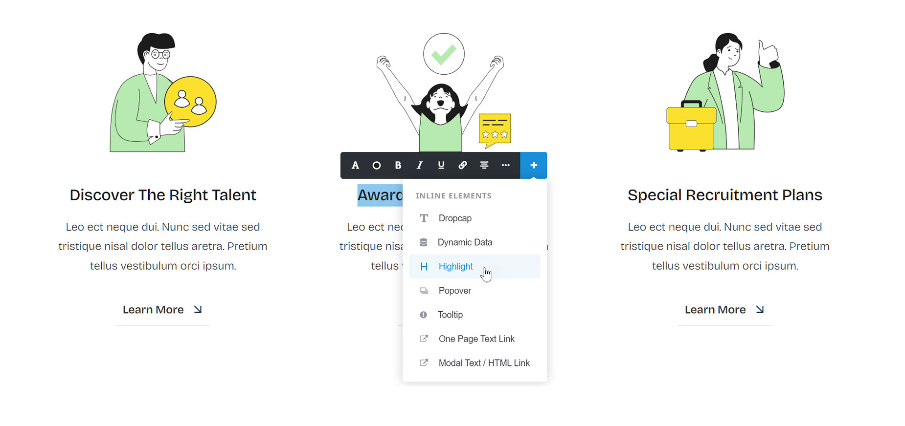
Add a text-based Element via the Avada Builder, for example, the Text Block Element. Add your content as usual, up to the point where you want the Tooltip to appear. Place your cursor at the end of your content and select the Avada Builder Element Generator icon on the Visual Editor toolbar. Select the Tooltip Element.
Add the Title, which is the text that is displayed in the Tooltip. Add the Content you want to trigger the Tooltip. Optionally, you can go to the Design tab and change the location and trigger for the Tooltip. When you are finished, click Insert.
You are now back in the Text Block Element. You can add more normal text content if you wish.
NB. The Tooltip Content will always display in the main site color.
What’s the difference between a tooltip and a popover? These two elements are very similar in many ways, but their intended usage is quite different. If you want to give a small, few-word, hint on how or what an element on the page does, use a tooltip. If you want to add any additional content, interactions, or content more than about a line; or if you need the content to remain open without the target being moused over, use a popover.
How To Use The Tooltip Element In Avada Live
Please see the Inline Elements document for more details on how Inline Elements work in Avada Live.


