The Avada Live Interface
Last Update: November 30, 2025
The Avada Live Visual Builder is Avada’s on-page, no-code editor that lets you design your WordPress site exactly as you see it—right on the front end. You click any part of the page, type to edit text inline, drag and drop Avada Elements, tweak spacing and colors, and watch changes appear instantly. Because it’s truly visual, there’s no need to bounce between a backend editor and a separate preview; what you’re building is exactly what visitors will see.
It comes loaded with highly flexible Design, Layout, Form Elements, and the creative Avada Library, so you can spin up hero areas, content, galleries, forms, pricing tables, and entire page or post layouts in minutes, all automatically matching your brand through global styles for colors, typography, and spacing. You can customize your designs for different devices (from mobile to desktop), craft headers, footers, and even WooCommerce product pages with the same editor, and reuse your favorite sections anywhere to move faster. The result is a professional, consistent, and responsive Avada website without touching code—perfect for beginners who want speed and confidence, and powerful enough for pros who want precise control.
The UI Toolbar
The Toolbar runs along the very top of the page in the Avada Live Visual Builder. This provides access to many page-building tools in much the same way as the back-end builder. It is also sticky, so it always remains at the top of the page as you scroll, providing constant access to its essential functions. Let’s have a look at these central components:

The Live Workspace
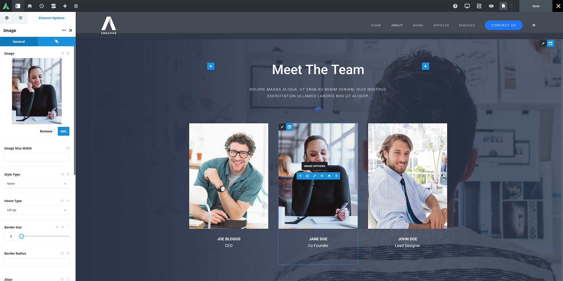
When you are in Avada Live, the only things that really differentiate it from a front-end page are the Toolbar along the top and the few icons overlaid on the content. It is when you mouse over these icons that you can fully see and access the Element Controls.
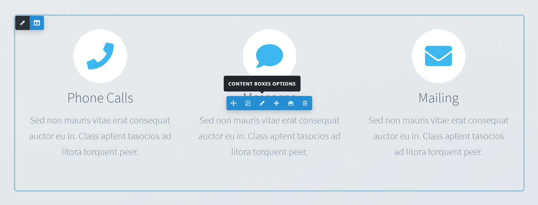
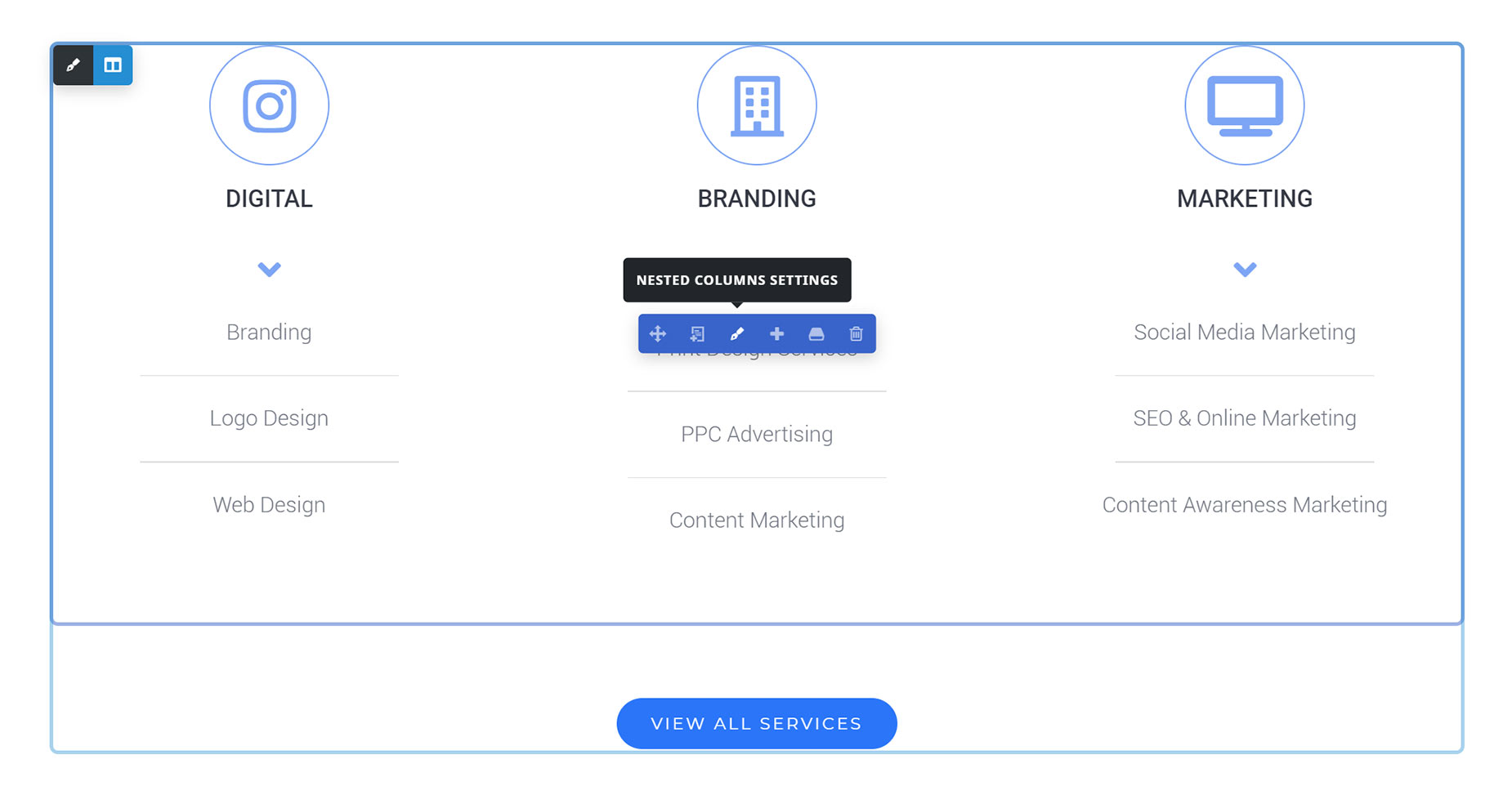
There are Controls for every editable part of the page. There are Container Controls, Column Controls, and individual Element Controls, as well as Avada Nested Columns and separate controls for both Parent and Children items in Elements that use this structure. Just mouse over a content area, and you will see the Element Controls for whatever content is there. Mouse over the various controls below to see a description of their function.
The Avada Container Controls

The Avada Column Controls

The Avada Design, Layout, & Form Elements
When you go to add an Element, the Element dialog appears. Depending on the plugins you have installed and the options you have enabled, you might see a different number of Avada Design Elements available. From the Avada Dashboard, you can go to “Options > Builder Options” to check that all available Elements are enabled.
There are four tabs across the top: (A) Design Elements, (B) Library Elements, (C) Nested Columns, and (D) Avada Studio. You can also search for an Element using the (E) search option.

The Individual Element Controls
When you mouse over an element, it expands to show the full range of controls for that item. The majority of these controls are the same across all Avada Elements, though a few are specific to the item. For example, all items have (A) Drag Element, (B) Clone Element, (C) Edit Element Options, (D) Add Element Below, (E) Save Element, and (F) Delete Element icons, except for child elements and individual columns inside a Nested Columns Element, which can’t be saved independently to the library, and so don’t have the Library icon. Also, Avada Columns have an additional control to change the Column Size.

Explaining The Color-Coded Element Controls
Depending on the type of page content you are editing, you will also notice some different colors on the Element Controls. This is to help differentiate content at a glance.
Editing With The Element Controls
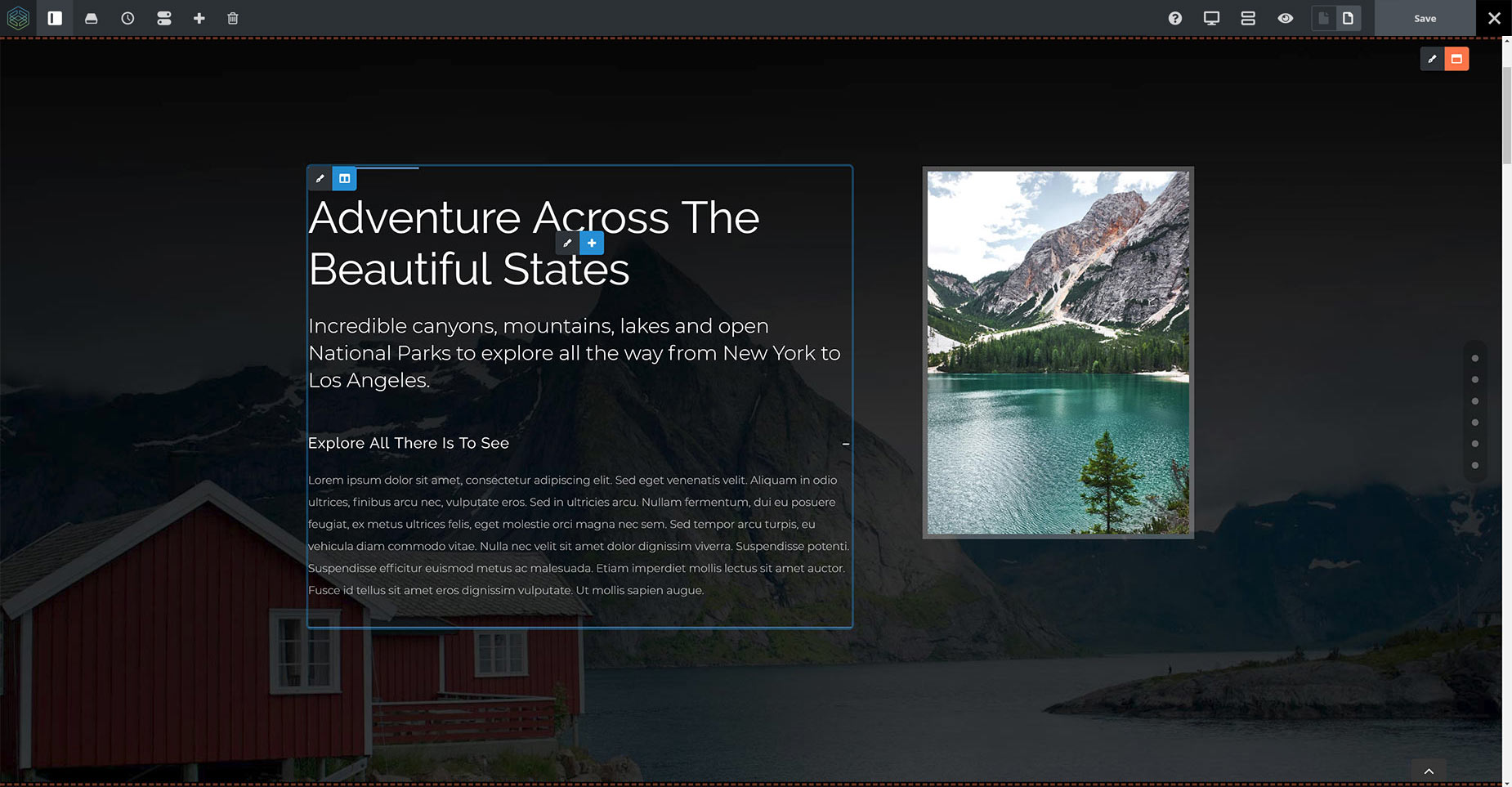
When you edit the Options of a Container, Column, or Element (the pen icon), the Element Options panel opens in a Sidebar on the left of the page. If you prefer, you can change the Element Editing Mode setting in the Avada Live Preferences to open it in a standalone dialog instead. Once you have set your preferred working position, it will open in that area from then on, unless you change it again.
Now you can edit the Avada Element as you would in the back-end editor, with the main difference being you can see the Element at the same time, and any changes you make to the Avada Element are reflected in real time on the page.
Depending on the Avada Element you are editing, you will have a range of options and tabs to configure it. Your changes will be visible on the page immediately. When you have completed editing the Element, you can move on to the next Element. There is no Save button at the bottom of the Element Options, as there is a Global Save button in the top-right corner of Avada Live. Click “Save” there whenever you wish to commit your changes. Note that this will clear the History States.
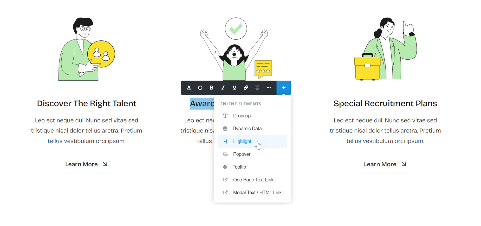
Inline Editing
Working with text is a little different. With the Avada Title Element and Avada Text Block Element, and in fact any aspects that have a text component, you can edit directly on the page without the need for any Element dialog.
Click in the text where you want to edit, and start typing. Also, if you select some text, the Inline Editing dialog appears. To fully understand Inline Editing, please see this help file.
Setting Avada Live As The Default Builder
You can also set the Live Builder to be your default builder. Just head to Options > Builder Options, from the Avada Dashboard. Here you will find the Builder Auto Activation option. You can turn on Live Builder to enable the live interface by default when opening a WordPress page or post.
Avada Live Preferences & Shortcuts
You can customize the Avada Live Workspace to some degree by setting your preferences. This is found in the main Toolbar, under the preferences icon. See the Avada Live Preferences doc for more information on these. There is also a range of shortcuts that can speed up your workflow in Avada Live. These can be found on the Toolbar under Support > Shortcuts.
In Avada Live, you don’t need to return to the WordPress Dashboard to navigate to new pages. Once you have edited and saved a page, you can navigate to another page using the main menu and keep editing. If the Header Icons are blocking the menu, click the Preview Icon to see the menu without any icons interfering.
You can also navigate to other linked pages on buttons by holding down Cmd/Ctrl while clicking on the button. When leaving Avada Live, the Exit Icon gives you three choices: the page front end, the back end, or the WordPress Dashboard.
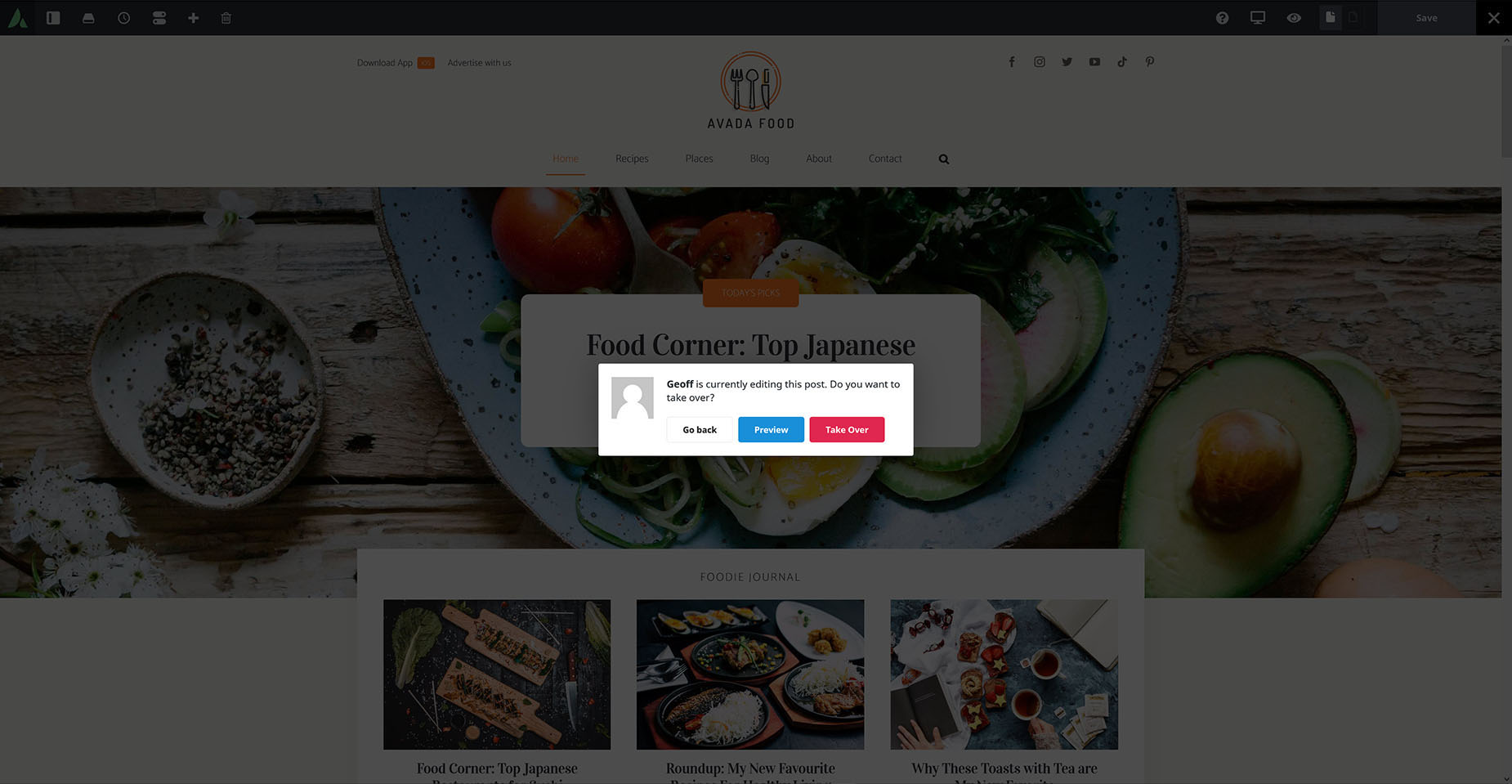
Post Lock
When one user is editing a page or post, and another user attempts to edit the same page, they are shown a pop-up that explains the page is already being edited. They have the option to return or to take over the edit. On the post or pages page, you can also see when another user is editing a post.
Page Areas Outside The Builder
There are also areas of the page that are not directly editable in Avada Builder, as their content is generated via the Avada Global Options or other areas of WordPress. These are areas such as the Header, Footer, Sidebars, and Sliding Bars.
In Avada Live, there is a series of icons in these areas to enable fast access to them in WordPress or Avada for making changes.
In Summary
As you use Avada Live, the workflow and controls will quickly become logical and evident. The beauty of this front-end builder’s design is that it stays out of the way as much as possible, yet everything you need is right at your fingertips.
Watch our related Avada tutorial videos and read our full range of Avada Builder documentation for more information for further information.


