Switch Element

Last Update: October 29, 2026

The Avada One Switch Element is a simple element that allows a user to switch between one element and another in the same space on the page.

Read on to see the complete list of options, and watch the video below for a visual overview of the Element.

How To Use The Switch Element

The Switch Element is what it says. It’s a switch. What it does is allow you to switch between two other elements, below or next to it. The elements can really be anywhere, but the user will only see the switch if they are visible on the screen at the same time as the switch itself.

To set this up, add the Switch Element on the page, and configure it. There are also a large range of styling options with the Switch Element, but the most important option is the Switch Name. Other elements target this name in their “Dynamic Display” condition to show or hide based on this switch’s state. You configure one element to display in the Off state, and one element to display in the On state.

  • Add Switch Element.

  • Configure the options, including a unique Switch Name.

  • Add your two other elements below it (or next to it) an configure them. See the video above for examples. These can be Containers, Columns, or even individual Elements.

Setting Up Dynamic Display Logic

The Dynamic Display Logic is found at the bottom of on the extras tab on all elements. Select Switch as the Condition Type, add your Switch Name in the field below, and set your relational operator. Equal To > No sets the content to display with the OFF state for the Switch, while Equal To > Yes would set the content to the ON state.
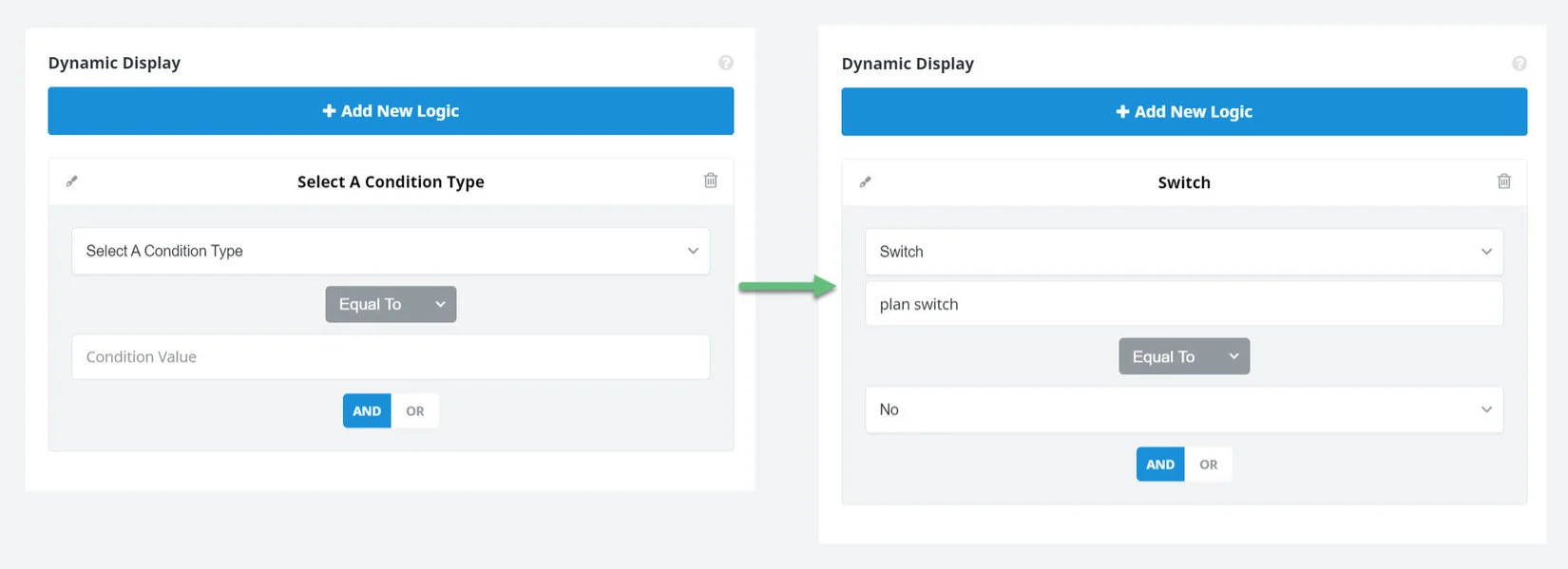
Switch > Dynamic Data Logic

Element Options

Note: Please note that the displayed option screens below show ALL the available options for the element. If you have Avada’s Option Network Dependencies turned on (Options > Advanced > Features), you will only see options relevant to your selections, and so the options screen may look somewhat different.

General

HeadingDescription
Switch NameA unique key for this switch. Other elements target this name in their "Dynamic Display" condition to show or hide based on this switch's state.
Default StateChoose whether the switch is on or off when the page first loads.
Remember StateChoose whether the visitor's choice is remembered. "Session" lasts until the tab is closed. "Always" persists across future visits and is also honored on the very first server-rendered page load.
Label StyleChoose where the switch's text lives: either side of the track, or inside the track itself (which expands to fit it).
AlignmentHorizontal alignment of the switch within its container.
Off LabelThe switch's off-state label. Outside: shown to the left of the track. Inside: shown while the switch is off.
Off Sub LabelOptional smaller line shown beneath the Off label. Leave empty to omit it.
On LabelThe switch's on-state label. Outside: shown to the right of the track. Inside: shown while the switch is on.
On Sub LabelOptional smaller line shown beneath the On label. Leave empty to omit it.
Equal Width LabelsMake both sides the same width (sized to fit whichever label is longer) instead of each side hugging its own text. For "Outside", this also keeps the track centered when only one side has text.
Experiment EventsSelect any available Avada Experiment events to this element. Note: if you are already using the selector to trigger this, no need to add here.

Element VisibilityChoose to show or hide the element on small, medium or large screens. You can choose more than one at a time.
Element Sticky VisibilityChoose to show or hide the element, based on the current mode (normal or sticky) of its parent container. You can choose more than one at a time.
CSS ClassAdd a class to the wrapping HTML element.

CSS IDAdd an ID to the wrapping HTML element.

Design

HeadingDescription
MarginEnter values including any valid CSS unit, ex: 4%.

Track WidthIn pixels. Not used by the "Inside" style, which sizes itself to fit its labels.
Track HeightIn pixels. For the "Inside" style this is a minimum -- the track still grows to fit taller label/sub-label text.
Thumb InsetSpace between the moving thumb/highlight and the track's edge, in pixels.
Elastic TransitionChoose whether the moving thumb/highlight bounces past its resting position before settling ("elastic"), or eases straight to it.
Label GapSpace between the track and its label(s), in pixels. Not used by the "Inside" style.
Label PaddingHorizontal padding inside each label's cell. This is what makes the "Inside" style expand to fit longer text.
Track ColorThe track's (or, for "Inside", the pill's) color while the switch is off -- use the "On" state to set its color while the switch is on.
Thumb ColorOutside/Single: the round thumb's color. Inside: the sliding highlight block behind the active label.
Border SizeControls the border size. In pixels, ex: 10px.
Border Color
Border RadiusEnter values including any valid CSS unit, ex: 10px.
Label ColorOutside/Single: label text color. Inside: color for the label NOT on the highlight -- use the "On" state for the label that is.
Label TypographyApplies to every label in every style. Leave empty to inherit from Theme Options.
Sub Label ColorColor of the smaller sub-label line. Inside: color for the sub-label NOT on the highlight -- use the "On" state for the one that is. Leave empty to inherit the main label color at reduced opacity.
Sub Label TypographyApplies to every sub-label in every style. Leave empty to inherit the main label typography, sized down.

Extras

HeadingDescription
Conditional RenderingAdd conditional rendering logic for the element. The element will only be part of the post / page contents, if the set conditions are met. NOTE: Server cache can interfere with results.

Animation TypeSelect the type of animation to use on the element.

Direction of AnimationSelect the incoming direction for the animation.
Animation ColorSelect the color of the animation
Speed of AnimationType in speed of animation in seconds (0.1 - 5).
Animation DelaySelect the delay time after the animation starts(0 - 5).
Offset of AnimationControls when the animation should start.

Dynamic DisplayShow or hide this element dynamically based on real-time cart and wishlist state. Changes apply immediately without a page reload. NOTE: Server cache can interfere with initial visibility.

In this article

Go to Top