Project Details Element
Last Update: May 27, 2025
As part of Avada Layouts, we created a series of Dynamic Elements that help generate content in the Content Layout Section of a Layout. These are called Layout Elements. In this document, we are looking at the Project Details Element.
Watch the video below for a visual overview of the Element, view the Element demo page for live examples, and read on to see the full list of options.
How To Use The Project Details Element
The Project Details Element is a specific portfolio element, designed to add the project details from a Portfolio post anywhere in a Content Layout Section, in any Single Portfolio Layout. Of course, you can also use the full range of Design Elements when building your Layout, and combine them with the Layout Section Elements.
When you go to add an Element in a Content Layout Section, the Element dialog opens in a new tab called Layout Elements. This is where you will find the Project Details Element.
The Project Details Element can be placed anywhere in you Layout Section, and duplicates the Project Details that you normally see in a Portfolio item on the right of the page, as seen below.
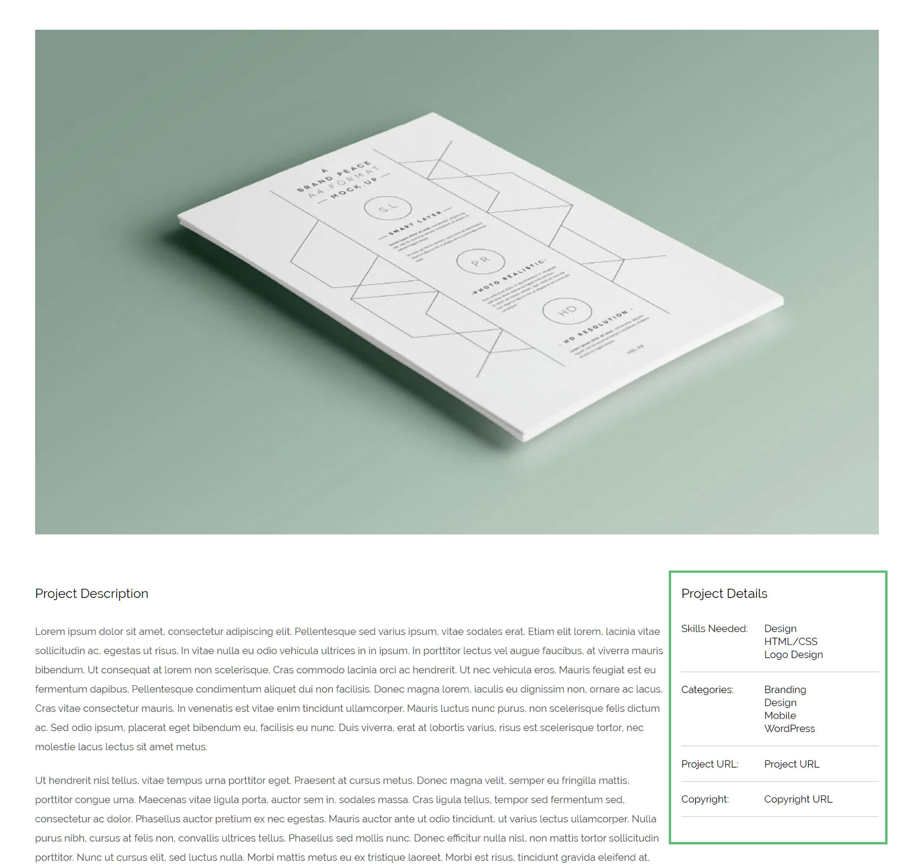
There are a few options with the element about how it displays, with regard Headings and Headings size etc. See the options panels below for specific details on that.
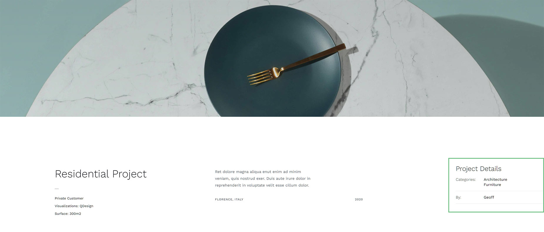
See below, for an example of the Project Details Element as added to the Portfolio Single Post Layouts on the Interior Design Demo.
Element Options
Note: Please note that the displayed options screens below show ALL the available options for the element. If you have Avada’s Option Network Dependencies turned on, you will only see options relevant to your selections, and so the options screen may look somewhat different.


