The Avada Popover Element is a simple yet elegant way to display information without disrupting your page layout. The Popover Element can be used as a stand-alone Avada Element. Still, it is also an Inline Element, accessible from the Inline Editor. You can add popovers to text, images, and even buttons!
Watch the video below for a visual overview of the Element, view the Avada Popover Element page for live examples, and read on to see the complete list of options.
For privacy reasons YouTube needs your permission to be loaded.
You can add popovers to any text content or image you have—for example, a word between paragraphs or an entire sentence. You can also add popovers on buttons; however, to do that, it requires a few more steps. Continue reading below to learn about how to add popovers to text, images, and buttons.
How To Add Popovers To Text
There are two ways to add a Popover to text – to pre-existing text, or through the Popover Element itself. Let’s look at both ways.
Existing Text
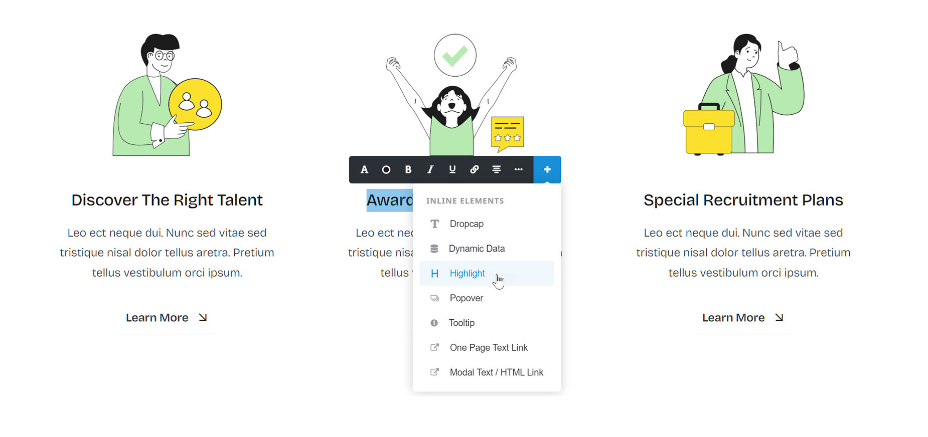
Step 1 – Select the text you want to be the trigger for the Popover in any Element that has a Text component, such as the Avada Text Block Element or Avada Title Element. If you are working with the Avada Live Visual Editor, the Inline Editor will appear, and from the + button, you can choose the Popover Element. If you are in Avada Builder, you will need to edit the Text-based Element and select the trigger text in the WordPress content editor field inside the Element.
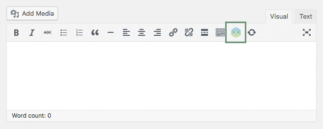
Step 2 – On the toolbar, you’ll find the ‘Avada Builder Element Generator’ icon, which looks like the Avada logo. Click the ‘Element Generator’ icon to bring up the Elements window.
Step 3 – Select the ‘Popover’ Element.
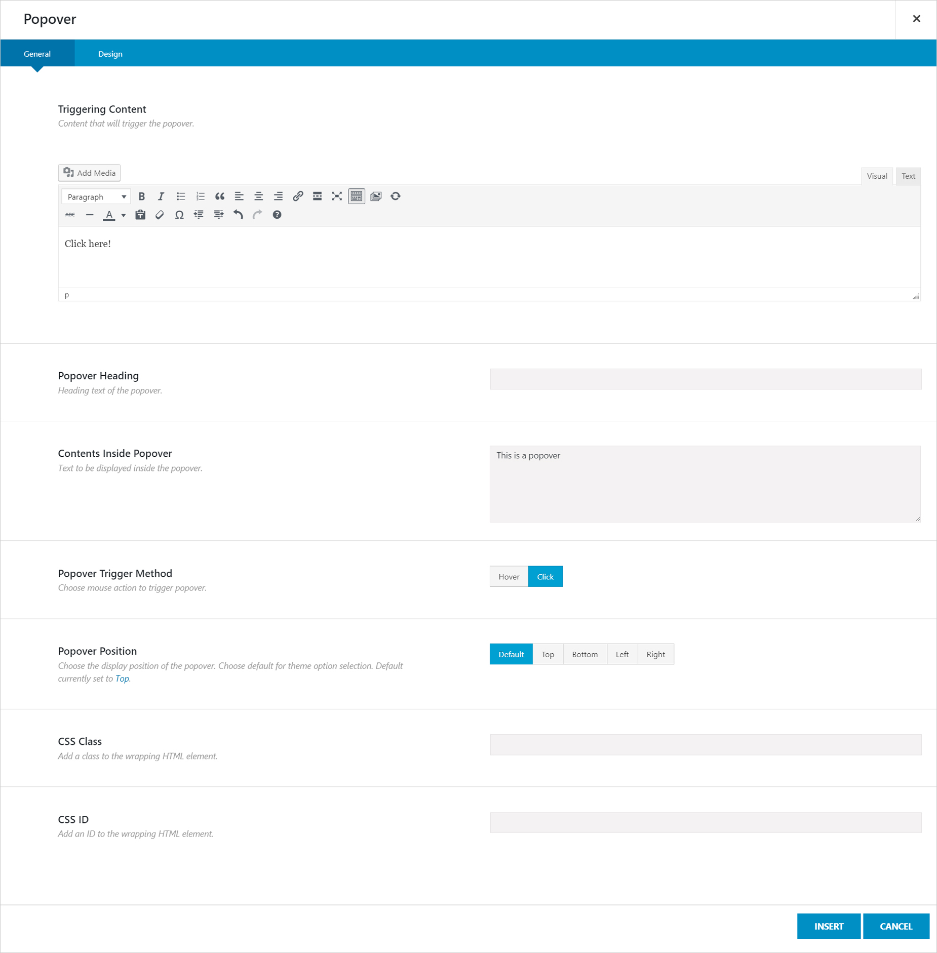
Step 4 – In the ‘Triggering Content’ field, you will see the text you have selected to trigger the popover with. For example, View More Info Here!.
Step 5 – In the ‘Popover Heading’ and ‘Contents Inside Popover’ options, insert the heading text and the content, respectively, that you’d like to display in the popover.
Step 6 – Set the other options such as the trigger method, popover position, heading/content background color, and other styling colors found in the Design tab.
Step 7 – If you are working in the back-end Avada Builder, click the ‘Insert’ button, and you will be back in the original text-based Element. Click “Save”.
Standalone Element
Step 1 – Select the Column you wish to place your Popover content in, and select Popover from the Element list.
Step 2 – In the ‘Triggering Content’ field, you need to add some content. This can be plain text, or it could be another Element, chosen from the Avada Builder Element Generator. Not all Elements will work with this method. Stick to basic things like text, images, or buttons, etc. It’s with this method that we can add Popovers to images and buttons.
Step 3 – Click Insert to add the generated Element into the Triggering Content field.
Step 4 – Set the other options, such as the trigger method, popover position, heading/content background color, and other styling colors, found in the Design tab. If you are working in the back-end Avada Builder, click Save to finish editing the Element.
How To Add Popovers To Images
Instead of adding a Popover to an Image, we do it the other way around – we add an image to a popover.
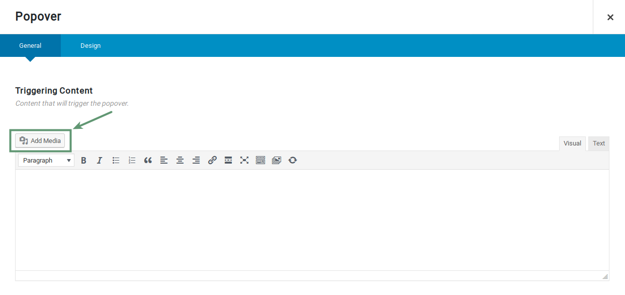
Step 1 – Add the Popover Element to your content where you wish the image to display.
Step 2 – In the Triggering Content options, you need to add your image. Locate the WordPress content editor field in your chosen element. On the toolbar, you’ll find the ‘Avada Builder Element Generator’ icon, which looks like the Avada logo. Click the ‘Element Generator’ icon to bring up the Elements window.
Step 3 – Select the ‘Popover’ Element.
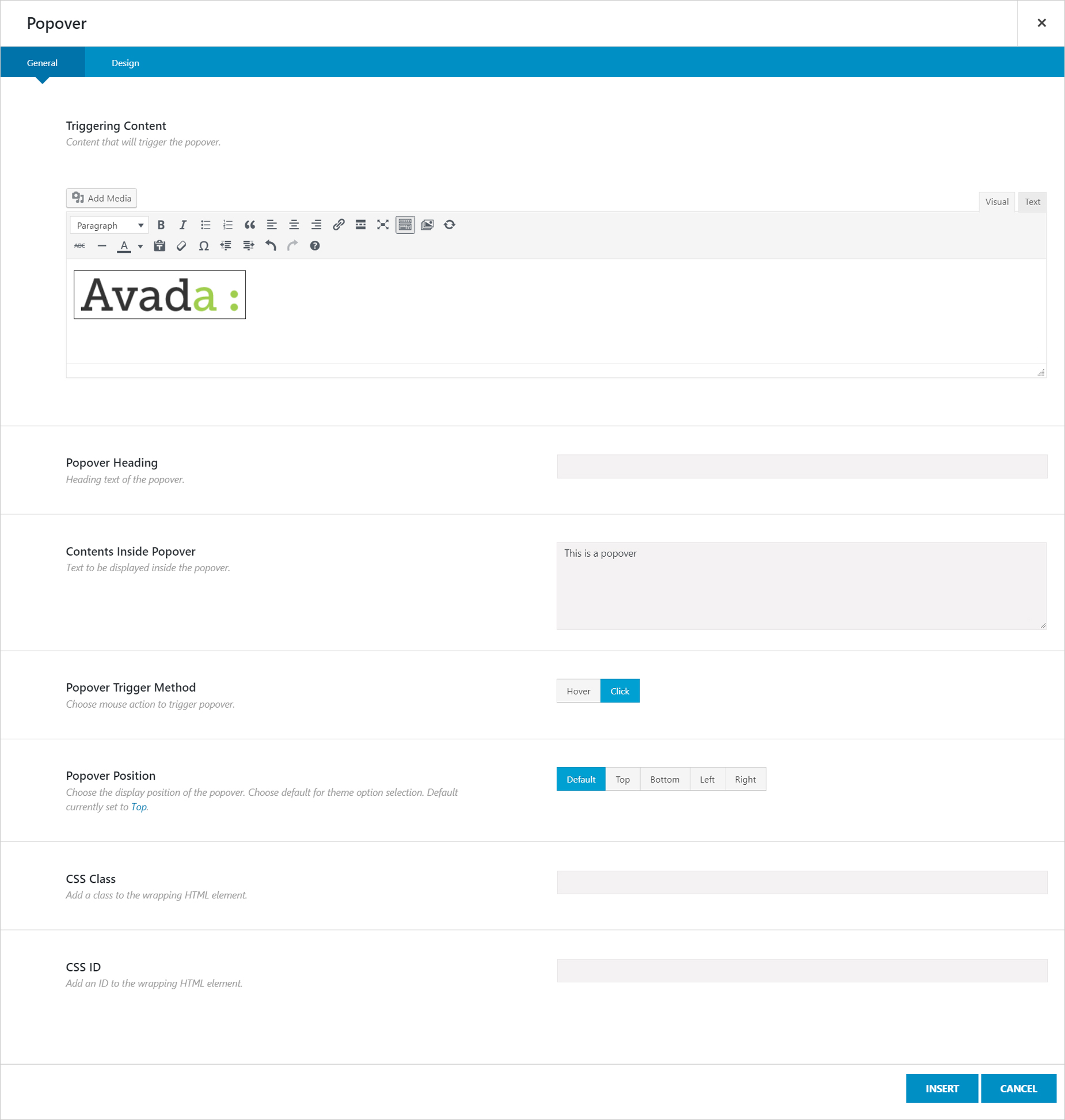
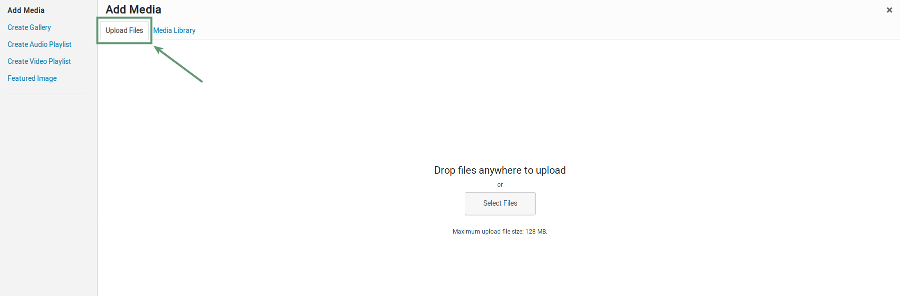
Step 4 – In the ‘Triggering Content’ field, click ‘Add Media’ button, and select a picture from the Media Library. If there are no images in the Media Library, go to the ‘Upload Files’ tab and upload an image. Upon selecting the chosen image, click the ‘Insert into page’ button.
Step 5 – In the ‘Popover Heading’ and ‘Contents Inside Popover’ options, insert the heading text and the content, respectively, that you’d like to display in the popover.
Step 6 – Set the other options such as the trigger method, popover position, heading/content background color, and other styling colors found in the Design tab.
Step 7 – Once finished, click the ‘Insert’ button.
Step 8 – You can then add content into the main Element as needed. Once you’re done, click ‘Save’ to save your changes.
How To Add Popovers To Buttons
Step 1 – Create a popover by following the instructions in the ‘How To Add Popovers To Text’ section above. Make sure to set the ‘Triggering Method’ option to ‘Hover’ for the popover to display when hovering over the button.
Step 2 – Insert the popover element to the page, then switch to the Default Editor to copy the popover’s code snippet. Once you’ve copied it, you can discard it. It looks something like this:
Copy to Clipboard
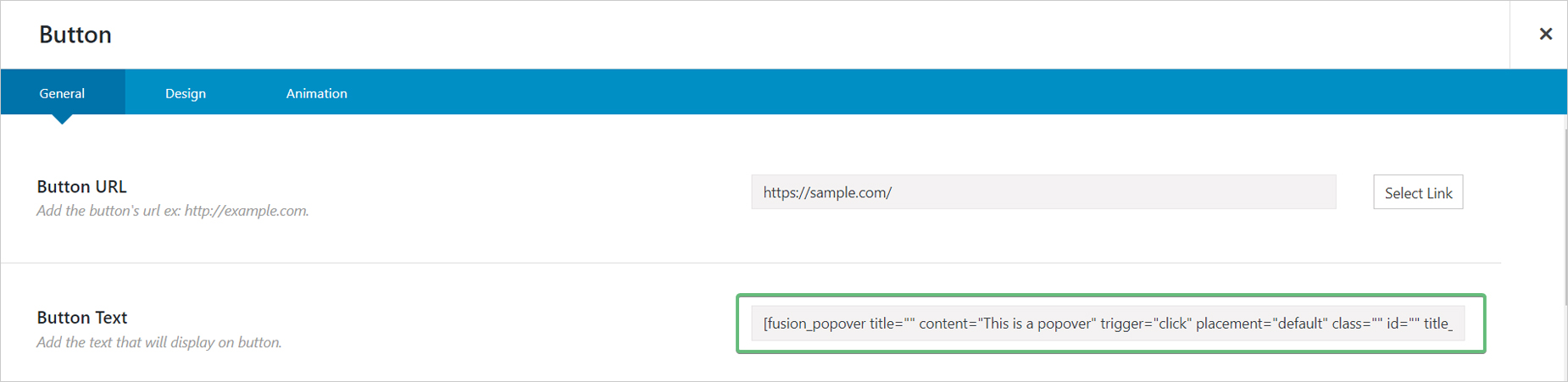
Step 3 – Activate the Avada Page Builder again and insert a Button Element. Click the ‘Settings’ icon to bring up its options window.
Step 4 – Paste the Popover code snippet you just copied into the ‘Button’s Text’ field. You can then customize the button to your liking using the available options. Once you’re finished customizing the Button Element, click the ‘Save’ button.
Inline Elements In Avada Live
Please see the Inline Elements document for more details on how Inline Elements work in Avada Live.
Element Options
Note: The Default setting will use the global settings assigned for this element in the Options > Avada Builder Elements > Popover section. Also note that the displayed option screens below show ALL the available options for the element. If you have Avada’s Option Network Dependencies turned on, you will only see options relevant to your selections, and so the options screen may look somewhat different.
General
Heading
Description
Triggering Content
Content that will trigger the popover.
Popover Heading
Heading text of the popover.
Contents Inside Popover
Text to be displayed inside the popover.
Popover Trigger Method
Choose mouse action to trigger popover.
Popover Position
Choose the display position of the popover. Choose default for Global Options selection.
CSS Class
Add a class to the wrapping HTML element.
CSS ID
Add an ID to the wrapping HTML element.
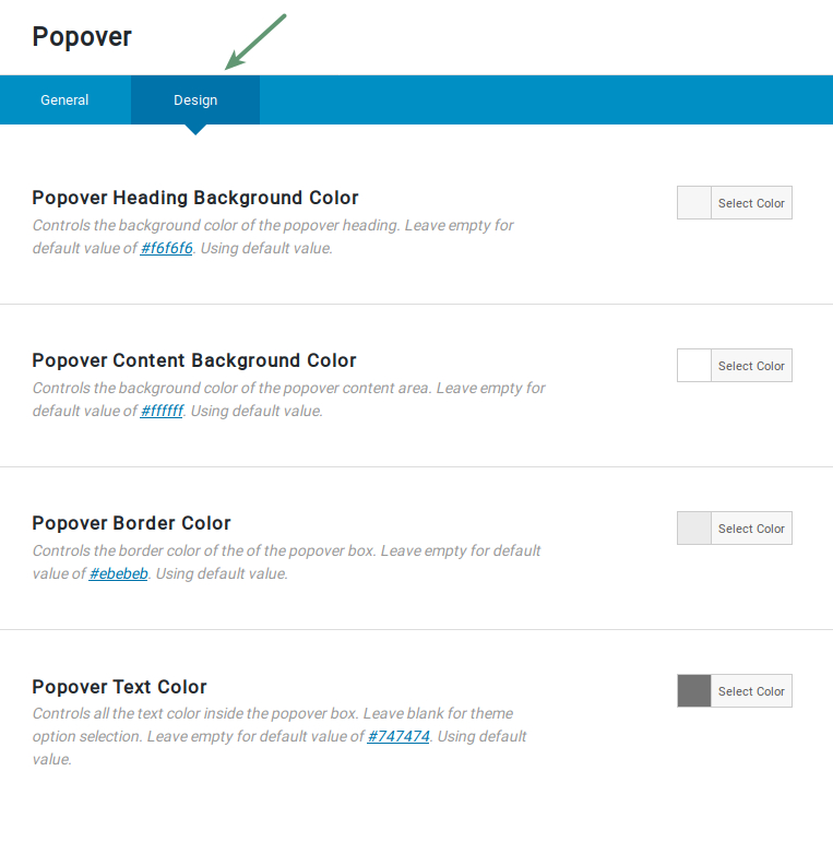
Design
Heading
Description
Popover Heading Background Color
Controls the background color of the popover heading.
Popover Content Background Color
Controls the background color of the popover content area.
Popover Border Color
Controls the border color of the popover box.
Popover Text Color
Controls all the text color inside the popover box.


