Main Menu Highlight Styles
Last Update: October 30, 2025
Menus are critical navigational tools on websites, and you want your menu to be appealing and easy to use. This is where Menu Styles can play an important role. There is a large range of menu highlight styles that can be chosen for adding an indicator to your Main Menu items when they are the active link, or when you hover over a menu item. Let’s take a look below for more details on each style choice.

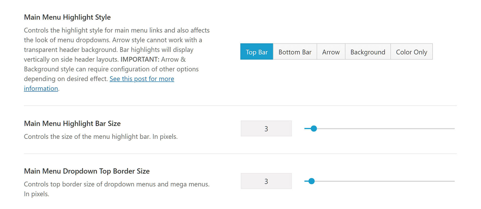
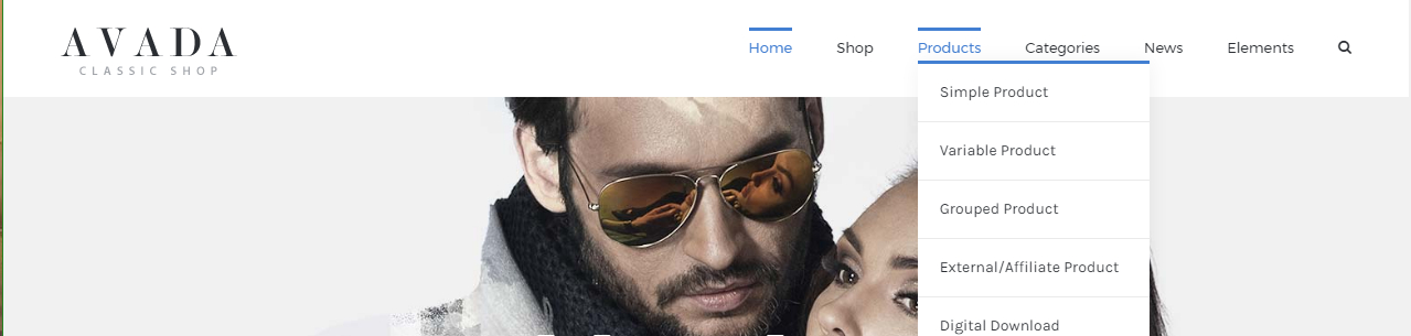
Top Bar Highlight Style

You can choose the Top Bar highlight style for your menu items in Avada > Options > Menu > Main Menu. Primarily, there are three settings which affect the Top Bar highlight style. These are shown below.
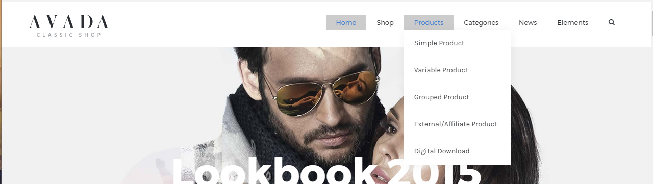
Bottom Bar Highlight Style

The Bottom Bar highlight style is similar to the Top Bar Highlight Style, but with the bar underneath. This option features a smooth underline, that grows outward from the center of the menu item. The same settings will affect the positioning and style of the Bottom Bar highlight style. These are shown below.
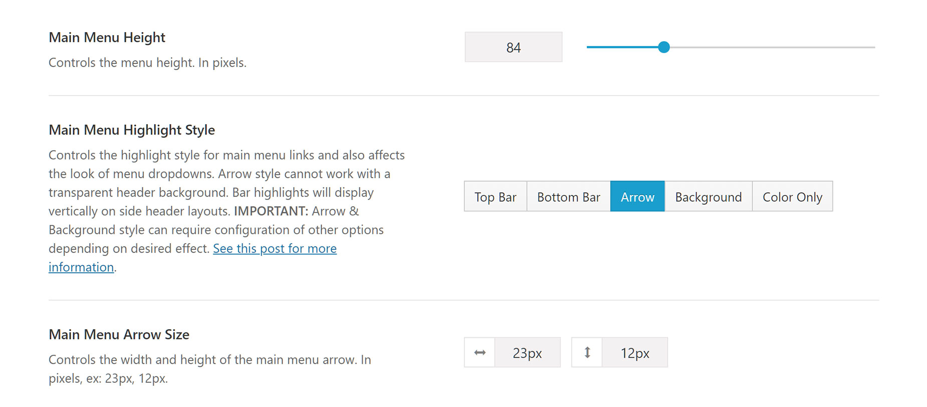
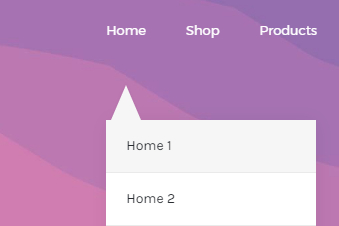
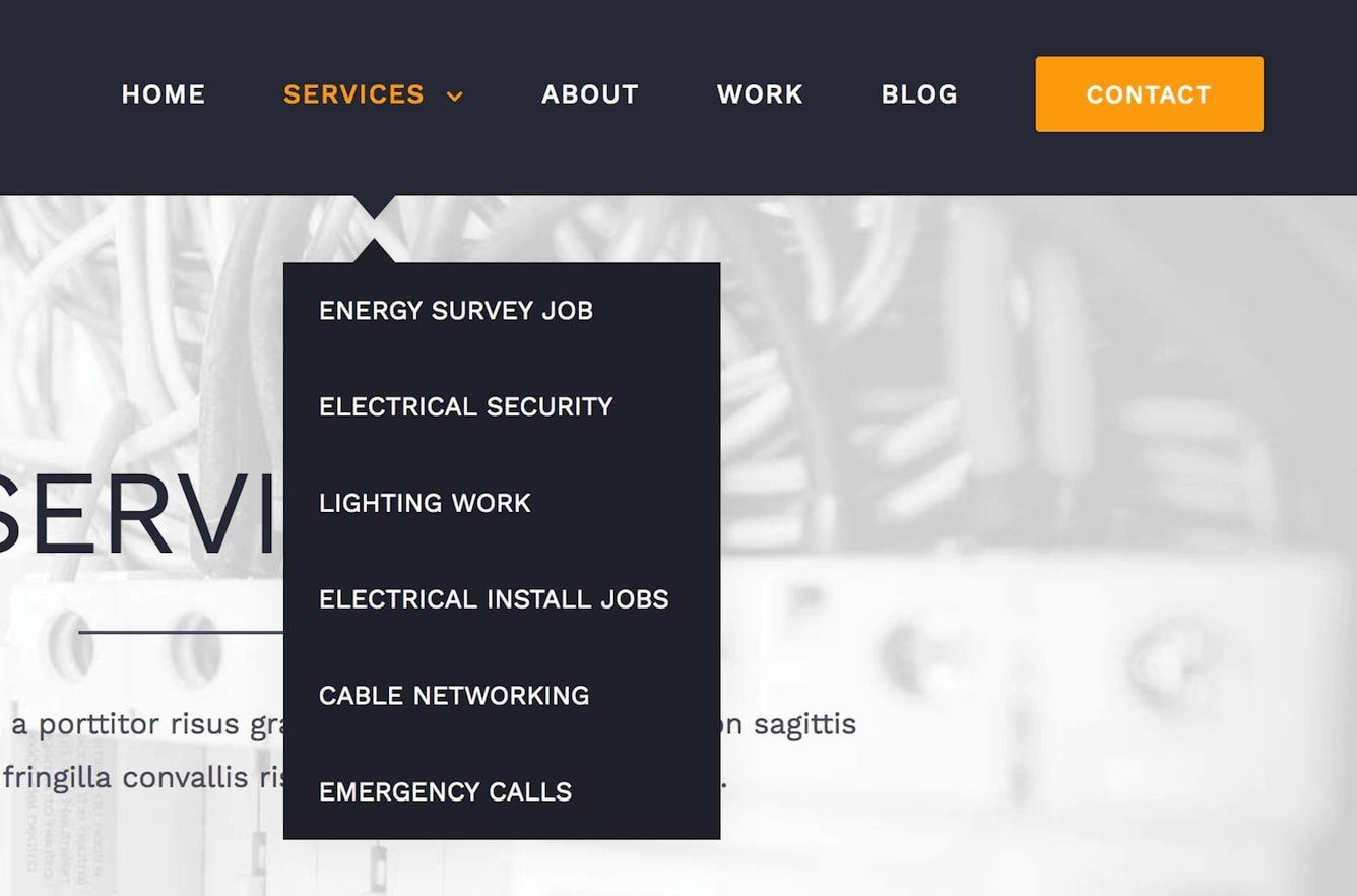
Arrow Highlight Style
You can choose the Arrow highlight style for your menu items in Avada > Options > Menu > Main Menu. This effect will not appear for main menu items when using a transparent header background. However, sub-menu items will still have the lower half of the arrow effect.
This style is most effective when a slider, or page Title Bar, or other colored content sits right up to the header, or if the header itself has a colored background or image. If the header is white, and the content directly below the header is white, the arrows will not be able to be seen.
There are several settings which can be used to adjust the positioning and appearance of the main menu when using this effect. These are listed below, along with an explanation of how they affect your menu.
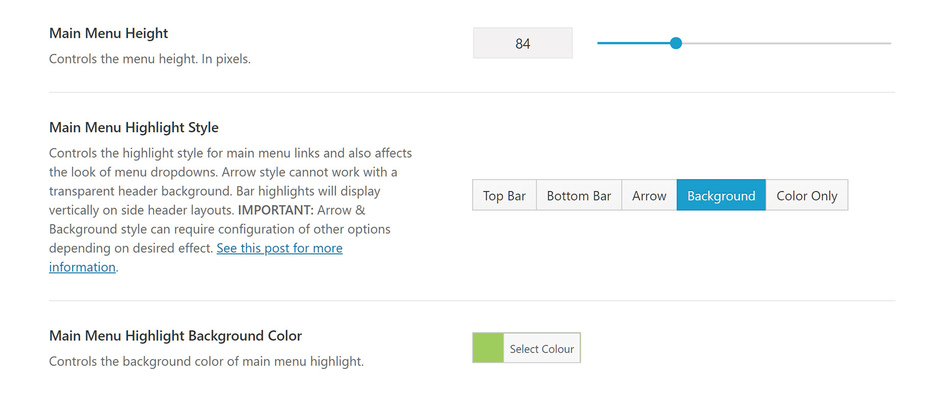
Background Highlight Style

You can choose the Background highlight style for your menu items in Avada > Options > Menu > Main Menu. The Background color will cover the whole menu item’s height as set in the Main Menu Height option seen in the example image for this section.
There are several settings which can be used to adjust the positioning and appearance of the main menu when using this effect. These are listed below, along with an explanation of how they affect your menu.
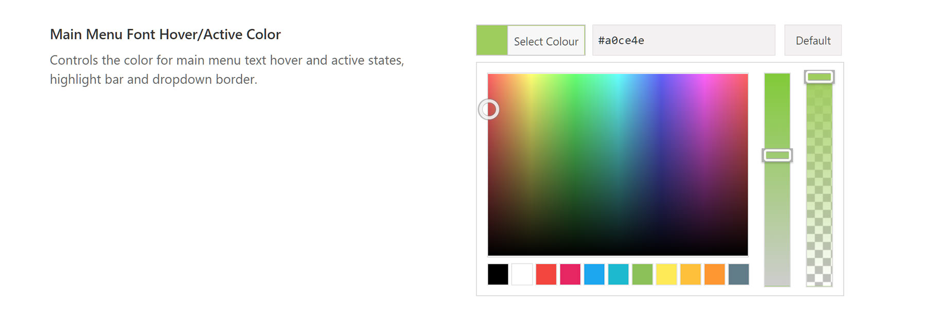
Color Only Highlight Style

The Color Only Menu Highlight style is very similar to the TopBar and Bottom Bar highlight styles, just without the bar. The main option that affects it is the Main Menu Font Hover Color, as listed below.
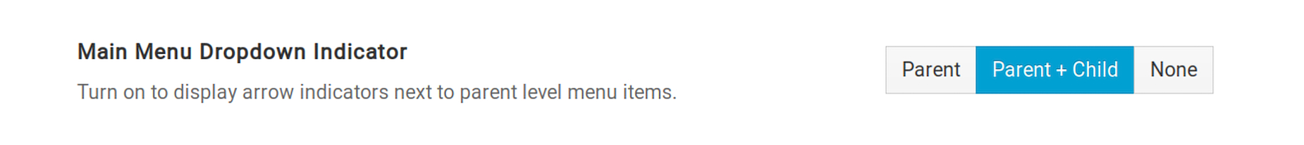
Main Menu Dropdown Indicator
In Avada 5.6 and up, you have the option to choose if you want to have an arrow indicator in both parent and child level menus. In previous versions of Avada, the default was currently set to either just parent or none. This option is available on all main menu highlight styles. To set this, go to Avada > Options > Menu > Main Menu.
Regardless of the menu highlight style that you choose, you’ll likely want the option to set your main menu height and not lose the header’s vertically centered appearance. Here we’ll show you which global options can be adjusted to get the positioning you like best. Your main menu height will affect the distance between the dropdown menu items and the parent menu, the distance your highlight bar is from the menu item, the highlight background color filled area and the position of your main menu in general.
To adjust your Main Menu’s position in the header, follow these steps:


