Responsive Design in Avada
Last Update: April 20, 2026
Designing for various screen sizes is an important aspect of website design, due to the rise of smartphone browsing, and especially the fact that Google uses the mobile version of a site’s content for indexing and ranking.
Let’s look at the various ways in which you can use Avada to design your pages so that they look great on desktop, tablet and mobile. Read below to explore how easy it is to edit your pages for responsive content in Avada, and watch the video for a visual overview.
Responsive Editing Mode
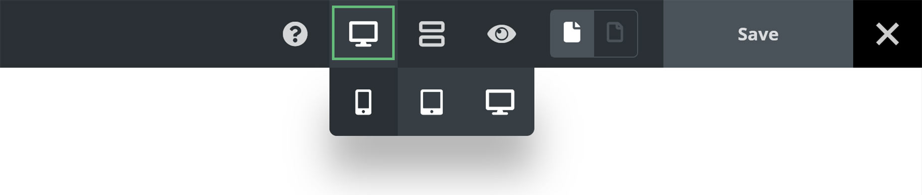
The key to Live Responsive Editing in Avada Live is the Responsive Icon on the Toolbar. Not only does this provide responsive previews for your content, but it is also a responsive editor.
You can choose from Large, Medium or Small Screen. These give you an emulated preview of your page content as it will appear on the selected screen size, and hides any containers etc. that are turned off for that screen size. It also allows you to edit any of the options that are part of the Responsive Option Sets, and only have the changes you make reflected at that specific screen size. This is achieved through the Responsive Option Sets feature.
What this means, is that you can now present the same content in completely different ways on Large, Medium and Small screens. For example, you can change the margins and padding of Containers, change the width and order, as well as the spacing, margins and padding of Columns.
Global Options
There are many form factors today with screens. What with desktops, laptops, tablets and smart phones, there is a huge range of aspect ratios, and it’s sometimes very difficult to tell what your content will look like on every device.
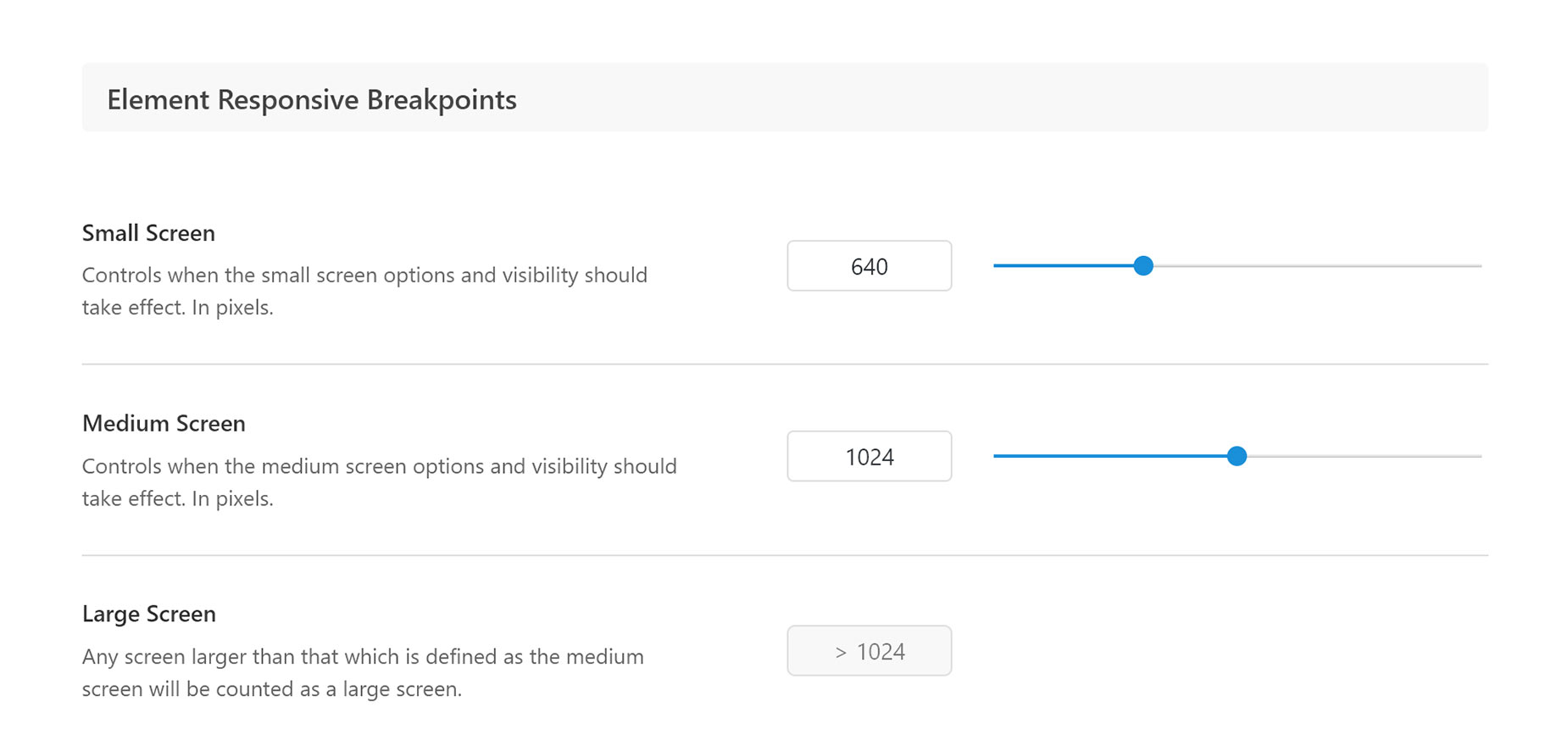
We have simplified this dilemma, by offering three screen size breakpoints, corresponding to the three major device types – desktop and laptop computers, tablets, and smart phones. These are found in the Avada Global Options, and here, you can specify at what pixel dimensions these layouts kick in when the website is viewed on the front end.
Just head to Avada > Options > Responsive, and here, in the Element Responsive Breakpoints section, you can determine the breakpoints at which Medium and Small screens begin. The Responsive Previews in the builder will always show the layout for Medium and Small screens regardless of what values you enter into the options here, but the preview size will change.
You will also find responsive typography options here, with these two options:
For a full explanation of how these work, please see the Responsive Headings documentation.
Responsive Option Sets
For full details on this great feature, check out the Responsive Option Sets doc and video. This is the main tool to use when you have entered the Responsive Editing Modes.
By default, options flow through the various screen sizes. So if you make a change while in Large Screen to the Margins of a Column, then that change will also be reflected in Medium and Small Screen views.
But the Responsive Option Sets allows you to break that connection, and edit independently for both Medium and Small Screens. Any changes made to any of the options that are part of the Responsive Option Sets will only affect the Screen size you are editing.
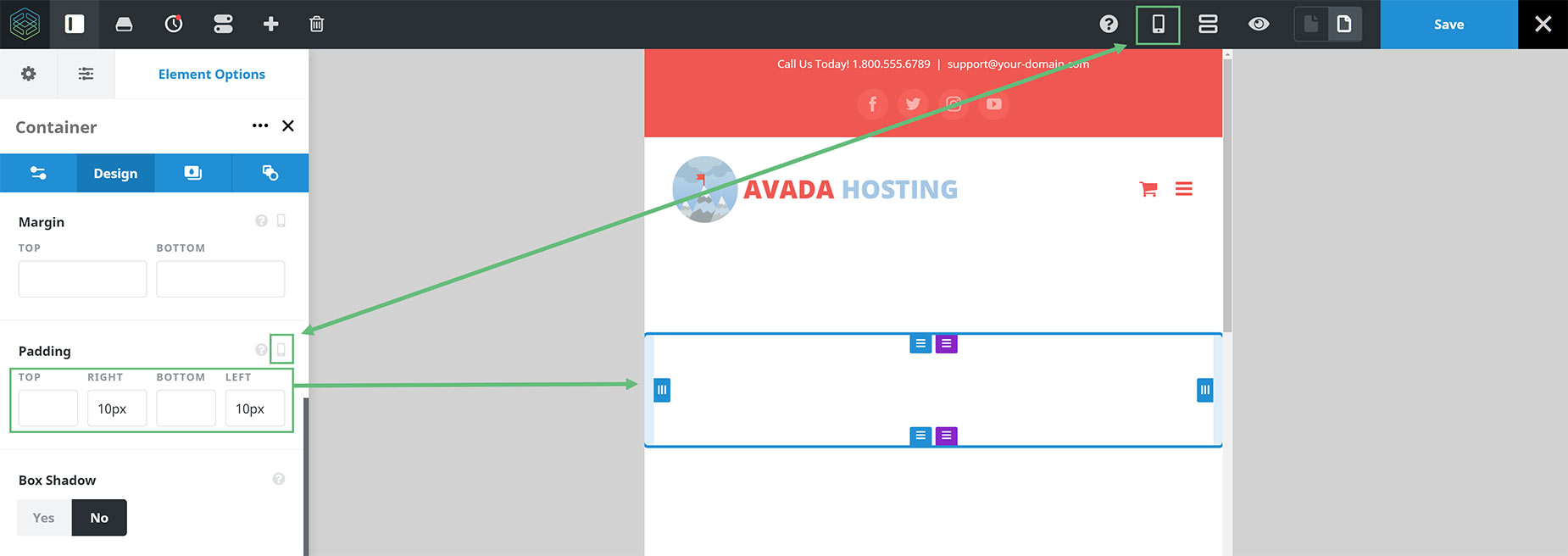
With Containers, there are only a couple of options that are part of the Responsive Option Sets. These are Margins and Padding. But with Columns, there are five options, all under the design tab, that you can make great changes to your layouts with. They are Column Width, Column Order, Column Spacing, Margins and Padding. Check out the How To Set The Display Order And Size Of Columns In Responsive Layouts doc for more details and some specific examples.
Default Column Behavior
To have full control over responsive design, it’s also important to understand the default behavior of Columns at various screen sizes. This is found at Avada > Avada Builder Elements > Column.
Here you can see two options which determine the default behavior for Columns on both Medium and Small Screens. The default behavior is that Columns on Medium Screens inherit the layout from Large Screens, and that Columns on Small Screens go Full Width.
You can change the default behavior for each size screen, or you can use the Responsive Option Sets to just change some of the Columns in each screen size using Live Responsive Editing. You decide.


