Column Size and Order for Responsive Design in Avada
Last Update: November 17, 2025
When designing your website with Avada, there is a wide array of options for Container and Column Elements, designed to make it easier for you to control your design in responsive layouts. One of these features is the Responsive Option Sets, which can be used, among other things, to set the display order and size of columns in tablet and mobile layouts. Read on to discover how to control this incredibly flexible new feature, or watch the video below for a visual overview.
How Responsive Option Sets Work
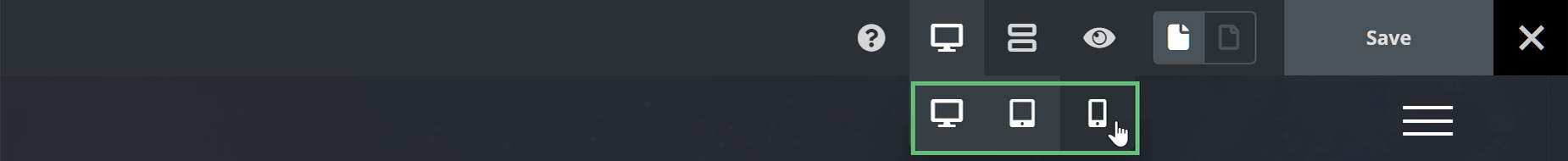
The new Responsive Option Sets feature makes all this possible. In Avada Live, on the right hand side of the toolbar, you will find the Responsive Icon. This is no longer just a preview option to see how the site looks on different screen sizes, but also a new responsive editing mode. When you select a specific screen size, like Medium or Small, not only does the layout change on the screen, but any Responsive Options that you set while in that view, will only apply for that view.
Any responsive option set while in the Desktop view will carry through to both medium and small layouts, but if you want a specific value, for Tablet for example, you would just click on the Tablet icon and then enter a different value into the relevant option.
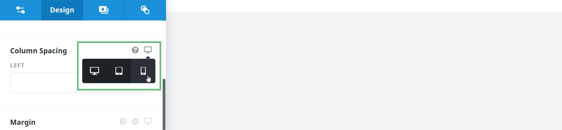
You can also change the Layout Size from any of the actual Responsive Option Set options, as seen below.
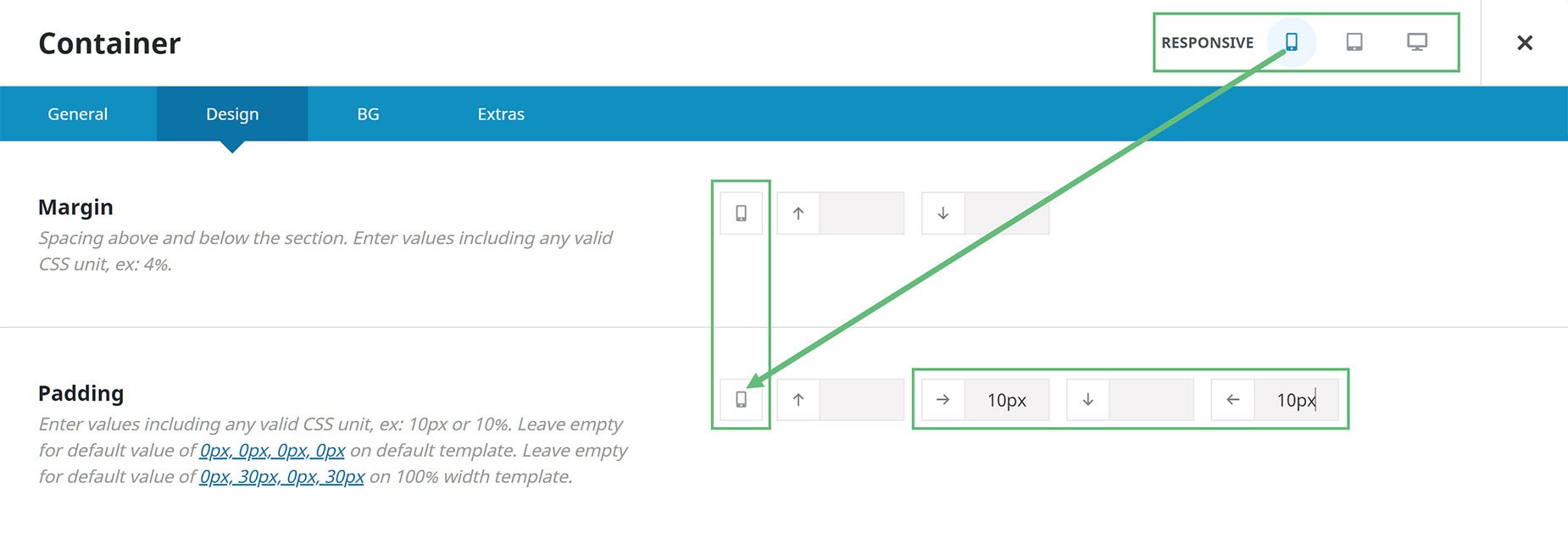
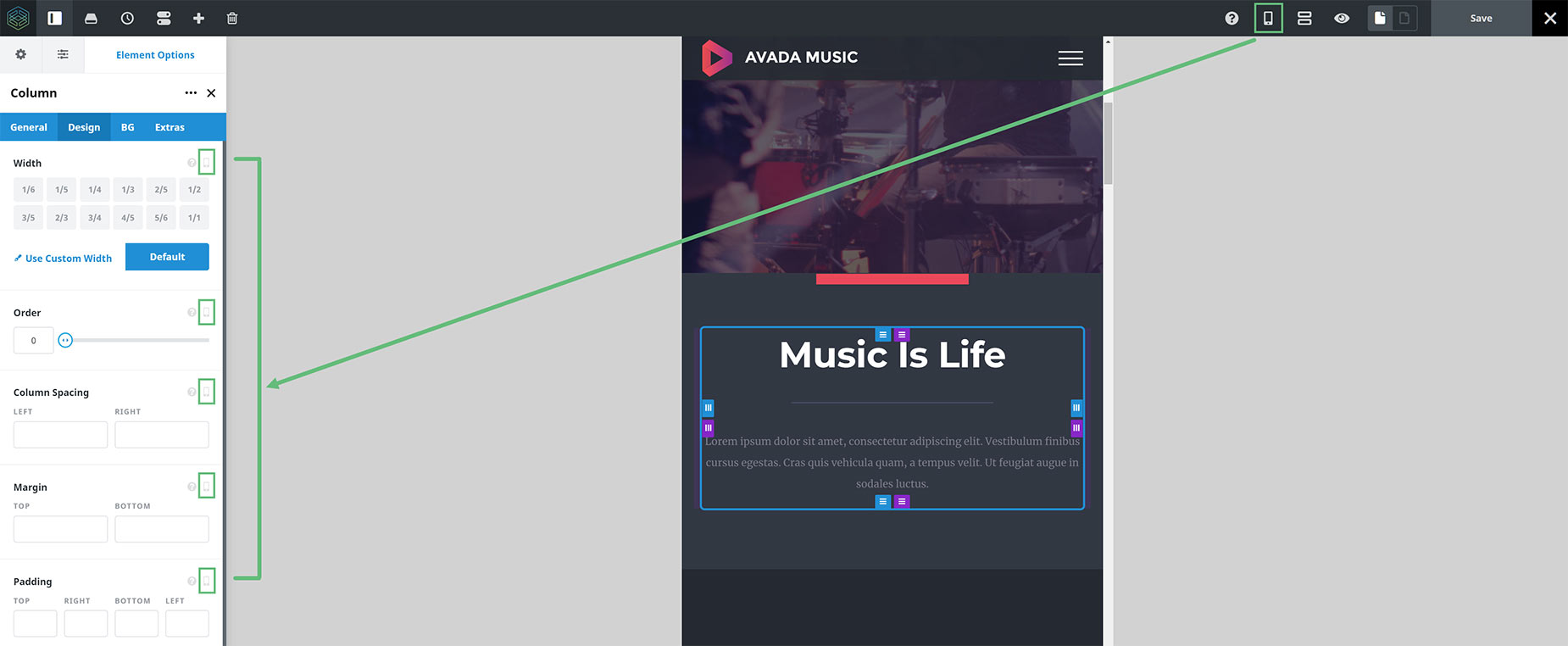
It’s much the same in the back end interface of the builder, but it just looks a little different. If we look at the Container or Column Element in the back-end interface of Avada Builder, we can see three Responsive icons at the top of the Element. If we select a specific icon along the top, the options included in this feature and that also have a responsive icon, will change their icons to match the one selected at the top. This shows that the values you set in this options will apply only to the selected layout.
See the image below to see how this works. Note how in the image, the Mobile Responsive view has been selected in the Container header, and in the Margin and Padding options of the Container, the Responsive Icons there have changed to a phone, showing that the values entered there will only apply when the page is viewed at Mobile size.
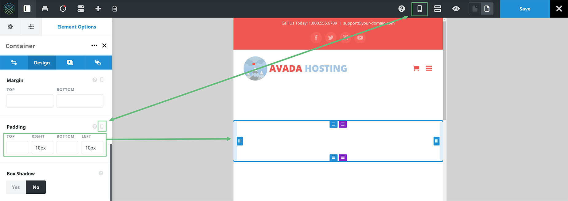
As you can see in the example of the Live Builder below, I have chosen the Small (Mobile) Icon in the toolbar, and in the Padding Option, the icon has changed to the same icon, signifying that the values inserted (in this case 10px padding on the left and right sides of the Container) will only apply when the screen is at Mobile size.
For full details on the Responsive Option Sets feature, follow the link, but for the purpose of this doc, the options we need are in the Column Element.
Column Width & Order
In the Column Element, under the Design tab, the first two options are Width and Order. NB. You will only see the Order option when you switch to one of the Responsive Layouts: Medium or Small.
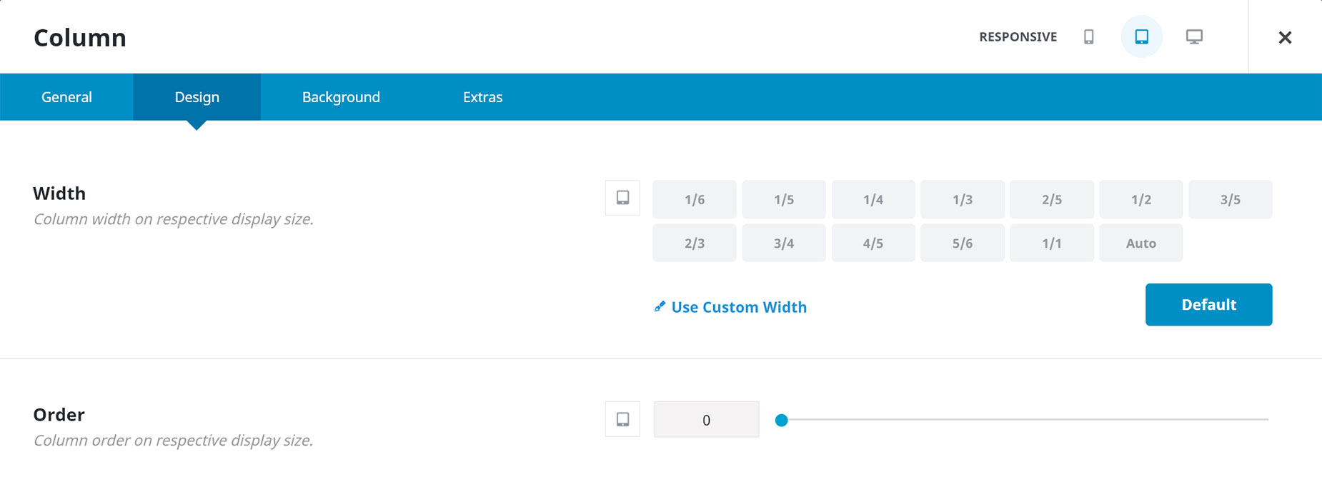
Width
The width of the column is set initially when you add it into the Builder. So if you are in Desktop view, and change the size of the column in the Width option, the column changes visually in the builder to that size. So, in this way, it’s just the same as changing the column size from the Column Size icon in the Column Element Controls. You can also now set a Custom Width to your Column.
It’s when you change to a Responsive view that things get really interesting, though. Here, we can take an existing column, regardless of its size in Desktop view, and change it to whatever we wish for the Responsive view.
There are already a few Global Options that affect what happens when a desktop layout changes to a tablet or phone layout. In the Responsive Options (Avada > Options > Responsive) you will find the Responsive Design Option itself, which turns Responsive Design on or off for the whole site. But you will also find two options called Element Responsive Breakpoints. This is where you set the default behavior for Columns on responsive layouts. By default, with tablet views, the columns inherit from the Desktop layout, and on Mobile Layouts, they become 1/1 columns.
But now, with Responsive Option Sets, you have complete freedom with what happens to your columns in both Mobile and Tablet view.
This is because you can now apply this new sizing independently to both Tablet and Mobile view. So, in this way, we can have three different widths, all for the same Column! This is much easier than duplicating the content and using Visibility options. See the Example section below, for a real world example of what this would look like.
Order
The Order option, as stated before, only appears in Responsive views. This option allows us simply to change the order of the selected Column in the selected view. So if we have two 1/2 Columns in desktop, we might decide to change the order of these in Tablet or Mobile view (or both).
To do this, you can simply drag the columns around to display them as you would like for the specific view. Alternatively, you can add a number to a selected Column to specify the order. You can number each Column, or you could, for example just add the number 1 to the Column you want at the top. For two columns, this would be easiest, but if you had three or more, you would control the display order with a numerical value on each Column.
Again, you can set the order for Columns independently in both Tablet and Mobile view, and for Desktop view, the order, of course, is the order you place them in the Builder. This provides and enormous amount of flexibility with Columns in all Responsive views, and combines with the Width option, allows for any conceivable layout on any device.
Example
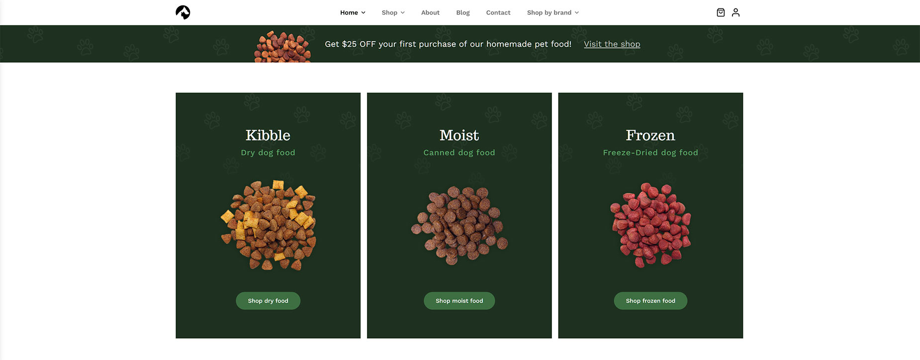
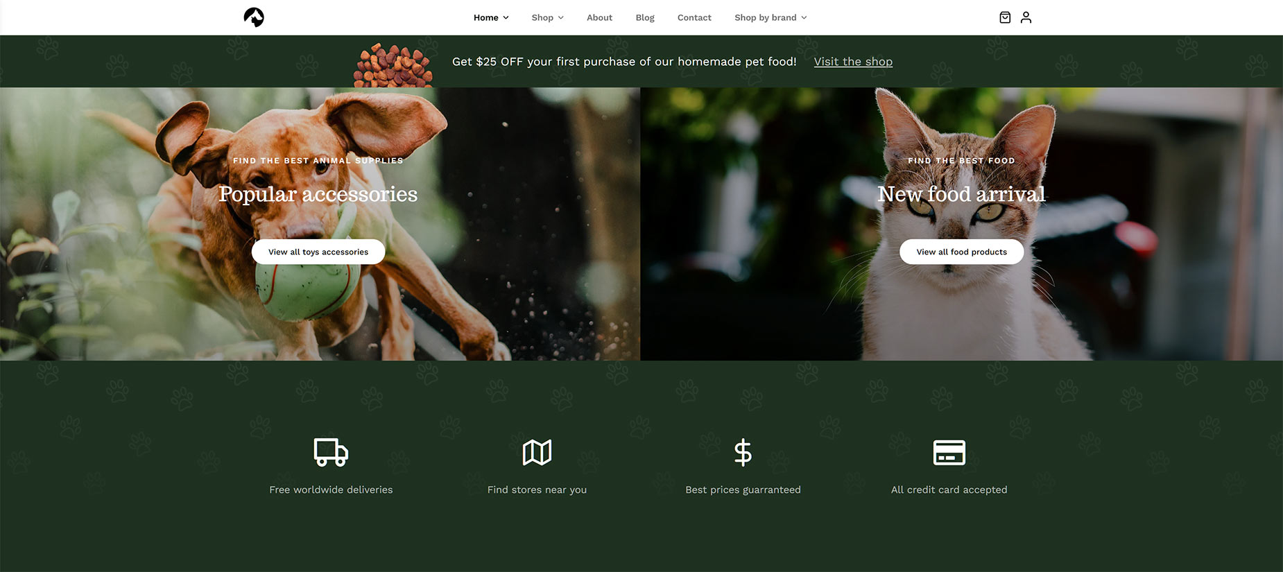
Let’s take a real world example to illustrate how this all works. In this example, from the Pet Supplies website, we can see in Large Screen view, that there are three 1/3 Columns with content a little way down the home page.
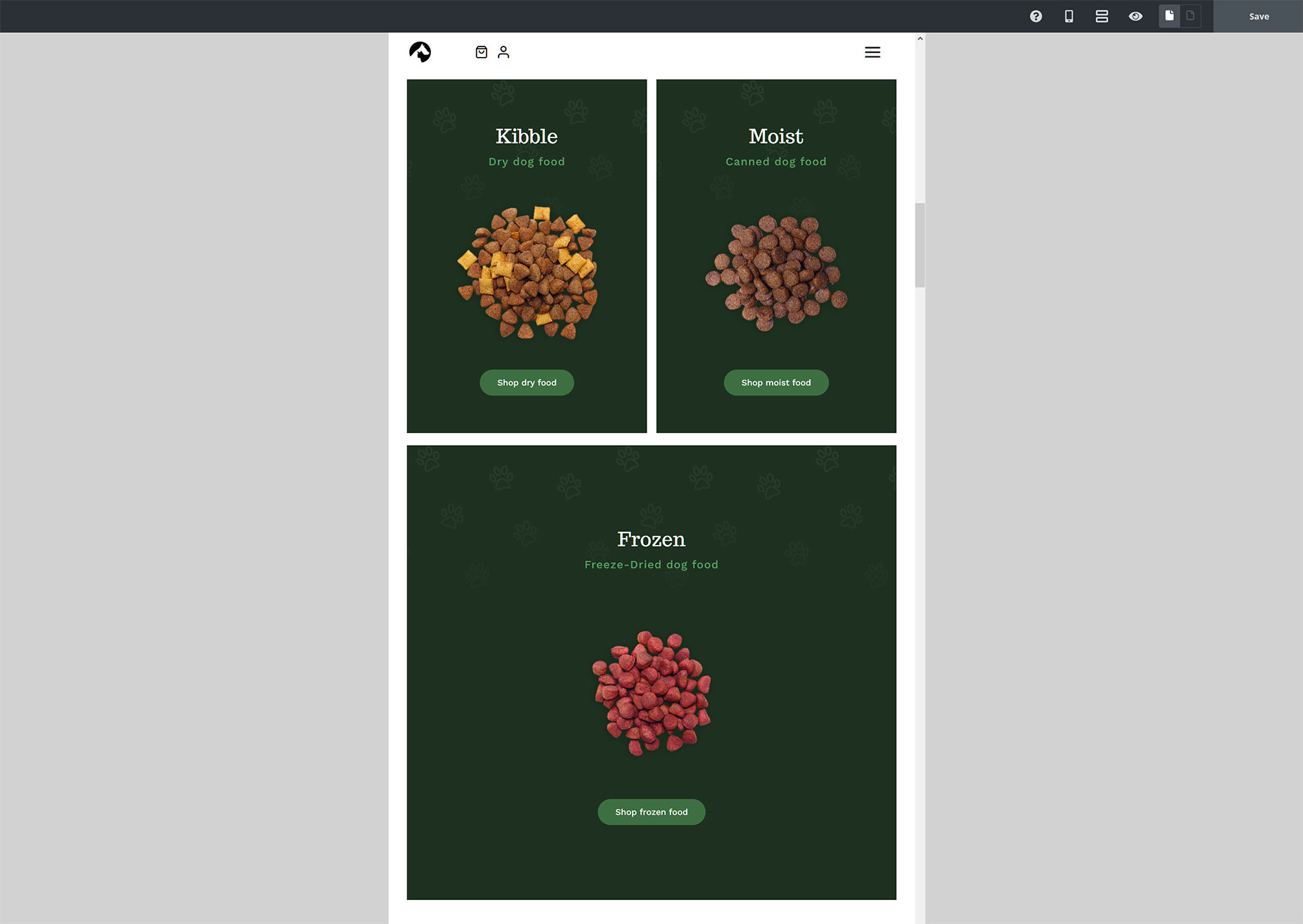
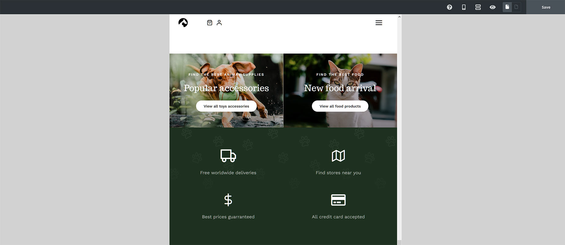
If we look at this area in Small Screen View, we can see that now two of the Columns have been changed to 1/2 width, and one left to go full width according to the Column Global Options.
In another example a little further down the page, we can two images in each their own 1/2 Column (going full screen), and a row of four x 1/4 Columns, containing Icons and text, directly under this.
If we look at this area in Small Screen View, the images have remained at their 1/2 Columns, instead of reverting to full width, as is the default for Columns in Small Screen View. And the four 1/4 Columns have now become 1/2 Columns.
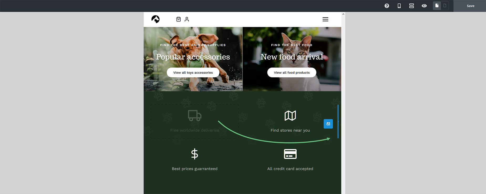
These are all examples of Column resizing. But what about Column Ordering? This hasn’t been used on this page, but as an example, when we are in Small Screen View, we can simply drag and drop our Columns to rearrange their order, as in the image below, and this would only take effect on Small Screen Views.


