Image Hover Effects
Last Update: October 30, 2025
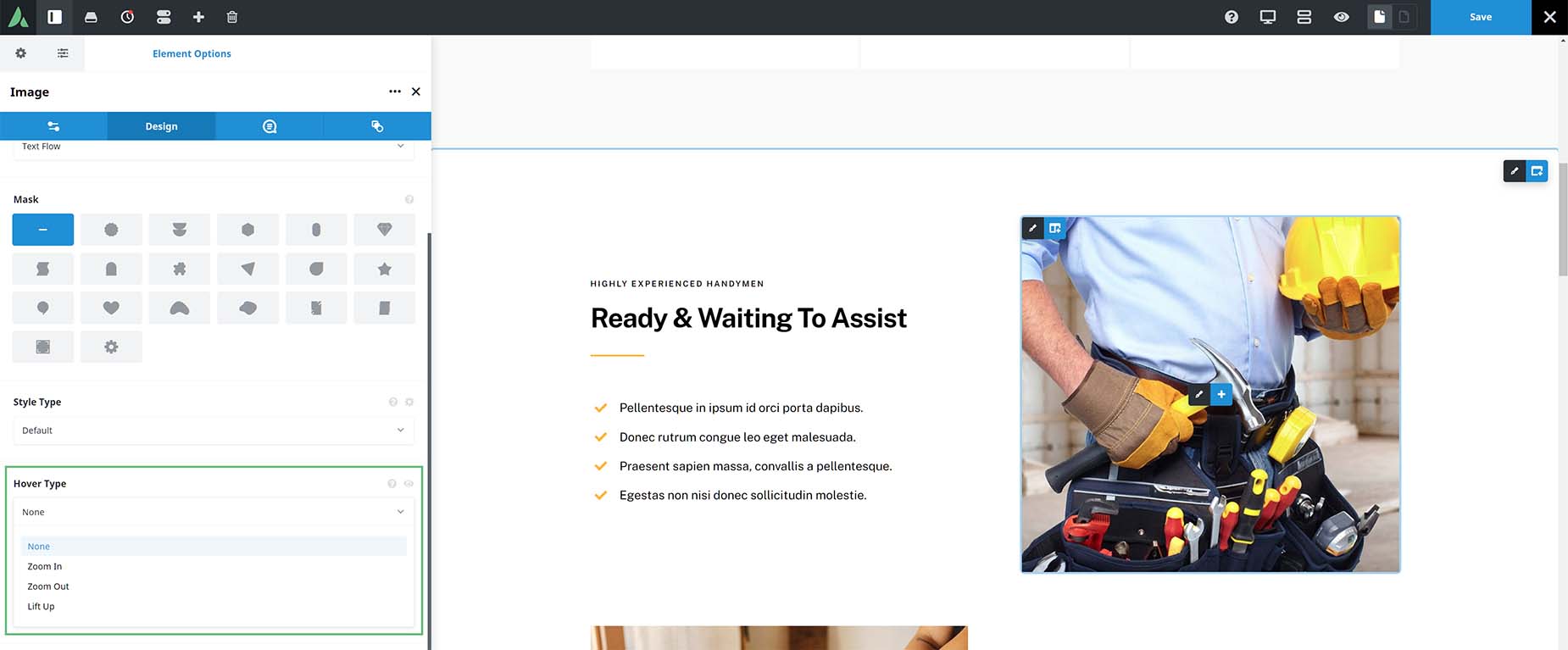
You can apply various effects to your images using the Avada Builder, including the Image Hover Effect. This effect controls what happens when the image is moused over and is not the same as the Style Type, which can also be applied to images and offers drop shadows or glow effects around the image. Both these options are found in several Avada Elements that use images. For a complete list, see below.
For the Hover Type option, you can choose from None, Zoom In, Zoom Out or Lift Up. These sleek and clean hover effects will make your images animate dynamically when they are hovered over. Let’s have a look at each one.
Zoom In
With the Zoom In effect, the image zooms in on mouseover, effectively cropping a small percentage of the image. When used with images with borders, as seen below, the border remains constant, and the image zooms in within it.

Zoom Out
With the Zoom Out effect, the image starts zoomed in a small amount, and zooms out to reveal the entire image when moused over.
Lift Up
With the Lift Up effect, the image gets slightly larger all around on mouseover, as well as having a subtle box shadow applied. Readers of the Avada Documentation will be familiar with this effect, as it’s the default for all images in the documentation. When used with images with borders, as can be seen below, the border expands with the image on mouseover.
These effects can also be used in conjunction with the aforementioned Style Type option, but when using Image Captions (other than Above or Below) or Masks, these effects are disabled.
Avada Elements Using Hover Effects
How To Use The ‘Hover Type’ Option


