How To Use Full Screen Scrolling Sections
Last Update: October 31, 2025
Full Screen scrolling sections offers you a way to combine multiple full height containers into full screen scrolling sections with side navigation. With this tool, you can set up a beautiful one page scrolling website or you can simply add them into any page/post as part of your page content.
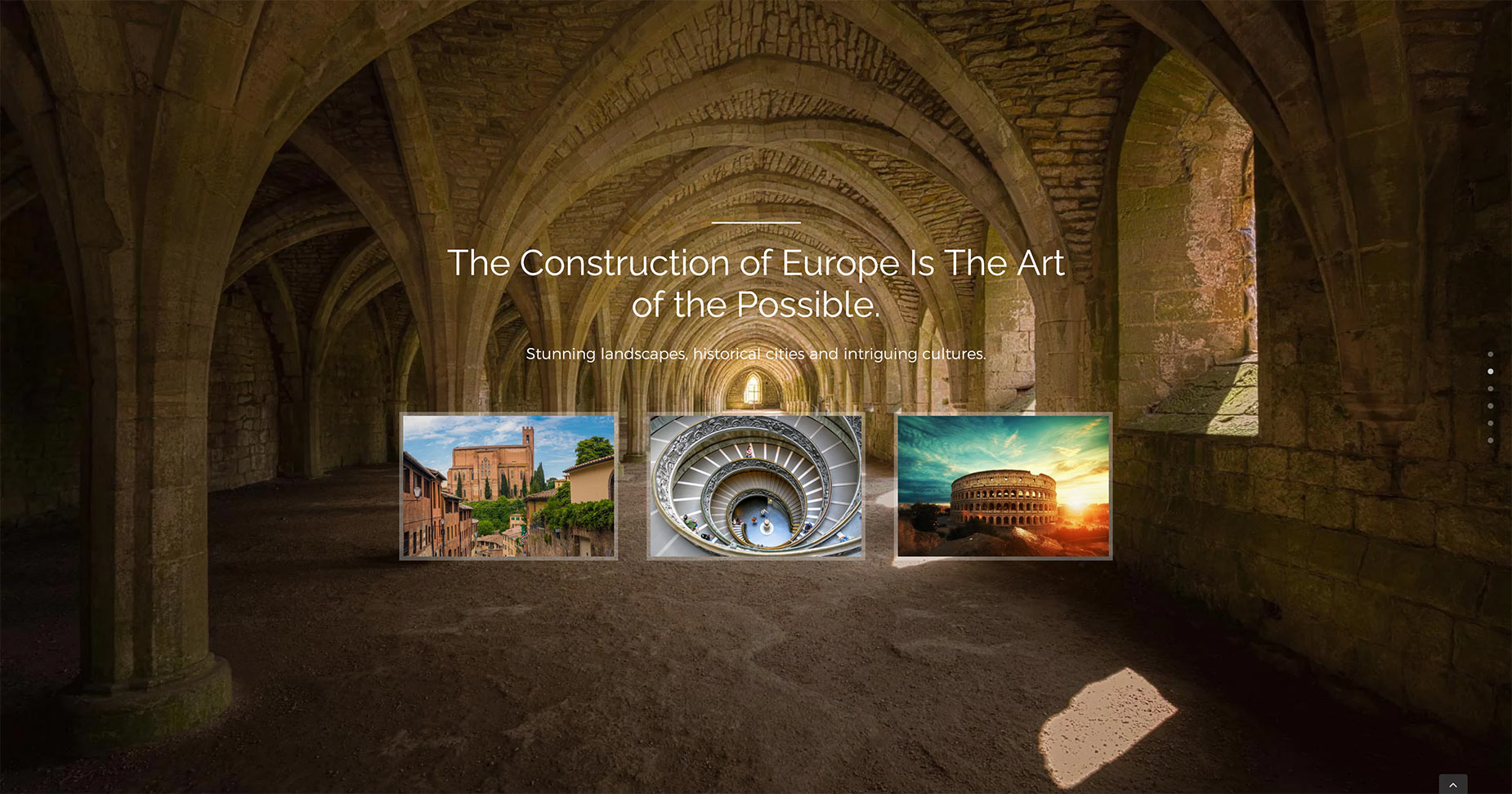
See an example below of full screen scrolling sections from the Avada Adventure website. Note the navigational dots along the right hand side. Please continue reading below to know more about this awesome feature, and watch the video below for a visual overview.
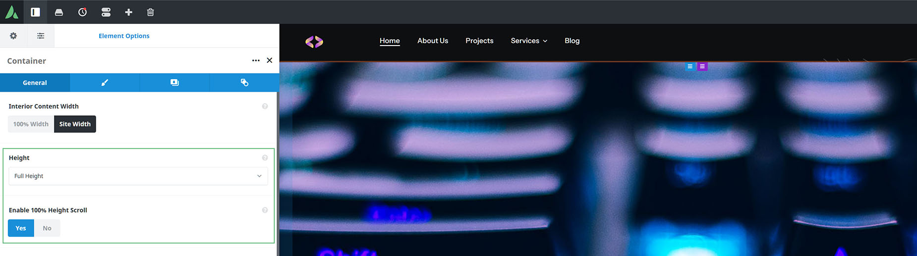
Full Screen Scrolling sections, also known as 100% Height Scrolling Sections can be activated via the individual Container Settings of the included containers. You will need at least 2 consecutive containers that are both Full Height and have Enable 100% Height Scroll enabled for this feature to work.
When Enable 100% Height Scroll is activated, the containers will display an orange color for the element controls. Please follow the steps below to set up full screen scrolling sections.
How To Set Up Full Screen Scrolling Sections
Note: You can set up more than one Full Screen Scrolling section within a page/post. It just requires 2+ consecutive containers to form a group that will scroll.
Full Screen Scrolling sections, also known as 100% Height Scrolling Sections can be activated via the individual Container Settings. You will need at least 2 consecutive containers that are Full Height and have Enable 100% Height Scroll enabled for this feature to work. Please follow the steps below to set up your full screen scrolling sections.
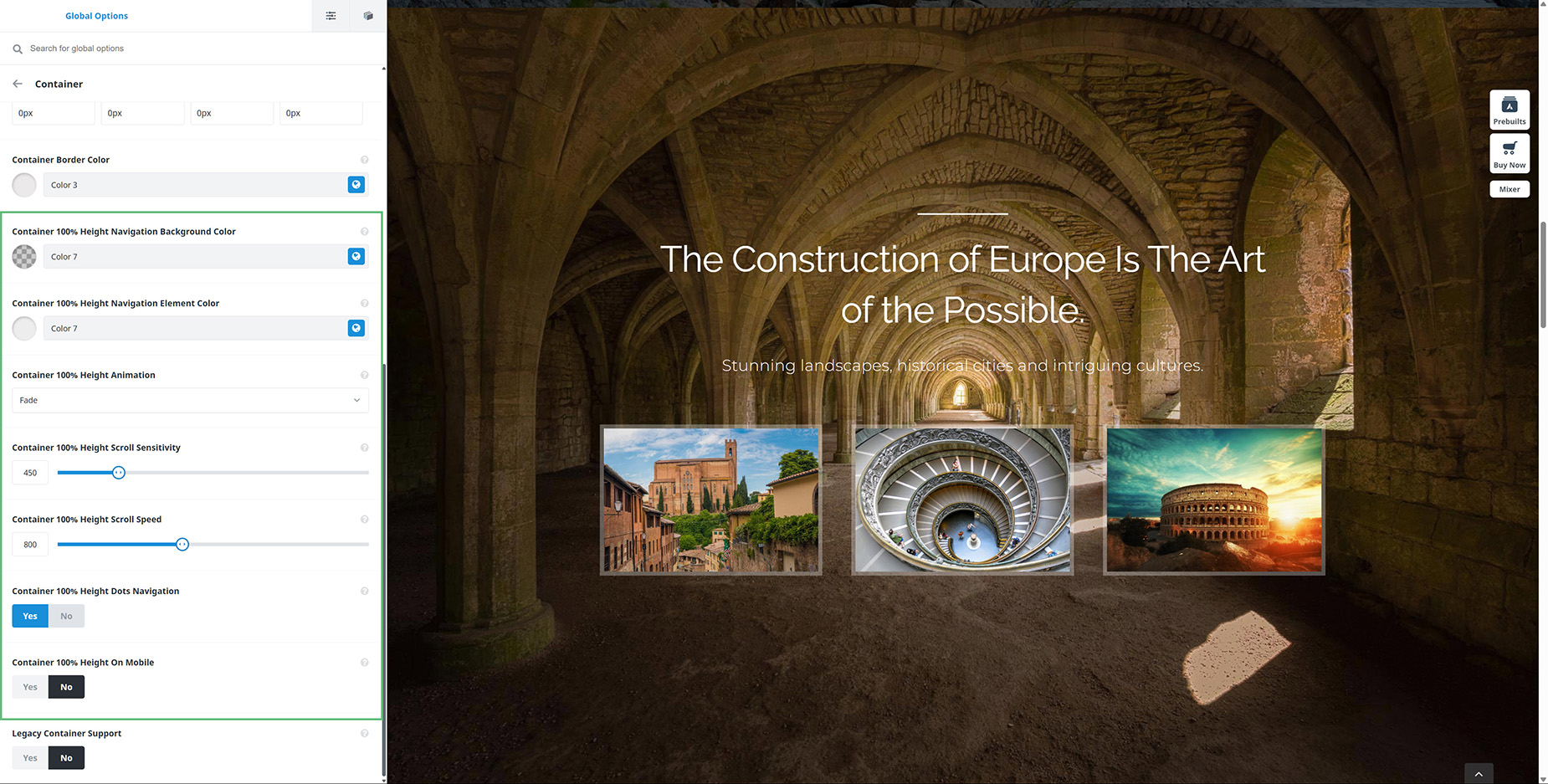
Navigate to Avada > Options > Avada Builder Elements > Container. Here you can set your preferred default options and behavior for 100% containers. This includes the styling of the navigation areas, the animation chosen for the transition between scrolling sections (here you can choose from Fade, Slide, Stack. Zoom, Slide Zoom In, ans Slide Zoom Out),
Anchor Scrolling With 100% Height Scrolling Sections
Anchor Scrolling is possible with Full Screen or 100% Height scrolling sections. Please click the button below for the detailed documentation on how to set up Anchor Scrolling.
Things To Keep In Mind When Using Full Screen Scrolling Sections
Full Screen Scrolling sections have their own challenges, and below is a list of some important things to keep in mind:


