How The Avada Builder Works
Last Update: February 26, 2026
The Avada Live Visual Builder is a drag-and-drop design editor that powers how you design pages, posts, and layouts in Avada and WordPress. It lets you build your entire website on-screen, seeing changes in real time as you make them. Instead of writing code, you add Avada Design and Layout Elements, adjust options, and shape your content exactly the way you want.
Everything—from spacing and colors to responsive behavior and animations—is controlled through an intuitive interface, so you can design confidently without needing technical knowledge. Whether you’re crafting simple pages or complex, dynamic layouts, the Avada Builder gives you complete creative freedom while ensuring your site remains fast, clean, and professional.
How To Access The Avada Live Visual Builder
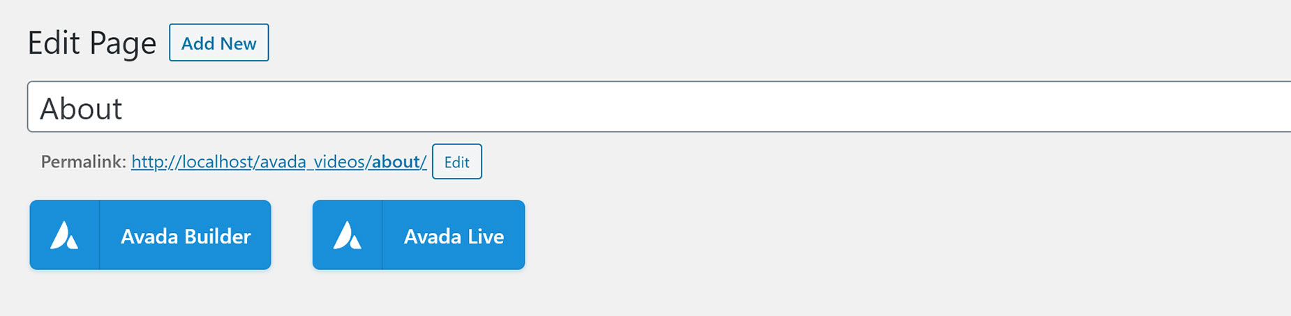
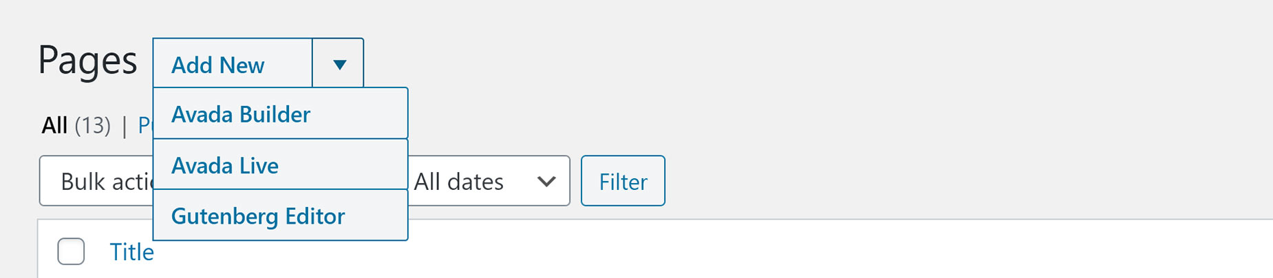
Once you have installed and activated Avada’s two required plugins (Avada Core and Avada Builder), you can use the Avada Builder to design and build your pages, posts, and even WordPress custom post types (CPT). There are several ways to access the Avada Builder, depending on where you are.

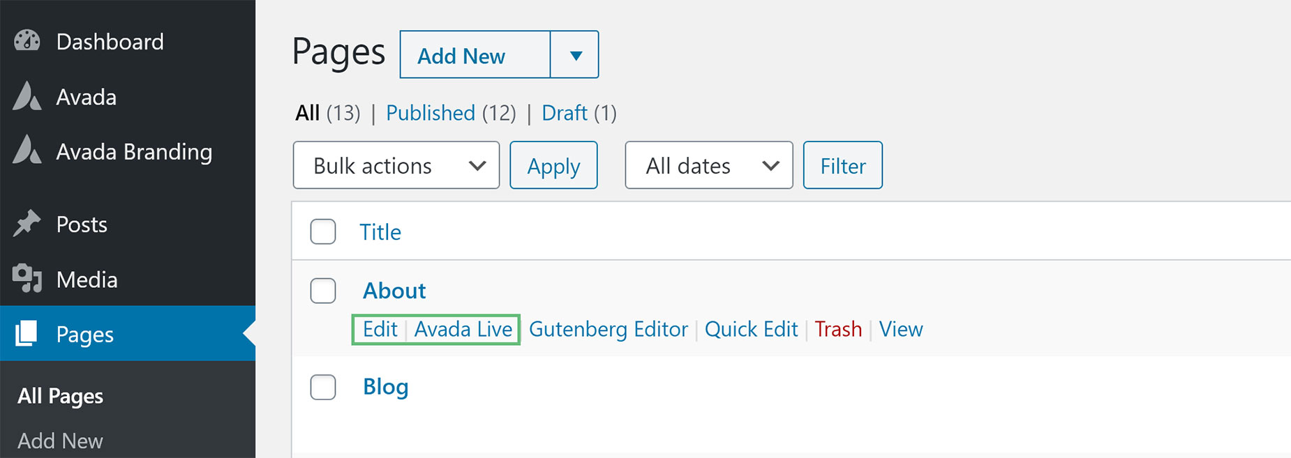
The Avada Builder is available for all registered post types, including blogs, events, and FAQs. If you don’t see these buttons on a particular post type, the Avada Builder may not be enabled for that custom post type. To enable or disable the Avada Builder on your various Post Types, please see our article on the Avada Builder Options.
If you’d prefer Avada Builder to load automatically when you edit a page, there is also an auto-activation option in the Options > Builder Options section of the Avada Dashboard. Set this to “On”, and the Avada Builder will automatically load when you edit your pages.
The Avada Live Visual Builder – Front-End
Creating pages with Avada Live is very similar to the back-end method, but it’s done visually on the front-end. The same controls are available to add Avada Design & Layout Elements, and the only real difference is the workspace.
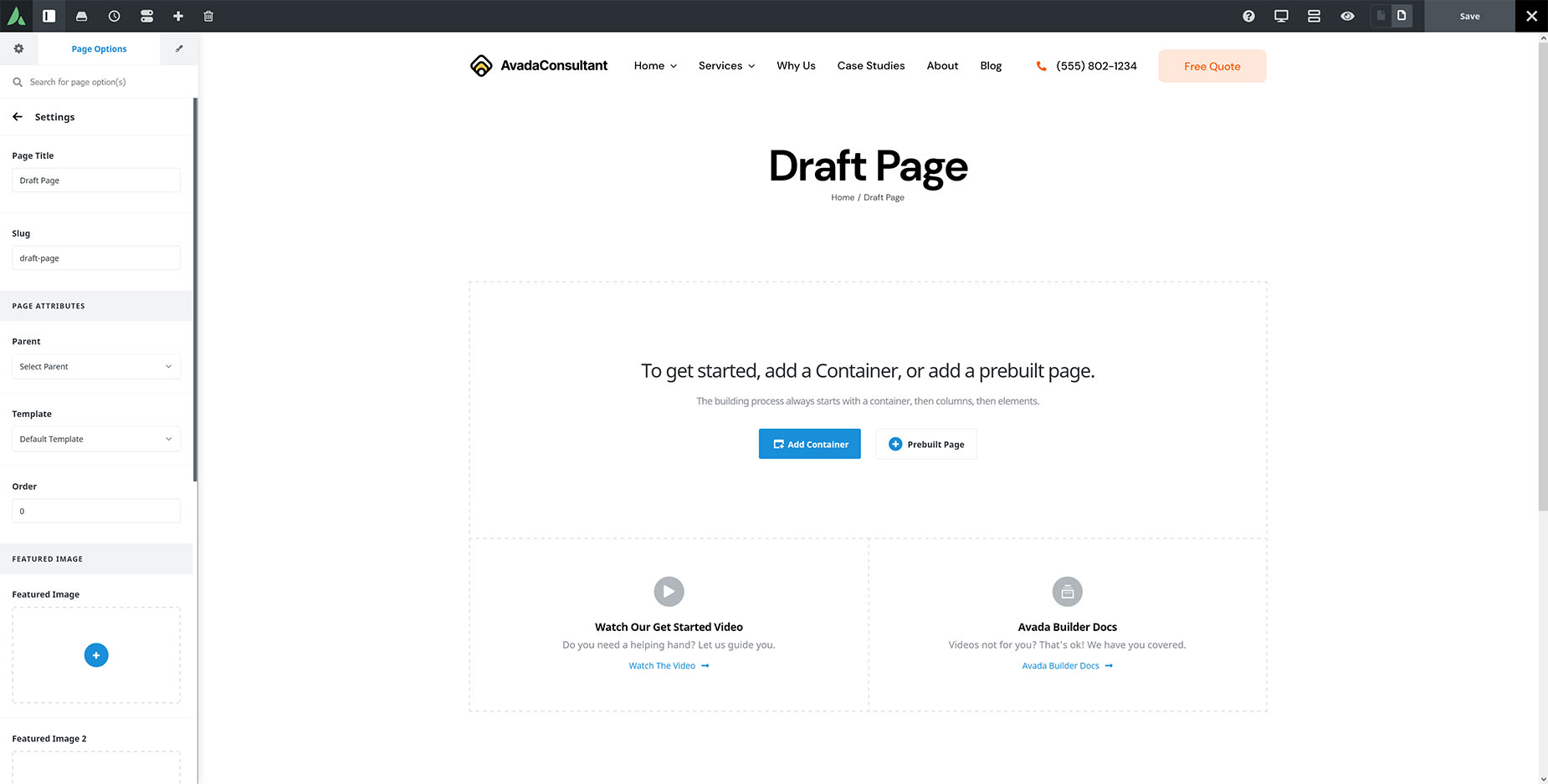
Step 1 – Add A Container
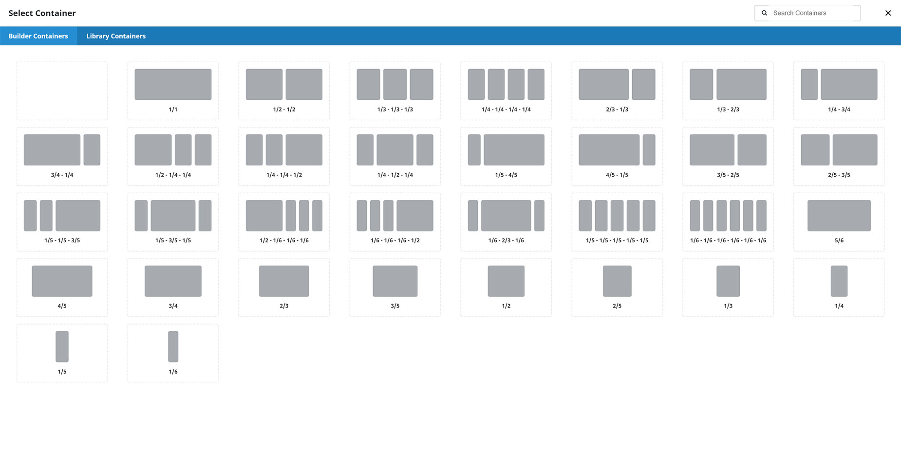
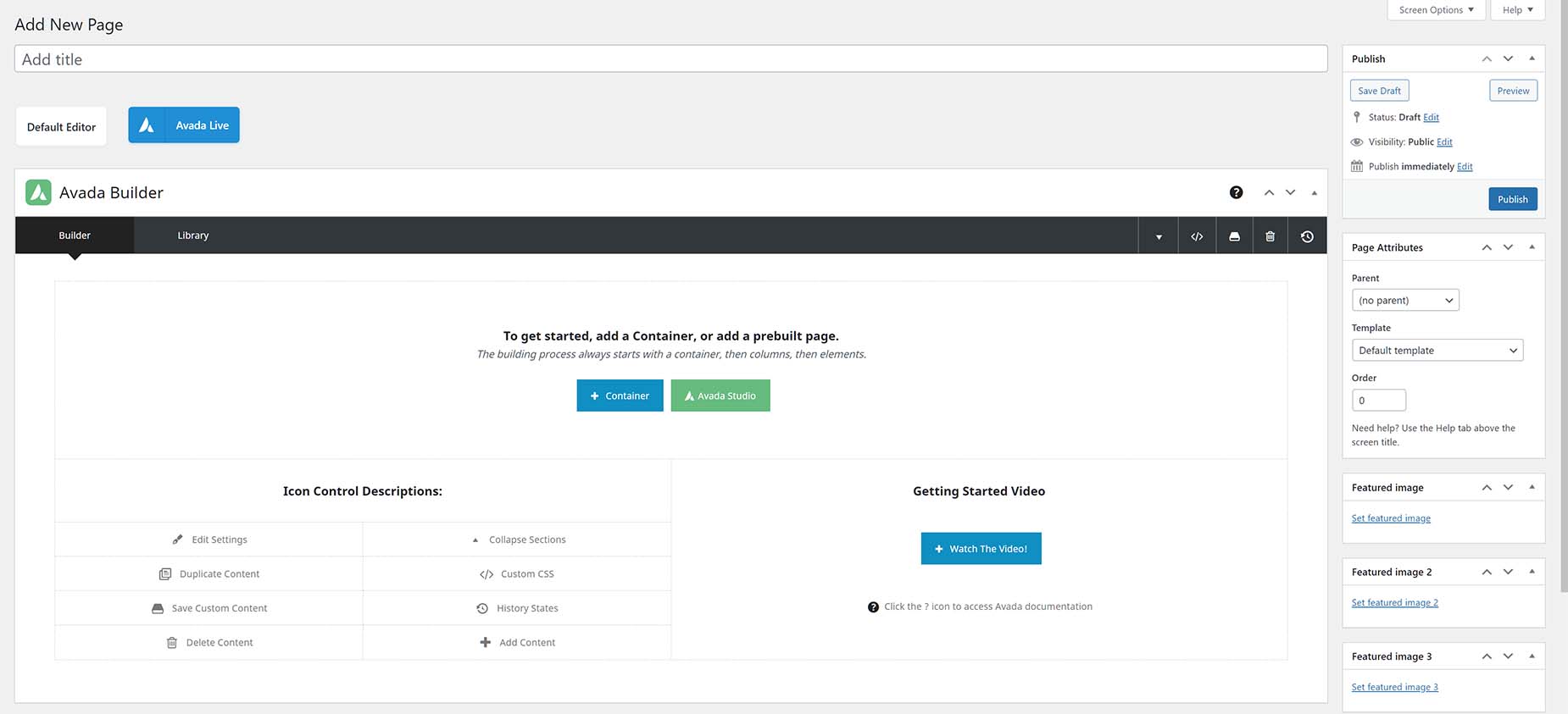
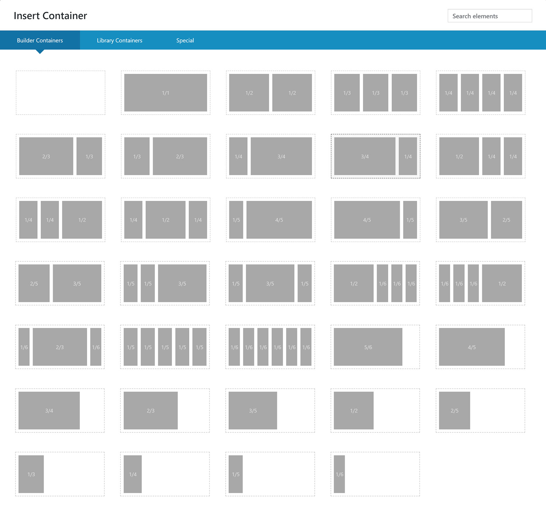
The first step on a new page or post is to add an Avada Container Element. The Avada Builder Starter Page has a large blue ‘Add Container’ button that, when clicked, opens the Add Containers Dialog. Here, you can add an empty container if you wish, but more commonly, you add a Container with Columns already inside.
There is a range of Avada Column combinations you can add to the Container that serve as the basis for your layout. You can add as many containers to the page as you wish, and as many Columns inside the Containers as well, but Avada Design Elements must be inside a Column.
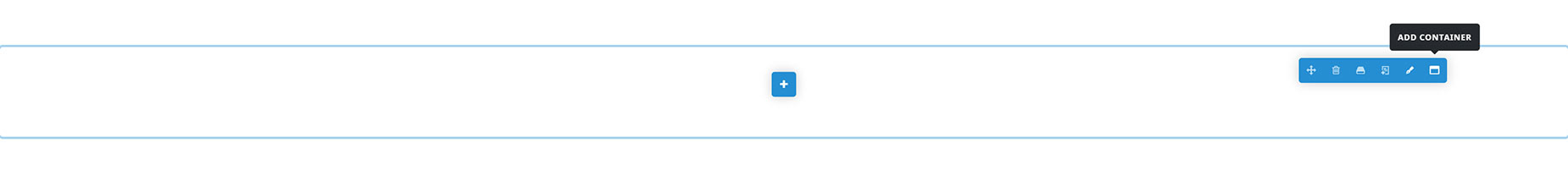
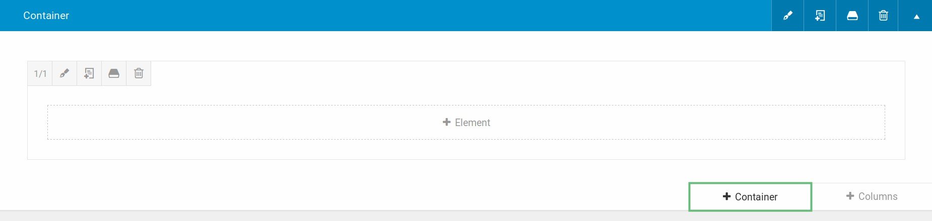
To add additional Containers once a Container is on the page, simply mouse over the Container Controls and select “Add Container”, as shown below. The usual Containers window will pop up, allowing you to add either an empty Container or one with Columns already added.
Step 2 – Add Columns To The Container
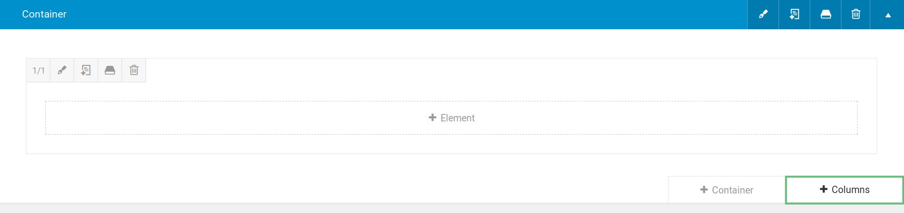
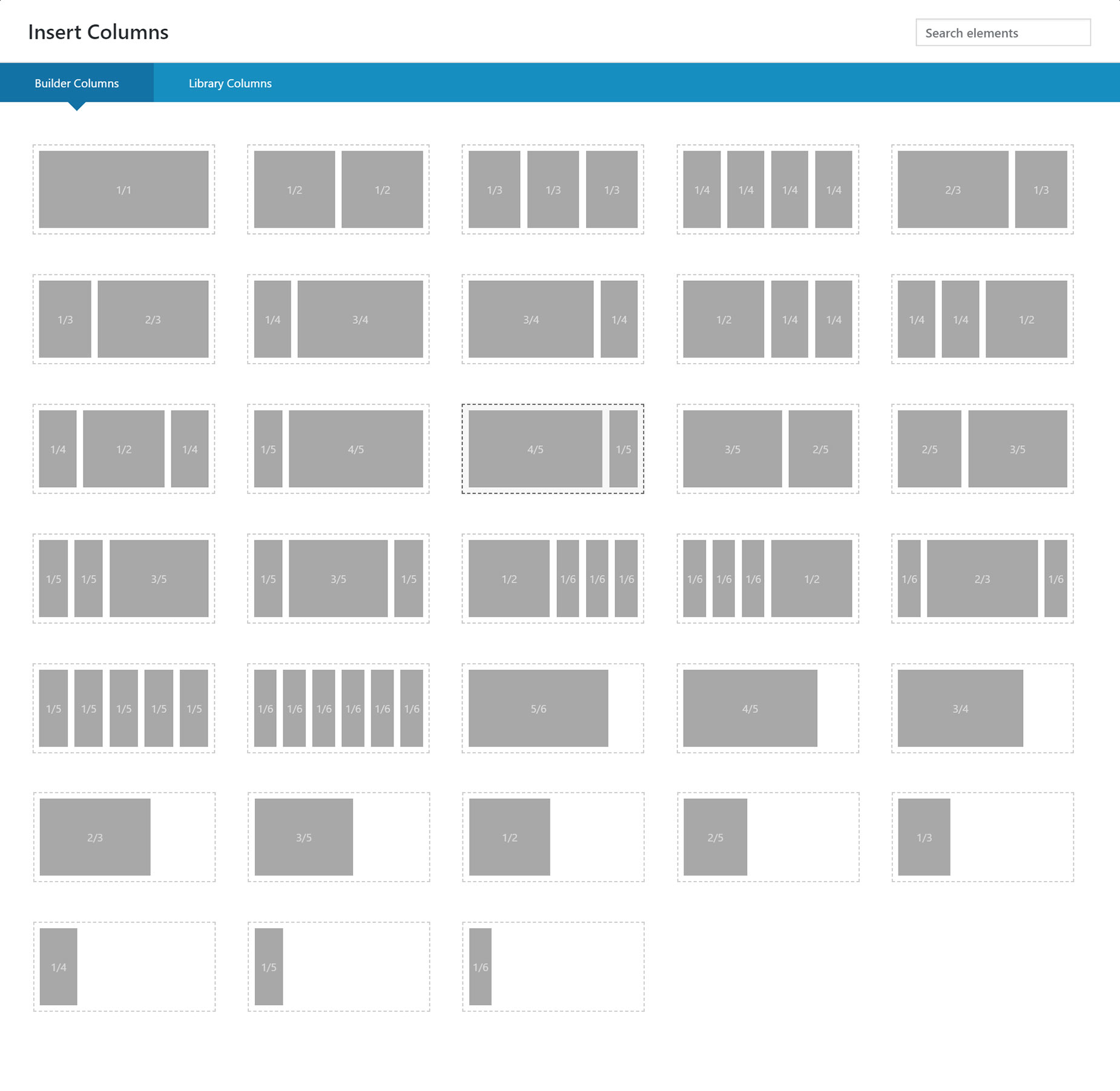
If you have added an empty Container, the next step is to add a Column, or Columns to it. This is done by clicking the “Add Columns” icon in the middle of the Container. This brings up the full range of Column combinations for you to add.

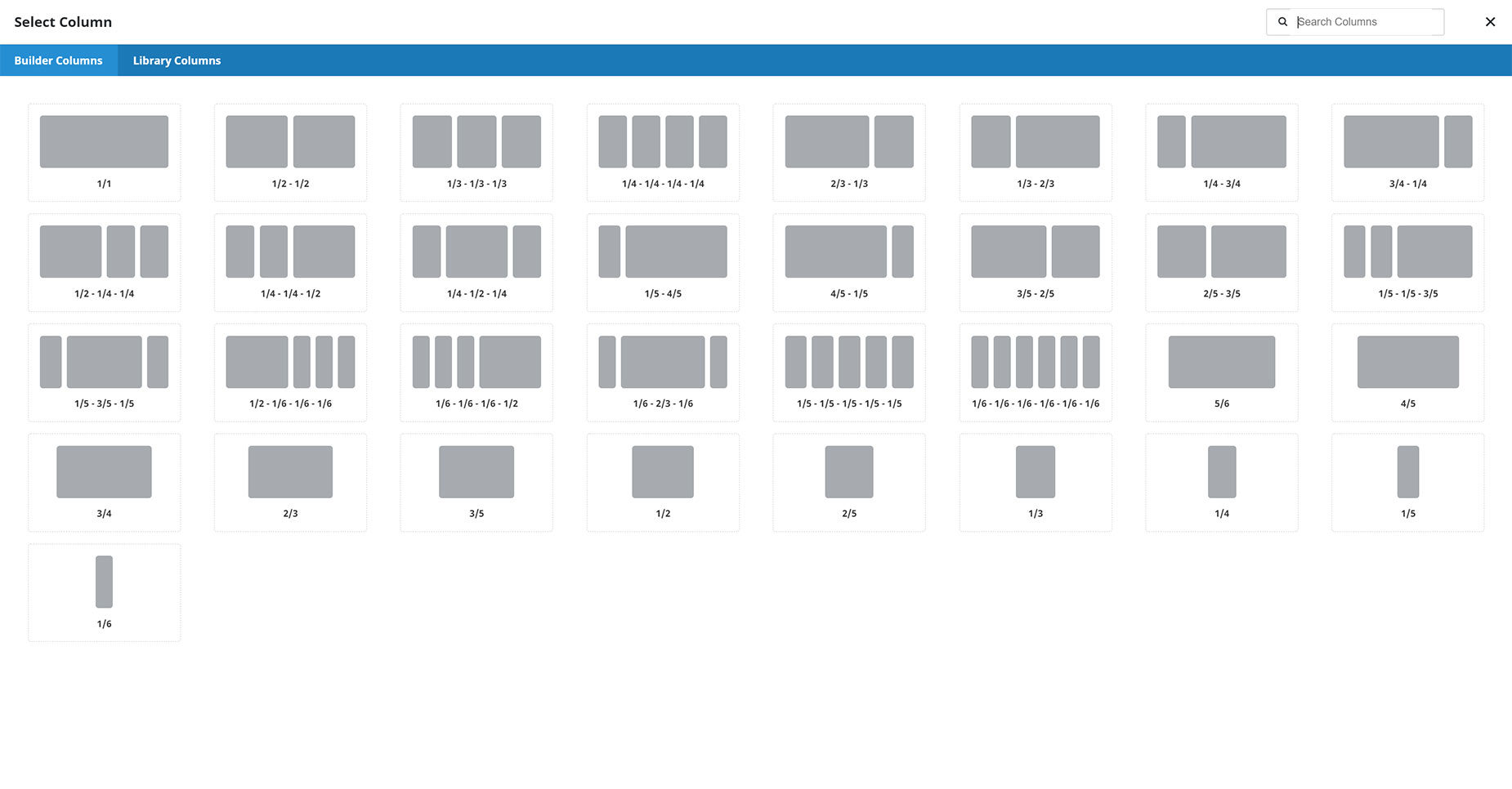
If you wish to add additional Columns to the Container, mouse over the Column controls and select the “Add Column” icon. This will again bring up the Add Column window, where you can choose the Column layout to add to the Container.
Step 3 – Add Design Elements
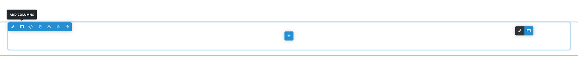
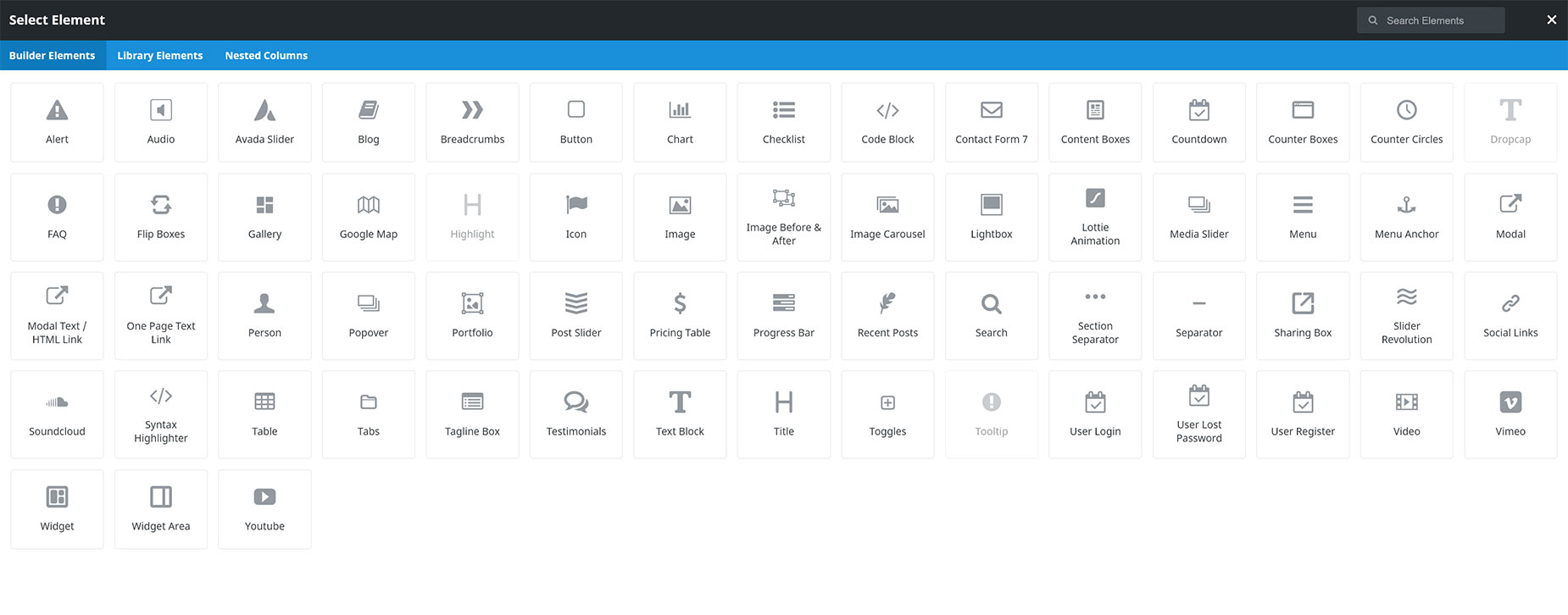
Once you have your Column or Columns inserted, there will now be an “Add Element” icon in the middle of the column. Click this to bring up the Design Elements window and select the Element you’d like to add.
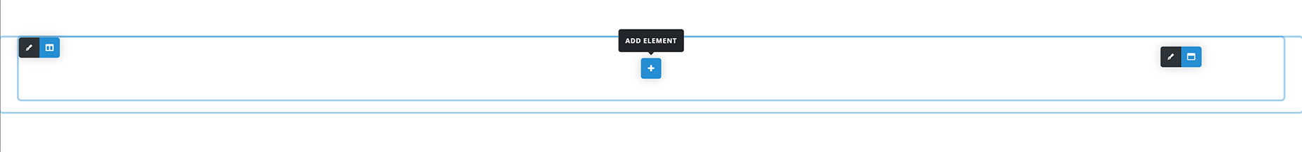
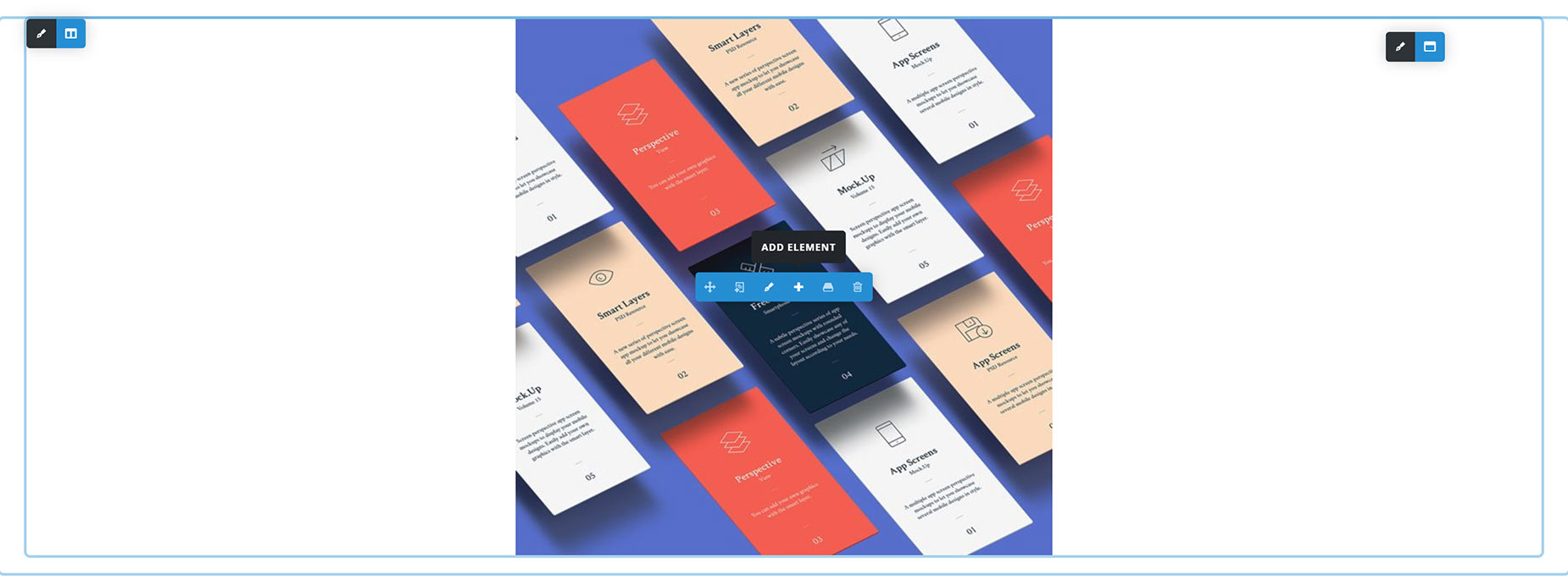
To add additional Design Elements to a Column, mouse over the current Element and choose the “Add Element” option. Again, the Element Window will pop up, and when you add the next Element, it will be inserted directly below the previous Element.
Step 4 – Rinse and Repeat
Continue building your page by adding Containers, Columns, and Design Elements. You can add new Containers to the page at any time, you can add more Columns to existing Containers, and you can add as many Design Elements as you wish to any Column.
The Avada Builder Editor – Back-End
When creating a new page in the back-end Avada Builder, the correct structure is to add a Container first, then a Column or Columns inside the Container, and then Design Elements inside the Columns. The back-end Builder naturally enforces this process to ensure there are no errors. On a new page, you will see the Starter Page, as shown below.
Step 1 – Add A Container
Click the “Add Container” button, and a window will pop up with the possible options. You can add an empty Container, which will be appropriate in some situations (if you wanted to drag existing content already in a Column into a new Container for example), but on a new page, you will want to choose a Column layout to add to the Container, so that effectively, you are adding a container and Columns at the same time.
Once you have content on the page, adding new Containers is done via the “+ Containers” button at the bottom of every Container, as shown below.
Step 2 – Add Columns To The Container
It’s likely that you combine Step 1 with Step 2. But if you ever add an empty container or want to add further columns to a container, you can click the “+ Columns” button at the bottom of every Container to add a new Column. Once you click that, you will again have the choice to insert a full range of Column layouts.
Step 3 – Add Design Elements
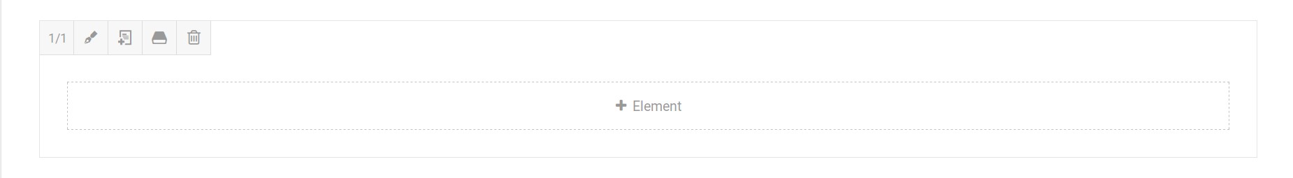
After setting up Columns, click the “+ Element” button to bring up the Elements window. This will show you our full range of available Design Elements to add to the Column.
Step 4 – Rinse and Repeat
From here, you can continue adding Design Elements and content to refine your layout. You can add further Containers and Columns to the page, you can add further Columns to existing Containers, and you can add further Design Elements to new or existing Columns. You can even resize the Columns and move the content around to suit your layout. Once you are done, remember to save the page!
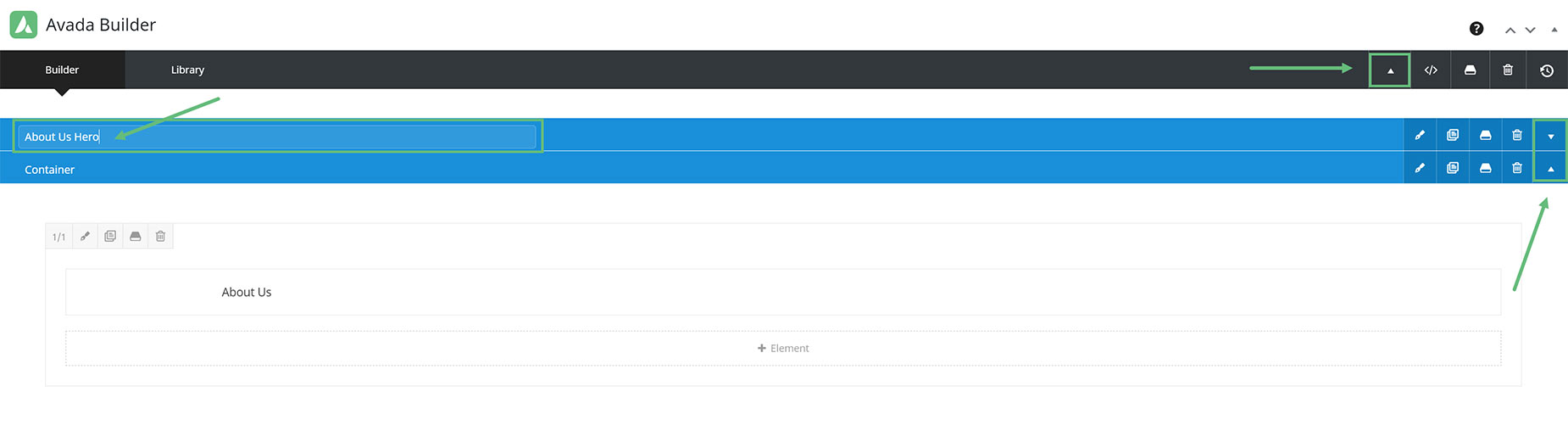
Collapsing And Expanding Containers – Back-End
To better organize your content, you can also collapse/expand all or individual Containers. You can do this by clicking the ‘Collapse/Expand’ icon found on all Containers and the main Avada Builder toolbar. Clicking the ‘Collapse/Expand’ icon on the main Avada Builder toolbar collapses/expands all the existing sections, while clicking it on individual sections collapses/expands that particular section only.
In addition, you can click the ‘Containers’ title to give it a custom name. This will help with identifying which section is which.
Sticky Toolbar
The Avada Builder also features a sticky toolbar that follows you as you scroll down the editor. This gives you quick access to all the tools and icons on the toolbar, such as the Library tab, the Custom CSS field, and your History States.


