Dropcap Element
Last Update: October 31, 2025
The Avada Dropcap Element is a standard typographical tool commonly used in articles and posts. The Dropcap Element offers you the ability to control various aspects of the drop cap, like boxed or unboxed options, boxed radius, and color. It is an Inline Element, which means it is only accessible through the Avada Element Generator, or the Inline Editor in the Avada Live Visual Builder. See the links below for more information on those topics.
Watch the video below for a visual overview of the Element, view the Avada Dropcap Element page for live examples, and read on to see the complete list of options.
How To Use The Dropcap Element
Using the Avada Dropcap Element allows you to add a dropcap to the first word of a sentence. To start, add a text-based element anywhere on your page and insert your content, leaving the first letter of the first word off to allow for the Dropcap at the start.
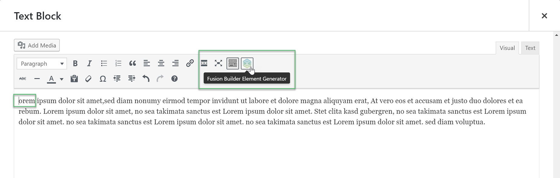
Now we need to add the Dropcap Element. To do this, position your cursor at the place you want the dropcap, and then click the Avada Builder Element Generator icon on the toolbar, as seen in Example 1.
Locate the Dropcap Element and click it to bring up the options window. In the Dropcap Letter field, enter the letter you wish to use for the dropcap.
You can choose to have the dropcap boxed or not, as well as select the radius of the box if you wish. In the Design tab, there are two Options. Color sets the color of the letter if you choose “No” for Boxed Dropcap, or it controls the color of the box if you select “Yes”. You can also change the color of the dropcap letter when using a Boxed Dropcap, with the Text Color option.
Once finished, click ‘Insert’. You’ll be returned to the original text-based Element, and you can see the One Page Tex Link shortcode has been added to the code. See Example 2. Save the Element to save your changes. If you preview your page, you will see the dropcap as you have styled it. See Example 3.
Example 1
Example 2

Example 3

How To Use The Dropcap Element In Avada Live
Please see the Inline Elements document for more details on how Inline Elements work in Avada Live.
Element Options
Note: The Default setting will use the global settings assigned for this element in the Options > Avada Builder Elements > Dropcap section.


