Comments Element
Last Update: November 17, 2025
The Avada Comments Element displays the WordPress post comments section on your web page, allowing visitors to read and leave feedback on posts or pages. With styling and layout options, you can control the appearance to match your website’s design.
Watch the video below for a visual overview of the Element, view the Avada Comments Element page for live examples, and read on to see the complete list of options.
How To Use The Comments Element
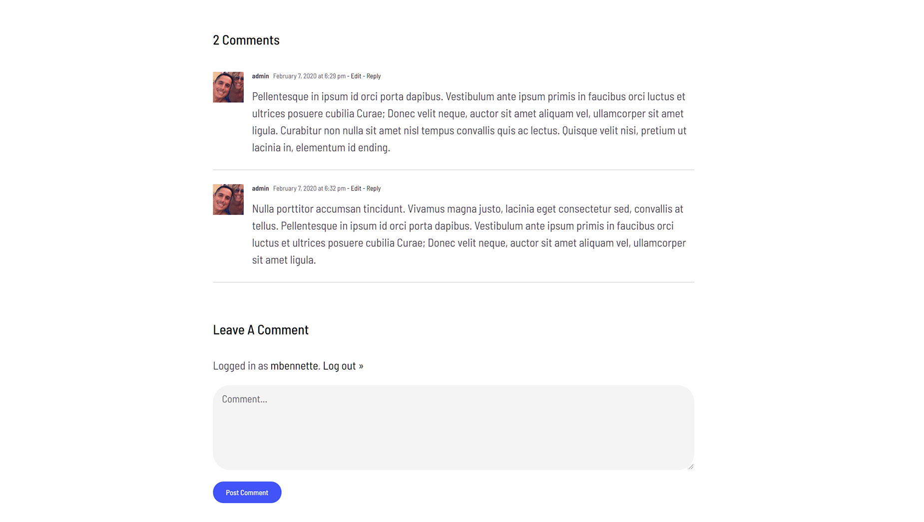
When you go to add an Element in a Content Layout Section, the Element dialog opens in a new tab called Layout Elements. This is where you will find the Comments Element. This is a basic Element, which allows you to place the comment section anywhere on your website. This would most commonly be used in WordPress posts. The Comments Element includes any comments made, as well as the Leave a Comment section, which allows people to submit their own comments. It will not display if comments are not permitted for that post or page.
The Comments Element can be placed anywhere in your Layout, and will dynamically pull the comments area into the page, based on the conditions set in the layout. You can also use the full range of Avada Design Elements when building your content layout. See below for an example of the Comments Element on a post on the Avada Fitness website. Additional examples can be viewed on the Avada Restaurant and the Avada Recruitment websites.
Element Options
Note: The displayed option screens below show ALL the available options for the element. If you have Avada’s Option Network Dependencies turned on, you will only see options relevant to your selections, and so the options screen may look somewhat different.


