Chart Element
Last Update: August 31, 2025
The Chart Element allows you to plot data in several different ways, displaying as a nifty-looking chart. There are various chart types to utilize, such as Bar, Horizontal Bar, Line, Pie, Doughnut, Radar, and Polar Area. Some usage examples include line graphs that show data can be used to compare changes over the same period for more than one group. Pie charts are for when you are trying to compare parts of a whole; they do not show changes over time. Bar graphs are used to compare data between different groups or to track changes over a specific time frame.
Watch the video below for a visual overview of the Element, view the Avada Chart Element page for live examples, and read on to see the complete list of options.
Chart Types
The Chart Element brings to you 7 different ways to display your numerical data, each one as impressive as the next, and each one suiting several or different types of design and layout. Which you use and how you use them is completely up to you, as we have included extensive styling options for each chart.
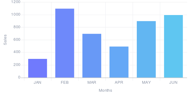
Bar Chart
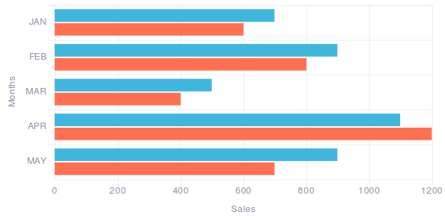
Horizontal Bar Chart
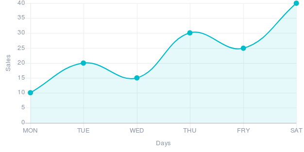
Line Chart
Pie Chart
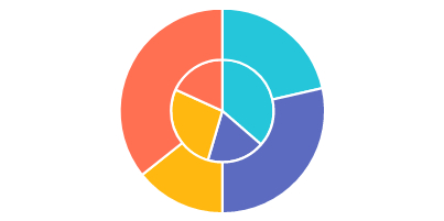
Doughnut Chart

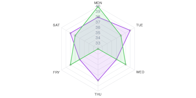
Radar Chart
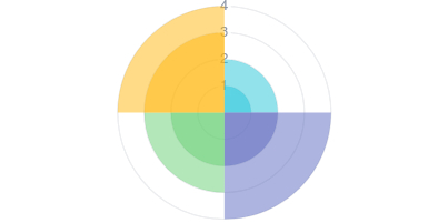
Polar Chart
How To Use The Chart Element
To start with this Element, just add it to your desired Column. Charts can be simple, and they can be very complex. The Chart options are broken up into two sections to make the process as easy as possible. The first section is called Chart Options. Here you configure the chart by giving it a title, choosing the chart type, the labels on the X and Y axes, as well as border, fill, and other styling options.
Once you have finished configuring the chart, you need to populate it. This happens in the Chart Data section. Here you can add Value Columns and Data Sets to build your chart. Once you are happy with the final result after you have entered your data, click Save.
Please read below for details on the specific options the Chart Element has.
Element Options
Note: The Default setting will use the global settings assigned for this element at Options > Avada Builder Elements > Chart. Also, please note that the displayed options screens below show ALL the available options for the element. If you have Avada’s Option Network Dependencies turned on, you will only see options relevant to your selections, and so the options screen may look somewhat different.
If you are using a Bar or Horizontal Bar Chart, the table interface and available options will change depending on the number of datasets added. This setup is needed in order to ensure maximum flexibility for your chart styling.


