Avada Widget Options
Last Update: October 31, 2025
Widgets can be styled via the ‘Avada Widget Options’ button and can be applied to every widget available. Please continue reading below to know more about the widget styling options.
How To Use Avada Widgets Options
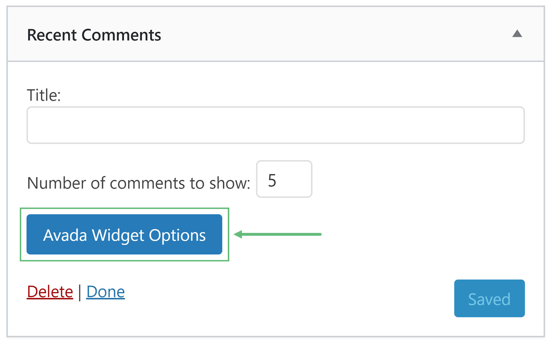
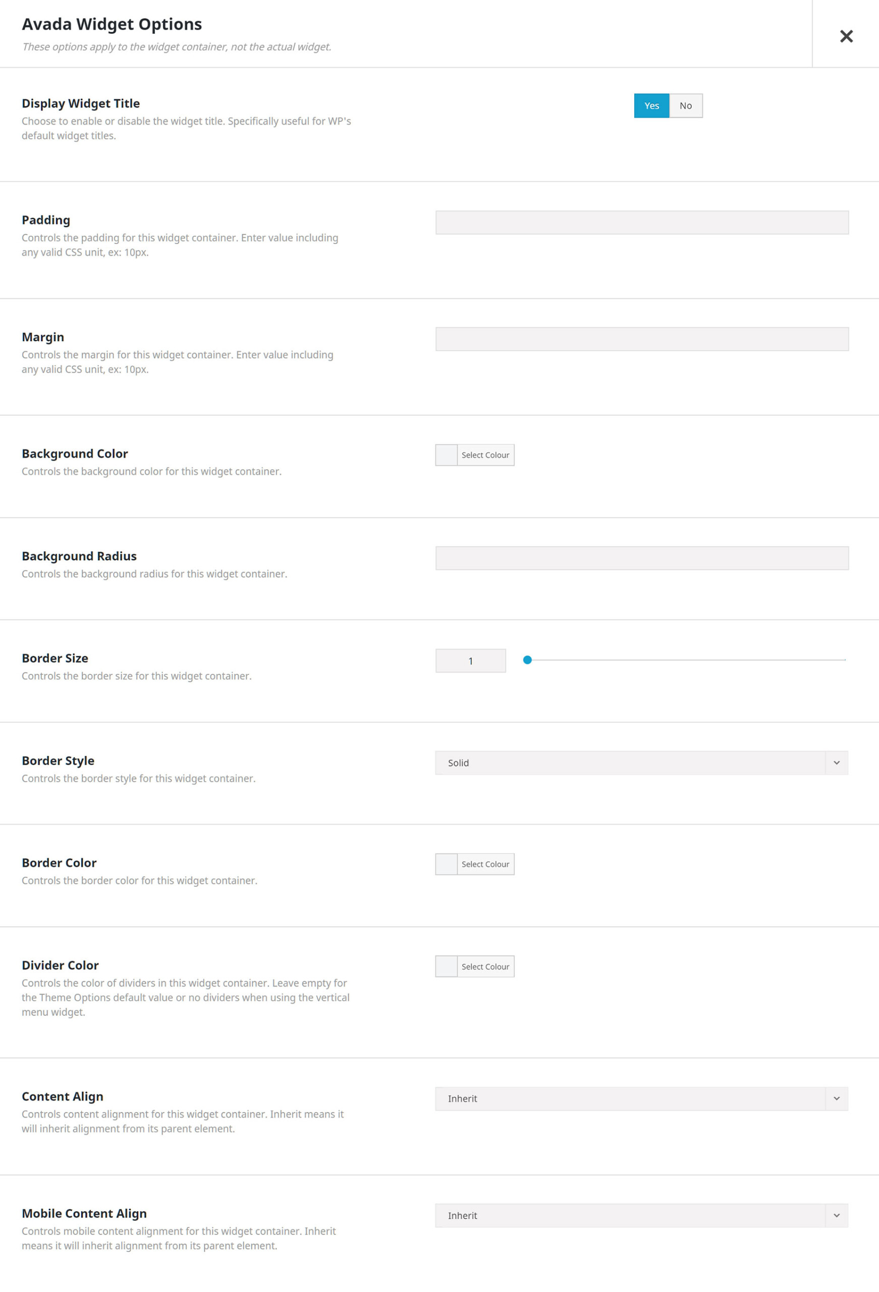
Avada Widget Options
Display Widget Title – Choose to enable or disable the widget title. Specifically useful for the WordPress default widget titles.
Padding – Controls the padding for the widget container.
Margin – Controls the margins for the widget container.
Background Color – Controls the background color for the widget container.
Background Radius – Controls the background radius for the widget container.
Border Size – Controls the border size for the widget container.
Border Style – Controls the border style for the widget container. Choose between None, Solid, Dotted, or Dashed.
Border Color – Controls the border color for the widget container.
Divider Color – Controls the color of dividers in this widget container. Leave empty for the Global Options default value or no dividers when using the vertical menu widget.
Content Align – Controls the content alignment for the widget container. Choose between Inherit, Left, Right, or Center. Inherit means it will inherit alignment from its parent element.
Mobile Content Align – Controls the mobile content alignment for the widget container. Choose between Inherit, Left, Right, or Center. Inherit means it will inherit alignment from it’s parent element.


