Share
Designing responsive websites can be challenging due to various form factors and screen sizes. Advanced tools are essential to manage these variations effectively. Avada, already a fully responsive Website Builder for WordPress, offers powerful global options and specialized tools for fine-tuning responsive design. Among these tools, Avada Responsive Option Sets stand out for providing granular control.
Overview
What Are Avada Responsive Option Sets?
Avada Responsive Option Sets allow designers to independently customize the appearance of website elements based on three distinct screen sizes—large, medium, and small. Instead of relying solely on Avada Global Options, designers can specify unique settings for each screen category within the same element, significantly enhancing flexibility and control.
These responsive option sets are primarily available in Avada Containers and Avada Columns, though they also exist across many Avada Elements throughout Avada Builder. Each responsive option is identified by a specific screen-size icon beside the setting.
To recap, Avada Responsive Option Sets can be found in these locations:
How to Use Avada Responsive Option Sets
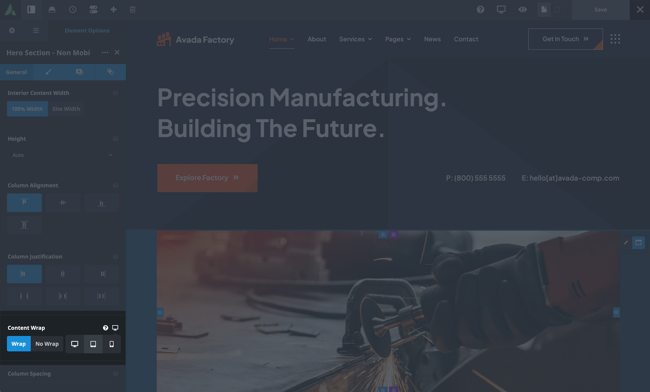
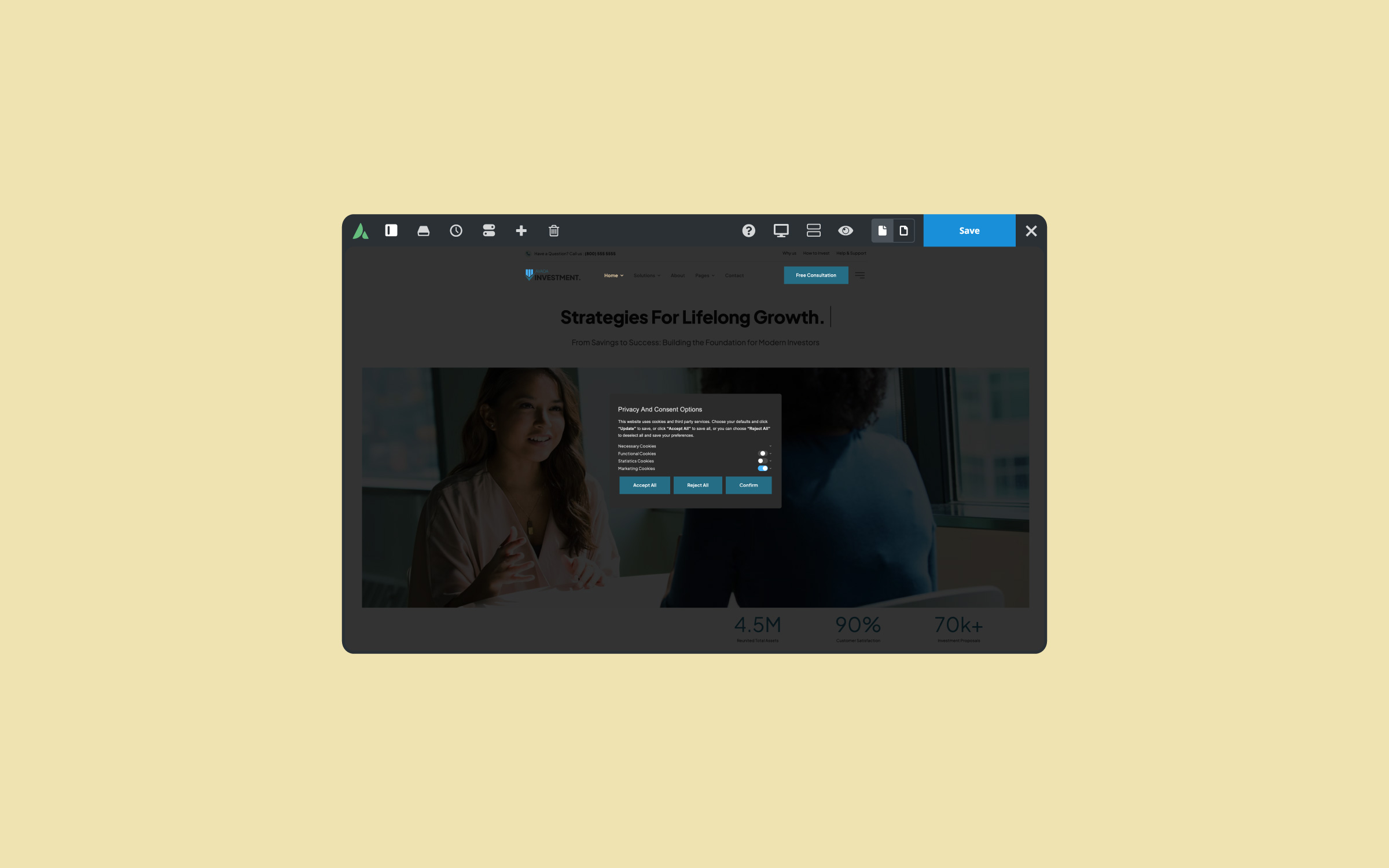
The Avada Factory pre-built website provides a practical demonstration for this article. By editing a Container, the responsive options appear through icons next to specific controls. Clicking these icons enables switching between large, medium, and small screen views, allowing distinct settings for each size.
For instance, Columns initially set to one-quarter width on large screens can automatically change to half-width on medium and full-width on small screens. While Avada defaults to inheriting large screen settings on medium screens and full-width layouts on small screens, designers can override these settings for more precise control.
Practical Example: (Avada Factory) Services Section
Consider a typical services section where individual service items appear in quarter-width columns on large screens. By navigating to medium screens through Avada’s responsive options, designers might adjust these columns to half-width, deviating from global defaults. On small screens, reverting columns to default full-width typically provides optimal readability, though customization is possible.
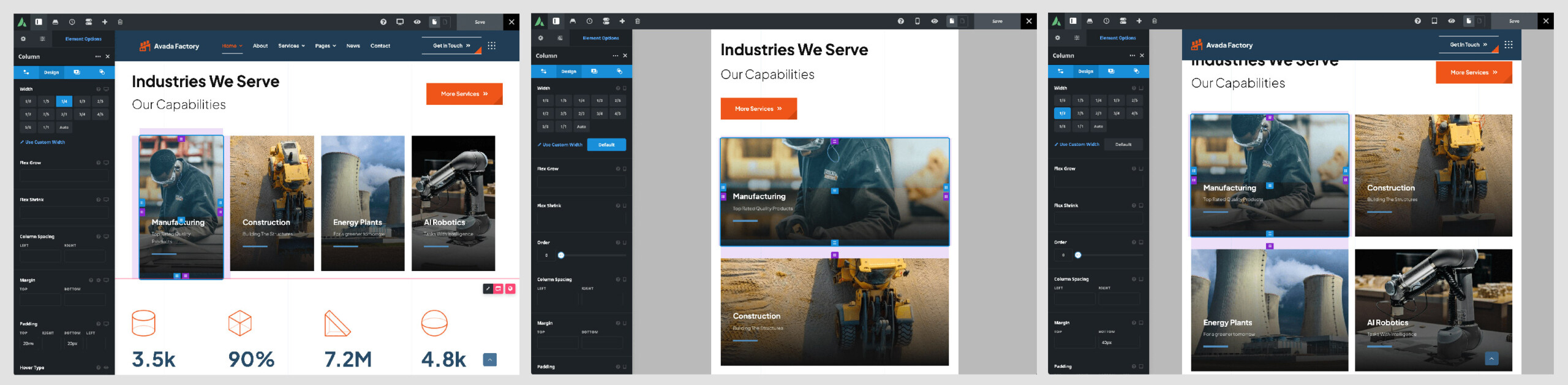
It’s crucial to test design adjustments on actual devices. Just because an option exists doesn’t imply its practicality in every scenario. For example, setting half-width Columns on small screens may adversely impact readability due to limited screen real estate.
Responsive Option Sets vs. Rendering Logic
The primary responsive settings are located under Options > Responsive in the Avada Dashboard. However, other global options throughout Avada also affect how a site looks on different devices.
Avada Responsive Option Sets
Avada Rendering Logic
Summary
Responsive Option Sets are among Avada’s most powerful responsive design tools. They provide substantial control and flexibility for creating exceptional, device-specific user experiences. Designers can significantly enhance their layouts through thoughtful use of responsive settings, ensuring optimal design clarity and functionality across all devices.
This is the Avada Builder’s main responsive feature, allowing you to set specific options independently for different screen sizes. Some specific Element options can hold up to three sets of values corresponding to the three Responsive screen sizes: large (Desktop), Medium (Tablet), and Small (Phone).


