Share
There’s not a lot of debate about the power of email subscriptions. Without a doubt, it’s important that you are asking your visitors to subscribe as effectively as possible!
That said, your readers aren’t psychic, and can’t subscribe if you don’t give them the opportunity. By simply asking for people to subscribe throughout your WordPress site with consistent messaging and presentation, you’ll ensure that you catch every potential subscriber possible.
Are you ready to stop letting subscribers slip through your fingers? In this post, we’ll discuss how to creatively insert your subscriber form throughout your WordPress website, in order to convert your readers into engaged participants of your brand!
1. Add Omnipresent Calls to Action in the Header, Footer, or Sidebar
An omnipresent Call to Action (CTA) is one that shows up throughout your entire site. It’s always waiting to catch new readers, and can be found no matter what page the viewer is on.
There are three main locations where this particular CTA can live:
This CTA is invaluable because you know that you’re putting every page to work. It’s baked right into the most important action locations that people use on a regular basis, which means people can’t miss it.
Here’s a bonus: If you’re willing to put a bit of effort in, you can not only track which pages are sending the most subscribers, but which also exact form location performs best! These numbers arm with you valuable knowledge about how your users interact with your design, which enables you to make more informed decisions about your website design in the future. (Exactly how to integrate the tracking of these marketing numbers will change for each email subscription service, but here’s how to do it with MailChimp.)
Feeling confused? Here are a few examples from around the web that demonstrate how to use each of these omnipresent CTA locations.
CTA in the Header
Including a call for subscriptions in the header is best done with subtlety, because you don’t want to make it difficult to navigate your site.
The Villages of Van Buren solves this problem with a simple button that brings you to the subscribe page:
CTA in the Sidebar
You have a little more wiggle room to write an introduction for the newsletter in the sidebar. Explain what sort of content the reader will receive before throwing the form in there!
Keep it simple, while providing relevant information for their newsletter:
CTA in the Footer
How detailed you care to be in your footer heavily relies on how much space your design allows for. Typically, it falls somewhere between the brevity of the header and the more detailed approach of the sidebar.
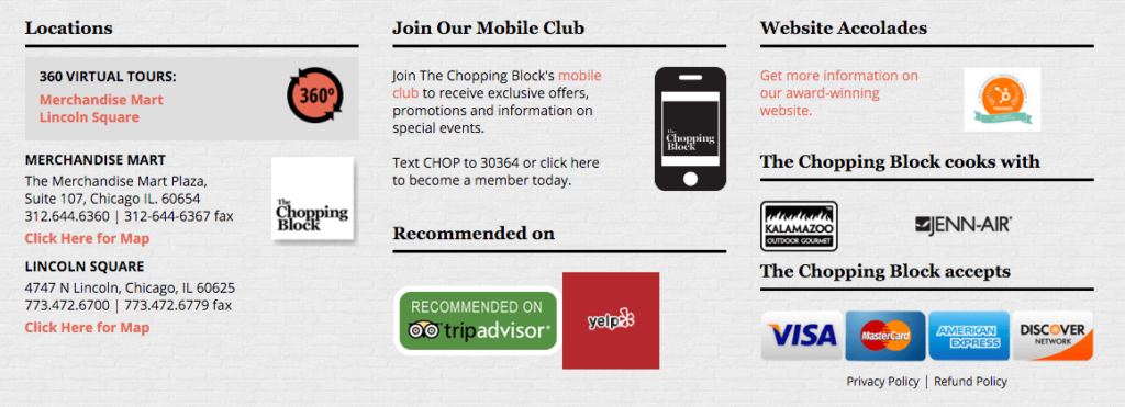
The Chopping Block offers a mobile subscription to their content, so they are able to make unique use of their subscribe call to action with a brief text and mobile phone image:
2. Integrate Contextually Relevant Subscription Forms Within Your Content
By only using subscription forms in typical locations (such as the header), you wind up leaving a lot of potential subscribers out in the cold.
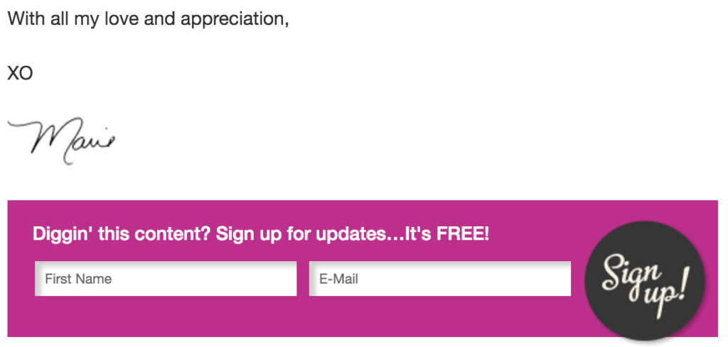
Here’s how one blogger, Marie Forleo, ensures every reader has the chance to subscribe after finishing her posts:
You can take this one step further.
It’s only logical that the prime moment someone may subscribe is when they’re actively experiencing the benefit they gain from your work. So, why not include a call to action right there, within your content?
Plugins like Easy Forms for MailChimp make it easy to include a signup form within your pages and blog posts.
For best results, make the form copy contextually relevant to the article. In other words, don’t randomly paste a template form; instead, introduce how your newsletter is relevant to what the reader is currently reading about, then ask for the subscribe with the form.
Here’s an example of what we mean:
Learning how to maintain the feng shui in your home takes ongoing practice. That’s why we send out weekly feng shui tips in our interior design newsletter.
You can subscribe easily, right here!
[Add Your Subscribe Form Here]
Even better, create a signup incentive specific to the article! The above example could read more like this:
Learning how to maintain the feng shui in your home takes ongoing practice. That’s why we send out weekly feng shui tips in our interior design newsletter.
If you subscribe right now, you’ll also get our free e-book: “The Beginner’s Guide to Feng Shui” [Add Your Subscribe Form Here]
Whether or not you include a form within a post itself, don’t forget to include a warm welcome to the newsletter and call to action at the end of your blog posts. You can use this on pages too, where it makes sense! CorePower Yoga is a great example of this:
3. Use (Tasteful!) Pop-Ups to Maintain Integrity While Boosting Conversions
Pop-ups are not without their controversy. Businesses love them, since pop-ups continue to hold high conversion rates in many environments. On the other hand, pop-ups perform best when employed tastefully, due to the knee-jerk reaction of seething rage on the visitor’s side of things.
This brings us to a very poignant question. What does tastefully mean?
Scroll Triggered Boxes offer solid examples of pop-ups that users may intuitively appreciate.
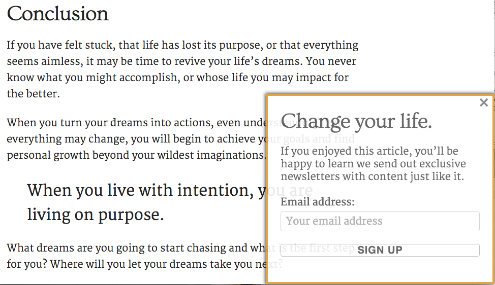
In this situation, the pop-up politely asks for a subscribe after the reader has made it all the way to the end of the blog post. It’s ethical, unobtrusive, but still catches attention. Best of all, it’s specifically targeted at people who finished your content and loved it. Who better to subscribe to your email list than your avid readers?
Here’s the plugin in action on the Without Boxes blog:
Experts all around the web have weighed in on what’s important for pop-ups, and we’ve narrowed it down to the two that we believe hold the most weight:
If you can stick to these two rules, your pop-ups won’t cause too much nuisance for your users, and should increase your subscriber rate considerably.
Consultant Lewis Howes has a great example of a pop-up that waits until you’ve had the chance to see what’s on the site first:
Conclusion
Don’t let your content stop working for you, even for a moment! Integrate clever subscriber forms and calls to action throughout your site for better subscription rates.
Ensure that your website is catching as many subscribers as possible by integrating:
How do you ask for more subscribers? What are your favorite opt-in plugins? Share your successes in the comments section below or let us know if you have any questions using Avada with WordPress!
Image credits: Michael Dunner


