Share
Of all the pages you will create for your website, a contact page is one of the most important after the homepage. While many online businesses treat their contact page as an afterthought, a strategically designed one can significantly improve user engagement, trust, and overall customer service satisfaction.
Building an engaging contact page for your website using WordPress and Avada is easier than you think. This article will explore five key elements to help you supercharge your contact page.
Overview
What Is the Purpose of a Contact Page?
Simply put, a contact page provides contact points between visitors and businesses. But it goes beyond that – from its capacity to invite potential customers to get in touch to offering existing customers a quick and easy means to reach you. In many ways, it helps build trust and confidence in your brand.
To build an effective contact page, you need to go further than including only static text with your address and phone number. Consider the following elements to squeeze as much power from your contact page as possible.
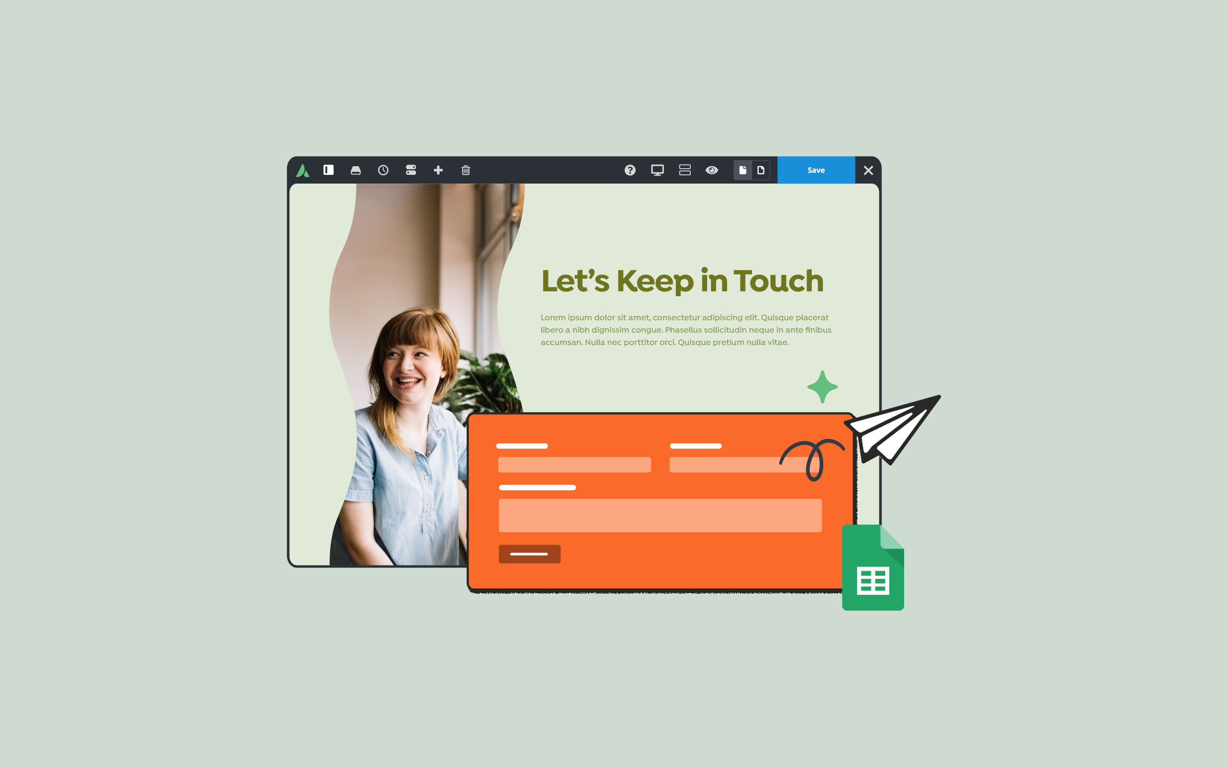
1. Clear and Engaging Headline
The first thing visitors notice upon landing on your contact page is the headline. Your headline should immediately inform visitors why they should reach out, what benefits they’ll gain, or how easily their concerns can be addressed. A compelling, clear headline captures attention and reassures visitors they are in the right place.
Avada makes building the ideal layout for this page straightforward using the Avada Live Visual Builder. You can drag and drop your choice of Avada Design Elements into place with ease. Choose a large, readable font and place it at the top of your contact page. Here are some examples:
Set your headline apart with strategic typography settings, including bold fonts and attention-grabbing color contrasts.
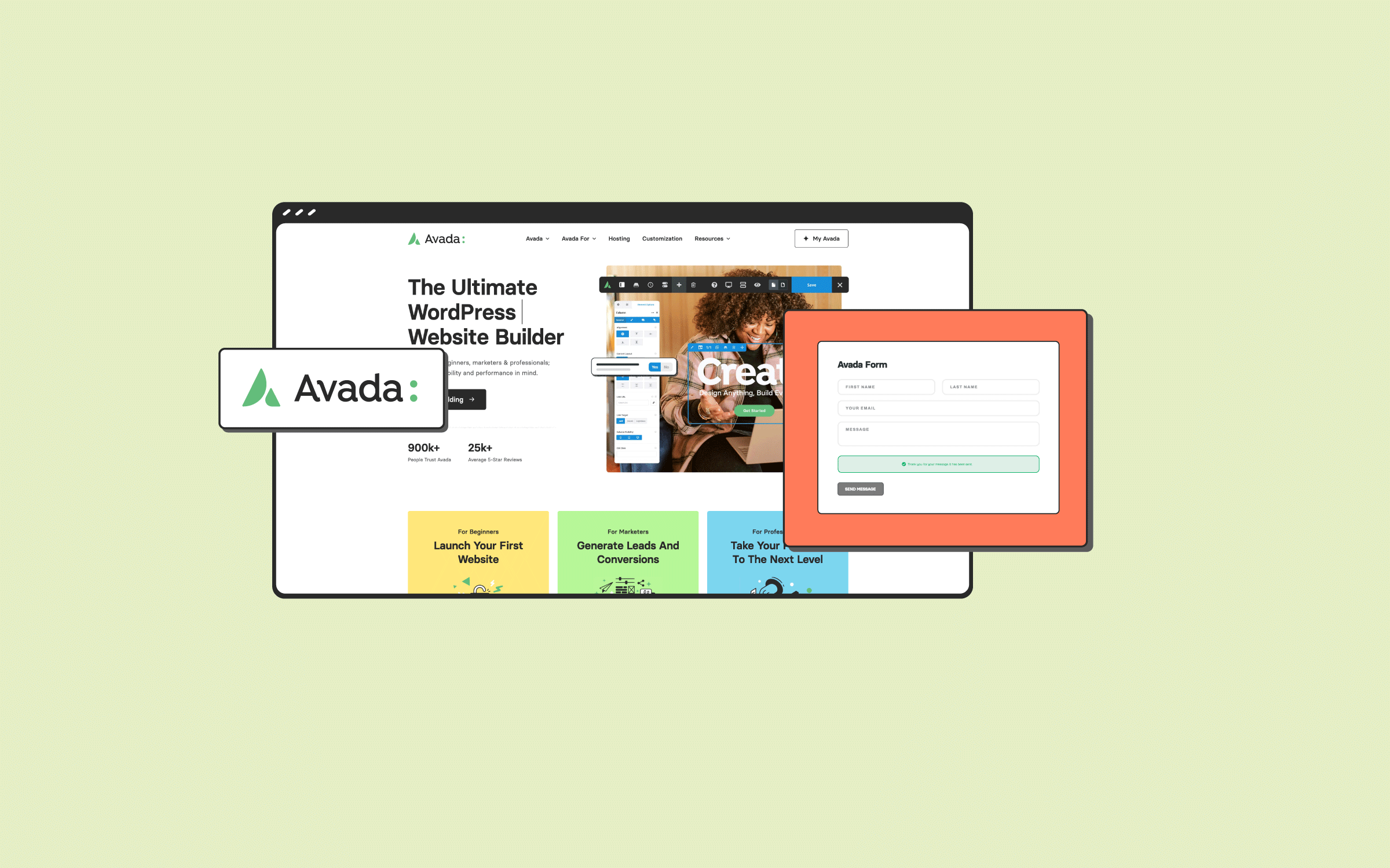
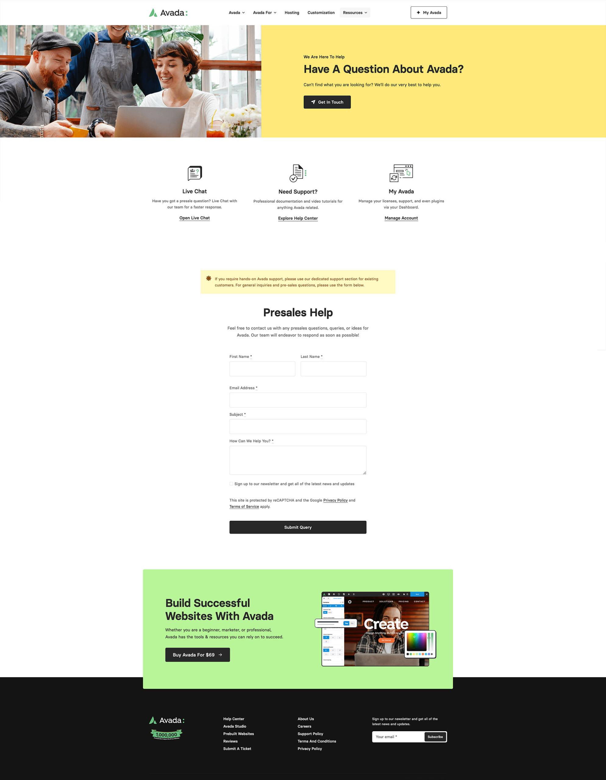
2. Customizable Contact Form
Your contact form should be user-friendly, accessible, and tailored to your audience’s needs. Using Avada’s Form Builder, you can design and build any type of form, whether complex or simple. Here are some tips to keep in mind:
Keep it Simple
Limit fields to essential information like name, email, subject, and message to avoid overwhelming visitors with unnecessary details.
Personalize the Experience
Implement Avada Forms Conditional Logic to display fields relevant to visitors’ selections, enhancing usability. The submit button should have clear calls to action, such as “Send Message,” “Submit Query,” or “Get Help Now.”
Responsive and Mobile-friendly
Avada’s responsive design options ensure you can create a contact form that looks great on all devices, from desktop to mobile.
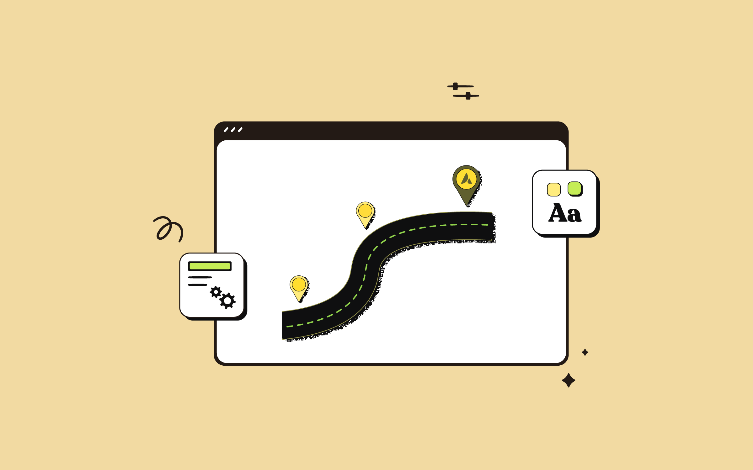
3. Consider Integrating An Interactive Map
Integrating a map displaying a physical location boosts credibility and user convenience. Avada integrates seamlessly with Google Maps and OpenStreetMaps, allowing easy embedding using the respective Avada Elements and providing a range of customizable options.
4. Compelling & Accessible Contact Information
Beyond forms and maps, displaying your contact details—like email addresses, phone numbers, and social media links—is crucial for user convenience. Using the Avada Icon Element, for example, can visually highlight these details:
5. Trust Signals and Testimonials
Trust signals such as testimonials or client logos greatly enhance credibility and encourage visitors to reach out confidently. Placing these elements strategically near your contact form reassures visitors, significantly increasing the likelihood they will complete and submit the form.
Summary
Implementing these five elements—clear and engaging headlines, customizable contact forms, interactive maps integration, compelling contact information, and firm trust signals—will transform your WordPress and Avada contact page into a powerful conversion engine.
Evaluate your page performance regularly through analytics and refine it to meet your audience’s evolving expectations.