Share
Long-form content and clean page design don’t always play well together. A recruitment page listing dozens of sectors, an “About Me” section with a few paragraphs too many, or any block of text that’s valuable but visually heavy can quickly disrupt a page’s flow. The Avada Collapsible/Read More Option solves this by letting you collapse a Container or Column to a defined height and reveal the rest on click — without hiding the content from search engines or users who want it.
This tutorial walks through every setting available for this feature, so you can configure it confidently whether you’re new to Avada or looking to get more precise control over an existing setup.
Overview
What the Collapsible/Read More Feature Does
This handy option lets you truncate a Container or Column to a set height, displaying a button (or your own custom trigger) that expands the full content on click. It’s ideal any time you’re balancing visual simplicity against content depth — think long text columns, extensive lists, or sections with more detail than the page layout should show by default.
The feature is available on both Containers and Columns and can be enabled independently for each screen size, so you can, for example, apply it only on mobile to keep smaller screens easy to scroll. Let’s take a closer look at how to enable and use this feature effectively:
Step 1: Enable the Option
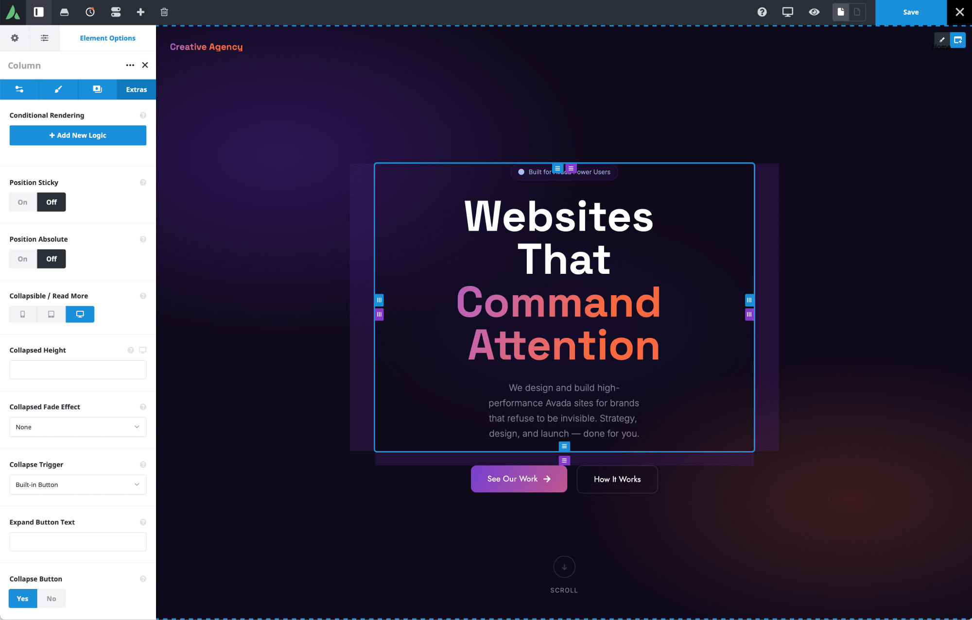
Once enabled, a set of dependent options appears, letting you fine-tune exactly how the collapse and expand behavior works.
Step 2: Set the Collapsed Height
The Collapsed Height Option defines how much content is visible before the reader has to expand it. It accepts:
This value can also be set independently per screen size. If you set it only on large screens, that value will automatically propagate to medium and small screens unless overridden.
Step 3: Choose a Collapsed Fade Effect
The Collapsed Fade Effect Option controls how the cut-off point of the collapsed content is visually softened. There are three settings:
Which option works best will depend entirely on your design and the background it sits on.
Step 4: Configure the Collapse Trigger
By default, Avada uses a built-in button to expand and collapse content, styled according to your website’s default button settings. If you need more control over styling or placement, you can use an external link or button instead. This requires:
You can use two separate buttons (one for expand, one for collapse — each auto-hidden when inactive), or simplify things with a single button set to “Toggle”, which switches between states automatically.
Step 5: Customize the Button Text and Behavior
With the built-in button selected, you have several more options:
Step 6: Position the Button
The Expand/Collapse Button Position option determines where the button sits relative to the collapsed content:
Which one to use depends on your layout and color scheme — overlay works well with a subtle fade, while below content keeps things clean and separate. You can also set:
Step 7: Set the Animation Speed
The Expand/Collapse Animation Speed controls how quickly the transition happens, and can be set anywhere from 0 to 5,000 milliseconds. The default of 400ms works well for most use cases, offering a smooth transition without feeling sluggish.
Step 8: Preview Across Screen Sizes
Once your settings are in place, preview the Container or Column at large, medium, and small breakpoints to confirm the experience holds up across all breakpoints. Content that reads comfortably on desktop can feel excessive on mobile — this is exactly the kind of case where the “Read More” feature earns its keep, turning an unwieldy block of text into an easy, single-click reveal.
Applying This to Columns
Everything covered above works the same way on Columns — whether it’s a full-width Column inside a Container, or one Column among several sitting side by side. A common use case is an “About Me” or bio section where the text exceeds the design’s requirements. Collapsing that Column to a set height keeps the layout tidy while still giving readers full access to the content with one click.
Summary
The Collapsible/Read More feature is a small addition with a wide range of practical uses — cleaning up dense text blocks, improving mobile usability, or giving you fine-grained control over how much content is shown up front. Once you’re familiar with the height, fade, trigger, and button options, you can tailor it to fit almost any layout in Avada, whether you’re refining an existing page or building something new.