Share
The vast majority of websites have a traditional layout: a header in the top third of the page, followed by content, and a footer with links and pertinent information at the bottom. When someone visits your website, the above-the-fold content is the first thing they will see, and it should leave a positive impression. Alternatively, a fullscreen header will catch your visitors’ attention with a stunning edge-to-edge design, regardless of the screen width and height.
In this post, we’ll walk through creating a fullscreen web page header with the navigation seated at the bottom of the screen using Avada and WordPress. This guide uses a Avada pre-built website and covers everything from setting up a custom Layout to adding navigation and ensuring responsiveness for various screen sizes. Let’s get started!
Overview
What Is Above-The-Fold?
The concept of above-the-fold originates from the newspaper industry, where the most important content was placed on the top half of a folded newspaper, ensuring it was immediately visible to readers.
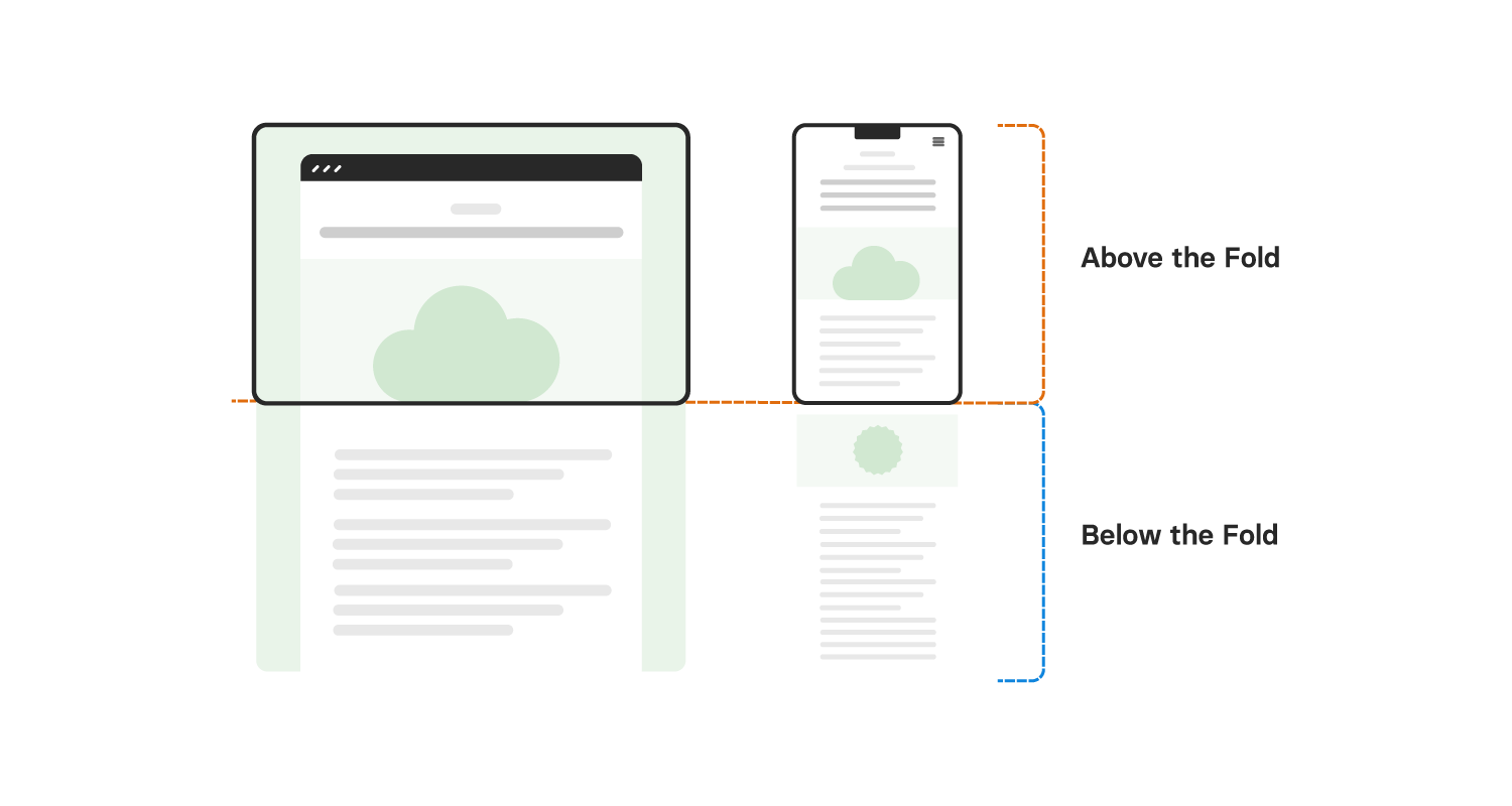
Within the context of web design, the above-the-fold portion of a web page is visible when the page first loads before the user scrolls down. The goal of this guide is to ensure that the navigation appears in the visible area once the user scrolls (at the bottom of the screen) or, in some cases, make it sticky so it remains visible as they move down the page.
A Fullscreen Header with Bottom Navigation
This guide provides a step-by-step process for creating a full-screen web page with bottom navigation in Avada. Following these instructions, you can craft a visually engaging and fully functional layout tailored to your needs.
Step 1: Setting Up the Layout
The default Avada Gym website features a traditional top header with a logo, menu, and button on a transparent background. The goal is to move this navigation to the bottom of the page and convert the header into a fullscreen layout.
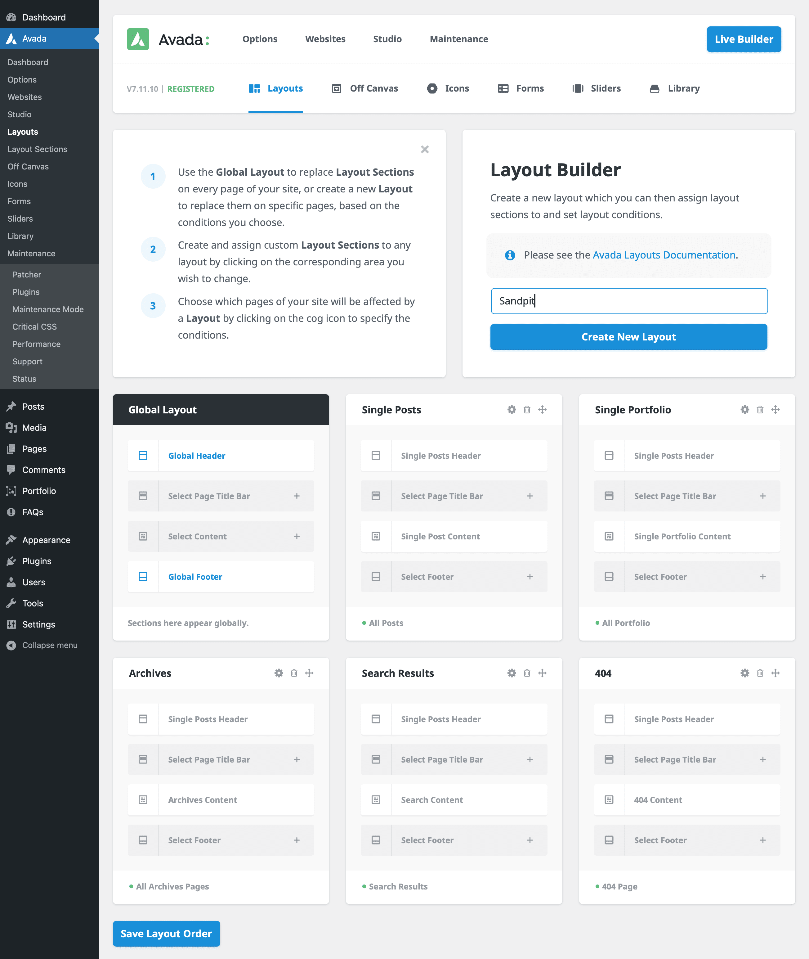
Start by heading to the Layouts section in Avada and creating a new layout called “Sandpit.” Next, create a new header layout section named “Full Page Header.” Afterward, assign the test page to this new layout to begin working on the header.
Step 2: Creating the Hero Section
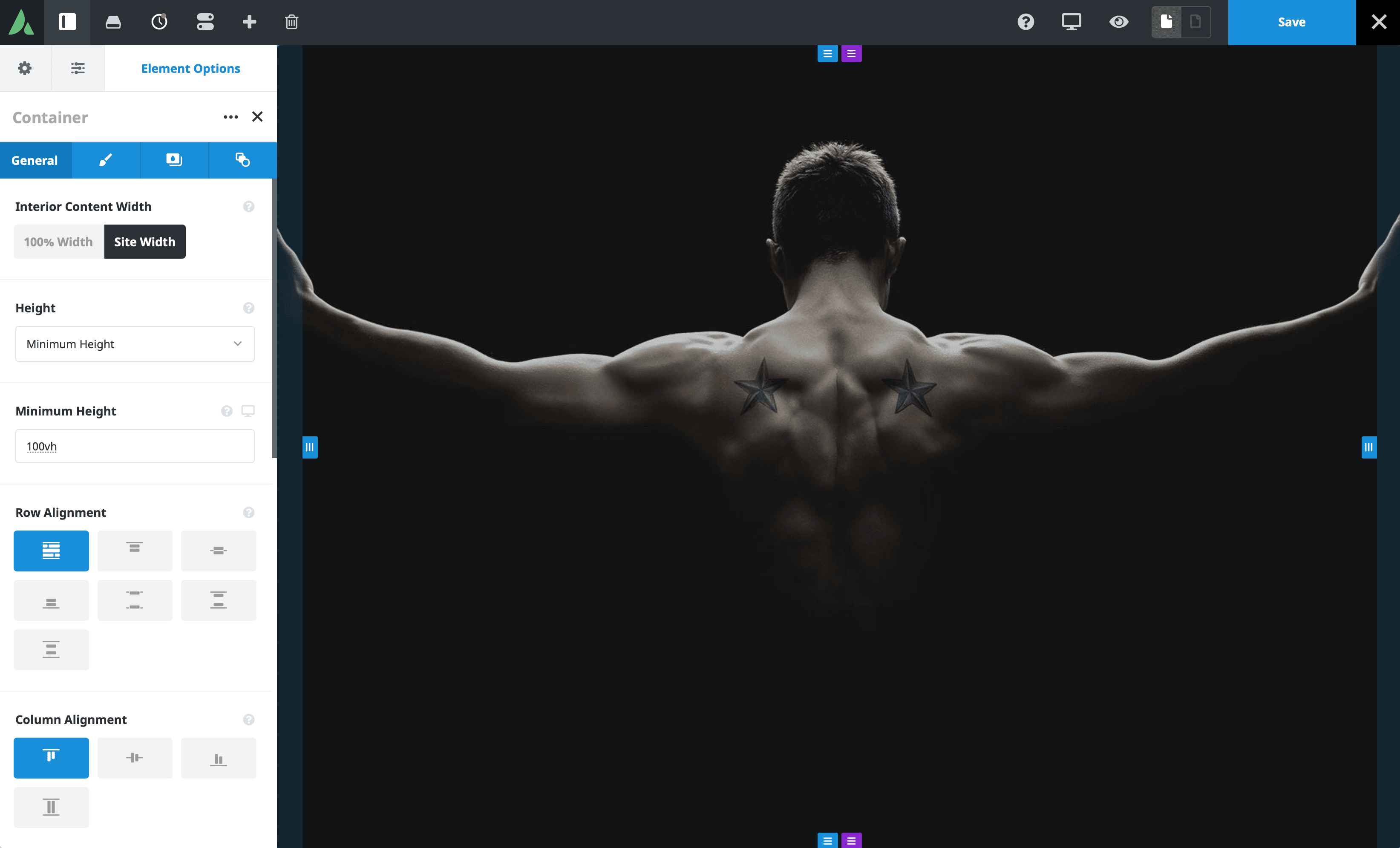
For the hero section, which will serve as the full-page header, select a 1-1 Container Element and set the minimum height to 100vh (100% of the viewport height). Add the desired hero image through the background settings. It’s essential to adjust the background position to “Center Top” to ensure the image aligns correctly when you add the bottom navigation.
Next, copy the content from the homepage’s existing hero section and paste it into the new layout. Set the column alignment to the center and add some top margin (around 400px) for spacing. This will complete the hero section setup.
Step 3: Adding Bottom Navigation
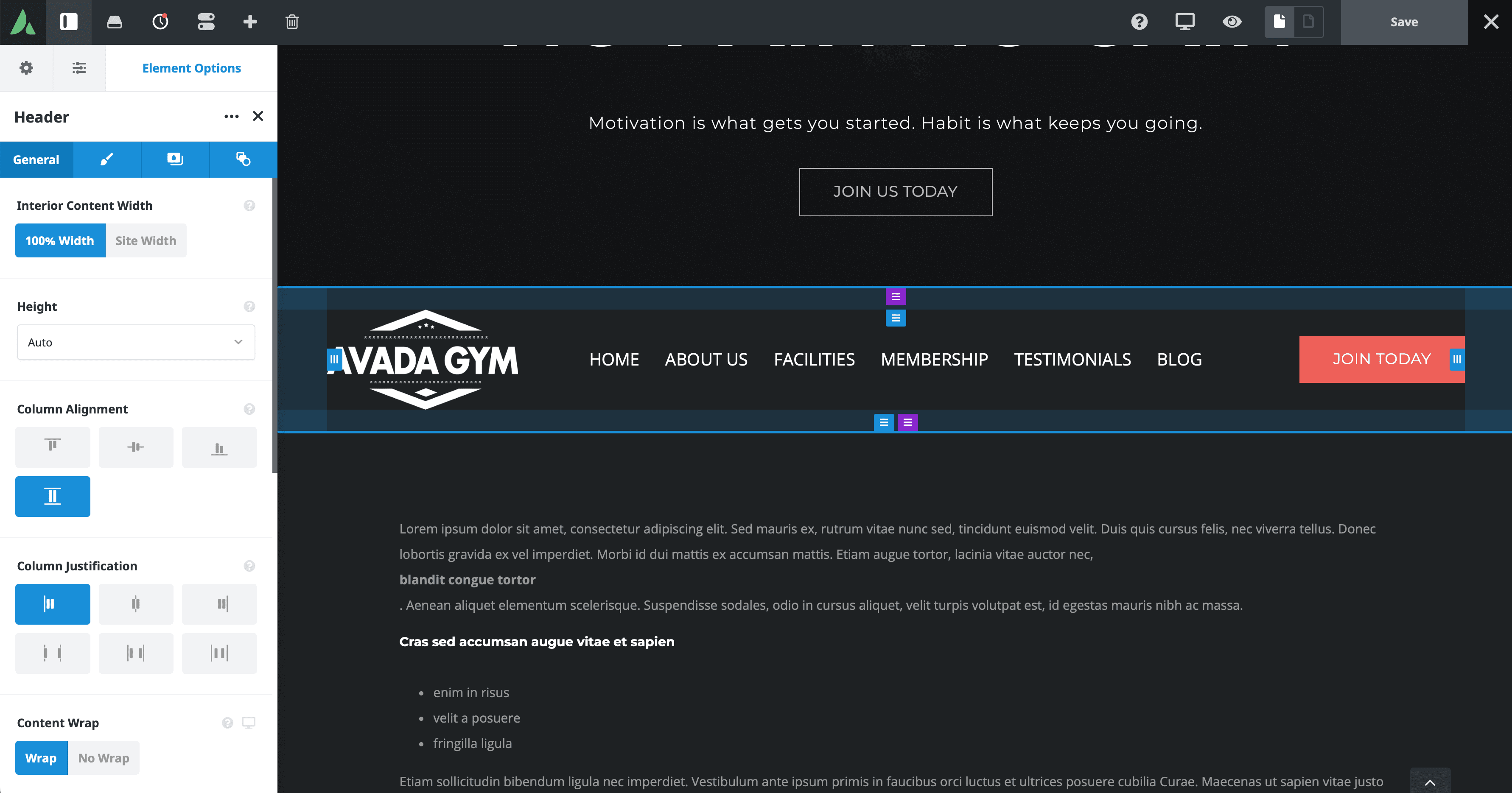
To add the bottom navigation, reuse the original header Layout Section. Copy the Container from the original layout and paste it below the hero container in your new header layout. Since the top Container Element is set to full height, the navigation will appear below the fold. Still, it will be moved to the bottom as we configure the layout further.
Turn off the “Position Absolute” setting in the Extras tab, as it’s unnecessary for this design. Adjust the logo by setting a max width of 250px to ensure it remains crisp and well-sized. For the menu, set the font size to 20px to improve legibility. Further adjustments include reducing the top and bottom padding of the container to 25px and setting a background color for the navigation container.
Step 4: Fine-Tuning the Header Layout
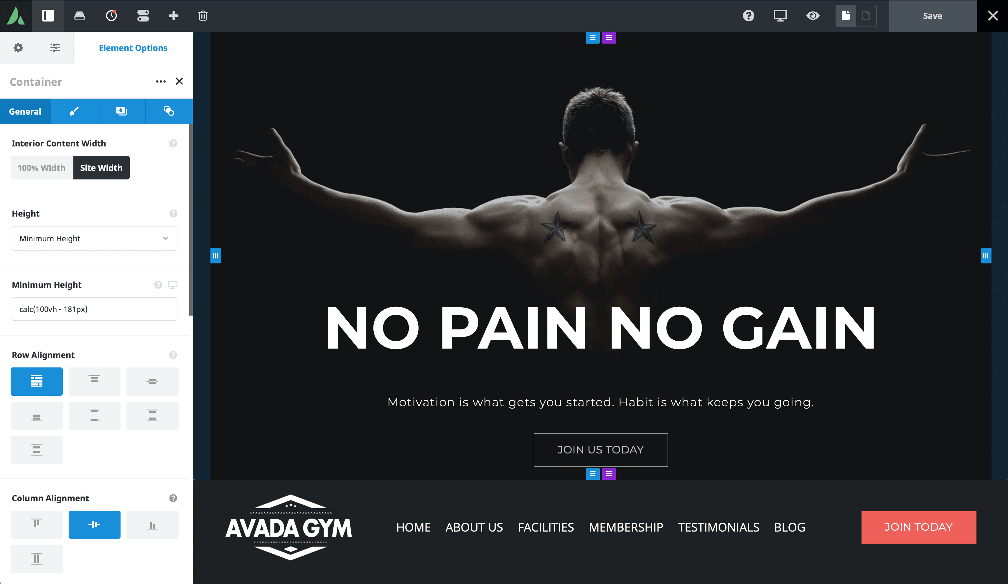
Calculate the total height of the bottom container to ensure the navigation appears just below the hero container. In this example, the logo height is 131px (half of its original size) with an additional 50px padding totaling 181px. Adjust the minimum height of the hero container by subtracting this value from 100vh. You can achieve this with the following calculation:
For a polished look, make the navigation sticky as users scroll. In the Extras tab, enable the sticky position for the navigation container and set a subtle transparent background color when sticky. The logo can also be resized to 150px when the container becomes sticky, giving the layout a smooth, professional feel.
Step 5: Ensuring Responsiveness
Responsive design is crucial for any layout, and Avada makes it easy to adapt your header for various screen sizes. Duplicate the hero container to adjust the layout for medium and small screens. One hero container will display above the navigation for larger screens, and the other will appear below for smaller screens. You can control the visibility of these containers through the rendering logic settings.
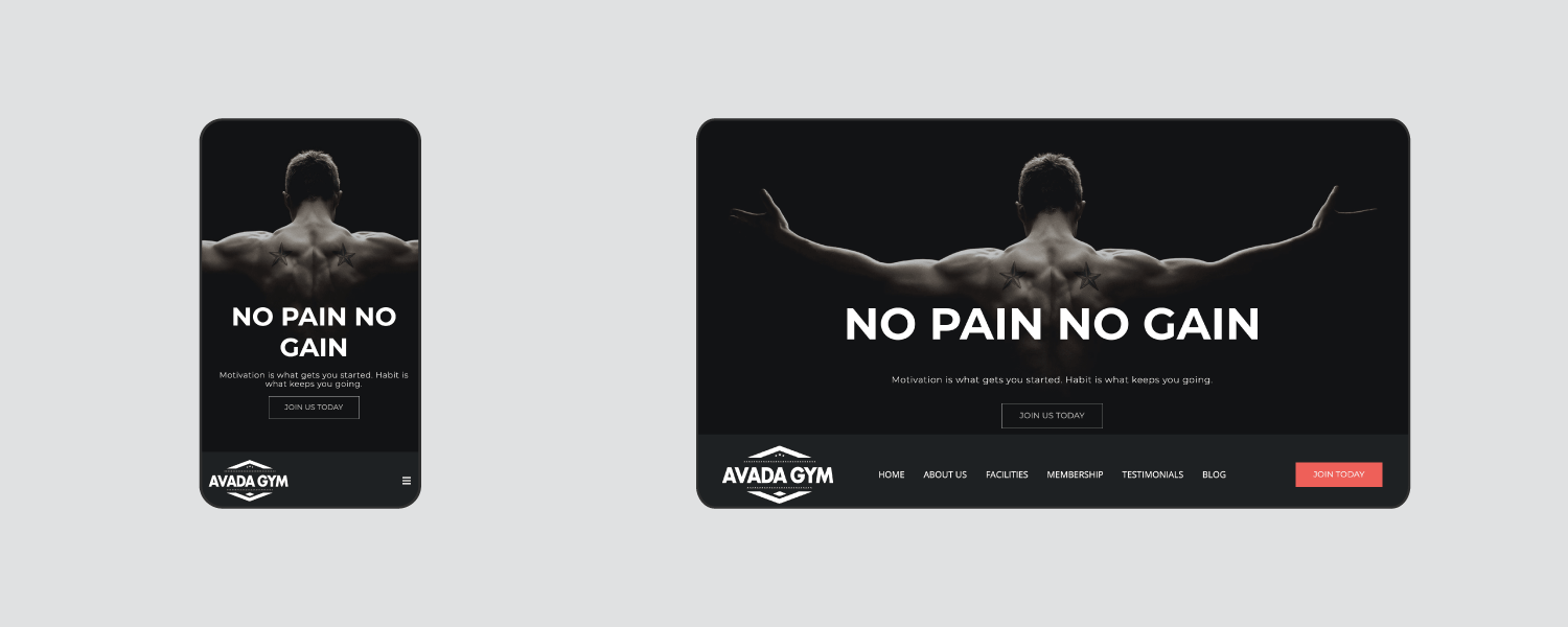
For instance, only set the bottom container to render on medium and small screens. In contrast, the top container will be visible on desktops. Additionally, adjust the font sizes and container heights for medium and small screens (e.g., 600px minimum height for medium screens and 500px for small screens). Ensure the mobile menu trigger size is large enough to navigate small screens easily.
Step 6: Preview and Final Adjustments
Once the layout is complete, preview the design on different screen sizes to ensure everything looks as expected. Check the desktop, medium, and small screen views to verify that the navigation functions as intended and that the layout remains consistent.
In this example, the fullscreen header layout fits perfectly, with the navigation becoming sticky upon scrolling and the logo resizing smoothly. If everything looks good, apply the Header Layout Section to the Global Layout, and remove any redundant hero sections on the homepage.
Additional Options
Alternative ways exist to achieve a full-screen header with bottom navigation. For instance, you can make the top Container full height, set the bottom container’s background semi-transparent, and use negative margins to pull the navigation over the top container’s background. Feel free to experiment with these settings to find the best design for your site.
Summary
This blog post provides a step-by-step guide on creating a fullscreen web page hero with bottom navigation using Avada and WordPress. It outlines the process of setting up a custom header layout, creating a hero section with a full-page image, and positioning the navigation bar at the bottom of the page. The tutorial also covers making the navigation sticky upon scrolling and ensuring the layout is responsive across different screen sizes. Additionally, it offers alternative design approaches and emphasizes the importance of previewing and adjusting the layout for optimal user experience.
