Share
The Avada Container Element is essential in designing content with the Avada Builder. This guide will walk you through the process of using the Container Element, outline its features, and demonstrate its versatility in creating structured and dynamic web pages. Whether you are new to Avada or looking to optimize your designs, understanding the Container Element will help you design more flexible and visually appealing layouts.
Overview
How is The Container Element Beneficial?
The Avada Container Element is a structural layout element. It acts as a framework that allows designers to control the layout by holding Columns and Design Elements in place. By defining sections on a page, the Container Element ensures that different parts of a website are distinct yet unified, making the design more navigable and accessible. In addition to offering structural organization, the Container Element enhances creativity and customization.
Moreover, the Container Element adds significant flexibility to web design. With options like responsive behavior, flexbox alignment, and control over content width, designers can ensure that the website adapts seamlessly to different devices and screen sizes. The ability to manage margins, padding, and advanced CSS features gives designers more control over the spacing and alignment of content, improving the overall aesthetic and functionality of the page.
This element also facilitates the use of advanced interactive features like sticky containers, scrolling effects, and animations, which can be leveraged to create engaging user experiences.
The Role of the Container Element in Avada
It is the foundational building block within Avada, alongside the Column Element. Together, they form the backbone of page structures. The Container holds Columns, which in turn hold Elements. As such, a Container must always be the first element added to a page before Columns or other content.
When starting with a blank page in Avada, users will notice that they cannot add Columns or Elements until a Container is in place. This hierarchy ensures that your content-building process is organized correctly from the start.
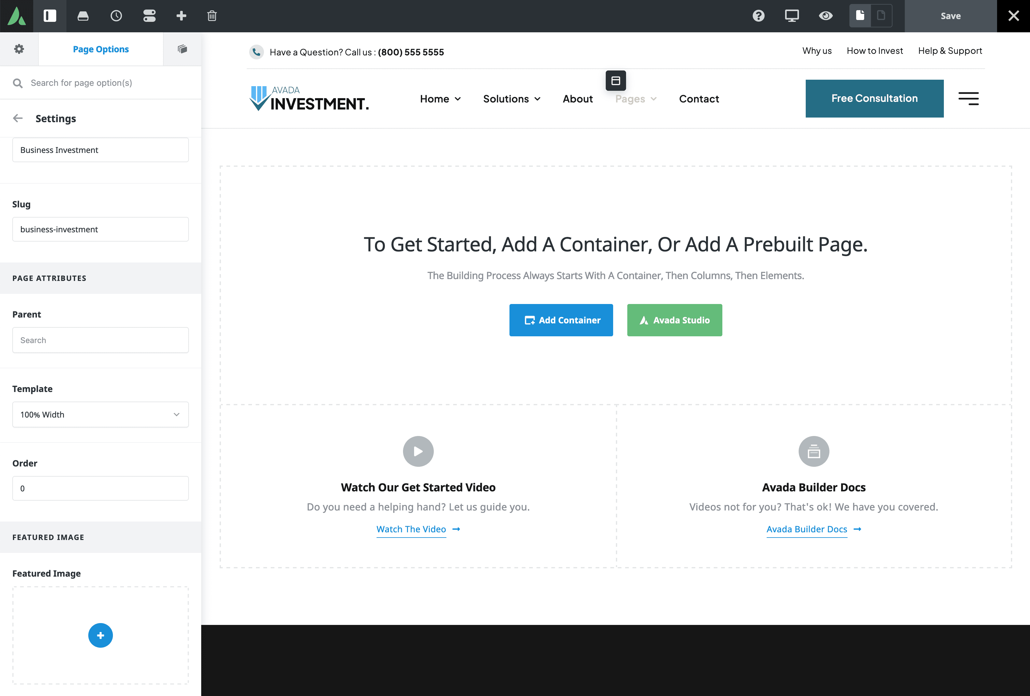
Adding Containers and Columns
The “Add Container” button opens a dialogue box with various options. Users can add an empty Container, ideal for situations where you want to separate content into different sections by adding Columns later. However, in most cases, it’s more efficient to add a Container with Columns simultaneously.
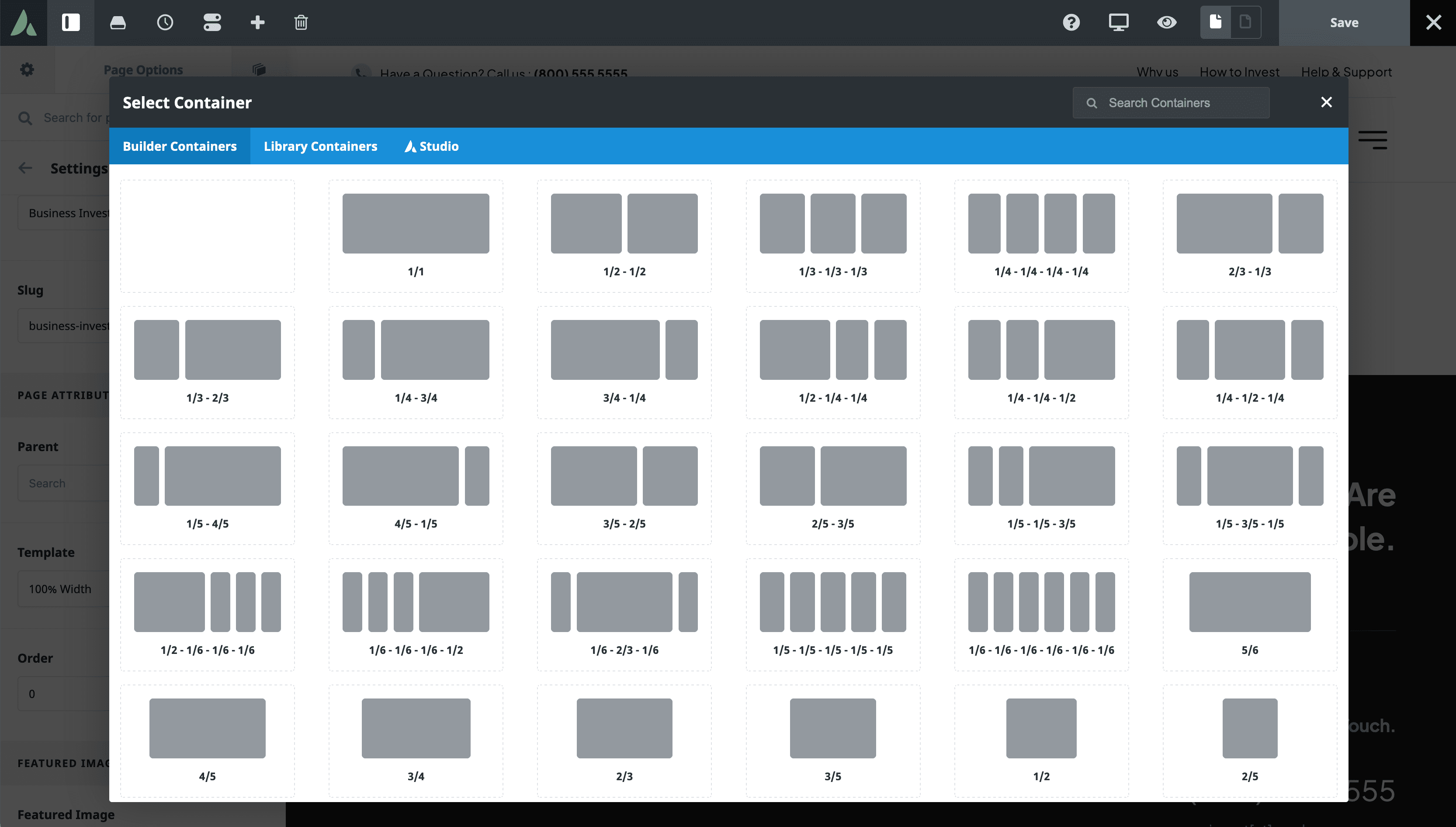
In addition to adding Containers directly, you can also use pre-saved Containers from the Avada Library. This is especially useful for reusing layouts across multiple pages. A Container can be a simple invisible frame that holds two Columns, or it can become a more complex element, depending on your design needs.
Organizing Your Page Or Post with Containers
You can add multiple Containers to a page and stack them one below the other. For instance, you may choose to have all of your content inside one Container or break your page into multiple Containers, each holding a distinct section of your content.
This method offers greater flexibility in managing your layout, and you can name your Containers to keep your design organized. Containers may have different background images, colors, or layout styles, allowing for varied designs across a single page.
Adjusting Page Templates
Page templates also impact the appearance and behavior of Containers. By default, the 100% width page template is used, meaning the Container spans the full width of the page while the Column inside remains at the site width. However, users who prefer their Containers to stay at site width can switch to the site-width template through the page options panel.
The 100% width template is often the most versatile, as it allows you to apply full-width backgrounds, colors, gradients, images, or even videos while keeping the content inside the site width. This creates a visually striking layout that is both flexible and dynamic.
Avada Container Settings and Options
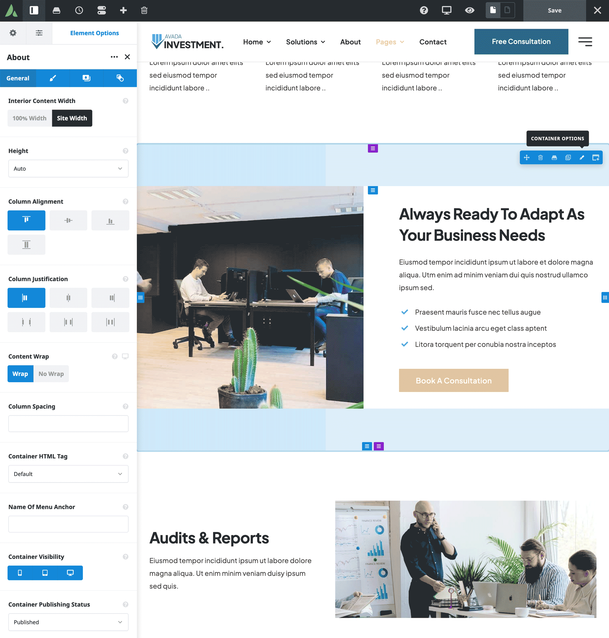
The Container’s General tab contains several essential options for customizing the Container’s behavior and appearance:
Interior Content Width
By default, this is set to “Site Width,” but it can be adjusted to 100% width to have the interior content span the entire screen.
Height Options
Users can select from Auto (default), Full Height, or Maximum Height. Full Height forces the Container to match the height of the browser’s viewport, which helps create impactful full-page sections. Additionally, enabling the “100% Scroll” option activates fullscreen scrolling sections, where each Container scrolls individually.
Flexbox Features
For more advanced layout control, Avada’s Flexbox settings enable vertical and horizontal alignment of Rows and Columns. These settings, such as Row Alignment, Column Alignment, and Column Justification, help you fine-tune how content is distributed within the Container.
The Container Design Tab
The Design tab provides access to margin and padding settings, which allow users to create separation between different elements. These settings are responsive, meaning you can adjust them based on various screen sizes for a mobile-friendly design.
This tab also includes options for adjusting Background Colors, Gradients, Images, and Videos. For example, you can add a box shadow to give your Container a more dimensional look.
Advanced Container Features
For users looking to dive deeper into Container customization, Avada offers a range of advanced options:
CSS Styling
Users can assign custom CSS Classes and IDs to Containers, which is ideal for those who want to add additional styling.
Visibility Control
This option allows you to show or hide Containers based on the device used. For example, you can create mobile-only Containers or hide specific Containers on larger screens.
Sticky Containers
This feature allows Containers to “stick” to the top of the page when scrolling, making them perfect for headers or key sections you want to keep visible.
Container Animations and Filters
Animations can be applied to Containers to control how they load on the page. Additionally, filter options like brightness, opacity, and blur can enhance the visual impact of the Container and its contents.
Summary
The Container Element is a versatile and powerful tool within the Avada Builder. It can act as a simple holding element for Columns and Elements or be transformed into a more complex design element with advanced features. Understanding how to use the Container Element effectively allows users to create flexible, visually appealing layouts that cater to various design needs.
For a comprehensive overview of every Container option available, please feel free to check out this help file.


