Share
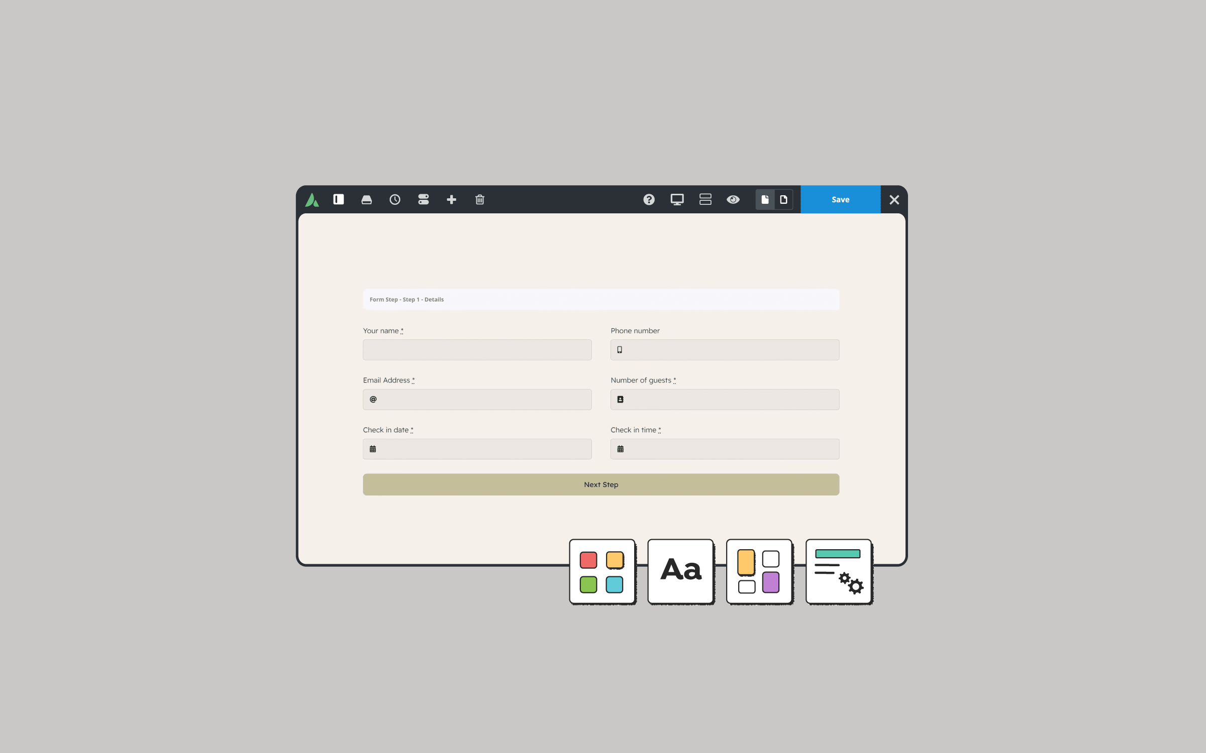
Avada includes an intuitive Form Builder, which provides a wide selection of Elements for creating and customizing forms. Within these Elements lie advanced options that can significantly enhance their functionality. This blog post will explore some of these advanced features, providing insight into how you can leverage them to create more engaging and user-friendly forms.
Overview
A Brief Overview of Avada Form Elements
Avada’s Form Builder allows users to add Elements to their forms, such as text fields, email fields, password fields, Honeypot fields, hidden fields, and more. While many users are familiar with the basic functionalities, several advanced options can take your forms to the next level. Below, we’ll explore some of these advanced features.
1: Customizing the Empty Input Notice

One often overlooked but useful feature is the Empty Input Notice. By default, if a user tries to submit a form without completing a required field, a popup message will prompt them to fill in the missing information. The fields default message is typically generic: “Please fill out this field.”
However, Avada allows you to customize this text to better suit the context of your form. It’s important to note that while you can customize this notice for multiple fields, the notice will only appear for the first incomplete field during form submission.
2: Pre-Filling Fields with the Field Value Option

The Field Value option lets you pre-populate a form field with a specific value. This feature is particularly useful when combined with disabled fields or dynamic data. For instance, you might want to automatically fill in the current date or the username of the person filling out the form. This option is available in text, email, and hidden field elements.
Additionally, suppose you’re directing users to the same form from different website pages. In that case, you can use the request parameter setting within the dynamic data options to determine the source of the form submission, tailoring the user experience accordingly.
3: Using Disabled Fields for Fixed Data

Another useful feature in Avada’s form elements is the Disabled Field option. Available in text and text area fields, this option adheres to HTML specification standards, rendering the form field disabled, non-focusable, and excluded from the form submission.
This can be particularly useful when you want to display a fixed value to the user without requiring or allowing editing. For example, if your form includes checkboxes for user selections, you could display additional information related to their choice in a disabled field directly below the checkbox.
4: Enforcing Input Formats with Input Patterns

The Input Pattern option is a powerful tool for ensuring users enter data in the correct format. This option is available in the text field element and offers a range of predefined patterns, such as patterns for names, passwords, credit card numbers, and postal codes from various countries.
If the predefined patterns do not meet your needs, you can select the custom option to define your own pattern. This ensures that users provide data in the exact format you require, reducing the likelihood of errors in form submissions.
5: Ensuring Accuracy with Input Must Match

The Avada Form Builder provides the Input Must Match option for fields where accuracy is crucial, such as email addresses and passwords. This feature allows you to include a confirmation field where users must re-enter their email address or password.
The form will only be submitted if the content of the confirmation field matches the original input, thereby reducing errors due to mistyping.
6: Controlling Form Navigation with Tab Index

The Tab Index option, available in almost all Form Elements, lets you control the sequence in which users navigate through the form fields using the Tab key. By default, Elements follow the natural order of the document.
Still, with this option, you can modify the sequence to suit your form’s layout and flow. The default value is zero, which maintains the standard tab order while setting a negative value will ensure the Element never receives focus via the Tab key.
Summary
These advanced options in Avada Form Elements provide powerful tools for creating more intuitive, user-friendly, and functional forms. Whether you need to enforce data formats, guide users through form navigation, or display dynamic data, these features can help you customize your forms to meet specific needs.


