Avada Mega Menu layout example

Avada Mega Menu

The Avada Mega Menu is a mobile-friendly, highly flexible expanded menu that can display multiple levels of navigation in a dropdown format. Mega-menus is stylish and can improve the user experience and make it easier for visitors to navigate a website.

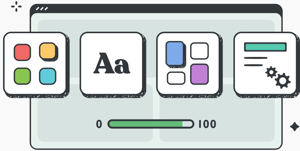
Styling And Configurable Options in Avada

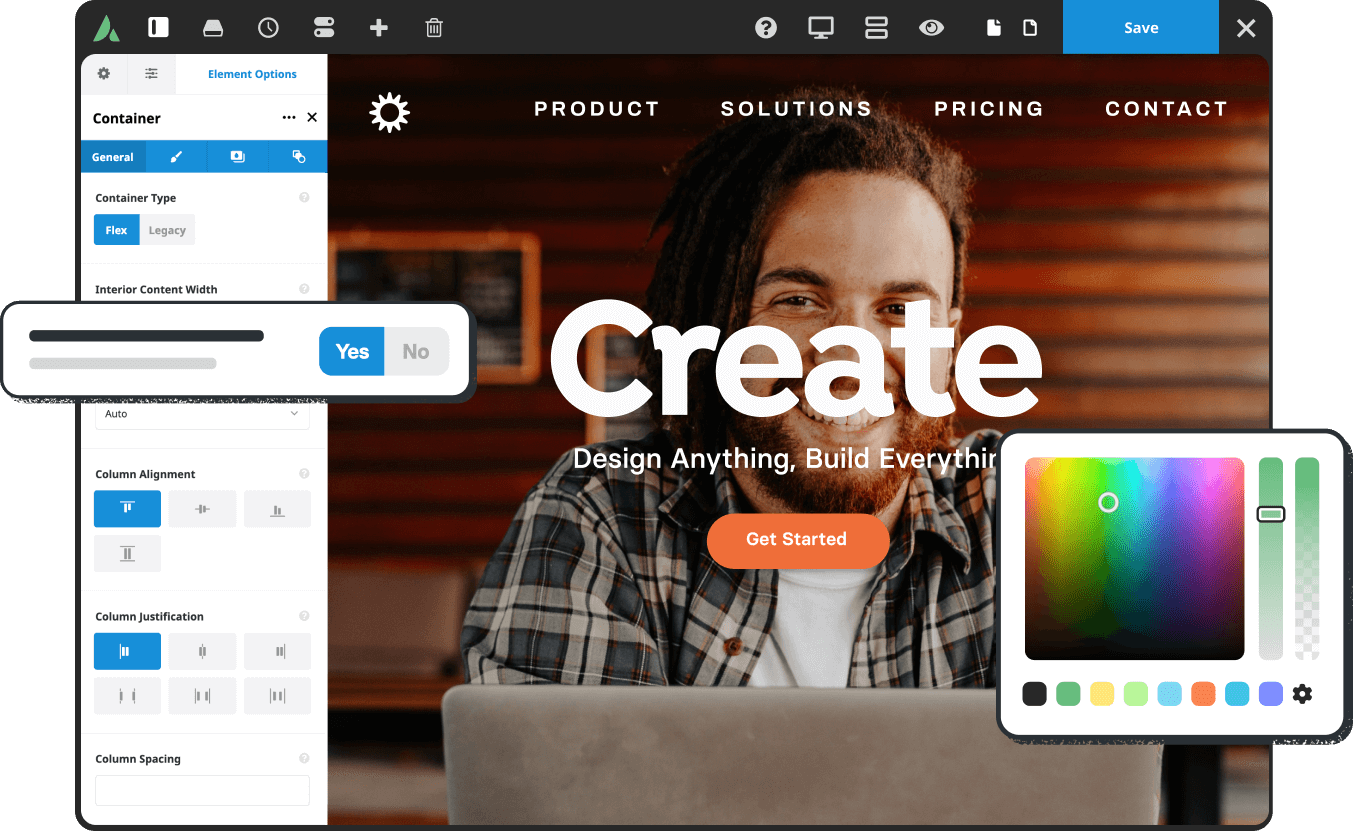
Intuitive Menu Builder Interface

Designing your website’s ultimate Avada Mega Menu is easier than ever and faster than a 3rd party plugin.

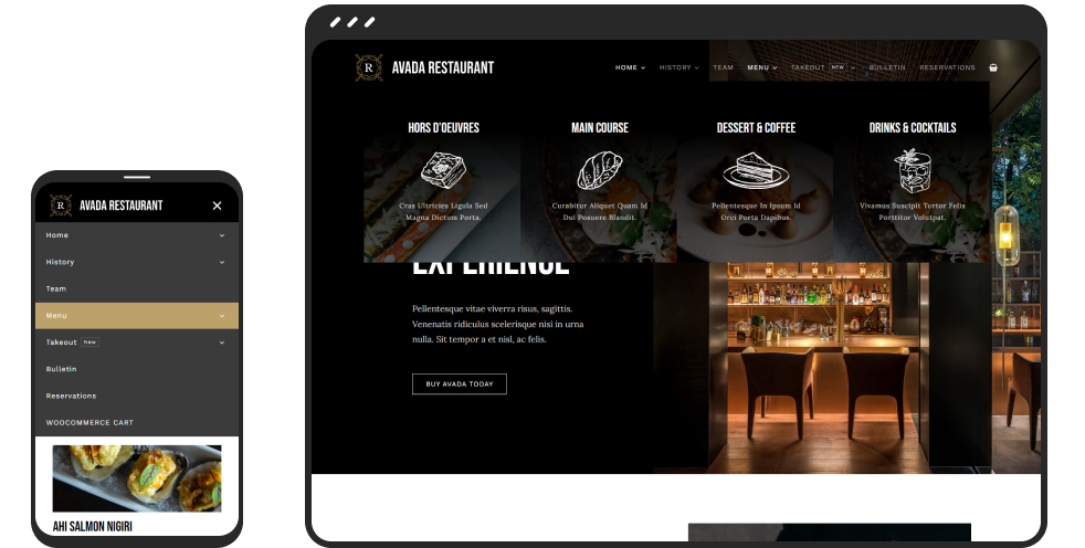
Website preview across multiple mobile devices

Mobile-Friendly Across All Devices

Both horizontal and vertical Mega Menus display perfectly across all mobile devices.

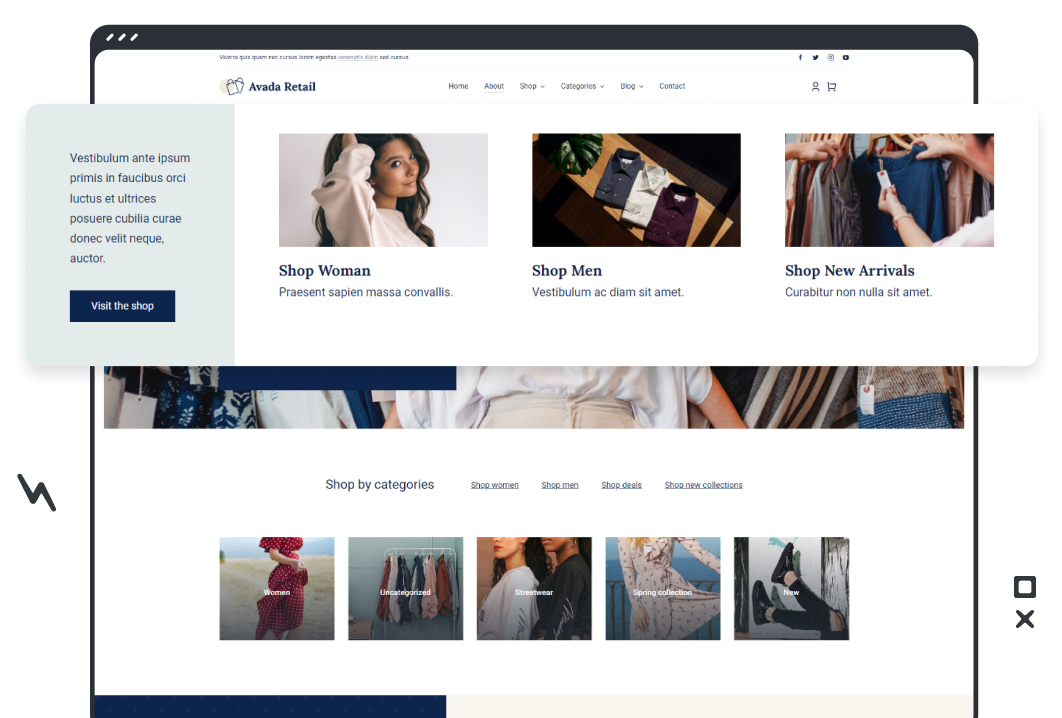
Prebuilt Mega Menu Layout example

Design Stylish Mega Menu Layouts

Design the perfect Avada Mega Menu with a wide array of tools and features at your fingertips.

Flexible Mega Menu Positioning

Positioning can be everything regarding your website’s style, the type of information you need to display in the Mega Menu, and how this will impact your customers. Either a vertical or horizontal Mega Menu layout is straightforward to design and mobile-friendly across mobile devices.
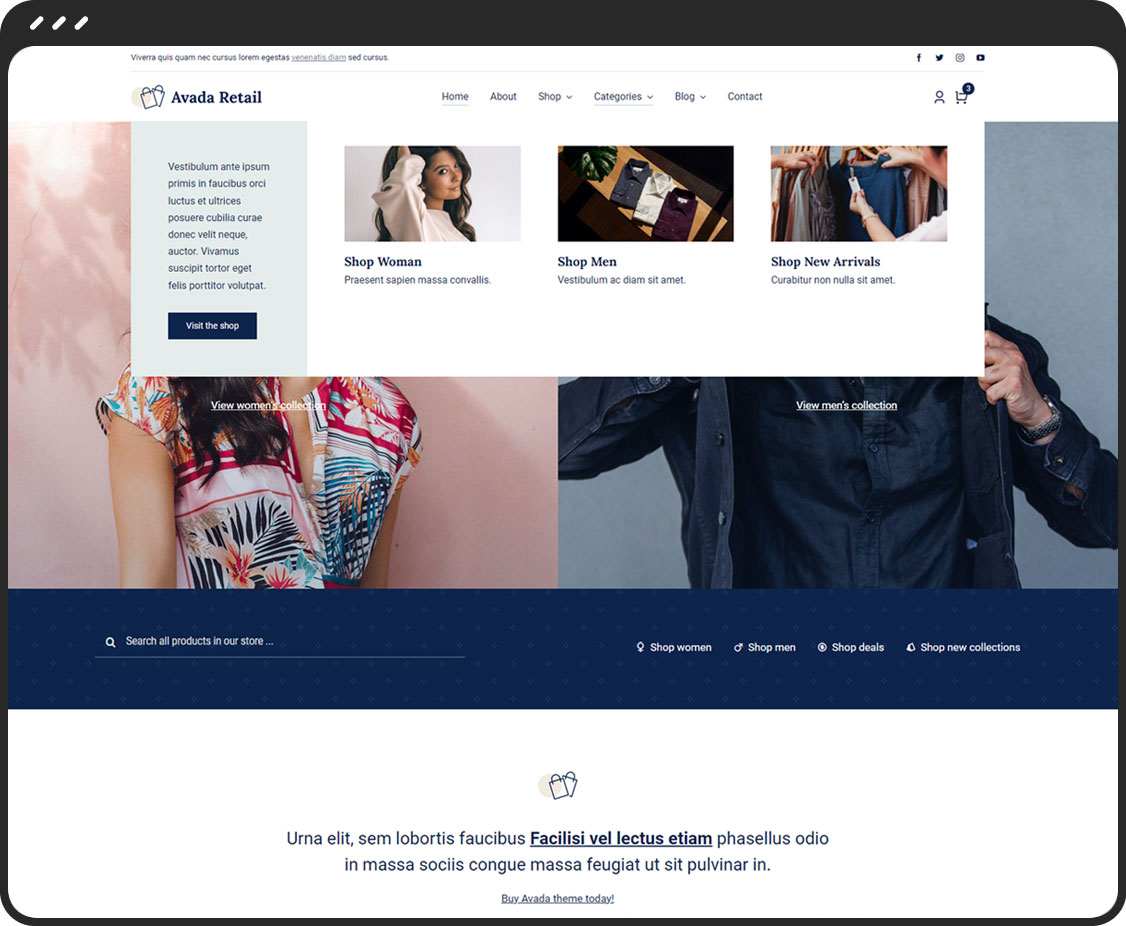
Horizontal Mega Menu Layout

Horizontal

A Mega Menu horizontal layout provides more layout space to showcase anything from products to services and more. The style choices are endless.
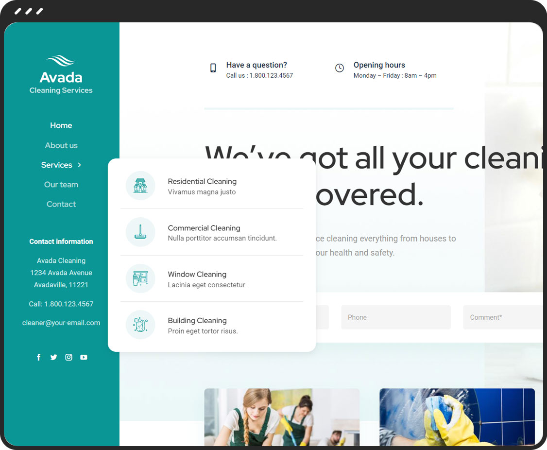
Vertical Mega Menu Layout

Vertical

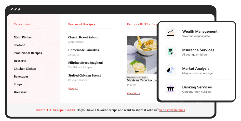
Vertical Mega Menu layouts are ideal for websites with a side header. Stylishly showcase anything from products to services with endless style choices.