Avada Progress Bar Element Examples
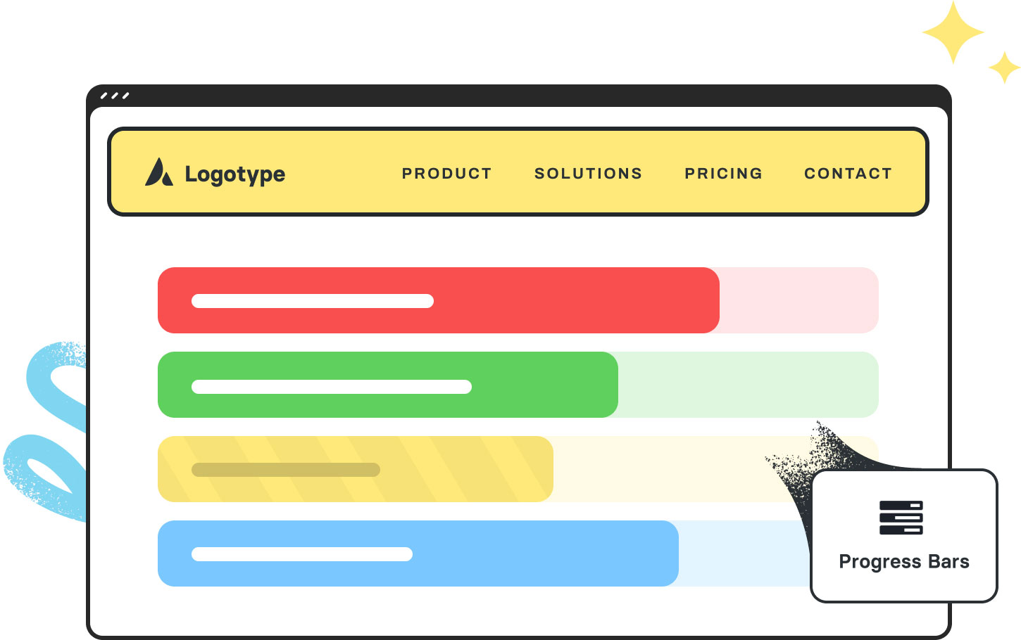
The Avada Progress Bar Element provides a visual way to display progress, skills, goals, or statistics using animated horizontal bars. With options for colors, striped styles, percentage labels, icons, and animation triggers, you can present data in an engaging, branded, and easy-to-understand format that adapts across devices.
Examples can include the individual option values set for that particular instance; however, in some cases, not all Element variations can be shown as they may be too numerous. Where a live example cannot be shown, an image representation will be used as a substitute. For more detailed information, please refer to the related Element documentation and videos.


