Avada Logo
Avada Design Elements

Content Boxes

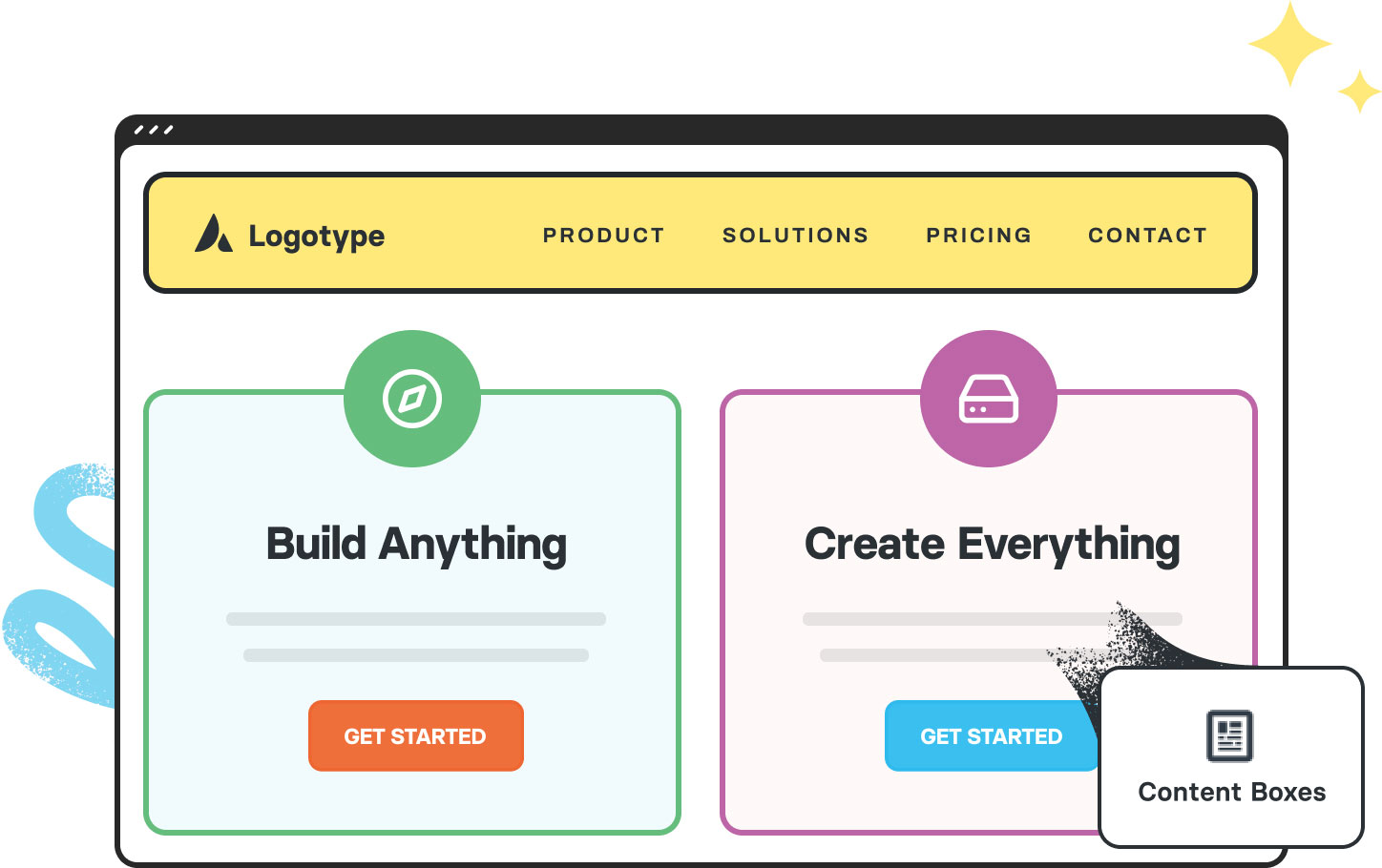
The Avada Content Boxes Element lets you present features or services with icons, titles, and text in stylish layouts, with animations, colors, and hover effects that match your brand.

Avada Content Box Element Featured Image

Layout Flexibility

Choose from 8 pre-made layouts & select from 1-6 columns, ensuring your content boxes fit the space and meet your content needs.

Visual Customization

Adjust icons, images, colors, typography, hover effects, box shadows, borders, and animations to align with your brand identity.

Individual & Global Control

Global settings for overall look, with per-box overrides so each box can have individual tweaks while maintaining consistency.

Avada Content Boxes Element Examples

The Avada Content Boxes Element is a highly flexible design component that lets you present grouped content (icon or image + title + description) in a variety of layouts, anywhere on the page, styled to your brand; with up to six columns, pre-designed layouts, hover effects, and full control over fonts, colors, spacing, and animation, it’s ideal for showcasing features, services, benefits or anything you want to highlight in a visually compelling way.


This Avada Content Boxes Element is set up as follows: Three Content Box child items, Box Layout (Clean Layout Horizontal), Number of Columns (3), Link Type (Text), Link Area (Link+Icon), Content Alignment (Left), Animation Type (None), Title Size (24px), HTML Heading Tag (H3), Icon Color, Icon Background (Yes), Icon Background Radius (0px), Icon Background Color, Icon Size (24px), Icon Hover Animation Type (Slide), and Hover Accent Color.

This Avada Content Boxes Element is set up as follows: Two Content Box child items, Box Layout (Clean Layout Horizontal), Number of Columns (2), Link Type (Button), Button Span (Yes), Link Area (Link+Icon), Content Alignment (Right), Animation Type (Flip Vertically), Title Size (24px), HTML Heading Tag (H3), Icon Color, Icon Background (Yes), Icon Background Radius (10px), Icon Background Color, Icon Size (20px), Icon Hover Animation Type (Slide), and Hover Accent Color.

This Avada Content Boxes Element is set up as follows: Four Content Box child items, Box Layout (Classic Icon On Top), Number of Columns (4), Link Type (Button Bar), Link Area (Entire Content Box), Animation Type (Fade), Title Size (26px), HTML Heading Tag (H4), Border Radius (20px Top Left/Right), Icon Color, Icon Background (Yes), Icon Background Radius (20px), Icon Background Color, Icon Size (30px), Icon Hover Animation Type (Fade), and Hover Accent Color.

This Avada Content Boxes Element is set up as follows: Two Content Box child items, Content Box Background Color, Box Layout (Classic Icon On Top), Number of Columns (2), Link Type (Button), Button Span (No), Link Area (Link+Icon), Animation Type (Fade), Title Size (32px), HTML Heading Tag (H2), Border Radius (15px Top Left/Right), Box Shadow (Yes), Box Shadow Blur Radius (0px), Box Shadow Color, Icon Image (Custom), and Hover Accent Color.

This Avada Content Boxes Element is set up as follows: Three Content Box child items, Box Layout (Timeline Vertical), Link Area (Entire Content Box), Content Alignment (Left), Title Size (28px), HTML Heading Tag (H4), Border Radius (20px Top/Left – 40px Bottom/Right), Icon Color, Icon Background (Yes), Icon Background Radius (100%), Icon Background Color, Icon Size (30px), and Hover Accent Color.

Examples can include the individual option values set for that particular instance; however, in some cases, not all Element variations can be shown as they may be too numerous. Where a live example cannot be shown, an image representation will be used as a substitute. For more detailed information, please refer to the related Element documentation and videos.
Avada Container Element Featured ImageContainer
Avada Countdown Element Featured ImageCountdown
Go to Top