Avada Circles Info Element Showcase

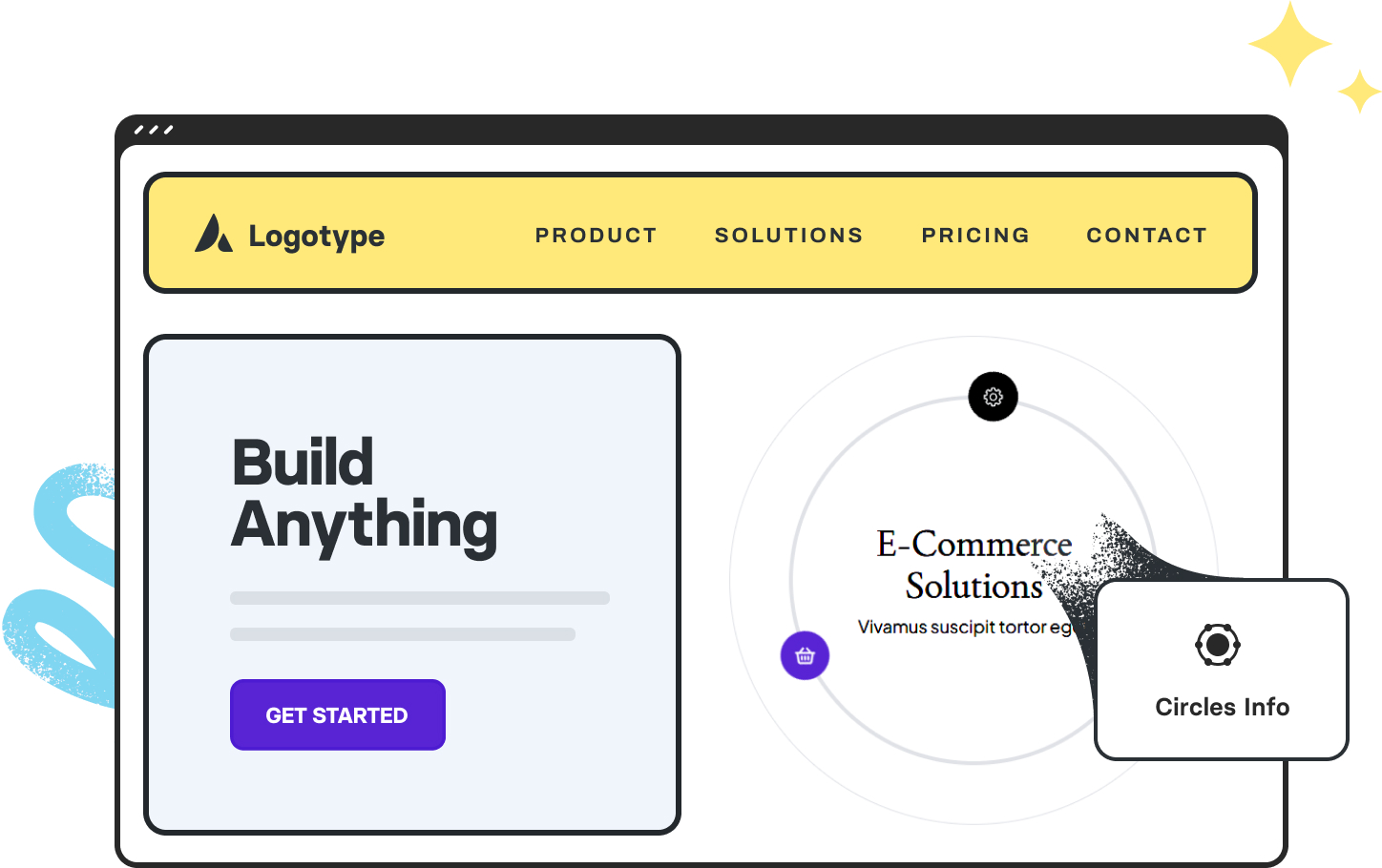
The Avada Circles Info Element displays information inside circular progress visuals, combining data representation with descriptive content. Each circle shows a percentage or value through animated, colored rings, accompanied by a title, icon, and optional description. This Element is ideal for showcasing statistics, skills, milestones, or performance metrics in a way that is both visually engaging and easy to understand. You can fully customize colors, animation speed, size, and layout to ensure it fits seamlessly within your design.

Below, you will find live examples of the Circles Info Element in action. Examples can include the individual option values set for that display; however, in some instances, not all Element variations can be shown as they may be too numerous. For further information related to this Avada Design Element, please check the Avada help center.

72%
Revenue
48K
Customers
8%
Portfolio

This Avada Cirlces Info Element is set up as follows: Auto Rotate (Yes), Auto Rotate Time (2.0sec), Pause on Hover (Yes), Activation Type (Click), Icons Placement (Content Circle), Circle Border Size (2px), Circle Border Style (Dashed), Content Cirlce Border Size (6px), Content Circle Border Style (Solid), Content Spacing (45px), and Icon Size (16px). In addition, there are three child elements, each with a custom typography set.

DISCOVER
Greatness
STUNNING
Websites
MOBILE
First
WEBSITES
For Everyone

This Avada Cirlces Info Element is set up as follows: Auto Rotate (Yes), Auto Rotate Time (3.3sec), Pause on Hover (No), Activation Type (Click), Icons Placement (Outer Circle), Circle Border Size (3px), Circle Border Style (Dotted), Content Cirlce Border Size (1px), Content Circle Border Style (Solid), Content Spacing (3px), and Icon Size (25px). In addition, there are four child elements, each with a custom typography set.

Passion
Dedication
Resolve
Strength
Endurance
Confidence
Success

This Avada Cirlces Info Element is set up as follows: Auto Rotate (No), Activation Type (Hover), Icons Placement (Content Circle), Circle Border Size (8px), Circle Border Style (Double), Content Cirlce Border Size (3px), Content Circle Border Style (Double), Content Spacing (0px), and Icon Size (12px). In addition, there are seven child elements, each with a custom typography set.

Insight
Vision
Success
1
2
Table of ContentsTable Of Contents
Stripe ButtonStripe Button