Woo Sorting Element
Last Update: February 11, 2026
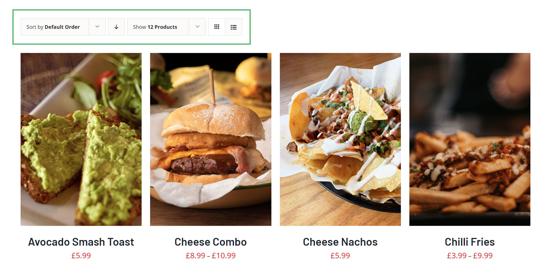
The Avada Woo Sorting Element replicates the sorting options of a WooCommerce Shop page and allows you to add product sorting into your custom Shop Layout.
Watch the video below for a visual overview of the Element, view the Avada Woo Sorting Element page for live examples, and read on to see the complete list of options.
For privacy reasons YouTube needs your permission to be loaded.
How To Use The Woo Sorting Element
This Avada Element is designed to be used in your Woo Shop Layout. It replicates the Woo Sorting options commonly available in the Avada Global Options. It has a range of display and styling options.
To use it, place the Element into your Layout on the designated WooCommerce Shop page. Set the options as you desire. See the individual options below.
Element Options
General
| Heading | Description | |
|---|---|---|
| Sorting Elements | Choose the order of sorting elements. | |
| Width / Height | Set a width and height for the Sorting element or leave empty for auto. | |
| Elements Flex Direction | Defines how the elements should be positioned in the flexbox. | |
| Elements Justify Content | Defines the element justification within the flexbox. | |
| Elements Align Items | Defines the element alignment within the flexbox. | |
| Elements Gap | Controls the space between the chosen elements. Enter values including any valid CSS unit, ex: 20px. | |
| Margin | In pixels or percentage, ex: 10px or 10%. | |
| Element Visibility | Choose to show or hide the element on small, medium or large screens. You can choose more than one at a time. | |
| CSS Class | Add a class to the wrapping HTML element. | |
| CSS ID | Add an ID to the wrapping HTML element. |
Sort
| Heading | Description | |
|---|---|---|
| Sort Options | Select the sorting options that you want to be displayed in the product sorting dropdown or select. NOTE: If the Order button is disabled and you have chosen "Price" here, it will display both, low to high, and high to low choices. If Order by Price is not working, please regenerate the Product Lookup Tables here. | |
| Layout | Set the layout of the product sorting. | |
| Dropdown/Select Size | Controls the size (width and height) of the sorting dropdown or select. Leave wdith empty for auto-width. Enter value including any valid CSS unit, ex: 20px. | |
| Select Font Size | Controls the font size of the sorting select. Enter value including any valid CSS unit, ex: 20px. | |
| Dropdown Typography | Controls the typography of the sorting dropdown. Leave empty for the global body font family. | |
| Dropdown/Button Text Color | Controls the text color of the sorting dropdown and order button. | |
| Dropdown/Button Background Color | Controls the background color of the sorting dropdown and order button. | |
| Dropdown/Button Border Size | Controls the border size of the sorting dropdown and order button. Enter value including any valid CSS unit, ex: 20px. | |
| Dropdown/Button Border Color | Controls the border color of the sorting dropdown and order button. | |
| Dropdown/Button Border Radius | Controls the border radius of the sorting dropdown and order button. Enter value including any valid CSS unit, ex: 20px. | |
| Display Order Button | Choose if the order button (ASC/DESC) should be displayed. NOTE: If it is not displayed, but the "Price" is one of the sorting options, the dropdown will display both, low to high, and high to low choices. | |
| Order Button Spacing | Controls the space between the the sorting element and the order button. Enter value including any valid CSS unit, ex: 20px. | |
| Order Button Font Size | Controls the font size of the order button. Enter value including any valid CSS unit, ex: 20px. |
Count
| Heading | Description | |
|---|---|---|
| Product Count Selection | Select the number of product count to display. For best results it should equal the number of posts set in the Post Card Archives element. | |
| Layout | Set the layout for the product count. | |
| Dropdown/Select Size | Controls the size (width and height) of the product count dropdown or select. Leave wdith empty for auto-width. Enter value including any valid CSS unit, ex: 20px. | |
| Select Font Size | Controls the font size of the product count select. Enter value including any valid CSS unit, ex: 20px. | |
| Display Button Label | Choose to display a label before the count buttons. | |
| Button Label Font Size | Set the font size of the product count button label. Enter value including any valid CSS unit, ex: 20px. | |
| Button Label Text Color | Controls the text color of the product count button label. | |
| Button Layout | Choose the layout of the product count buttons. | |
| Button Size | Controls the size (width and height) of the product count buttons. Enter value including any valid CSS unit, ex: 20px. | |
| Text Button Separator | Set a separator character for the text buttons. Enter value including any valid CSS unit, ex: 20px. | |
| Text Button Separator Color | Controls the color of the product count text button separator. | |
| Dropdown/Button Typography | Controls the typography of the product count dropdown or buttons. Leave empty for the global body font family. | |
| Dropdown/Button Text Color | Controls the text color of the product count dropdown or buttons. | |
| Dropdown/Button Background Color | Controls the background color of the product count dropdown or buttons. | |
| Dropdown/Button Border Size | Controls the border size of the product count dropdown or buttons. Enter value including any valid CSS unit, ex: 20px. | |
| Dropdown/Button Border Color | Controls the border color of the product view dropdown or buttons. | |
| Dropdown/Button Border Radius | Controls the border radius of the product view dropdown or buttons. Enter value including any valid CSS unit, ex: 20px. |
View
| Heading | Description | |
|---|---|---|
| Display Button Label | Choose to display a label before the view buttons. | |
| Button Label Font Size | Set the font size of the product view button label. Enter value including any valid CSS unit, ex: 20px. | |
| Button Label Text Color | Controls the text color of the product view button label. | |
| View Buttons | Choose which product view buttons you want to use. Either user the "General Grid" button to get what is set in your connected product element, or use the column buttons to adjust the product element columns accordingly. | |
| Button Layout | Choose the layout of the product view buttons. | |
| Button Size | Controls the size (width and height) of the product view buttons. Enter value including any valid CSS unit, ex: 20px. | |
| Font Size | Controls the font size of the product view buttons. Enter value including any valid CSS unit, ex: 20px. | |
| Text Color | Controls the text color of the product view buttons. | |
| Background Color | Controls the background color of the product view buttons. | |
| Border Size | Controls the border size of the product view buttons. Enter value including any valid CSS unit, ex: 20px. | |
| Border Color | Controls the border color of the product view buttons. | |
| Border Radius | Controls the border radius of the product view buttons. Enter value including any valid CSS unit, ex: 20px. |
Extras
| Heading | Description | |
|---|---|---|
| Conditional Rendering | Add conditional rendering logic for the element. The element will only be part of the post / page contents, if the set conditions are met. NOTE: Server cache can interfere with results. |


